flex-basis: Webkit / Blink ignore intrinsic aspect ratio
According the editors draft of the current Flexbox spec, neither of these browsers are rendering this correctly.
When I saw this question posted here, I asked about it on the www-style mailing list, and this is the discussion it prompted (via readable-email.org):
The consensus is that a strict interpretation of the current draft would suggest that the image be sized to 300x300 pixels because that's the minimum content size of the flex item and flex items are not supposed to shrink below their minimum content size if their min-size property is auto (the default, and the case in your example).
Daniel Holbert (Flexbox implementor on Firefox) continued this discussion on another thread where he proposed that items with an intrinsic aspect ration should be allowed to shrink to below their minimum content size. He states:
min-content sizes aren't really a useful lower-bound for flex items with aspect ratios. These flex items can shrink (honoring their intrinsic aspect ratio) below their min-content size, without overflowing.
Anyway, as I said, the answer to your question is that neither browser is rendering this correctly (as per the current spec), but it's possible that the spec will change to handle this case and the way Firefox is currently rendering it will be considered correct in the future.
Input breaks out of small container with flex basis auto
Removing the flex basis auto does resolve it, but I'd like to know why (as the default flex basis value is auto anyway). . .
You're correct that the initial value of flex-basis is auto (MDN).
However, in using the flex property, you've overridden the default, resulting in flex-basis: 0.
flex: 1 0 means:
flex-grow: 1flex-shrink: 0flex-basis: 0
(Spec: § 7.1.1. Basic Values of Flex)
So when you remove flex-basis: auto the code falls back to flex-basis: 0, and the layout works.
Note that the problem you describe exists in Chrome, but not Firefox and Edge, where the layout works fine with the original code.
Centering and Scaling an Image in a Flexbox
CSS is catching up. It doesn't have the greatest support yet, but object-fit: contain does exactly what you want (EDIT 11/17: Edge now has partial support making IE11 the only browser with no support). Just put it in your css rule for img and change max-width: 100% and max-height: 100% to width: 100% and height: 100%. Here's a codepen.
.Container {  height: 100vh;  width: 100vw;  background: red;  display: flex;  justify-content: center;  align-items: center;}
img {  height: 100%;  width: 100%;  object-fit: contain;}
body {  margin: 0;}
<div class="Container"> <img src="https://unsplash.it/2000/1500"></div>Creating a Responsive Flex Layout of Items Using Phone Width and Maintaining Aspect Ratio
You can use calc() and media-queries in CSS to do so.
@media only screen and (max-width: 550px) {
  body {
    background-color: #ffe897;
  }
  li {
    width: calc(100vw - 64px);
    height: calc(75vw - 64px);
  }
}
Here the above media-query will only work if the device width is less or equal to 550px. You can change it as per your need.
The background-color to body is given just to see a when is the media-query start working. You can remove it after you are done with the media-query.
Now is the actual part:
We have assigned width to calc(100vw - 64px). We can do all types of calculation inside calc(). Here 100vw means 100% of the viewport or screen width. We are saying set the width to 100% of the divide width minus 64px which is the margin of 32px on left and right side.
Similarly, the height says 75% of the device with minus the 64px margin.
Check it in action on Codepen Editor: https://codepen.io/manaskhandelwal1/pen/OJbNpqx?editors=1100
Check it in action on Codepen Debug Mode: https://cdpn.io/manaskhandelwal1/debug/OJbNpqx/XxkVwKaqOJxM
To see the width and height calculated by the browser you can use the browser developer tools.
Open the developer tools and change the tab Styles to Computed.
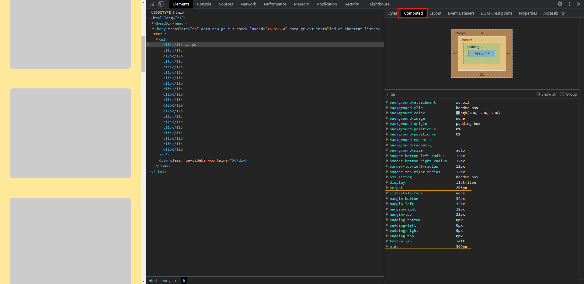
You can see the values change as you change the screen width.
Related Topics
Ie7 and "Inherit": Ignoring Entire Rule
Fieldset Contents Overflow in Firefox
How to Pass Value from Ts File to SCSS File in Same Component in Angular 2+
How to Make The Animation Smooth
Do You Put Ie Conditionals in The CSS File or in The HTML File
Set Div Width to Content Without Inline-Block and Keep Divs Under Each Other Center Aligned
Adding Background Image to Shiny Navbarpage
How to @Import .CSS File as a .Scss File in Sass
Angular [Class.Active]="Isactive" - What Does "Class.Active" Mean Here
Repeated Series of Number via CSS
Sticky Scrollbar at Bottom of Table
Style Ng-Bootstrap Accordion with CSS