CSS Font Border?
There's an experimental CSS property called text-stroke, supported on some browsers behind a -webkit prefix.
h1 {    -webkit-text-stroke: 2px black; /* width and color */
    font-family: sans; color: yellow;}
<h1>Hello World</h1>Text border using css (border around text)
Use multiple text shadows:
text-shadow: 2px 0 #fff, -2px 0 #fff, 0 2px #fff, 0 -2px #fff,
             1px 1px #fff, -1px -1px #fff, 1px -1px #fff, -1px 1px #fff;

body {
  font-family: sans-serif;
  background: #222;
  color: darkred;
}

h1 {
  text-shadow: 2px 0 #fff, -2px 0 #fff, 0 2px #fff, 0 -2px #fff,
               1px 1px #fff, -1px -1px #fff, 1px -1px #fff, -1px 1px #fff;
}<h1>test</h1>Outline effect to text
There is an experimental webkit property called text-stroke in CSS3, I've been trying to get this to work for some time but have been unsuccessful so far.
What I have done instead is used the already supported text-shadow property (supported in Chrome, Firefox, Opera, and IE 9 I believe).
Use four shadows to simulate a stroked text:
.strokeme {
  color: white;
  background-color: white;
  text-shadow: -1px -1px 0 #000, 1px -1px 0 #000, -1px 1px 0 #000, 1px 1px 0 #000;
}
<div class="strokeme">
This text should have a stroke in some browsers
</div>Add text between full border CSS
You could easily use the <fieldset> and <legend> elements to do this:
legend { text-align: center;}<fieldset> <legend>Share with your friends</legend> <p>Lorem ipsum dolor sit amet, consectetur adipisicing elit. Ex cupiditate tenetur corporis officia corrupti at mollitia quam deleniti minus fuga accusantium, illo aliquid, eaque aperiam voluptatibus ad optio magni hic.</p></fieldset>Text in Border CSS HTML
You can do something like this, where you set a negative margin on the h1 (or whatever header you are using)
div{
    height:100px;
    width:100px;
    border:2px solid black;
}

h1{
    width:30px;
    margin-top:-10px;
    margin-left:5px;
    background:white;
}
Note: you need to set a background as well as a width on the h1
Example: http://jsfiddle.net/ZgEMM/
EDIT
To make it work with hiding the div, you could use some jQuery like this
$('a').click(function(){
    var a = $('h1').detach();
    $('div').hide();
    $(a).prependTo('body');
});
(You will need to modify...)
Example #2: http://jsfiddle.net/ZgEMM/4/
Font outline using only CSS
One way to do that is to use text-shadow and overlap multiple shadows:
.introText {
   text-shadow: 0 0 1px black, 0 0 1px black, 0 0 1px black, 0 0 1px black;
}
4 times in this case.
Example:
.introText { font-family: "Nunito", sans-serif; text-shadow: 0 0 1px black, 0 0 1px black, 0 0 1px black, 0 0 1px black; color: white; font-size: 50px; margin-top: 20vh; } <h1 class="introText text-center">We've got your perfect spot.</h1>CSS Text Border With Padding
What you're asking for is not possible. Especially the requirement of making an outer border of transparency. While box-shadow has an inset property, text-shadow does not. Background clip can create some interesting effects in conjunction with text-shadow but nothing like what you're looking for.
span{font-size: 300px;font-weight:bold;font-family: Arial, 'sans-serif';background-color: #ed5c65;color: transparent;text-shadow: 4px 4px 4px rgba(255,255,255,0.3);-webkit-background-clip: text;-moz-background-clip: text;background-clip: text;}<span>M</span>How can i move the border with the text or close to it i need the left to move in 30px
If I understand you correctly, you are trying to move the button elements in their entirety, and not just their contents. I'm assuming you want to move them to the right.
To do this, wrap the contents of the buttons in a div, and give that div margin-left:30px.
CSS
     .button-container {
         margin-left:30px;
     }

     .p-2{
          border: 1px solid #D8DADA;
          margin: 0 12px 0 0;
          padding: 15px 0 8px 15px !important;
      }
HTML
    <div class='button-container'>
        <button class='p-2'></button>
        <!-- and so on.. --->
    </div>
Outline effect to text in Arabic using CSS
Stack many text-shadow having 1px of blur to simulate a solid stroke. The more shadow you add the more you get close to a solid visual
body {
  background-color: pink;
}

h1 {
  color: white;
  text-align: center;
  text-shadow:
   0 0 1px #000,
   0 0 1px #000,
   0 0 1px #000,
   0 0 1px #000,
   0 0 1px #000,
   0 0 1px #000,
   0 0 1px #000,
   0 0 1px #000,
   0 0 1px #000,
   0 0 1px #000,
   0 0 1px #000,
   0 0 1px #000,
   0 0 1px #000;
}
<h1>Experiment</h1>
<h1>تجربة</h1>How to add border to a text only and align center
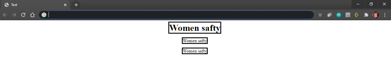
Using a span
HTML
<span>Women safty</span>
CSS
body {
    text-align: center;
}
span {
    border: solid;
}
Result

Using a div, h1 and p
HTML
<h1>Women safty</h1><br /><br />
<div>Women safty</div><br /><br />
<p>Women safty</p><br /><br />
CSS
body {
    text-align: center;
}
h1 {
    border: solid;
    display: inline;
}
div {
    border: solid;
    display: inline;
}
p {
    border: solid;
    display: inline;
}
Result
Related Topics
Difference Between Ng-Class and Ng-Style
CSS How to Position an Element in a Middle (Half Height/Vertical 50%) of Another Element
Including CSS with '<Link>' or '@Import' - Which Is Better
CSS Multiple Backgrounds Scrolling at Different Speeds
Sharepoint 2013 Deleting Contents of <Style> in Embed Code When Saving
How to Edit CSS in Chrome Like in Firebug for Firefox
How Does 'Flex-Grow:0' Get Interpreted
Line Two Divs Side by Side with CSS and React
Webpack 4: Mini-CSS-Extract-Plugin + Sass-Loader + Splitchunks
Background Color in Tabsetpanel in Shiny