CSS: Skew a buttons border, not the text
You can unskew the child element i.e. provide the opposite skew co-ordinates as you specified for the parent.
Here is a working example
Suppose you have below as you html,
<div class="btn">
    <button><div class="btn-text">Click</div></button>
</div>
If we skew the parent element by 20deg then we should skew the child element by -20deg as,
.btn {
    -ms-transform: skewX(20deg); /* IE 9 */
    -webkit-transform: skewX(20deg); /* Safari */
    transform: skewX(20deg);
}
.btn-text {
    -ms-transform: skewX(-20deg); /* IE 9 */
    -webkit-transform: skewX(-20deg); /* Safari */
    transform: skewX(-20deg);
    padding: 20px;
}
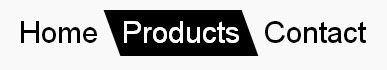
How to skew element but keep text normal (unskewed)
skew a parent element (li in this example) and inverse skew its child elements:
nav ul {
  padding: 0;
  display: flex;
  list-style: none;
}
nav li {
  transition: background 0.3s, color 0.3s;
  transform: skew(20deg); /* SKEW */
}

nav li a {
  display: block; /* block or inline-block is needed */
  text-decoration: none;
  padding: 5px 10px;
  font: 30px/1 sans-serif;
  transform: skew(-20deg); /* UNSKEW */
  color: inherit;
}

nav li.active,
nav li:hover {
  background: #000;
  color: #fff;
}
<nav>
<ul>
<li><a href="#">Home</a></li>
<li class="active"><a href="#">Products</a></li>
<li><a href="#">Contact</a></li>
</ul>
</nav>Not skewed text in skewed class button
Partly seconding Sidharth, I think you won't get around the wrapper element to apply the CSS-transform on and then reset it for its child elements (the submit-input):
<div class="button-wrapper">
  <input type="submit" alt="submit" value="Login">
</div>
Sidharth's answer implies that you completely hide the original <input> and relies on JavaScript to trigger a click on it when the styled wrapper is clicked, but here's and easy way around that: Style the button-wrapper on :hover and remove all styles from the nested <input>-element and make it 100% wide (jsBin example):
.button-wrapper {
  background: #fff;
  border: 1px solid #bbb;
  border-color: #ddd #ccc #bbb;
  overflow: hidden;

  -webkit-transform: skewX(20deg);
  -moz-transform: skewX(20deg);
  -o-transform: skewX(20deg);
  transform: skewX(20deg);
}

.button-wrapper:hover {
  background: #efe;
  border-color: #090;
}

.button-wrapper input {
  background: transparent;
  border: 0;
  cursor: pointer;
  font-size: 20px;
  font-weight: bold;
  padding: 4px 0;
  margin: 0;
  width: 100%;

  -webkit-transform: skewX(-20deg);
  -moz-transform: skewX(-20deg);
  -o-transform: skewX(-20deg);
  transform: skewX(-20deg);
}

.button-wrapper input:hover {
  color: #060;
}
Remove background outline on the side of the border after skew transform
To remove the red outlines and keep the animation, you can do this:
- Remove the borders left and right from p:hover
- Add some margin-left
div.labels p:hover {
  background: red !important;
  margin-left: 30px;
}
div.labels p {
  color: white;
  font-family: 'Bebas Neue';
  text-transform: uppercase;
  line-height: 0.8;
  transition: 0.4s ease all;
  font-size: 4rem;
  -webkit-text-stroke: 2px white;
  letter-spacing: 2px;
  width: fit-content;
  padding: 1rem 2rem;
  transform: skew(-10deg);
}
<div class="labels">
<p>Very Funny</p>
</div>Related Topics
Table Cells Height Calculated Differenly in Ie11
Enforce Print Page Breaks with CSS
Firefox Text-Overflow with Nowrap Ignored (Chrome Works)
Box-Shadow Not Shown on Safari Mobile on iOS 7 (In Landscape)
Whitespace in Wrapped Form Element
CSS Two Columns with Known Children Width
How to Center Crop an Image (<Img>) in Fluid Width Container
Bootstrap Fullscreen Layout with 100% Height
Consistently Sizing a <Textarea> Under Ie, Ff, Safari/Chrome
How to Add Zig Zag Border to a Box Contains Background Image
Select Element Without a Child
CSS Doesn't Work on Https Pages in Chrome and Ie