CSS Color Filter Overlay
A combination of CSS filters would be one method but without seeing the actual source page it's hard to be certain.
.wrap {  width: 400px;  height: 400px;  margin: 1em auto;  position: relative;}
.wrap img {  -webkit-filter: sepia(100%) hue-rotate(90deg) saturate(400%);  filter: sepia(100%) hue-rotate(90deg) saturate(400%);}
<div class="wrap"><img src="http://lorempixel.com/image_output/nature-q-c-400-400-6.jpg" alt="Sample Image" /></div>How to overlay image with color in CSS?
You should use rgba for overlaying your element with photos.rgba is a way to declare a color in CSS that includes alpha transparency support. you can use .row as an overlayer like this:
#header {
    background: url(../img/bg.jpg) 0 0 no-repeat fixed;
    height: 100%;
    overflow: hidden;
    color: #FFFFFF
 }

.row{
    background: rgba(39,62,84,0.82);
    overflow: hidden;
    height: 100%;
    z-index: 2;
}
CSS image overlay with color and transparency
CSS Filter Effects
It's not fully cross-browsers solution, but must work well in
most modern browser.
<img src="image.jpg" />
<style>
    img:hover {
        /* Ch 23+, Saf 6.0+, BB 10.0+ */
        -webkit-filter: hue-rotate(240deg) saturate(3.3) grayscale(50%);
        /* FF 35+ */
        filter: hue-rotate(240deg) saturate(3.3) grayscale(50%);
    }
</style>
EXTERNAL DEMO PLAYGROUND
- CSS Filter Effects
IN-HOUSE DEMO SNIPPET (source:simpl.info)
#container {  text-align: center;}
.blur {  filter: blur(5px)}
.grayscale {  filter: grayscale(1)}
.saturate {  filter: saturate(5)}
.sepia {  filter: sepia(1)}
.multi {  filter: blur(4px) invert(1) opacity(0.5)}
<div id="container">
<h1><a href="https://simpl.info/cssfilters/" title="simpl.info home page">simpl.info</a> CSS filters</h1>
<img src="https://simpl.info/cssfilters/balham.jpg" alt="No filter: Balham High Road and a rainbow" /> <img class="blur" src="https://simpl.info/cssfilters/balham.jpg" alt="Blur filter: Balham High Road and a rainbow" /> <img class="grayscale" src="https://simpl.info/cssfilters/balham.jpg" alt="Grayscale filter: Balham High Road and a rainbow" /> <img class="saturate" src="https://simpl.info/cssfilters/balham.jpg" alt="Saturate filter: Balham High Road and a rainbow" /> <img class="sepia" src="https://simpl.info/cssfilters/balham.jpg" alt="Sepia filter: Balham High Road and a rainbow" /> <img class="multi" src="https://simpl.info/cssfilters/balham.jpg" alt="Blur, invert and opacity filters: Balham High Road and a rainbow" />
<p><a href="https://github.com/samdutton/simpl/blob/gh-pages/cssfilters" title="View source for this page on GitHub" id="viewSource">View source on GitHub</a></p>
</div>How to add a color overlay to a background image?
I see 2 easy options:
- multiple background with a translucent single gradient over image
- huge inset shadow
gradient option:
    html {
      min-height:100%;
      background:linear-gradient(0deg, rgba(255, 0, 150, 0.3), rgba(255, 0, 150, 0.3)), url(https://picsum.photos/id/1043/800/600);
      background-size:cover;
    }
Change color of PNG image via CSS?
You can use filters with -webkit-filter and filter:
Filters are relatively new to browsers but supported in over 90% of browsers according to the following CanIUse table: https://caniuse.com/#feat=css-filters
You can change an image to grayscale, sepia and lot more (look at the example).
So you can now change the color of a PNG file with filters.
body {
    background-color:#03030a;
    min-width: 800px;
    min-height: 400px
}
img {
    width:20%;
    float:left;
     margin:0;
}
/*Filter styles*/
.saturate { filter: saturate(3); }
.grayscale { filter: grayscale(100%); }
.contrast { filter: contrast(160%); }
.brightness { filter: brightness(0.25); }
.blur { filter: blur(3px); }
.invert { filter: invert(100%); }
.sepia { filter: sepia(100%); }
.huerotate { filter: hue-rotate(180deg); }
.rss.opacity { filter: opacity(50%); }
<!--- img src http://upload.wikimedia.org/wikipedia/commons/thumb/e/ec/Mona_Lisa%2C_by_Leonardo_da_Vinci%2C_from_C2RMF_retouched.jpg/500px-Mona_Lisa%2C_by_Leonardo_da_Vinci%2C_from_C2RMF_retouched.jpg -->
<img alt="Mona Lisa" src="https://images.pexels.com/photos/40997/mona-lisa-leonardo-da-vinci-la-gioconda-oil-painting-40997.jpeg?auto=compress&cs=tinysrgb&dpr=3&h=750&w=1260" title="original">
<img alt="Mona Lisa" src="https://images.pexels.com/photos/40997/mona-lisa-leonardo-da-vinci-la-gioconda-oil-painting-40997.jpeg?auto=compress&cs=tinysrgb&dpr=3&h=750&w=1260" title="saturate" class="saturate">
<img alt="Mona Lisa" src="https://images.pexels.com/photos/40997/mona-lisa-leonardo-da-vinci-la-gioconda-oil-painting-40997.jpeg?auto=compress&cs=tinysrgb&dpr=3&h=750&w=1260" title="grayscale" class="grayscale">
<img alt="Mona Lisa" src="https://images.pexels.com/photos/40997/mona-lisa-leonardo-da-vinci-la-gioconda-oil-painting-40997.jpeg?auto=compress&cs=tinysrgb&dpr=3&h=750&w=1260" title="contrast" class="contrast">
<img alt="Mona Lisa" src="https://images.pexels.com/photos/40997/mona-lisa-leonardo-da-vinci-la-gioconda-oil-painting-40997.jpeg?auto=compress&cs=tinysrgb&dpr=3&h=750&w=1260" title="brightness" class="brightness">
<img alt="Mona Lisa" src="https://images.pexels.com/photos/40997/mona-lisa-leonardo-da-vinci-la-gioconda-oil-painting-40997.jpeg?auto=compress&cs=tinysrgb&dpr=3&h=750&w=1260" title="blur" class="blur">
<img alt="Mona Lisa" src="https://images.pexels.com/photos/40997/mona-lisa-leonardo-da-vinci-la-gioconda-oil-painting-40997.jpeg?auto=compress&cs=tinysrgb&dpr=3&h=750&w=1260" title="invert" class="invert">
<img alt="Mona Lisa" src="https://images.pexels.com/photos/40997/mona-lisa-leonardo-da-vinci-la-gioconda-oil-painting-40997.jpeg?auto=compress&cs=tinysrgb&dpr=3&h=750&w=1260" title="sepia" class="sepia">
<img alt="Mona Lisa" src="https://images.pexels.com/photos/40997/mona-lisa-leonardo-da-vinci-la-gioconda-oil-painting-40997.jpeg?auto=compress&cs=tinysrgb&dpr=3&h=750&w=1260" title="huerotate" class="huerotate">
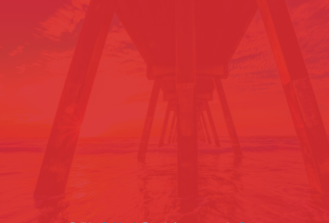
<img alt="Mona Lisa" src="https://images.pexels.com/photos/40997/mona-lisa-leonardo-da-vinci-la-gioconda-oil-painting-40997.jpeg?auto=compress&cs=tinysrgb&dpr=3&h=750&w=1260" title="opacity" class="rss opacity">Color tinting on images using the filter property
You should try to mix a background color (red) than rotating hue. Then you can adjust the saturation to get the desired effect.
.filter {
  position: relative;
  -webkit-filter: brightness(81%) saturate(113%);
  filter: brightness(81%) saturate(113%);
}
.filter::before {
  content: "";
  display: block;
  height: 100%;
  width: 100%;
  top: 0;
  left: 0;
  position: absolute;
  pointer-events: none;
  background: rgba(253, 62, 65, 0.91);
}
You can use a website like this to generate the code you can use.
https://www.cssfilters.co/
Add color filter to dark part of image and another filter to light part of the image?
There is a nice SVG filter component which does map luminance to alpha: <feColorMatrix type="luminanceToAlpha"/>
Since we can use SVG filters in canvas, this allows us to separate the dark area from the light one and use compositing instead of blending.
This way, your input colors are preserved.
(async () => {
  const canvas = document.querySelector("canvas");
  const ctx = canvas.getContext("2d");
  const img = new Image();
  img.src = "https://picsum.photos/500/500";
  await img.decode();
  canvas.width = img.width;
  canvas.height = img.height;
  // first we create our alpha layer
  ctx.filter = "url(#lumToAlpha)";
  ctx.drawImage(img, 0, 0);
  ctx.filter = "none";
  const alpha = await createImageBitmap(canvas);

  // draw on "light" zone
  ctx.globalCompositeOperation = "source-in";
  ctx.fillStyle = "red";
  ctx.fillRect(0, 0, canvas.width, canvas.height);
  // save into an ImageBitmap
  // (note that we could also use a second canvas to do this all synchronously)
  const light = await createImageBitmap(canvas);

  // clean canvas
  ctx.globalCompositeOperation = "source-over";
  ctx.clearRect(0, 0, canvas.width, canvas.height);
  // draw on "dark" zone
  ctx.drawImage(alpha, 0, 0);
  ctx.globalCompositeOperation = "source-out";
  ctx.fillStyle = "blue";
  ctx.fillRect(0, 0, canvas.width, canvas.height);
  // reintroduce "light" zone
  ctx.globalCompositeOperation = "source-over";
  ctx.drawImage(light, 0, 0);
})().catch(console.error);
<svg width="0" height="0" style="visibility:hidden;position:absolute">
<filter id="lumToAlpha">
<feColorMatrix type="luminanceToAlpha" />
</filter>
</svg>
<canvas></canvas>
<!--
If you don't like having an element in the DOM just for that
you could also directly set the context's filter to a data:// URI
url("data:image/svg+xml,%3Csvg%20xmlns%3D%22http%3A%2F%2Fwww.w3.org%2F2000%2Fsvg%22%3E%3Cfilter%20id%3D%22f%22%3E%3CfeColorMatrix%20type%3D%22luminanceToAlpha%22%2F%3E%3C%2Ffilter%3E%3C%2Fsvg%3E#f");
but you'd have to wait a least a task (setTimeout(fn, 0))
because setting filters this way is async...
Hopefully CanvasFilters will solve this soon enough
-->Related Topics
How to Use CSS3: :Selection Without Changing The Default Color and Background Color
How to Apply Linear Gradient for Ie8
Turn Off Animations in Capybara Tests
How to Capitalize First Letter Only Using CSS in Each Case
Tailwind CSS + Vuejs Single File Component and Vs Code Integration
Sprite Height Limitation for CSS Images
Styling Email Link/Href="Mailto:" with CSS
Any Way to Save a CSS Diff Rather Than Save The Entire Stylesheet in Chrome Dev Tools
Most Sophisticated CSS Rendering Bug of All Time (Ie9)
Ionic - How to Wordwrap a Long String in Ion-Header
Dynamic CSS Properties in Less
Selecting an Element That Has a Specific Child
Responsive Semantic UI React Grid, Columns, Rows