How to make a percentage circle using using html and css only with percentage written inside
I think this codepen link might help you by Andre Firchow. Although it uses SCSS
HTML
<div class="wrapper">
  <div class="c100 p99 blue">
      <span>90%</span>
      <div class="slice">
        <div class="bar"></div>
        <div class="fill"></div>
      </div>
  </div>
  <div class="c100 p75 pink">
      <span>75%</span>
      <div class="slice">
        <div class="bar"></div>
        <div class="fill"></div>
      </div>
  </div>
  <div class="c100 p70 green">
      <span>70%</span>
      <div class="slice">
        <div class="bar"></div>
        <div class="fill"></div>
      </div>
  </div>
  <div class="c100 p85 orange">
      <span>85%</span>
      <div class="slice">
        <div class="bar"></div>
        <div class="fill"></div>
      </div>
  </div>
</div>
CSS
// Compass utilities
@import "compass";
@import url('https://fonts.googleapis.com/css?family=Titillium+Web:200,200i,300,300i,400,400i,600,600i,700,700i,900');

body {
    font-family: "Titillium Web", sans-serif;
    margin: 0 auto;
}

// VARS
$circle-width: 0.09em;
$circle-width-hover: 0.07em;

// colors default
$primary-color: #000000; // czarny
$secondary-color: #dfe8ed; //szary bcg
$bg-color: #ffffff; //srodkowy bezowy

// colors customized
$primary-color-blue: #30bae7;
$primary-color-green: #15c7a8;
$primary-color-orange: #eb7d4b;
$primary-color-pink: #d74680;
$primary-color-span: #3c4761;

// CIRCLE
// classes 2 extend
.rect-auto{
    clip: rect(auto, auto, auto, auto);
}

.pie {
    position: absolute;
    border: $circle-width solid $primary-color;
    width: 1 - (2 * $circle-width);
    height: 1 - (2 * $circle-width);
    clip: rect(0em, 0.5em, 1em, 0em);
    border-radius: 50%;
    @include rotate(0deg);
}

.pie-fill {
    @include rotate(180deg);
}
.wrapper {
  width: 1200px;
  margin: 0 auto;
}

// main
.c100 {

    *, *:before, *:after {
        @include box-sizing(content-box);
    }

    position: relative;
    font-size: 160px;
    width: 1em;
    height: 1em;
    border-radius: 50%;
    float: left;
    margin: 0.4em;
    background-color: $secondary-color;

    // centered value inside circle
    > span {
        position: absolute;
        width: 100%;
        z-index: 1;
        left: 0;
        top: 0;
        width: 5em;
        line-height: 5em;
        font-size: 0.2em;
        color: $primary-color-span;
        display: block;
        text-align: center;
        white-space: nowrap;
        @include transition-property(all);
        @include transition-duration(0.2s);
        @include transition-timing-function(ease-out);
    }

    // background inside the circle
    &:after{
        position: absolute;
        top: $circle-width;
        left: $circle-width;
        display: block;
        content: " ";
        border-radius: 50%;
        background-color: $bg-color;
        width: 1 - (2 * $circle-width);
        height: 1 - (2 * $circle-width);
        @include transition-property(all);
        @include transition-duration(0.2s);
        @include transition-timing-function(ease-in);

    }

    // the slice (mask)
    .slice {
        position: absolute;
        width: 1em;
        height: 1em;
        clip: rect(0em, 1em, 1em, 0.5em);
    }

    // circle to show the status
    .bar {
        @extend .pie;
    }

    // loop to create all needed elements automatically
    @for $j from 51 through 100 {

        &.p#{$j} .slice {
            @extend .rect-auto;
        }

        &.p#{$j} .bar:after{
            @extend .pie-fill;
        }

        &.p#{$j} .fill{
            @extend .pie;
            @extend .pie-fill;
        }

    }

    // loop to rotate all 100 circles
    @for $j from 1 through 100 {
        &.p#{$j} .bar {
            @include rotate((360/100*$j) + deg);
        }
    }

    // hover styles
    &:hover{

        cursor: default;

        > span {
            width: 3.33em;
            line-height: 3.33em;
            font-size: 0.3em;
            color: $primary-color-span;
        }

        &:after{
            top: $circle-width-hover;
            left: $circle-width-hover;
            width: 1 - (2 * $circle-width-hover);
            height: 1 - (2 * $circle-width-hover);
        }

    }

    // blue
    &.blue{

        .bar, .fill { border-color: $primary-color-blue !important;}

        &:hover{
            > span { color: $primary-color-span;}
        }

    }

    // pink skin
    &.pink{

        .bar, .fill { border-color: $primary-color-pink !important;}

        &:hover{
            > span { color: $primary-color-span;}
        }

    }

    // green skin
    &.green{

        .bar, .fill { border-color: $primary-color-green !important;}

        &:hover{
            > span { color: $primary-color-span;}
        }

    }

    // orange skin
    &.orange{

        .bar, .fill { border-color: $primary-color-orange !important;}

        &:hover{
            > span { color: $primary-color-span;}
        }

    }

}
Filling a circle border by percent
For first linear part, you can use linear-gradient:(270deg,...) for filling 50% of the circle.
For other linear part, you can increase the angle (270°+) to fill more than 50% of the circle (360° or 0° = 75% of the circle ... 90° = 100% of the circle)
For example: linear-gradient(270deg, black 50%, transparent 50%), linear-gradient(0deg, black 50%, lightgray 50%) combination creates a circle with a lightgray background, filled with seventy-five percent black color. (snippet below)
.circle {  position: relative;  top: 5px;  left: 5px;  text-align: center;  width: 100px;  height: 100px;  border-radius: 100%;  background-color: #ffffff;}
.circle-border {  position: relative;  text-align: center;  width: 110px;  height: 110px;  margin-left: 30%;  border-radius: 100%;  background-color: #E53B3B;  background: linear-gradient(270deg, black 50%, transparent 50%), linear-gradient(0deg, black 50%, lightgray 50%)}
<div class="circle-border"> <div class="circle"> </div></div>Percentage circle border CSS React
Is don't think it's particularly a bug in your code - it's just that the system is trying to work out how to show part CSS pixels on a screen which uses several screen pixels per CSS pixel. Some can get 'left behind'.
A different way of creating the effect you want is to use background images made up of a conic gradient overlaid with a radial one (to give the 'hole' in the middle).
This is a simple snippet to demonstrate the idea in HTML/CSS. The CSS variable --ratio could be set in JS using setProperty to whatever the ratio of red to green is required.
.ratio {
  --ratio: 0.3;
  height: 150px;
  width: 150px;
  border-radius: 50%;
  position: relative;
  clip-path: circle(50%);
}

.ratio::before {
  content: '';
  position: absolute;
  width: 100%;
  height: 100%;
  top: 0;
  left: 0;
  background-image: conic-gradient(red 0 calc(var(--ratio) * 360deg), lime calc(var(--ratio) * 360deg) 360deg);
  z-index: -2;
}

.ratio::after {
  content: '';
  position: absolute;
  width: 80%;
  height: 80%;
  top: 10%;
  left: 10%;
  background-color: white;
  border-radius: 50%;
  z-index: -1;
}
<div class="ratio"></div>calculate percentage in progress circle
To have the progress circle redraw when the values are changed simply call the drawProgress() function within the input event handler.
Also note that there's a couple of other improvements you can make to the code:
- remove nested document.ready
- delegate is deprecated, use on instead
$('#percent').text()should be$('#percent').val(), and I would assume1000in the condition on that line should be100instead.
jQuery($ => {
  $('#submitClick').click(function() {
    var val = parseInt($('#percent').val());
    drawProgress(val / 100);
  }).trigger('click');

  $(".tags").on('input', function() {
    // needlessly using 2 loops here, amended
    //var calculated_total_sum = $(this).find(".ingredient:checked").map((i, el) => parseFloat($(el).closest("div").find(".txtCal").val())).get().reduce((a, b) => a + b) || 0;
    var calculated_total_sum = 0;
    $(this).find('div:has(.ingredient:checked) .txtCal').each((i, el) => calculated_total_sum += parseFloat(el.value));

    $("#percent")
      .val(calculated_total_sum)
      .css('color', parseFloat($("#percent").val()) > 1000 ? 'red' : 'green');

    drawProgress(calculated_total_sum / 100);
  });

  // ingrédients allergènes
  $('div.tags').on('change', 'input:checkbox', function() {
    $(this).parent().nextAll().slice(0, 2).hide().val('0');
    var list = $('.results > li').hide();

    $('input:checked').each(function() {
      list.filter('.' + $(this).attr('rel')).show();
      $(this).parent().nextAll().slice(0, 2).show();
    });
  }).find('input:checkbox').change();

  $(".tags").on('input', '.txtCal', function() {
    var calculated_total_sum = 0;
    $(".tags .txtCal").each(function() {
      var get_textbox_value = $(this).val();
      if ($.isNumeric(get_textbox_value)) {
        calculated_total_sum += parseFloat(get_textbox_value);
      }
    });
    $("#percent").val(calculated_total_sum);
  });

  var svg;

  function drawProgress(end) {
    d3.select("svg").remove()
    if (svg) {
      svg.selectAll("*").remove();
    }
    var wrapper = document.getElementById('radialprogress');
    var start = 0;

    var colours = {
      fill: '#FF0000',
      track: '#555555',
      text: '#00C0FF',
      stroke: '#FFFFFF',
    }

    var radius = 80;
    var border = 12;
    var strokeSpacing = 4;
    var endAngle = Math.PI * 2;
    var formatText = d3.format('.0%');
    var boxSize = radius * 2;
    var count = end;
    var progress = start;
    var step = end < start ? -0.01 : 0.01;

    //Define the circle
    var circle = d3.svg.arc()
      .startAngle(0)
      .innerRadius(radius)
      .outerRadius(radius - border);

    //setup SVG wrapper
    svg = d3.select(wrapper)
      .append('svg')
      .attr('width', boxSize)
      .attr('height', boxSize);

    // ADD Group container
    var g = svg.append('g')
      .attr('transform', 'translate(' + boxSize / 2 + ',' + boxSize / 2 + ')');

    //Setup track
    var track = g.append('g').attr('class', 'radial-progress');
    track.append('path')
      .attr('fill', colours.track)
      .attr('stroke', colours.stroke)
      .attr('stroke-width', strokeSpacing + 'px')
      .attr('d', circle.endAngle(endAngle));

    //Add colour fill
    var value = track.append('path')
      .attr('fill', colours.fill)
      .attr('stroke', colours.stroke)
      .attr('stroke-width', strokeSpacing + 'px');

    //Add text value
    var numberText = track.append('text')
      .attr('fill', colours.text)
      .attr('text-anchor', 'middle')
      .attr('dy', '.5rem');

    //update position of endAngle
    value.attr('d', circle.endAngle(endAngle * end));
    //update text value
    numberText.text(formatText(end));
  }
});
<div class="tags">
<div>
<label><input type="checkbox" checked rel="ingredient-1" class="ingredient"> ingredient 1 </label><br><input type="text" class='txtCal' /><br>
</div>
<div>
<label><input type="checkbox" checked rel="ingredient-2" class="ingredient"> ingredient 2 </label><br><input type="text" class='txtCal' /><br>
</div>
<div>
<label><input type="checkbox" checked rel="ingredient-3" class="ingredient"> ingredient 3 </label><br><input type="text" class='txtCal' /><br>
</div>
<span><b>TOTAL :</b></span><b><span id="total_sum_value"></span></b>
<label for="percent">Type a percent!</label>
<input id="percent" name="percent" value="0">
<button id='submitClick' name='submitButton'>Render</button>
<div id="radialprogress"></div>
</div>
<ul class="results">
<li class="ingredient-1 ingredient-3">Alpha isomethylionone</li>
<li class="ingredient-1">Amyl cinnamal (Jasmonal A)</li>
<li class="ingredient-1">Amylcinnamyl alcohol</li>
<li class="ingredient-1">Anisyl alcohol</li>
<li class="ingredient-1 ingredient-2">Benzyl alcohol</li>
<li class="ingredient-1 ingredient-2 ingredient-3">Benzyl benzoate</li>
<li class="ingredient-2">Benzyl cinnamate</li>
<li class="ingredient-2">Benzyl salicylate</li>
<li class="ingredient-2">Butylphenyl methylpropional (Lilial)</li>
<li class="ingredient-2 ingredient-3">Cinnamal</li>
<li class="ingredient-3">Cinnamyl alcohol</li>
<li class="ingredient-3">Citral</li>
<li class="ingredient-3">Citronellol</li>
<li class="ingredient-3">Coumarin</li>
</ul>
<script src="https://cdnjs.cloudflare.com/ajax/libs/d3/3.4.11/d3.min.js"></script>
<script src="https://ajax.googleapis.com/ajax/libs/jquery/2.1.1/jquery.min.js"></script>Create a perfect circle with CSS
In order to achieve a perfectly round shape you'll need to have perfect square to begin with. So, for instance, your button will need to have dimensions like width: 32px; height: 32px. To turn a square into a circle you'll have to apply a border radius of 50% e.g. border-radius: 50%.
HTML - How do I generate a progress bar circle with a percentage in and set the value with JS or jQuery?
You might be looking for this one
var svg ;
function drawProgress(end){ d3.select("svg").remove()   if(svg){  svg.selectAll("*").remove();  }var wrapper = document.getElementById('radialprogress');var start = 0; var colours = {  fill: '#FF0000',  track: '#555555',  text: '#00C0FF',  stroke: '#FFFFFF',}
var radius = 80;var border = 12;var strokeSpacing = 4;var endAngle = Math.PI * 2;var formatText = d3.format('.0%');var boxSize = radius * 2;var count = end;var progress = start;var step = end < start ? -0.01 : 0.01;
//Define the circlevar circle = d3.svg.arc()  .startAngle(0)  .innerRadius(radius)  .outerRadius(radius - border);
//setup SVG wrappersvg = d3.select(wrapper)  .append('svg')  .attr('width', boxSize)  .attr('height', boxSize);
  // ADD Group containervar g = svg.append('g')  .attr('transform', 'translate(' + boxSize / 2 + ',' + boxSize / 2 + ')');
//Setup trackvar track = g.append('g').attr('class', 'radial-progress');track.append('path')  .attr('fill', colours.track)  .attr('stroke', colours.stroke)  .attr('stroke-width', strokeSpacing + 'px')  .attr('d', circle.endAngle(endAngle));
//Add colour fillvar value = track.append('path')  .attr('fill', colours.fill)  .attr('stroke', colours.stroke)  .attr('stroke-width', strokeSpacing + 'px');
//Add text valuevar numberText = track.append('text')  .attr('fill', colours.text)  .attr('text-anchor', 'middle')  .attr('dy', '.5rem');
  //update position of endAngle  value.attr('d', circle.endAngle(endAngle * end));  //update text value  numberText.text(formatText(end));  }
$('#submitClick').click(function(){  var val = parseInt($('#percent').val());   drawProgress(val/100)}) drawProgress(10/100)
<script src="https://cdnjs.cloudflare.com/ajax/libs/d3/3.4.11/d3.min.js"></script><script src="https://ajax.googleapis.com/ajax/libs/jquery/2.1.1/jquery.min.js"></script>
<label for="percent">Type a percent!</label><input id="percent" name="percent" value=10><button id='submitClick' name='submitButton' >Render</button>
<div id="radialprogress" </div> CSS Progress bar with a circle dot at the end
It would be useful if you could go through the code to understand what it is doing so far.
Notice that the way it is animating that bar is simply by animating one CSS variable - the percentage which goes from 0 to what is to be shown eventually.
In the code you already have this is used to draw a conic gradient with an angle which increases from 0 to that percentage of 360degrees.
We can use the same idea to move an element as if it were the hand of a clock, rotating it about the middle of its bottom in sync with the growing of the conic gradient.
First let's draw the 'hand' of the clock in the upright position. We can use a CSS pseudo after element to do this - as it's purely a visual embellishment we don't want to add actual content to the DOM. It's shown in pink here.
And to get the circle we give it a radial-gradient background image.
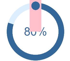
Now we want to rotate it about its bottom central point (the middle of the circle) so we change its transform origin and set it to have a rotation which depends on the CSS property (variable) which holds the percentage value we are already animating.
@keyframes growProgressBar {
  0%,
  33% {
    --pgPercentage: 0;
  }
  100% {
    --pgPercentage: var(--value);
  }
}

@property --pgPercentage {
  syntax: '<number>';
  inherits: false;
  initial-value: 0;
}

div[role="progressbar"] {
  --size: 12rem;
  --fg: #369;
  --bg: #def;
  --pgPercentage: var(--value);
  animation: growProgressBar 3s 1 forwards;
  width: var(--size);
  height: var(--size);
  border-radius: 50%;
  display: grid;
  place-items: center;
  background: radial-gradient(closest-side, white 80%, transparent 0 99.9%, white 0), conic-gradient(var(--fg) calc(var(--pgPercentage) * 1%), var(--bg) 0);
  font-family: Helvetica, Arial, sans-serif;
  font-size: calc(var(--size) / 5);
  color: var(--fg);
  position: relative;
}

div[role="progressbar"]::before {
  counter-reset: percentage var(--value);
  content: counter(percentage) '%';
}

div[role="progressbar"]::after {
  content: '';
  position: absolute;
  height: calc(var(--size) / 2 + 10px);
  width: calc(10 / 100 * var(--size) + 20px);
  top: -10px;
  left: 50%;
  transform: translateX(-50%) rotate(calc(var(--pgPercentage) / 100 * 360deg));
  transform-origin: 50% 100%;
  animation: growProgressBar 3s 1 forwards;
  z-index: 1;
  background-image: radial-gradient(var(--fg) 0 50%, transparent 50% 100%);
  background-repeat: no-repeat;
  background-position: 0px 0;
  background-size: 40px 40px;
}

/* demo */

body {
  margin: 0;
  display: flex;
  align-items: center;
  justify-content: center;
  height: 100vh;
}
<div role="progressbar" aria-valuenow="80" aria-valuemin="0" aria-valuemax="100" style="--value:80"></div>Related Topics
Responsive Canvas in Bootstrap Column
Multiple Classes Inside :Not()
Font-Awesome Error 404 on Fonts
Rounded Tables in Twitter Bootstrap 3
CSS Is Not Working in My Angular Component
Re-Color Tooltip in Bootstrap 4
Full Body Background with Twitter Bootstrap
Styling Qml Without Manually Marking Each Property to Be Styled
How to Visually Indicate Current Page in ASP.NET MVC
Bootstrap Fluid Layout - Fixed Width of Sidebar
How to Override CSS Set on a Pseudo Element
Load Google Font with <Link> Asynchronously or Deferred Without Font Face Observer
How to Disable Stacking of Bootstrap Justified Tabs on Small Screens
Changing Comment Colour in Atom Editor
How to Make Text Reverse Direction in HTML