Bootstrap3 - Change navbar size
You can apply the height css attribute to your navbar class and it will work
However you should do this in a separate css file and not modify
bootstrap's own css.
One thing that you should keep in mind is that when you include the css file in your html is that, it should be included after the bootstrap.min.css so that it will override bootstrap css.
.navbar {

  height: 80px;

}
<script src="https://ajax.googleapis.com/ajax/libs/jquery/2.1.1/jquery.min.js"></script>
<script src="https://maxcdn.bootstrapcdn.com/bootstrap/3.3.7/js/bootstrap.min.js"></script>
<link href="https://maxcdn.bootstrapcdn.com/bootstrap/3.3.7/css/bootstrap.min.css" rel="stylesheet"/>
<nav class="navbar navbar-inverse navbar-fixed-top" role="navigation" >
<div class="container" >
<!-- Brand and toggle get grouped for better mobile display -->
<div class="navbar-header">
<button type="button" class="navbar-toggle" data-toggle="collapse" data-target="#bs-example-navbar-collapse-1">
<span class="sr-only">Toggle navigation</span>
<span class="icon-bar"></span>
<span class="icon-bar"></span>
<span class="icon-bar"></span>
</button>
<a class="navbar-left" href="#"><img src="images/_ressources/logo.svg" height="50px"></a>
</div>
<!-- Collect the nav links, forms, and other content for toggling -->
<div class="collapse navbar-collapse" id="bs-example-navbar-collapse-1">
<ul class="nav navbar-nav">
<li>
<a href="#" style="font-family: 'Roboto', sans-serif;">ACCUEIL</a>
</li>
<li>
<a href="#" style="font-family: 'Roboto', sans-serif;">BOUTIQUE</a>
</li>
<li>
<a href="#" style="font-family: 'Roboto', sans-serif;">CONTACT</a>
</li>
</ul>
<ul class="nav navbar-nav navbar-right">
<li>
<a href="#" style="font-family: 'Roboto', sans-serif;">MON COMPTE</a>
</li>
<li>
<div class="input-group-btn">
<button type="button" class="btn btn-default btn-lg" style="background-color:orange">
<span class="glyphicon glyphicon-lock" ></span>
</button>
</div>
</li>
</ul>
<form class="navbar-form navbar-right" role="search">
<div class="input-group">
<input type="text" class="form-control" placeholder="Recherche un produit">
<div class="input-group-btn">
<button class="btn btn-default" type="submit"><i class="glyphicon glyphicon-search"></i></button>
</div>
</div>
</form>
<!-- /.navbar-collapse -->
</div>
</div>
<!-- /.container -->
</nav>Change navbar height in Bootstrap3
update
As per response on https://github.com/twbs/bootstrap/issues/11443 @mdo wrote:
Change the
@navbar-heightand@navbar-padding-verticaland you
should get it.
Example, set @navbar-height: 20px; and @navbar-padding-vertical: 0;, see: http://bootply.com/100604
Note this doesn't set the height of the .navbar-form elements
end update
The navbar itself has no defined width. Cause Bootstrap use the border-box model, the height is set by the highest element inside it.
Notice the navbar will have a min-height (set to 50px the default
navbar height). @navbar-height in navbar.less sets this min-height.
also read it's comments:
// Ensure a navbar always shows (e.g., without a .navbar-brand in collapsed mode)
To change the height you will have to change the heights of the inside
elements.
.navbar-brand
The .navbar-brand class got a height of 50px. Defined by a padding of
15px + a line-height of 20px;. (2 x 15 + 20 = 50).
The line-height is set in navbar.less too by @line-height-computed.
With @line-height-computed defined in variables.less as floor(@font-size-base * @line-height-base); // ~20px
@line-height-computed will also used in forms, navigation, etc. so
changing it and recompile Bootstrap will not only effect your navbar.
The above make it impossible to set your navbar height with Less.
The padding is defined by navbar-padding-vertical but this variables is NOT used for setting the padding of the navbar links (.navbar-nav > li > a)
Use css to manipulate the line-height (so font-size) and padding of
.navbar-brand to change its height and so the height of the navbar.
.navbar-nav > li > a
The .navbar-nav > li > a class, the links in your navbar also defines
a height of 50px (padding of 15 bottom/top) and a line-height of 20x
again.
Note the padding is first set to 10px hard code in navbar.less and
overwritten by ((@navbar-height - @line-height-computed) / 2) (higher precedence) for @media (min-width:
@grid-float-breakpoint)
Also in this case the line-height of the links will be set by
@line-height-computed.
Other elements
Also element like forms, dropdown will have a calculated height.
Overall it seems you will have to use css for the different elements
of your fixed navbar to sets it's height.
See also: https://github.com/twbs/bootstrap/issues/11443 and https://github.com/twbs/bootstrap/issues/11444
How do you decrease navbar height in Bootstrap 3?
bootstrap had 15px top padding and 15px bottom padding on .navbar-nav > li > a so you need to decrease it by overriding it in your css file and .navbar has min-height:50px; decrease it as much you want.
for example
.navbar-nav > li > a {padding-top:5px !important; padding-bottom:5px !important;}
.navbar {min-height:32px !important}
add these classes to your css and then check.
How to increase Bootstrap 3 Navbar height while keeping menu height small when collapsed
I finally developed a solution myself. You have to create a media query that keeps the line height of the collapsing menu at 20px for screen widths up to 767px. The following CSS in my style.css overrides the boostrap.css and solved my problem:
.navbar-fixed-top {
    min-height: 80px;
}

.navbar-nav > li > a {
    padding-top: 0px;
    padding-bottom: 0px;
    line-height: 80px;
}

@media (max-width: 767px) {
    .navbar-nav > li > a {
    line-height: 20px;
    padding-top: 10px;
    padding-bottom: 10px;}
}
Bootstrap 3 - Height of the NavBar
instead of giving fixed height i would recommend removing height entirely and giving top and bottom padding to your li elements.
How to change in bootstrap navbar height?
.navbar {
    height: 100px !important; /*i assume your navbar size 100px*/
}
if you dealing with mobile
@media only screen and (min-width: 600px) {
   .navbar {
    height: 100px !important;
   }
}
@media only screen and (min-width: 768px) {
   .navbar {
    height: 120px !important;
  }
}
Bootstrap 3 change navbar button height
Here the full working Code, If you want to change the height change in the test1 or test2 css alone.
  <!DOCTYPE html>
  <html lang="en">
  <head>
  <meta charset="UTF-8">
  <title>Example of Twitter Bootstrap 3 Static Navbar</title>
  <link rel="stylesheet" href="http://maxcdn.bootstrapcdn.com/bootstrap/3.2.0/css/bootstrap.min.css">
  <link rel="stylesheet" href="http://maxcdn.bootstrapcdn.com/bootstrap/3.2.0/css/bootstrap-theme.min.css">
  <script src="http://ajax.googleapis.com/ajax/libs/jquery/1.11.1/jquery.min.js">       </script>
  <script src="http://maxcdn.bootstrapcdn.com/bootstrap/3.2.0/js/bootstrap.min.js"> </script>
  <style type="text/css">
.bs-example{
    margin: 20px;
}
.test1
{
    height:20px !important;
    min-height:40px !important;
}
.test2
{
    height:20px !important;
    padding-top:10px !important;
    min-height:20px !important;
}
</style>
</head>
<body>
<div class="bs-example">
<nav role="navigation" class="navbar navbar-inverse test1">
    <!-- Brand and toggle get grouped for better mobile display -->
    <div class="navbar-header test1">
        <button type="button" data-target="#navbarCollapse" data-toggle="collapse" class="navbar-toggle">
            <span class="sr-only">Toggle navigation</span>
            <span class="icon-bar"></span>
            <span class="icon-bar"></span>
            <span class="icon-bar"></span>
        </button>
        <a href="#" class="navbar-brand test2">Brand</a>
    </div>
    <!-- Collection of nav links and other content for toggling -->
    <div id="navbarCollapse" class="collapse navbar-collapse test1">
        <ul class="nav navbar-nav">
            <li class="active test1"><a href="#" class="test2">Home</a></li>
            <li class="test1"><a href="#" class="test2">Profile</a></li>
            <li class="test1"><a href="#" class="test2">Messages</a></li>
        </ul>
        <ul class="nav navbar-nav navbar-right">
            <li><a href="#" class="test2">Login</a></li>
        </ul>
    </div>
</nav>
</div>
</body>
</html>
Decreasing height of bootstrap 3.0 navbar
After spending few hours, adding the following css class fixed my issue.
Work with Bootstrap 3.0.*
.tnav .navbar .container { height: 28px; }
Work with Bootstrap 3.3.4
.navbar-nav > li > a, .navbar-brand {
    padding-top:4px !important;
    padding-bottom:0 !important;
    height: 28px;
}
.navbar {min-height:28px !important;}
Update
Complete code to customize and decrease height of navbar with screenshot.
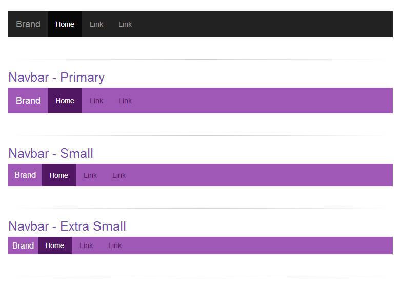
CSS:
/* navbar */
.navbar-primary .navbar { background:#9f58b5; border-bottom:none; }
.navbar-primary .navbar .nav > li > a {color: #501762;}
.navbar-primary .navbar .nav > li > a:hover {color: #fff; background-color: #8e49a3;}
.navbar-primary .navbar .nav .active > a,.navbar .nav .active > a:hover {color: #fff; background-color: #501762;}
.navbar-primary .navbar .nav li > a .caret, .tnav .navbar .nav li > a:hover .caret {border-top-color: #fff;border-bottom-color: #fff;}
.navbar-primary .navbar .nav > li.dropdown.open.active > a:hover {}
.navbar-primary .navbar .nav > li.dropdown.open > a {color: #fff;background-color: #9f58b5;border-color: #fff;}
.navbar-primary .navbar .nav > li.dropdown.open.active > a:hover .caret, .tnav .navbar .nav > li.dropdown.open > a .caret {border-top-color: #fff;}
.navbar-primary .navbar .navbar-brand {color:#fff;}
.navbar-primary .navbar .nav.pull-right {margin-left: 10px; margin-right: 0;}
.navbar-xs .navbar-primary .navbar { min-height:28px; height: 28px; }
.navbar-xs .navbar-primary .navbar .navbar-brand{ padding: 0px 12px;font-size: 16px;line-height: 28px; }
.navbar-xs .navbar-primary .navbar .navbar-nav > li > a {  padding-top: 0px; padding-bottom: 0px; line-height: 28px; }
.navbar-sm .navbar-primary .navbar { min-height:40px; height: 40px; }
.navbar-sm .navbar-primary .navbar .navbar-brand{ padding: 0px 12px;font-size: 16px;line-height: 40px; }
.navbar-sm .navbar-primary .navbar .navbar-nav > li > a {  padding-top: 0px; padding-bottom: 0px; line-height: 40px; }
Usage Code:
<div class="navbar-xs">
   <div class="navbar-primary">
       <nav class="navbar navbar-static-top" role="navigation">
          <!-- Brand and toggle get grouped for better mobile display -->
          <div class="navbar-header">
              <button type="button" class="navbar-toggle" data-toggle="collapse" data-target="#bs-example-navbar-collapse-8">
                 <span class="sr-only">Toggle navigation</span>
                 <span class="icon-bar"></span>
                 <span class="icon-bar"></span>
                 <span class="icon-bar"></span>
              </button>
              <a class="navbar-brand" href="#">Brand</a>
          </div>
          <!-- Collect the nav links, forms, and other content for toggling -->
          <div class="collapse navbar-collapse" id="bs-example-navbar-collapse-8">
              <ul class="nav navbar-nav">
                  <li class="active"><a href="#">Home</a></li>
                  <li><a href="#">Link</a></li>
                   <li><a href="#">Link</a></li>
              </ul>
          </div><!-- /.navbar-collapse -->
      </nav>
  </div>
</div>
Related Topics
Text Field Not Working in Safari
CSS - Circle Border with Various Colors
Control CSS Variable from Angular 5
Changing the Scrollbars' Style
Conventional Order of CSS Properties
Oocss Separation of Container and Content
Add Bullet Styling to Dd Element
* { Box-Sizing: Border-Box; }:To Border-Box or Not to Border-Box All Elements
Why Does Internet Explorer Need the "Haslayout" Flag
Converting Between Physical Pixels and CSS Pixels
CSS Box-Shadow on Three Sides of a Div
How to Fade-Out the End of a Text Line in CSS
Css: Rotate Image and Align Top Left
Tailwind CSS Classes Not Showing in Storybook Build
Css-Less Class Extend Class with Pseudo Class
How to Get a Grid-Gap Between the Grid Item and the Container