Capsule shape using border-radius without a set width or height?
Applying a very large border radius seems to work on many browsers (IE9+, FF, Chrome) like this mod of David's fiddle http://jsfiddle.net/cthQW/1/
border-radius: 500px;
How to do Capsule shape div with delimiter like below attachment?
Yes, You can try this way
.container {

    width: 90%;

    padding:20px;

    margin: 10px auto;

    background:#000;

}

ul {

    list-style: none;

    padding: 7px;

    background: #333;

    border-radius: 12px;

    display: inline-flex;

}

li {

    padding: 0 10px;

    border-right: 1px solid #999;

    line-height: 1;

    color: #999;

    font-size: 12px;

    display: inline-block;

    vertical-align: middle;

}

li:last-child {

    border-right: none;

}
<div class="container">
<ul>
<li>abc</li>
<li>def</li>
<li>ghi</li>
</ul>
</div>How to make a pill shape button with HTML and CSS?
All you need is to set a border-radius greater than the button's height. It gives you that pill shape. Like so :
button{
   height:25px;
   width:75px;
   border-radius: 30px;
   background-color:blue;
   border:none;
   color:white;
}<button>Update</button>Avoid elliptical shape in CSS border-radius
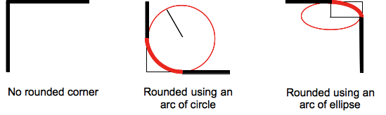
(source: mozilla.org)
Formally, the syntax for the border-radius property accepts 2 values for each corner: a horizontal radius and a vertical radius (separated by a slash). The following line would create an elliptical border-radius similar to the third image above.
border-radius: 10px / 5px;
Usually, we only specify one value. In this case, that value gets used as both the vertical and horizontal radii. The following line would create a circular border-radius similar to the second image above.
border-radius: 10px;
Using Percentages
The Mozilla Developer's Network defines the possible value types for this property as follows:
<length>
Denotes the size of the circle radius or the semi-major and semi-minor axes of the ellipsis. It can be expressed in any unit allowed by the CSS data types. Negative values are invalid.<percentage>
Denotes the size of the circle radius, or the semi-major and semi-minor axes of the ellipsis, using percentage values. Percentages for the horizontal axis refer to the width of the box, percentages for the vertical axis refer to the height of the box. Negative values are invalid.
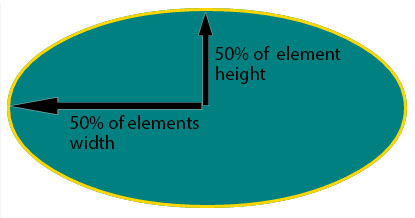
Using a single value to create a circular radius is fine when we're using absolute length units like pixels or ems, but gets more complicated when we're using percentages. Since the single-value usage of this property is synonymous with using the same value twice, the following two lines are equivalent; however, these would not necessarily create a circular border-radius.
border-radius: 50%;
border-radius: 50%/50%;
These lines say to "create an ellipse or circle whose vertical radius is equal to 50% of the element's height and whose horizontal radius is equal to 50% of the element's width, and use that as the border-radius.". If the element is 200 pixels wide and 100 pixels tall, this results in an ellipse rather than a circle.
Solution
If you want a circular border-radius, the easiest thing to do is to use absolute measurement units (like pixels or ems or anything besides percentage), but sometimes that doesn't fit your use case and you want to use percentages. If you know the aspect-ratio of the containing element, you still can! In the example below, since my element is twice as wide as it is tall, I've scaled the horizontal radius in half.
#rect {
  width: 200px;
  height: 100px;
  background: #000;
  border-radius: 25%/50%;
}
<div id="rect"></div>How to maintain border-radius shape as height changes
50px border radius is too big here. you can use 20px.
.card {

  margin-bottom:20px;

  background: yellow;

  padding: 10px;

  width: 80%;

  border-radius: 20px;

  position: relative;

}

.avatar {

  background: red;

  height: 50px;

  width:50px;

  border-radius:50%;

  position: absolute;

  top: -2px;

  right: -2px;


}

p {

 width: calc(100% - 20px);

}
<div class="card">
<p>Lorem Ipsum is simply dummy text of the printing and typeset </p>
<div class="avatar"></div>
</div>
<div class="card">
<p>
Lorem Ipsum is simply dummy text of the printing and typesetting industry. Lorem Ipsum is simply dummy text of the printing and typesetting industry. </p>
<div class="avatar"></div>
</div>
<div class="card">
<p>
Lorem Ipsum is simply dummy text of the printing and typesetting industry. Lorem Ipsum is simply dummy text of the printing and typesetting industry.
Lorem Ipsum is simply dummy text of the printing and typesetting industry. Lorem Ipsum is simply dummy text of the printing and typesetting industry.
Lorem Ipsum is simply dummy text of the printing and typesetting industry. Lorem Ipsum is simply dummy text of the printing and typesetting industry. </p>
<div class="avatar"></div>
</div>Border-radius in percentage (%) and pixels (px) or em
Border-radius :
First, you need to understand that the border-radius property takes 2 values. These values are the radii on the X/Y axis of a quarter ellipse defining the shape of the corner.
If only one of the values is set then the second value is equal to the first one. So border-radius: x is equivalent to border-radius:x/x;.
Percentages values
Refering to the W3C specs : CSS Backgrounds and Borders Module Level 3 border-radius property this is what we can read concerning percentage values:
Percentages: Refer to corresponding dimension of the border box.
So border-radius:50%; defines the raddi of the ellipse this way :
- the radii on the X axis is 50% of the containers width
- the radii on the Y axis is 50% of the containers height
Pixel and other units
Using one value other than a percentage for border radius (em, in, viewport related units, cm...) will always result in an ellipse with the same X/Y radii. In other words, a circle.
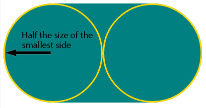
When you set border-radius:999px; the radii of the circle should be 999px. But another rule is applied when the curves overlap reducing the radii of the circle to half the size of the smallest side. So in your example it is equal to half the height of the element : 50px.
For this example (with a fixed size element) you can obtain the same result with both px and percentages. As the element is 230px x 100px, border-radius: 50%; is equivalent to border-radius:115px/50px; (50% of both sides) :
div {

  display: inline-block;

  background: teal;

  width: 230px;

  height: 100px;

  padding: 40px 10px;

  box-sizing: border-box;

  font-family: courier;

  font-size: 0.8em;

  color: #fff;

}

.percent {

  border-radius: 50%;

}

.pixels {

  border-radius: 115px/50px;

}
<div class="percent">border-radius:50%;</div>
<div class="pixels">border-radius:115px/50px;</div>Related Topics
What Are Most Useful Media="Print" Specific, Cross Browser Compatible CSS Properties
Which Is Better to Use in CSS, Percentage or Pixels
Clip-Path on Chrome Leaves a Strange Line on the Edge
How to Delete Border Spacing in Table
Less Mixin with Optional Parameters
Grid Layout on <Fieldset>... Bug on Chrome
Remove Underline Only from Anchor Element Child
Nth-Child with Mod (Or Modulo) Operator
Background Image Is Not Displayed in Firefox
Preventing Relayout Due to Scrollbar
Is It Allowed to Use Any Decimal Value in CSS Keyframe Animations
Fontawesome - Failed to Decode Downloaded Font
How to Set Cache for CSS/Js File
CSS Image Max-Width Set to Original Image Size
(Css) Make a Background Image Scroll Slower Than Everything Else
Differencebetween ".Class Element" and "Element.Class"