Bootstrap right Column on top on mobile view
Use Column ordering to accomplish this.
col-md-push-6 will "push" the column to the right 6 and col-md-pull-6 will "pull" the column to the left on "md" or greater view-ports. On any smaller view-ports the columns will be in normal order again.
I think what throws people off, is that you have to put B above A in your HTML. There may be a different way to do this where A can go above B in the HTML, but I'm not sure how to do it...
DEMO
<div class="row">
  <div class="col-md-6 col-md-push-6">B</div>
  <div class="col-md-6 col-md-pull-6">A</div>
</div>
view-port >= md
|A|B|
view-port < md
|B|
|A|
Bootstrap 4 right Column on top on mobile view
With Bootstrap 4 you can use the following classes.
order-first, order-last and order-0 - order-12
on your element.
Have a look here: Column ordering in Bootstrap 4
Getting right column to show up on top of left column
- Place the blocks inside the layout in the order in which they should go on the mobile.
Introduction: Bootstrap is developed mobile first, a strategy in which we optimize code for mobile devices first and then scale up components as necessary using CSS media queries.
- Change their order. To do this, Bootstrap 3 provides classes of the type
.col-md-push-9and.col-md-pull-3, and Bootstrap 4 provides the order classes.
Demo for Bootstrap 3: https://codepen.io/glebkema/pen/qBONaQd
/* Demo Decorations */.row-demo > div { color: white; font: bold 20px sans-serif; padding: 9px 15px 30px;}.row-demo > div:first-child { background: #69c;}.row-demo > div:last-child { background: #c69;}<div class="container"> <div class="row row-demo"> <div class="col-md-3 col-md-push-9">Top on mobile / Right on desktop</div> <div class="col-md-9 col-md-pull-3">Bottom on mobile / Left on desktop</div> </div></div>
<link href="https://cdnjs.cloudflare.com/ajax/libs/twitter-bootstrap/3.4.1/css/bootstrap.min.css" rel="stylesheet"/>In Desktop view screen will be left and right column in mobile view top & bottom using bootstrap 5
Try using order class.
<div class="row">
    <div class="col-md-6 order-2 order-md-1">
        <div class="img-al">
            <img style="vertical-align: middle;" src="images/uiw_login.png">
            <h2 class="img_text">
               Client Login
            </h2>
        </div>
        <input type="text" class="form-control" placeholder="Client Code"><br/>
        <div style="display: inline-block;">
            <input style="margin-left:45px;" type="checkbox"> I'm not a robot
            <span><img src="images/Vector.png"></span>
        </div>
        <div>
            <button class="lgn_btn">
                Login
            </button><br/><br/>
            <p style="margin-left:40px;margin-top: 24px;">New here ? <a href="#" style="color: red;">Non - Client SignUp</a></p>
        </div>
    </div>
    <div class="col-md-6 order-1 order-md-2">
        <img class="auth" src="images/Two_factor_authentication.png">
    </div>
</div>
Alternating bootstrap grid columns and mobile view
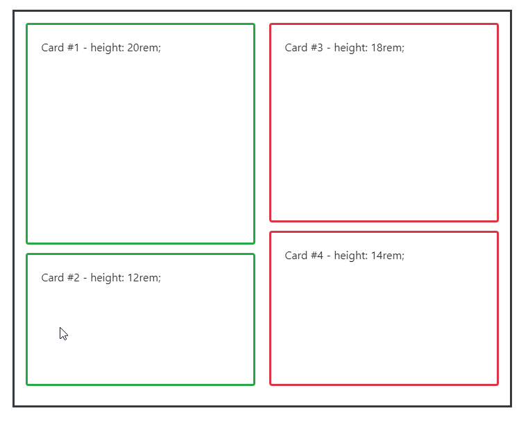
First of all, if you would like to build a masonry-like columns, a regular Bootstrap grid system won't give you what you want. Instead, you will have to use the card columns or JavaScript masonry plugins.
Layout with Card Columns
<div class="container">
    <div id="example" class="card-columns">
        <div id="card1" class="card border-success">
            <div class="card-body">
                <p class="card-text">Card #1 - height: 20rem;</p>
            </div>
        </div>
        <div id="card2" class="card border-success">
            <div class="card-body">
                <p class="card-text">Card #2 - height: 12rem;</p>
            </div>
        </div>
        <div id="card3" class="card border-danger">
            <div class="card-body">
                <p class="card-text">Card #3 - height: 18rem;</p>
            </div>
        </div>
        <div id="card4" class="card border-danger">
            <div class="card-body">
                <p class="card-text">Card #4 - height: 14rem;</p>
            </div>
        </div>
    </div>
</div>
With little bit of styling to setup 1 column for mobile view and 2 for others:
#example.card-columns {
    column-count: 1;
}

@media(min-width: 576px) {
    #example.card-columns {
        column-count: 2;
    }
}
You can get something closed to what you would like to achieve:
demo: https://jsfiddle.net/davidliang2008/n3fhyp8c/60/
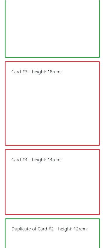
Problems on Mobile View
Now there is a problem on the mobile view. Since the order of the CSS columns is top to bottom, left to right, and there is no way to change it, the only way to get what you want on the mobile view is to duplicate contents and hide/show them based on the breakpoints...
Again, your second screenshot is missing a red box so I don't know which one you want to put in the middle. Here I am assuming you want to put both red boxes there:
<div id="card1" />
<div id="card2" class="card border-success d-none d-sm-block">
    ...
</div>
<div id="card3" />
<div id="card4" />
<div id="card2" class="card border-success d-block d-sm-none">
    ...
</div>
Then you can get something you want to achieve on mobile view:
demo: https://jsfiddle.net/davidliang2008/n3fhyp8c/63/
Bootstrap 4 - Ordering left side item to bottom right in mobile view only
If you want to keep using bootstrap4 grid system, this is just a matter of assigning correct order to the columns: https://getbootstrap.com/docs/4.1/layout/grid/#order-classes
<div class="container-fluid">
    <div class="row">
        <div class="order-3 col-md-3 order-md-1">
            <button class="btn btn-lg btn-primary btn-block"> Left Sidebar</button>
            <button class="btn btn-lg btn-primary btn-block"> Left Sidebar</button>
        </div>
        <div class="order-1 content-area col-md-6 order-md-2">
            <button class="btn btn-lg btn-info btn-block"> Content</button>
            <button class="btn btn-lg btn-info btn-block"> Content</button>
        </div>
        <div class="order-2 col-md-3 order-md-3">
            <button class="btn btn-lg btn-primary btn-block"> Right Sidebar</button>
            <button class="btn btn-lg btn-primary btn-block"> Right Sidebar</button>
        </div>
    </div>
</div>
I have omitted your col-xs-12 because that's the default. From the beginning, I assigned order 3,1 and 2 to the sidebars and content so that the Left Sidebar will go to the bottom. And at md breakpoint and up, I re-assigned their orders to 1,2 and 3 so they go back to normal.
demo: http://jsfiddle.net/davidliang2008/aq9Laaew/287105/
change bootstrap grid column order when page in mobile view
In bootstrap 3, you can use col-xs- to make columns on mobile screens.
The code below makes 2 columns on tablets and mobiles, and 4 columns on larger screens:
<link href="https://maxcdn.bootstrapcdn.com/bootstrap/3.3.7/css/bootstrap.min.css" rel="stylesheet">

<div class="container">
 <div class="row">
   <div class="col-xs-6 col-md-3">
     <div class="alert alert-info">a</div>
   </div>
   <div class="col-xs-6 col-md-3">
     <div class="alert alert-danger">b</div>
   </div>
   <div class="col-xs-6 col-md-3">
     <div class="alert alert-info">c</div>
   </div>
   <div class="col-xs-6 col-md-3">
     <div class="alert alert-info">d</div>
   </div>
 </div>
</div>
bootstrap row going above another in mobile view in html
Remove height (181px) from ".addonscard" class in CSS and try :
.addonscard {
  width: 100%;
  height: auto; // height is updated from 181px to auto..
  padding: 2%;
  border: 1px solid #efefef;}
Related Topics
Draw an Arrow Inside Table Cell Using CSS
Jquery UI Tooltip Custom Class on Page Load
How to Change the Font Size of the List (Not the Initial View)
Less CSS - Accessing Classes Further Up the Dom Tree from Within a Nested Class
Bootstrap 4 Center Navbar Brand with Collapse
How to Vertically Center Text in Its Bounding Box
How to Create Vertical Text Using Only CSS
CSS - Force Overflowing Elements to Disappear If Partially Hidden
Css3 Image Crossfade (No JavaScript)
Css: Adding a Border Changes the Background-Color (!)
How to Round-Off an Image with CSS
CSS Drop-Down Menus Pushing Page Content Down
IE9 Issue Border Radius and Linear Gradient
Two Fixed Width Full Height Columns, with Seamless Transition to Blank Space
CSS Problem to Make 2 Divs Float Side by Side
Gmail Responsive Email - Media Queries - Style Tag