Bigger fonts on smaller screens without @media queries or javascript?
You can't divide a px value by a viewport-width increment, but you can achieve this inverse size behavior reducing a px value by a viewport-width increment.
Example:font-size: calc(40px - 2vw);
Codepen DEMO
Alternatively, you could use the other 3 units related to the viewport's size: vh vmin and vmax.
Examples:font-size: calc(40px - 2vh);font-size: calc(200px - 20vmin);font-size: calc(200px - 20vmax);
vw - Relative to 1% of the width of the viewport*;
vh - Relative to 1% of the height of the viewport*;
vmin - Relative to 1% of viewport's* smaller dimension;
vmax - Relative to 1% of viewport's* larger dimension;*viewport = the browser window size.
Source: w3schools
Responsive font size in CSS
The font-size won't respond like this when resizing the browser window. Instead they respond to the browser zoom/type size settings, such as if you press Ctrl and + together on the keyboard while in the browser.
Media Queries
You would have to look at using media queries to reduce the font-size at certain intervals where it starts breaking your design and creating scrollbars.
For example, try adding this inside your CSS at the bottom, changing the 320 pixels width for wherever your design starts breaking:
@media only screen and (max-width: 320px) {

   body {
      font-size: 2em;
   }

}
Viewport percentage lengths
You can also use viewport percentage lengths such as vw, vh, vmin and vmax. The official W3C document for this states:
The viewport-percentage lengths are relative to the size of the initial containing block. When the height or width of the initial containing block is changed, they are scaled accordingly.
Again, from the same W3C document each individual unit can be defined as below:
vw unit - Equal to 1% of the width of the initial containing block.
vh unit - Equal to 1% of the height of the initial containing block.
vmin unit - Equal to the smaller of vw or vh.
vmax unit - Equal to the larger of vw or vh.
And they are used in exactly the same way as any other CSS value:
.text {
  font-size: 3vw;
}

.other-text {
  font-size: 5vh;
}
Compatibility is relatively good as can be seen here. However, some versions of Internet Explorer and Edge don’t support vmax. Also, iOS 6 and 7 have an issue with the vh unit, which was fixed in iOS 8.
How to change text (not font size) according to screen size in CSS?
Have 2 spans with full and short strings, then when below target resolution, swap between them using a media query:
HTML
<span class="full-text">Saturday</span>
<span class="short-text">Sat</span>
CSS
// Hide short text by default (resolution > 1200px)
.short-text { display: none; }

// When resolution <= 1200px, hide full text and show short text
@media (max-width: 1200px) {
    .short-text { display: inline-block; }
    .full-text { display: none; }
}
Replace 1200px with your target resolution breakpoint.
More on CSS media queries
Responsive Font Sizing
You can use CSS3 vh, vw,vmin and vmax new values for responsive font.
1vw = 1% of viewport width
1vh = 1% of viewport height
1vmin = 1vw or 1vh, whichever is smaller
1vmax = 1vw or 1vh, whichever is larger
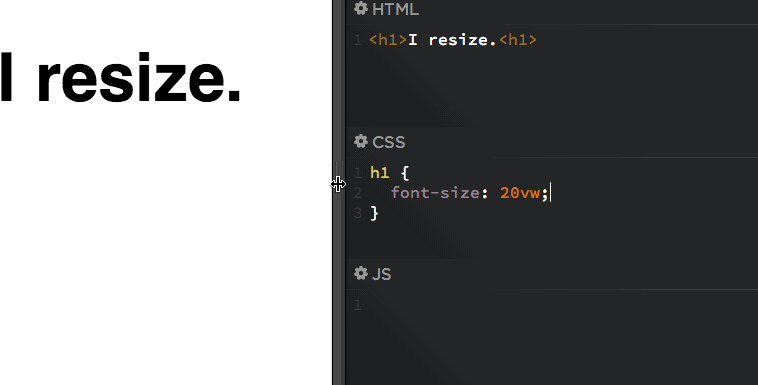
h1 {
font-size: 5.9vw;
}
h2 {
font-size: 3.0vh;
}
p {
font-size: 2vmin;
}
More details: https://css-tricks.com/viewport-sized-typography/
Font scaling based on width of container
If the container is not the body, CSS Tricks covers all of your options in Fitting Text to a Container.
If the container is the body, what you are looking for is Viewport-percentage lengths:
The viewport-percentage lengths are relative to the size of the initial containing block. When the height or width of the initial containing block is changed, they are scaled accordingly. However, when the value of overflow on the root element is auto, any scroll bars are assumed not to exist.
The values are:
vw(% of the viewport width)vh(% of the viewport height)vi(1% of the viewport size in the direction of the root element's inline axis)vb(1% of the viewport size in the direction of the root element's block axis)vmin(the smaller ofvworvh)vmax(the larger orvworvh)
1 v* is equal to 1% of the initial containing block.
Using it looks like this:
p {
    font-size: 4vw;
}
As you can see, when the viewport width increases, so do the font-size, without needing to use media queries.
These values are a sizing unit, just like px or em, so they can be used to size other elements as well, such as width, margin, or padding.
Browser support is pretty good, but you'll likely need a fallback, such as:
p {
    font-size: 16px;
    font-size: 4vw;
}
Check out the support statistics: http://caniuse.com/#feat=viewport-units.
Also, check out CSS-Tricks for a broader look: Viewport Sized Typography
Here's a nice article about setting minimum/maximum sizes and exercising a bit more control over the sizes: Precise control over responsive typography
And here's an article about setting your size using calc() so that the text fills the viewport: http://codepen.io/CrocoDillon/pen/fBJxu
Also, please view this article, which uses a technique dubbed 'molten leading' to adjust the line-height as well. Molten Leading in CSS
Related Topics
Animate Transform Only One Property (Scale) Override Other (Translate)
How to Set Horizontal Gradient to Text via CSS? (Left Letter One Colour, Right - Another Colour)
CSS Display Inline-Block Issue with Ie
Firefox 30.0 - -Moz-Appearance: None Not Working
Can Not Use Theme Color with Text or Bg
Is There Any IE8 Only CSS Hack
Pixel Density, Retina Display and Font-Size in CSS
Calculating Viewport Height on Chrome Android with CSS
Smart Way to Add Corner Image to Div Border on All Four Corners
Why Do Flexbox Item Images Resize Differently According to Their Initial Size
Bootstrap 4, Bg-Inverse Not Showing
How to Turn Off SASS Rgb -> Color Name
How to Avoid "-Internal-Autofill-Selected" Style to Be Applied
Tweaking Bootstrap 2.0 for Semantic Markup
Change Color of Select Component's Border and Arrow Icon Material Ui