3 columns, middle one with flexible width
You can do that by floating col1 and col3 to the left and to the right, with a fixed width.
Then add a left and right margin to col2 equal to the width of col1 and col3.
This gives you three columns; col1 and col3 having a fixed width and col2 filling the available width:
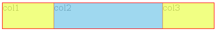
(col2's content box in blue, and its margins in yellow)
<div class='container'>
    <div class='right'>
        col3
    </div>
    <div class='left'>
        col1
    </div>
    <div class='middle'>
        col2
    </div>
</div>

.container {
    overflow: hidden;
}
.right {
    float: right;
    width: 100px;
}
.left {
    float: left;
    width: 100px;
}
.middle {
    margin: 0 100px;
}
Try it here: http://jsfiddle.net/22YBU/
BTW if you need display: table, display: table-row and display: table-cell, use a table ;-)
Three-column HTML flex box: how to set the middle one to get all the remaining space?
The proper way to do it is with flex. Set flex to 1 1 auto for the middle column, and 0 0 100px for the side columns. This makes it so the side columns are always the specified width (or width of content, if set to auto), and the middle column takes up the remaining space (growing/shrinking accordingly).
#main-container {

  display: flex;

  justify-content: space-between;

  align-items: center;

}

#center-content {

  /* Lets middle column shrink/grow to available width */

  flex: 1 1 auto;

}

#left-content,

#right-content {

  /* Forces side columns to stay same width */

  flex: 0 0 100px;

}

img {

  /* Shrinks images to fit container */

  max-width: 100%;

}
<div id="main-container">
<div id="left-content">
<div><img src="http://agevoluzione.com/wp-content/uploads/2014/07/Work-in-progress-1024x603.png"></div>
<div><img src="http://agevoluzione.com/wp-content/uploads/2014/07/Work-in-progress-1024x603.png"></div>
<div><img src="http://agevoluzione.com/wp-content/uploads/2014/07/Work-in-progress-1024x603.png"></div>
<div><img src="http://agevoluzione.com/wp-content/uploads/2014/07/Work-in-progress-1024x603.png"></div>
</div>
<div id="center-content">
<div><img src="https://farm6.staticflickr.com/5560/14080568109_9f33dc7964_o.jpg"></div>
</div>
<div id="right-content">
<div><img src="http://agevoluzione.com/wp-content/uploads/2014/07/Work-in-progress-1024x603.png"></div>
<div><img src="http://agevoluzione.com/wp-content/uploads/2014/07/Work-in-progress-1024x603.png"></div>
<div><img src="http://agevoluzione.com/wp-content/uploads/2014/07/Work-in-progress-1024x603.png"></div>
<div><img src="http://agevoluzione.com/wp-content/uploads/2014/07/Work-in-progress-1024x603.png"></div>
</div>
</div>3 Column Flex Layout - Middle Column only as width as it's content
You can just add flex: 1 to left and right divs or in your case DEMO
.content {

  display: flex;

  height: 100vh;

}

.content > div {

  display: flex;

  align-items: center;

  justify-content: center;

}

.left,

.right {

  flex: 1;

  background: lightblue;

}

.middle {

  background: lightgreen;

}
<div class="content">
<div class="left">Lorem</div>
<div class="middle">Lorem ipsum dolor sit amet.</div>
<div class="right">lorem</div>
</div>Css3 Flexbox 3 column layout small width, stretch middle one and width: max-200px on right
You can adjust your code like below:
.flex-container {

  display: flex;

  flex-flow: row wrap;

}

.flex-container>div {

  margin: 10px;

  text-align: center;

  border:1px solid;

  box-sizing:border-box;

}

.flex-container>div:first-child {

   width:60px; /*fixed width*/

   flex-shrink:0; /*avoid shriking*/

}

.flex-container>div:nth-child(2) {

  flex-grow:1; /*can grow*/

}

.flex-container>div:nth-child(3) {

  flex-grow:1;  /*can grow*/

  max-width:200px; /*max-width*/

}
<div class="flex-container">
<div>LEFT</div>
<div>MIDDLE</div>
<div>RIGHT</div>
</div>3 column layout, with responsive width for the middle column
You could use flexbox
        <style>
.parent {
    display:flex;
    width: 100%;
}
.item {
    border: 1px solid #000;
    height: 100px;
}
.a {
    width: 85px;
}
.b {
    flex: 1 auto;
}
    </style>
<div class="parent">
    <div class="item a"></div>
    <div class="item b"></div>
    <div class="item c">rgfdgfdgfdgfdgfdgfdgfdg</div>
</div>
https://jsfiddle.net/bkqgzghb/1/
How can I have a fixed-width centered column with in a 3-column layout?
As NiettheDarkAbsol said in the comments, it's better to do this with grid layout:
If you want to use grid, you can do this by adding display: grid; to your main container and then specify the items within it with grid-template-columns: 1fr 10em 1fr;.
fr indicates a fraction of document width, so since the layout is 1⁄3 (We have 3 different child elements) and the middle one is 10em, so each fr will represent (100% - 10em)⁄2 width of the document.
.row {
  display: grid;
  grid-template-columns: 1fr 10em 1fr;
}

.row [class*="meta"] {
  background: blue;
  color: white;
}

.row .meta-right {
  text-align: right;
}

.row .logo-bg-top {
  background: red;
}
<div class="row">
<div class="meta-left">
<p>Left Contents with align left...</p>
</div>
<div class="logo-bg-top"></div>
<div class="meta-right">
<p>Right Contents with align right...</p>
</div>
</div>Flex container with 3 columns, 100% height, and fixed-width side columns
When you create a flex container (display: flex or display: inline-flex), it automatically applies flex-direction: row and align-items: stretch (among other initial settings).
These default settings line up flex items in a row and give them each the full height of the container. However, if you set a height on a flex item, it overrides align-items. So remove any heights you've set on the items.
This should work for you:
#container {

  display: flex;

  justify-content: space-between;

  height: 100vh;

}

.col-side {

  flex: 0 0 240px;

}

#col2 { flex: 1; }

#container > div + div {

  border-left: 2px solid rgba(0, 0, 0, 0.12);

}

#col1 { background-color: lightgreen; }

#col2 { background-color: tomato; }

#col3 { background-color: aqua; }

body  { margin: 0; }
<div id="container">
<div class="col-side" id="col1">Left</div>
<div class="col" id="col2">Center</div>
<div class="col-side" id="col3">Right</div>
</div>CSS Grid 3 columns first and second same size middle fixed size
.grid {
    width: 100%;
    height: 100%;
    display: grid;
    background-color: lightBlue;
    grid-template-columns: 1fr 50px 1fr;
}

.grid-item {
    border: 1px solid black;
    overflow: hidden;
}
<div class="grid">
<div class="grid-item">A</div>
<div class="grid-item">B</div>
<div class="grid-item">CCCCCCCCCCCCCCCCCCCCCCCCCCCCCCC</div>
</div>Create 3 columns in HTML – left and right fixed width and middle elastic
I've created two simple examples. First one does not use flex as long as you don't want to use it.
Example using calc()
.container > div {

   float: left;

}

.left {

   width: 100px;

   background-color: pink;

}

.middle {

   width: calc(100% - 200px);

   background-color: blue;

}

.right {

   width: 100px;

   background-color: yellow;

}
<h1>No flex</h1>
<div class="container">
<div class="left">Left</div>
<div class="middle">Middle</div>
<div class="right">Right</div>
</div>Related Topics
How to Nest Media Queries Within Media Queries
How to Solve the Table Row Background Image Problem, in Chrome, in Multi Celled Tables
Removing Table Lines and Table Space Between Cells in CSS
CSS Positioning Elements Next to Each Other
CSS Image Layouting Before Image Loaded
How to Display CSS3 Columns on Ie
Different Behaviours of Treating \ (Backslash) in the Url by Firefox and Chrome
Bootstrap 4 Align Elements Right Inside a Col Div
Css3 Transitions: Is There an on Click Option Without Using Jquery
Jqgrid Zebra/Alt Rows Background Not Working Due to UI Theme Class
Extracting Content in :After Using Xpath
How to Have Multiple Columns That Consume 100% Height Using Twitter Bootstrap
What Are Most Useful Media="Print" Specific, Cross Browser Compatible CSS Properties
Do Ie Browsers (IE6, 7, 8) Support @Font-Face
Bootstrap 4 Row Height Set by Specific Col - Not Highest One