Default virtualport size on mobile when meta tag is not declared?
When the meta tag is not defined there is a virtual viewport default values defined. Non-mobile-optimized sites with these default vaules looks in general better on narrow screen devices.
On Safari iOS the default width is 980 pixels, and the others browsers width size are alike or a little less.
Narrow screen devices (e.g. mobiles) render pages in a virtual window or viewport, which is usually wider than the screen, and then shrink the rendered result down so it can all be seen at once. Users can then pan and zoom to see different areas of the page.
For example, if a mobile screen has a width of 640px, pages might be rendered with a virtual viewport of 980px, and then it will be shrunk down to fit into the 640px space.
Explanation and default values for width and height with viewport on mobiles
Apple as the inventor of viewport says that the default viewport settings are:
The default width is 980 pixels. However, these defaults may not work well for your webpages, particularly if you are tailoring your website for a particular device.
Apple configuring viewport and default values
What does the shrink-to-fit viewport meta attribute do?
It is Safari specific, at least at time of writing, being introduced in Safari 9.0. From the "What's new in Safari?" documentation for Safari 9.0:
Viewport Changes
Viewport meta tags using
"width=device-width"cause the page to scale down to fit content that overflows the viewport bounds. You can override this behavior by adding"shrink-to-fit=no"to your meta tag as shown below. The added value will prevent the page from scaling to fit the viewport.
<meta name="viewport" content="width=device-width, initial-scale=1.0, shrink-to-fit=no">
In short, adding this to the viewport meta tag restores pre-Safari 9.0 behaviour.
Example
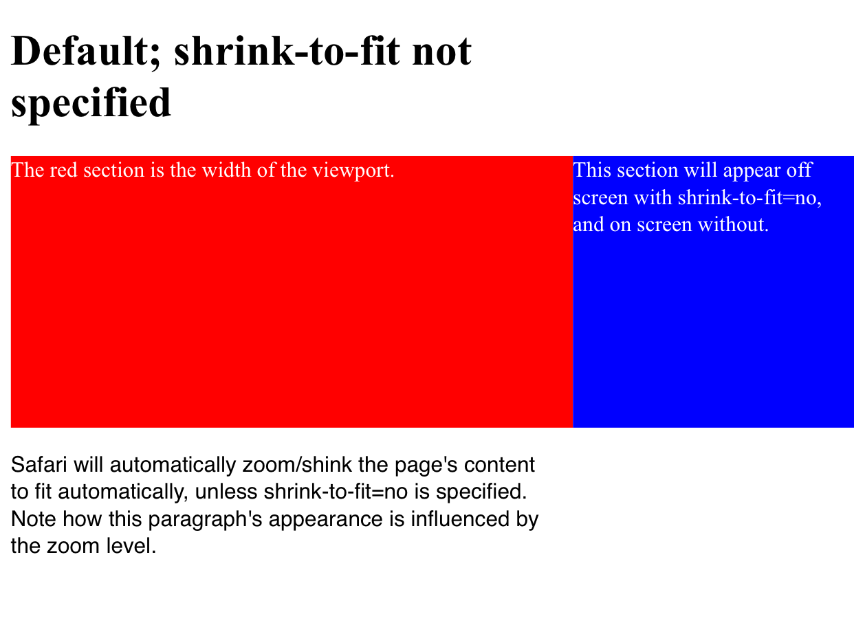
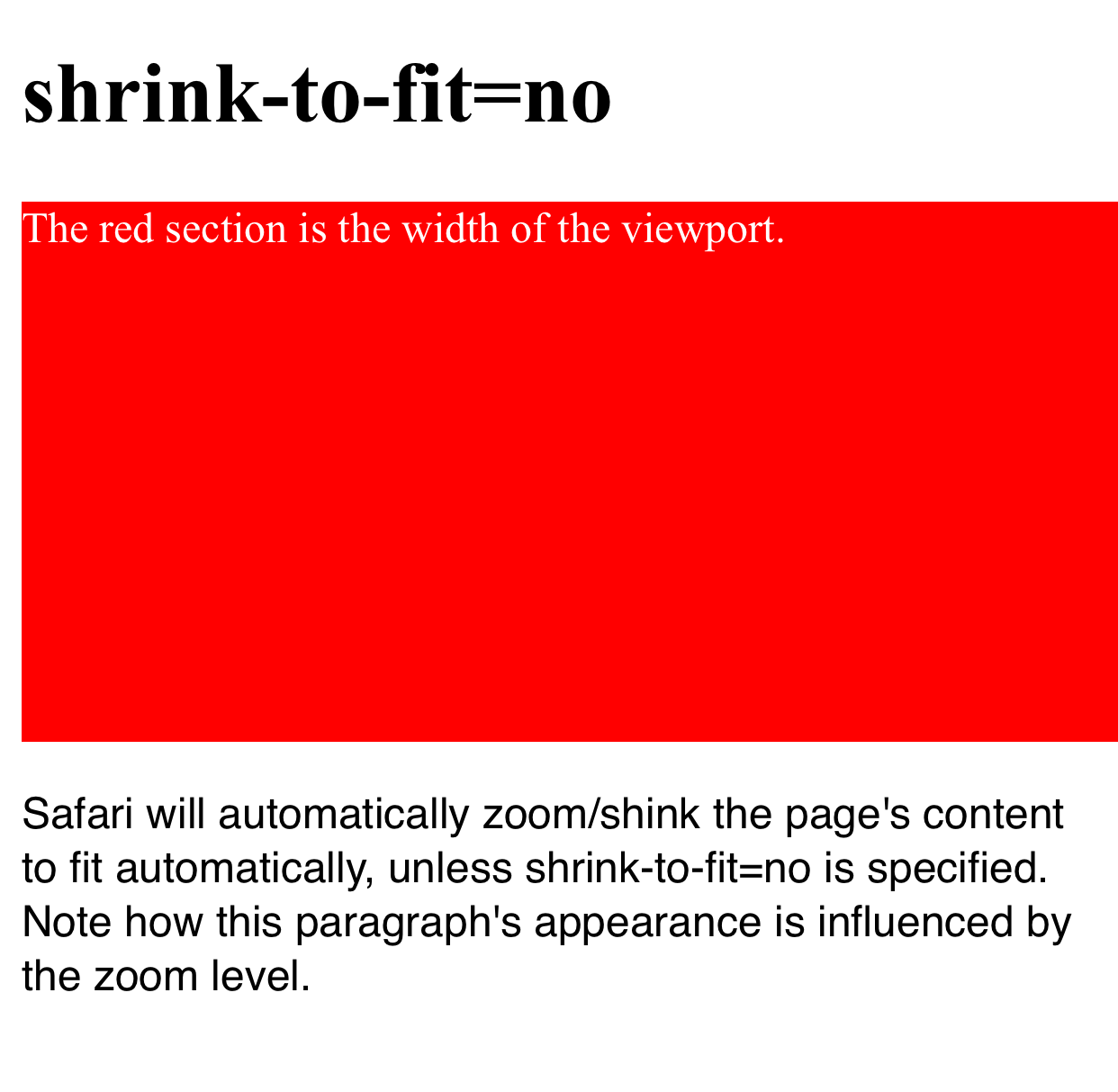
Here's a worked visual example which shows the difference upon loading the page in the two configurations.
The red section is the width of the viewport and the blue section is positioned outside the initial viewport (eg left: 100vw). Note how in the first example the page is zoomed to fit when shrink-to-fit=no is omitted (thus showing the out-of-viewport content) and the blue content remains off screen in the latter example.
The code for this example can be found at https://codepen.io/davidjb/pen/ENGqpv.
Without shrink-to-fit specified
With shrink-to-fit=no
HTML5 Viewport meta tag not working on android phone in portrait mode
Try using maximum-scale instead of initial-scale. The maximum scale keeps the scale settings when the user switches from portrait to landscape view.
Like below:
<meta name="viewport" content="width=device-width, initial-scale=1, maximum-scale=1, user-scalable=0"/>
Or, you may also specify width:
<meta name="viewport" content="width=360, maximum-scale=1"/>
I guess the below works for iPhone and iPad both
<meta name="viewport" content="width=720, maximum-scale=1.0" />
or last try
<meta name="viewport" content="width=device-width, maximum-scale=1.0" />
Besides there are CSS3 media queries too.
Why won't my viewport tag properly use device width (no zoom) on most mobile devices?
After much testing and continued searching, I came up with a fix that seems to be very effective. Another solution I saw to a similar problem proposed the following:
<meta name="viewport" content="width=640, initial-scale=.5, user-scalable=no" />
This, at first, seemed like a decent solution as it worked on most phones. It bugged me a little bit though because it obviously isn't geared specifically towards working with any device width. That answer can be found here:
Android viewport setting "user-scalable=no" breaks width / zoom level of viewport
This solution worked on most mobile devices, but on some it was ineffective causing the display to be using incorrect zoom.
I believe the reason why the solution above is not effective is because not all mobile devices use a base 320 for zoom. So when device-width isn't working, this causes the constraints to be inconsistent.
I tried a bunch of different things, but then ultimately tried the following which (so far) seems highly effective:
<meta name="viewport" content="width=device-width, initial-scale=0.5, user-scalable=no">
I believe the difference in this tag is that it tells the device to use it's native dimensions, but then adds a scale factor that tells it to not zoom in as much as it would normally.
I never was able to find any CSS adjustments that solved the problem, and I welcome any other answers in the future that may add further clarification to the problem/solution.
One other thing I'd like to add, is that an alternative meta tag that may be more effective for larger devices (tablets, which the site in this problem was not designed for), may be to set maximum scale instead of using user-scalable. Like this:
<meta name="viewport" content="width=device-width, initial-scale=0.5, maximum-scale=0.5">
EDIT / Update 2018:
This question still gets quite a few hits even though it's a very dated problem. Certainly in hindsight and after much more experience with responsive, I can say that both the initial problem and the solutions were based around stop-gap issues that resulted from poorly constructed responsive CSS and HTML.
While the answers here may help future visitors solve for issues when it comes to retro-fitting more dated code, I would highly recommend that any new development conform to the latest in responsive standards. If your markup and CSS conforms, there are very few reasons why you would ever not want the standard meta for viewport in responsive (below):
<meta name="viewport" content="width=device-width, initial-scale=1">
Related Topics
Java.Lang.Noclassdeffounderror: Org.Ksoap2.Serialization.Soapobject
"File Not Found" Exception in Dexdebug Task of Build
The Import Android.Support.V7.App Cannot Be Resolved
Android Sharedpreferences Limitations
Android Mediaplayer Problems :"Error (-38 , 0) " and "Stop Called in State 1"
Display Unity Scene as Sub View in Android Studio
Adding Google Cloud Messagin (Gcm) for Android - Registration Process
How to Calculate Phone's Movement in the Vertical Direction from Rest
How to Store and Retrieve a Byte Array (Image Data) to and from a SQLite Database
How to Store Image Retrieved from Url in a SQLite Database
Writing/Reading Files To/From Android Phone's Internal Memory