Putting screen densities into the correct bucket
The reason I asked is because I have created the following value directory resources. (...)
In the dimens.xml I have different margins and set the dp depending on the bucket size. (...)
I am interested to know if this is the correct way to do this.
I'm not sure why you want different margins specified in dp depending on the density. Specifying the margin as dp once, for the baseline density, already handles all other densities for you, meaning that the physical size of the margin will be the same when displayed on any device.
If you used px instead of dp (but don't), then you would have to do the scaling for different screens yourself.
Scaling down into the buckets i.e if the ppi is 300 that would go into the hdpi bucket as it less then 320?
Yes, but not because it is less than 320. If there was a rule of thumb I would say it is rounding to the nearest generalized density. See this illustration of how Android roughly maps actual densities to generalized densities (figure is not exact):

Relevant part of the documentation is this:
Each generalized size and density spans a range of actual screen sizes and densities. For example, two devices that both report a screen size of normal might have actual screen sizes and aspect ratios that are slightly different when measured by hand. Similarly, two devices that report a screen density of hdpi might have real pixel densities that are slightly different. Android makes these differences abstract to applications, so you can provide UI designed for the generalized sizes and densities and let the system handle any final adjustments as necessary.
So again, you shouldn't really care how Android does this if you are just writing an app. What you should care about is:
- specify all layout dimension values in
dpor withwrap_content/match_parent, as appropriate (text can be inspto additionally match the user preference, but nothing other than text), - think about different layouts depending on physical size and orientation of the screen,
- provide bitmap resources for different densities, just to avoid blurry or pixelated artifacts (because Android will scale them to have the right physical size if you use
dporwrap_content).
Android will lookup the best matching resource, and then transparently handle any scaling of the dp units, as necessary, based on the actual density of the screen in use. The conversion of dp units to screen pixels is simple: px = dp * (dpi / 160).
Note the actual density as opposed to generalized density. The latter is only a convenience for the developers, since it would be impossible to provide drawables for every screen out there. This way developers need to provide only 3 or 4 sets of graphics, while Android picks the closest fit and adjusts it further for the needs of that particular device. (Nowadays it's possible to use one vector drawable instead of many pre-scaled raster graphics, meaning better quality and less size.)
Is this the correct way to work out buckets for screen sizes.
No, it is not. According to Google device metrics all devices you listed fall into buckets higher than you expected:
Galaxy S3    NA        NA
Nexus 4     318     xhdpi
Nexus 5X    424    xxhdpi
Nexus 5     445    xxhdpi
Nexus 6     493   xxxhdpi
Nexus 6P    515   xxxhdpi
I took some other devices from that list, and plotted how different devices are falling into density buckets depending on their actual physical density.
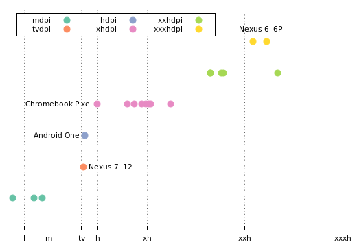
Chromebox 30            101      mdpi
Chromebook 11           135      mdpi
Samsung Galaxy Tab 10   149      mdpi
Nexus 7 '12             216     tvdpi
Android One             218      hdpi
Chromebook Pixel        239     xhdpi
Nexus 9                 288     xhdpi
Nexus 10                299     xhdpi
Moto X                  312     xhdpi
Nexus 4                 318     xhdpi
Nexus 7 '13             323     xhdpi
Moto G                  326     xhdpi
Dell Venue 8            359     xhdpi
LG G2                   424    xxhdpi
Nexus 5X                424    xxhdpi
HTC One M8              441    xxhdpi
Nexus 5                 445    xxhdpi
Nexus 6                 493   xxxhdpi
Nexus 6P                515   xxxhdpi
LG G3                   534    xxhdpi
You can see, that with some notable exceptions, the rule that the closest generalized density is selected, holds.
The exceptions being Nexus 6 and 6P, that are listed as xxxhdpi, even though LG G3 has a higher physical density and still is far from 640px/in. Android One is hdpi but it is only slightly denser than Nexus 7 '12 which is tvdpi. Chromebox 30 and Chromebook Pixel (admittedly, not Android) are assigned to buckets mdpi and xhdpi even though they are physically lower than ldpi and hdpi, respectively.
Get screen size bucket programmatically?
I ended up using bool resources placed in the different bucket folders. I only needed to differentiate between normal (small / medium) and large (large / xlarge) screens, so I did this:
values/bools.xml
<?xml version="1.0" encoding="utf-8"?>
<resources>
    <bool name="screen_large">false</bool>
</resources>
values-large/bools.xml
<?xml version="1.0" encoding="utf-8"?>
<resources>
    <bool name="screen_large">true</bool>
</resources>
Then, I just call getBoolean(R.bool.screen_large) to tell whether the screen is large or not. This way it's 100% up to the platform decide what screen the device has.
Why different image sizes for different density buckets if Android/iOS scales them?
So if I decide on the first strategy and supply the image in correct sizes for xhdpi (320dpi) a device with 350 or 300 dpi may still belong to that density bucket and the resulting image will vary in size.
Only if you set your ImageView (or whatever widget is using the image) to be sized based on wrap_content. If you set the widget size to be based upon other dimensions (e.g., 15mm), then Android will choose the image based on density, then scale to fix the specified dimensions.
why should I supply the images in different resolutions?
Quality. Apparent image quality decreases the more you scale the image. This is particularly true for upscaling an image, though you will encounter problems downscaling as well.
Also, particularly on Android 1.x/2.x devices, this sort of scaling was done using application memory (heap space); avoiding this sort of scaling would be beneficial for memory use. AFAIK, on modern devices, this scaling is done on the GPU, which helps somewhat. However, on the whole, you want to use the smallest resolution bitmap as possible as input that will give you a visual result that meets your needs and user expectations. This is why we use lower-resolution bitmaps for lower-density devices — scaling downward is guaranteed to waste RAM, and not all users have high-end devices with lots of RAM.
And what is the "optimal resolution" (given a size requirement in mm) for each density bucket?
Density is expressed in dots, or pixels, per inch. Convert your mm value to inches, then multiply by a density to get a value in pixels.
Why can't all density buckets have images of size 1024x1024 for example?
You are absolutely welcome to do that, if somehow that gives you the results that you want, and it does not waste disk space or heap space for the user.
What is the best way to insert this image (with the correct dimension) into my Android project?
Is it really so horrible use android:background instead android:src
for these situations?
Its not about background and rsc attributes. Android runs on a variety of devices that offer different screen sizes and densities (dpi).You can't use same image for Nexus 5 and Nexus S.
Solution is:
You will have to make multiple image based on screen size and dpi
A set of six generalized densities:
-ldpi (low) ~120dpi
-mdpi (medium) ~160dpi
-hdpi (high) ~240dpi Nexus S
-xhdpi (extra-high) ~320dpi Moto G
-xxhdpi (extra-extra-high) ~480dpi Nexus 5
-xxxhdpi (extra-extra-extra-high) ~640dpi Galaxy and
S6S7
Read more Supporting Multiple Screens
How should you (not) use density independent pixels on Android?
Multiple reasons:
Bad practice
The approach taken by this project is arguably useless, even destructive.
Destructive, because it breaks Android density independence. It takes images that need little scaling to match the display's actual pixels per inch property, because they were designed for that device's generalized density. And it scales them up, even up to 2.6 times on 10″ tablets. This must result in blurry or pixelated bitmaps.
Useless because:
You don't want bigger physical size on bigger devices in the first place anyway. You don't want to take an app and just scale everything on bigger screens. This is what Apple did when the iPad first came out in 2010 and people hated it.
What you do want is to put a limit on the width of text, buttons and other UI elements that shouldn't be stretched too much. You also want wider margins. But you handle this, by providing an alternative layout for large screens, not by fiddling with how Android handles the screen density. The documentation agrees with me on that.
And if you really wanted some graphic to be bigger on a large screen (which you generally shouldn't, the second image here is perfectly fine, except for the horizontal stretching), then you should handle it by providing drawables for every size/density pair that you want to support. For example drawable-hdpi, drawable-xhdpi, drawable-sw720dp-hdpi, drawable-sw720dp-xhdpi. This way the bitmap won't need scaling for those bigger screens and will be displayed in high quality.
Misleading
The screenshots do not use the same scale for each device. Nexus 7 looks just as tiny as Nexus One.
When the scale is preserved, the comparison looks like this when using the project:

And like this, when not using it:

Irrelevant
That project deals with physical size and not screen density. What it does is scale units depending on varying physical screen size.
It does not apply to the question that was asked. Which could be paraphrased as "How does Android generalize an actual screen density?".
Related Topics
Margins of a Linearlayout, Programmatically with Dp
Gradle Project Sync Failing After Google Announced The New Sdk Versioning System
Error: Error Parsing Xml: Not Well-Formed (Invalid Token) ...
Uninstall App Silently with System Privileges
Using Onbackpressed() in Android Fragments
Flutter Insecure Http Is Not Allowed by Platform
How to Make a Linearlayout Scrollable
Action Bar Back Button Not Working
Check If a Vpn Connection Is Active in Android
Android Httpsurlconnection Eofexception
Can't Grab Progress on Http Post File Upload (Android)
Android: Why Does Long Click Also Trigger a Normal Click
Viewpager with Fragments - Onpause(), Onresume()
Android Intercept Recent Apps Button