Progress bar with divider
replace ProgressDrawable from my answer with the modified one:
class ProgressDrawable extends Drawable {
    private static final int NUM_SEGMENTS = 4;
    private final int mForeground;
    private final int mBackground;
    private final Paint mPaint = new Paint();
    private final RectF mSegment = new RectF();

    public ProgressDrawable(int fgColor, int bgColor) {
        mForeground = fgColor;
        mBackground = bgColor;
    }

    @Override
    protected boolean onLevelChange(int level) {
        invalidateSelf();
        return true;
    }

    @Override
    public void draw(Canvas canvas) {
        float level = getLevel() / 10000f;
        Rect b = getBounds();
        float gapWidth = b.height() / 2f;
        float segmentWidth = (b.width() - (NUM_SEGMENTS - 1) * gapWidth) / NUM_SEGMENTS;
        mSegment.set(0, 0, segmentWidth, b.height());
        mPaint.setColor(mForeground);

        for (int i = 0; i < NUM_SEGMENTS; i++) {
            float loLevel = i / (float) NUM_SEGMENTS;
            float hiLevel = (i + 1) / (float) NUM_SEGMENTS;
            if (loLevel <= level && level <= hiLevel) {
                float middle = mSegment.left + NUM_SEGMENTS * segmentWidth * (level - loLevel);
                canvas.drawRect(mSegment.left, mSegment.top, middle, mSegment.bottom, mPaint);
                mPaint.setColor(mBackground);
                canvas.drawRect(middle, mSegment.top, mSegment.right, mSegment.bottom, mPaint);
            } else {
                canvas.drawRect(mSegment, mPaint);
            }
            mSegment.offset(mSegment.width() + gapWidth, 0);
        }
    }

    @Override
    public void setAlpha(int alpha) {
    }

    @Override
    public void setColorFilter(ColorFilter cf) {
    }

    @Override
    public int getOpacity() {
        return PixelFormat.TRANSLUCENT;
    }
}
and create it like this:
Drawable d = new ProgressDrawable(0xdd00ff00, 0x4400ff00);
Is there a way to put a separator line in the progress bar?
Hello hanjiman
I will suggest you with two example
First One
    import android.annotation.SuppressLint;
    import android.app.Activity;
    import android.app.ProgressDialog;
    import android.graphics.drawable.Drawable;
    import android.os.Bundle;
    import android.os.CountDownTimer;

    import android.widget.ProgressBar;

    public class MainLayout extends Activity {
      int progress=1;
      ProgressBar progressBar;
      @SuppressLint("ResourceType")
      @Override
      protected void onCreate(Bundle savedInstanceState) {
        super.onCreate(savedInstanceState);
        setContentView(R.layout.activity_main);
         progressBar= (ProgressBar)findViewById(R.id.progress_bar_test);
      SeperatedProgressbar bgProgress= new SeperatedProgressbar(ContextCompat.getColor(this,R.color.color_progress),ContextCompat.getColor(this,R.color.color_normal),this);
       progressBar.setProgressDrawable(bgProgress);
        progressBar.setMax(100);
        progressBar.setProgress(50);

        new CountDownTimer(100000, 1000) {

          public void onTick(long millisUntilFinished) {
              progress=progress+1;
              progressBar.setProgress(progress);
          }

          public void onFinish() {

          }

        }.start();

      }
    }
activity_main.xml
    <RelativeLayout
        xmlns:android="http://schemas.android.com/apk/res/android"

        android:layout_width="match_parent"
        android:paddingLeft="10dp"
        android:layout_height="match_parent"
        >

       <ProgressBar
           android:id="@+id/progress_bar_test"
           android:layout_width="match_parent"
           android:layout_height="25dp"
           android:layout_centerInParent="true"
           style="?android:attr/progressBarStyleHorizontal"
           android:max="100"
           android:progress="10"

           />

    </RelativeLayout>
SeperatedProgressbar.java
    import android.content.Context;
    import android.graphics.Bitmap;
    import android.graphics.BitmapFactory;
    import android.graphics.Canvas;
    import android.graphics.ColorFilter;
    import android.graphics.Paint;
    import android.graphics.PixelFormat;
    import android.graphics.Rect;
    import android.graphics.RectF;
    import android.graphics.drawable.Drawable;

    public class SeperatedProgressbar extends Drawable {
      private static final int NUM_SEGMENTS = 8;
      private int mForeground;
      private  int mBackground;
      private final Paint mPaint = new Paint();
      private final RectF mSegment = new RectF();
      Context context;

      public SeperatedProgressbar(int fgColor, int bgColor, Context context) {
        mForeground = fgColor;
        this.context=context;
        mBackground = bgColor;
      }

      @Override
      protected boolean onLevelChange(int level) {
        invalidateSelf();
        return true;
      }

      @Override
      public void draw(Canvas canvas) {
        float level = getLevel() / 1000f;
        Rect b = getBounds();
        float gapWidth = b.height() / 8f;
        float segmentWidth = (b.width() - (NUM_SEGMENTS - 1) * gapWidth) / NUM_SEGMENTS;
        mSegment.set(0, 0, segmentWidth, b.height());
        mPaint.setColor(mForeground);

        for (int i = 0; i < NUM_SEGMENTS; i++) {
          float loLevel = i / (float) NUM_SEGMENTS;
          float hiLevel = (i + 1) / (float) NUM_SEGMENTS;
          if (loLevel <= level && level <= hiLevel) {
            float middle = mSegment.left + NUM_SEGMENTS * segmentWidth * (level - loLevel);
            canvas.drawRect(mSegment.left, mSegment.top, middle, mSegment.bottom, mPaint);
            mPaint.setColor(mBackground);
          canvas.drawRect(middle, mSegment.top, mSegment.right, mSegment.bottom, mPaint);

          } else {
            canvas.drawRect(mSegment, mPaint);
          }
          mSegment.offset(mSegment.width() + gapWidth, 0);
        }
      }

      @Override
      public void setAlpha(int alpha) {
      }

      @Override
      public void setColorFilter(ColorFilter cf) {
      }

      @Override
      public int getOpacity() {
        return PixelFormat.TRANSLUCENT;
      }
    }
Result

Second Answer
MainActivity.Java
import android.os.Bundle;
import android.os.CountDownTimer;
import android.support.v7.app.AppCompatActivity;

import com.rachitgoyal.segmented.SegmentedProgressBar;

import java.util.ArrayList;
import java.util.Arrays;

public class MainActivity extends AppCompatActivity {

    SegmentedProgressBar mSegmentedProgressBar;
   ArrayList<Integer> arrayList=new ArrayList<>();;
    int progress;
    @Override
    protected void onCreate(Bundle savedInstanceState) {
        super.onCreate(savedInstanceState);
        setContentView(R.layout.activity_main);
        mSegmentedProgressBar = findViewById(R.id.segmented_pb_1);
        arrayList.add(progress);

        new CountDownTimer(200000, 2000) {

            public void onTick(long millisUntilFinished) {

                if(progress==0)
                {

                    arrayList.add(progress);
                }
                else
                {
                    arrayList.add(progress);
                }
                progress=progress+1;

                mSegmentedProgressBar.setEnabledDivisions(arrayList);
            }

            public void onFinish() {

            }

        }.start();

    }
}
activity_main.xml
<?xml version="1.0" encoding="utf-8"?>
<RelativeLayout
    xmlns:android="http://schemas.android.com/apk/res/android"
    xmlns:app="http://schemas.android.com/apk/res-auto"
    xmlns:tools="http://schemas.android.com/tools"
    android:layout_width="match_parent"
    android:layout_height="match_parent"
    tools:context=".MainActivity">

    <com.test.package.SegmentedProgressBar
        android:id="@+id/segmented_pb_1"
        android:layout_width="wrap_content"
        android:layout_height="30dp"

        android:layout_centerHorizontal="true"
        android:layout_margin="10dp"
        android:layout_centerInParent="true"
        app:cornerRadius="20dp"
        app:dividerColor="@color/white"
        app:dividerWidth="2dp"
        app:divisions="10"
        app:isDividerEnabled="true"
        app:progressBarBackgroundColor="#dadada"
        app:progressBarColor="#ff2d2d" />

</RelativeLayout>
SegmentedProgressBar.java
    import android.annotation.TargetApi;
    import android.content.Context;
    import android.content.res.TypedArray;
    import android.graphics.Canvas;
    import android.graphics.Paint;
    import android.graphics.RectF;
    import android.os.Build;
    import android.support.v4.content.ContextCompat;
    import android.util.AttributeSet;
    import android.util.Log;
    import android.view.View;
    import android.view.ViewTreeObserver;

    import com.test.package.segmentedprogressbar.R;

    import java.util.ArrayList;
    import java.util.List;

    public class SegmentedProgressBar extends View {

        private static final String TAG = "SegmentedProgressBar";
        RectF bgRect;
        private Paint progressBarBackgroundPaint = new Paint();
        private Paint progressBarPaint = new Paint();
        private Paint dividerPaint = new Paint();
        private int progressBarWidth;
        private float percentCompleted;
        private float dividerWidth = 1;
        private boolean isDividerEnabled = true;
        private int divisions = 1;
        private List<Integer> enabledDivisions = new ArrayList<>();
        private List<Float> dividerPositions;
        private float cornerRadius = 20f;

        public SegmentedProgressBar(Context context) {
            super(context);
            init(null);
        }

        private void init(AttributeSet attrs) {
            dividerPositions = new ArrayList<>();
            cornerRadius = 0;

            TypedArray typedArray = getContext().getTheme().obtainStyledAttributes(attrs, R.styleable.SegmentedProgressBar, 0, 0);

            try {
                dividerPaint.setColor(typedArray.getColor(R.styleable.SegmentedProgressBar_dividerColor,
                        ContextCompat.getColor(getContext(), R.color.white)));
                progressBarBackgroundPaint.setColor(typedArray.getColor(R.styleable.SegmentedProgressBar_progressBarBackgroundColor,
                        ContextCompat.getColor(getContext(), R.color.grey_light)));
                progressBarPaint.setColor(typedArray.getColor(R.styleable.SegmentedProgressBar_progressBarColor,
                        ContextCompat.getColor(getContext(), R.color.progress_bar)));
                dividerWidth = typedArray.getDimension(R.styleable.SegmentedProgressBar_dividerWidth, dividerWidth);
                isDividerEnabled = typedArray.getBoolean(R.styleable.SegmentedProgressBar_isDividerEnabled, true);
                divisions = typedArray.getInteger(R.styleable.SegmentedProgressBar_divisions, divisions);
                cornerRadius = typedArray.getDimension(R.styleable.SegmentedProgressBar_cornerRadius, 2f);

            } finally {
                typedArray.recycle();
            }

            ViewTreeObserver viewTreeObserver = getViewTreeObserver();
            if (viewTreeObserver.isAlive()) {
                viewTreeObserver.addOnGlobalLayoutListener(new ViewTreeObserver.OnGlobalLayoutListener() {
                    @Override
                    public void onGlobalLayout() {
                        if (getWidth() > 0) {
                            getViewTreeObserver().removeOnGlobalLayoutListener(this);
                            progressBarWidth = getWidth();
                            dividerPositions.clear();
                            if (divisions > 1) {
                                for (int i = 1; i < divisions; i++) {
                                    dividerPositions.add(((float) (progressBarWidth * i) / divisions));
                                }
                            }
                            bgRect = new RectF(0, 0, getWidth(), getHeight());
                            updateProgress();
                        }
                    }
                });
            }
        }

        /**
         * Updates the progress bar based on manually passed percent value.
         */
        private void updateProgress() {
            invalidate();
        }

        public SegmentedProgressBar(Context context, AttributeSet attrs) {
            super(context, attrs);
            init(attrs);
        }

        public SegmentedProgressBar(Context context, AttributeSet attrs, int defStyleAttr) {
            super(context, attrs, defStyleAttr);
            init(attrs);
        }

        @TargetApi(Build.VERSION_CODES.LOLLIPOP)
        public SegmentedProgressBar(Context context, AttributeSet attrs, int defStyleAttr, int defStyleRes) {
            super(context, attrs, defStyleAttr, defStyleRes);
            init(attrs);
        }

        @Override
        protected void onDraw(Canvas canvas) {
            super.onDraw(canvas);

            if (bgRect != null) {

                canvas.drawRoundRect(bgRect, cornerRadius, cornerRadius, progressBarBackgroundPaint);

                for (Integer enabledDivision : enabledDivisions) {
                    if (enabledDivision < divisions) {
                        float left = 0;
                        if (enabledDivision != 0) {
                            left = dividerPositions.get(enabledDivision - 1) + dividerWidth;
                        }
                        float right = enabledDivision >= dividerPositions.size() ? progressBarWidth : dividerPositions.get(enabledDivision);

                        RectF rect = new RectF(left, 0, right, getHeight());
                        canvas.drawRoundRect(rect, cornerRadius, cornerRadius, progressBarPaint);
                        if (enabledDivision == 0) {
                            canvas.drawRect(left + cornerRadius, 0, right, getHeight(), progressBarPaint);
                        } else if (enabledDivision == divisions - 1) {
                            canvas.drawRect(left, 0, right - cornerRadius, getHeight(), progressBarPaint);
                        } else {
                            canvas.drawRect(rect, progressBarPaint);
                        }
                    }

                    if (divisions > 1 && isDividerEnabled) {
                        for (int i = 1; i < divisions; i++) {
                            float leftPosition = dividerPositions.get(i - 1);
                            canvas.drawRect(leftPosition, 0, leftPosition + dividerWidth, getHeight(), dividerPaint);
                        }
                    }
                }
            }
        }

        /**
         * Set the color for the progress bar background
         *
         * @param color
         */
        public void setBackgroundColor(int color) {
            progressBarBackgroundPaint.setColor(color);
        }

        public void reset() {
            dividerPositions.clear();
            percentCompleted = 0;
            updateProgress();
        }

        /**
         * Set the color for the progress bar
         *
         * @param color
         */
        public void setProgressBarColor(int color) {
            progressBarPaint.setColor(color);
        }

        /**
         * Set the color for the divider bar
         *
         * @param color
         */
        public void setDividerColor(int color) {
            dividerPaint.setColor(color);
        }

        /**
         * set the width of the divider
         *
         * @param width
         */
        public void setDividerWidth(float width) {
            if (width < 0) {
                Log.w(TAG, "setDividerWidth: Divider width can not be negative");
                return;
            }
            dividerWidth = width;
        }

        /**
         * Set whether the dividers are enabled or not.
         *
         * @param value true or false
         */
        public void setDividerEnabled(boolean value) {
            isDividerEnabled = value;
        }

        /**
         * Sets the number of divisions in the ProgressBar.
         *
         * @param divisions number of divisions
         */
        public void setDivisions(int divisions) {
            if (divisions < 1) {
                Log.w(TAG, "setDivisions: Number of Divisions cannot be less than 1");
                return;
            }
            this.divisions = divisions;
            dividerPositions.clear();
            if (divisions > 1) {
                for (int i = 1; i < divisions; i++) {
                    dividerPositions.add(((float) (progressBarWidth * i) / divisions));
                }
            }
            updateProgress();
        }

        /**
         * Set the enabled divisions to specified value.
         *
         * @param enabledDivisions number of divisions to be enabled
         */
        public void setEnabledDivisions(List<Integer> enabledDivisions) {
            this.enabledDivisions = enabledDivisions;
            updateProgress();
        }

        public void setCornerRadius(float cornerRadius) {
            this.cornerRadius = cornerRadius;
        }
    }
attrs.xml
    <?xml version="1.0" encoding="utf-8"?>
    <resources>
        <declare-styleable name="SegmentedProgressBar">
            <attr name="dividerColor" format="color" />
            <attr name="progressBarBackgroundColor" format="color" />
            <attr name="progressBarColor" format="color" />
            <attr name="dividerWidth" format="dimension" />
            <attr name="isDividerEnabled" format="boolean" />
            <attr name="divisions" format="integer" />
            <attr name="cornerRadius" format="dimension" />
        </declare-styleable>
    </resources>
response
how to make vertical progressbar with divider
I know its late , but if someone want looking for it ,you can see here
    private static final int NUM_RECTS = 10;
    Paint mPaint = new Paint();

    @Override
    public void draw(Canvas canvas) {
        // TODO Auto-generated method stub
        int level = getLevel();// It will give the level of progress(0 to 10,000)

        Rect b = getBounds();
        float height = b.height();
        float width=b.width();
        float x=40;
        float y=0;
        for (int i =0; i<NUM_RECTS; i++) {

      if((i+1)*10000/NUM_RECTS>level)
            {
                mPaint.setColor(Color.GRAY);
            }else{
               mPaint.setColor(Color.GREEN);
            }

         canvas.drawRect(0,height-x,width,height-y, mPaint);
            //canvas.drawCircle(width/2,height-y,30, mPaint);

            x=x+50;
            y=y+50;
        }

      }

    @Override
    public void setAlpha(int alpha) {

    }

    @Override
    public void setColorFilter(ColorFilter colorFilter) {

    }

    @Override
    public int getOpacity() {
        return PixelFormat.TRANSLUCENT;
    }

    @Override
    protected boolean onLevelChange(int level) {
        invalidateSelf();
        return true;
    }

}
ViewList item divider as Progressbar
I'm pretty sure it's impossible to have different dividers for different list items (you set the divider to the whole ListView, not the items themselves).
I'd just put a ProgressBar in your row_schedule, set it's visibility to gone. In your adapter's getView mthod you check if the row is the one you want to show the ProgressBar in and set it's visibility to visible. Keep a reference to the ProgressBar and update it with the progress.
EDIT: Other possibility: Create a layout that contains only a ProgressBar. If the item that you want to display the ProgressBar under is at index 3 in your list, in getView() for position 4 you inflate the ProgressBar layout instead of your normal list item layout and return the view.
In getCount() you have to return the number of your items + 1.
Progress Bar with Cycle Divider
I tried to recreate your progress bar, see my fiddle here.
Just add a class .current to the .cycle you want to be currently highlighted. I used pure CSS on this with floats for better compatibility.
You can add numbers to the circles by adding .counter class to the .progress element.
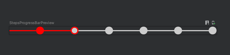
.progress, .progress * { box-sizing: border-box; }.progress { width: 410px; padding: 15px; padding-left: 25px; margin: 20px; border-radius: 3px; background: #ddd;}.progress .cycle { width: 90px; height: 10px; border: 1px solid #111; float: left; position: relative; background: #555;}.progress .cycle:first-of-type { width: 0px;}.progress .cycle.current ~ .cycle { background: #fff;}.progress .cycle:after { content: ''; width: 30px; height: 30px; border: 1px solid #111; border-radius: 50%; position: absolute; top: -12px; right: -15px; z-index: 2; background: #555;}.progress .cycle.current:after { background: deepskyblue;}.progress .cycle.current ~ .cycle:after { background: #fff;}/* With Counters */.progress.counter { counter-reset: cycle; }.progress.counter .cycle:after { counter-increment: cycle; content: counter(cycle); line-height: 30px; text-align: center; font-family: Arial;}Using Floats<div class="progress"> <div class="cycle"></div> <div class="cycle"></div> <div class="cycle"></div> <div class="cycle current"></div> <div class="cycle"></div> <div style="clear: both; height: 0px;"> </div></div><div class="progress"> <div class="cycle"></div> <div class="cycle current"></div> <div class="cycle"></div> <div class="cycle"></div> <div class="cycle"></div> <div style="clear: both; height: 0px;"> </div></div><div class="progress counter"> <div class="cycle"></div> <div class="cycle"></div> <div class="cycle"></div> <div class="cycle"></div> <div class="cycle current"></div> <div style="clear: both; height: 0px;"> </div></div>step progress bar with android compose
I don't think you need a library from this one, a simple and quick 'do it yourself' solution could be something like this:
@Composable
fun StepsProgressBar(modifier: Modifier = Modifier, numberOfSteps: Int, currentStep: Int) {
    Row(
        modifier = modifier,
        verticalAlignment = Alignment.CenterVertically
    ) {
        for (step in 0..numberOfSteps) {
            Step(
                modifier = Modifier.weight(1F),
                isCompete = step < currentStep,
                isCurrent = step == currentStep
            )
        }
    }
}

@Composable
fun Step(modifier: Modifier = Modifier, isCompete: Boolean, isCurrent: Boolean) {
    val color = if (isCompete || isCurrent) Color.Red else Color.LightGray
    val innerCircleColor = if (isCompete) Color.Red else Color.LightGray

    Box(modifier = modifier) {

        //Line
        Divider(
            modifier = Modifier.align(Alignment.CenterStart),
            color = color,
            thickness = 2.dp
        )

        //Circle
        Canvas(modifier = Modifier
            .size(15.dp)
            .align(Alignment.CenterEnd)
            .border(
                shape = CircleShape,
                width = 2.dp,
                color = color
            ),
            onDraw = {
                drawCircle(color = innerCircleColor)
            }
        )
    }
}

@Preview
@Composable
fun StepsProgressBarPreview() {
    val currentStep = remember { mutableStateOf(1) }
    StepsProgressBar(modifier = Modifier.fillMaxWidth(), numberOfSteps = 5, currentStep = currentStep.value)
}
This will be the result:
Related Topics
How to Monitor Sim State Change
Event Onclick for a Button in a Custom Notification
How to Get Profile Like Gender from Google Signin in Android
Calling Hidden API in Android to Turn Screen Off
How to Link a Prebuilt Shared Library to an Android Ndk Project
Scan Android Sd Card for New Files
Replacing Glreadpixels with Egl_Khr_Image_Base for Faster Pixel Copy
How to Import a Native Library (.So File) into Eclipse
How to Create an Avd for Android 4.0
How to Change Toolbar Home Icon Color
How to Display More Than 3- Levels of Expandable List View
Javadoc in Eclipse Failing to Recognize Packages
How to Read CPU Frequency on Android Device
How to Disable Status Bar Click and Pull Down in Android
Android: Detect Orientation Changed
Android Save Checkbox State in Listview with Cursor Adapter