NavigationView and custom Layout
Here's how I solved it, and worked perfectly:
<android.support.design.widget.NavigationView
    android:id="@+id/navigation"
    android:layout_width="wrap_content"
    android:layout_height="match_parent"
    android:layout_gravity="start"
    android:fitsSystemWindows="true">

    <LinearLayout
        android:layout_width="match_parent"
        android:layout_height="match_parent"
        android:orientation="vertical">

        <include layout="@layout/nav_header" />

        <ListView
            android:id="@+id/lst_menu_items"
            android:layout_width="match_parent"
            android:layout_height="0dp"
            android:layout_weight="1" />
    </LinearLayout>
</android.support.design.widget.NavigationView>
How to add custom views in the new NavigationView
The new support library 23.1
allows using a custom view for the items in Navigation View using app:actionLayout or using MenuItemCompat.setActionView().
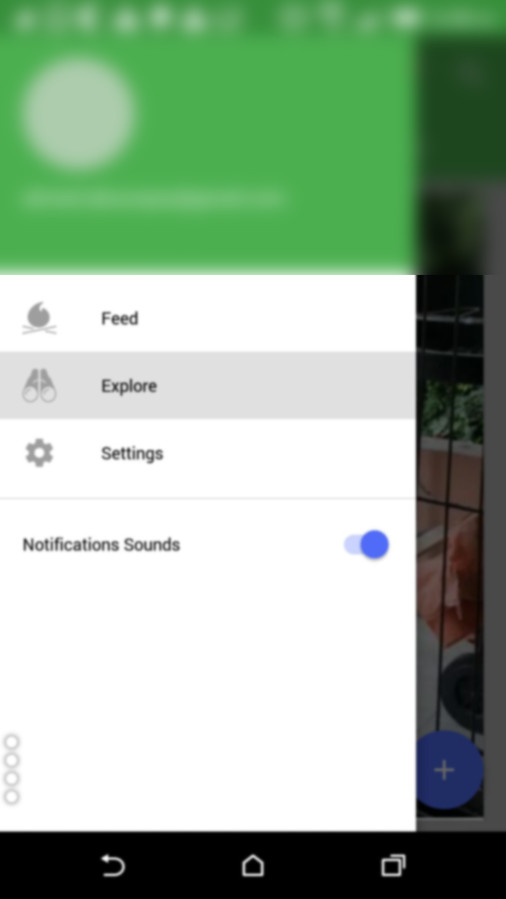
Here's how I managed to display a SwitchCompat
menu_nav.xml
<?xml version="1.0" encoding="utf-8"?>
<menu xmlns:android="http://schemas.android.com/apk/res/android">

    <group
        android:id="@+id/first"
        android:checkableBehavior="single">

        <item
            android:id="@+id/navi_item_1"
            android:icon="@drawable/ic_feed_grey_500_24dp"
            android:title="Feed" />
        <item
            android:id="@+id/navi_item_2"
            android:icon="@drawable/ic_explore_grey_500_24dp"
            android:title="Explore" />
        <item
            android:id="@+id/navi_item_4"
            android:icon="@drawable/ic_settings_grey_500_24dp"
            android:title="Settings" />

    </group>
    <group
        android:id="@+id/second"
        android:checkableBehavior="single">
        <item xmlns:app="http://schemas.android.com/apk/res-auto"
            android:id="@+id/navi_item_create_notifications_sound"
            android:title="Notifications Sounds"
            app:actionLayout="@layout/menu_swich"
            app:showAsAction="always" />

    </group>
</menu>
menu_switch.xml
<?xml version="1.0" encoding="utf-8"?>
<android.support.v7.widget.SwitchCompat xmlns:android="http://schemas.android.com/apk/res/android"
    xmlns:app="http://schemas.android.com/apk/res-auto"
    android:layout_width="wrap_content"
    android:layout_height="match_parent"
    android:gravity="right|center_vertical"
    app:buttonTint="@color/colorPrimary"
    app:switchPadding="@dimen/spacing_small" />
To get the View and assign events to it, you should do :
SwitchCompat item = (SwitchCompat) navigationView.getMenu().getItem(3).getActionView();
        item.setOnCheckedChangeListener( new CompoundButton.OnCheckedChangeListener(){
            @Override public void onCheckedChanged(CompoundButton buttonView, boolean isChecked) {
                Logr.v(LOG_TAG, "onCheckedChanged" + isChecked);
            }
        });
How to center a custom layout in navigation drawer?
After some research on the internet I came up with a solution.
Steps
- Included my custom layout(toggle_button.xml) in NavigationView Layout.
NavigationView Layout
 <?xml version="1.0" encoding="utf-8"?>
    <!-- Use DrawerLayout as root container for activity -->
    <android.support.v4.widget.DrawerLayout xmlns:android="http://schemas.android.com/apk/res/android"
        xmlns:app="http://schemas.android.com/apk/res-auto"
        xmlns:layout_gravity="http://schemas.android.com/tools"
        android:id="@+id/drawer_layout"
        android:layout_width="match_parent"
        android:layout_height="match_parent"
        android:fitsSystemWindows="true">

        <!-- Layout to contain contents of main body of screen (drawer will slide over this) -->
        <FrameLayout
            android:id="@+id/content_frame"
            android:layout_width="match_parent"
            android:layout_height="match_parent">

            <android.support.v7.widget.Toolbar
                android:id="@+id/toolbar"
                android:layout_width="match_parent"
                ndroid:layout_height="?attr/actionBarSize"
                app:titleTextColor="@color/white"
                android:background="?attr/colorPrimary"
                ndroid:theme="@style/ThemeOverlay.AppCompat.ActionBar" />

        </FrameLayout>
   <!-- Container for contents of drawer - use NavigationView to make configuration easier -->
    <android.support.design.widget.NavigationView
        android:id="@+id/nav_view"
        android:layout_width="wrap_content"
        android:layout_height="match_parent"
        android:layout_gravity="start"
        android:fitsSystemWindows="true"
        app:menu="@menu/drawer_view_menu"
        app:headerLayout="@layout/nav_header">

     <include layout="toggle_button.xml""/>

  </android.support.design.widget.NavigationView>
 </android.support.v4.widget.DrawerLayout>
2.Updated my custom layout for making toggle aligned center in bottom.
toggle_button.xml
<LinearLayout xmlns:android="http://schemas.android.com/apk/res/android"
    android:orientation="horizontal"
    android:layout_width="match_parent"
    android:layout_height="wrap_content"
    android:gravity="center_horizontal"
    android:layout_marginBottom="@dimen/margin_medium"
    android:layout_gravity="bottom">

    <Button
        android:layout_width="wrap_content"
        android:layout_height="wrap_content"
        android:background="@drawable/left_rounded"
        android:backgroundTint="@color/red"
        android:text="@string/lang_en"
        android:textColor="@color/white"/>

    <Button
        android:layout_width="wrap_content"
        android:layout_height="wrap_content"
        android:background="@drawable/right_rounded"
        android:text="@string/lang_ar" />

</LinearLayout>
- Also removed the second group from drawer_view_menu.xml
Done! It was as simple as that....
How can I add a custom item to a NavigationView with a menu layout?
The actionLayout attribute is now supported in Android Support Library 23.1:
NavigationView provides a convenient way to build a navigation drawer, including the ability to creating menu items using a menu XML file. We’ve expanded the functionality possible with the ability to set custom views for items via app:actionLayout or using MenuItemCompat.setActionView().
So the code in the question should just work now.
SwiftUI NavigationView and NavigationLink changes layout of custom view
If you just want to have the normal layout, you can also use:
NavigationLink(destination: DetailView(picture: "dunnottar castle").navigationBarHidden(true))
Related Topics
Where Did the "Createfromresourceid()" Go
How to Get a Dialog Style Activity Window to Fill the Screen
Hiding the Actionbar on Recyclerview/Listview Onscroll
Navigation Drawer Below Toolbar
Android: Using Simplecursoradapter to Get Data from Database to Listview
Android Kitkat Securityexception When Trying to Read from Mediastore
Fit Image in Imagebutton in Android
How to Change the New Tablayout Indicator Color and Height
Validate Username and Email Crashed and Cannot Insert to Firebase Database
Navigation Drawer Semi-Transparent Over Status Bar Not Working
How to Animate a View with Translate Animation in Android
How to Display Image in Android's Textview
Android Broadcastreceiver, Auto Run Service After Reboot of Device
Launch Skype from an App Programmatically & Pass Number - Android