How to create EditText with rounded corners?
There is an easier way than the one written by CommonsWare. Just create a drawable resource that specifies the way the EditText will be drawn:
<?xml version="1.0" encoding="utf-8"?>
<!--  res/drawable/rounded_edittext.xml -->
<shape xmlns:android="http://schemas.android.com/apk/res/android"
    android:shape="rectangle"
    android:padding="10dp">

    <solid android:color="#FFFFFF" />
    <corners
        android:bottomRightRadius="15dp"
        android:bottomLeftRadius="15dp"
        android:topLeftRadius="15dp"
        android:topRightRadius="15dp" />
</shape>
Then, just reference this drawable in your layout:
<?xml version="1.0" encoding="utf-8"?>
<LinearLayout xmlns:android="http://schemas.android.com/apk/res/android"
    android:orientation="vertical"
    android:layout_width="fill_parent"
    android:layout_height="fill_parent">

    <EditText
        android:layout_width="fill_parent"
        android:layout_height="wrap_content"
        android:padding="5dip"
        android:background="@drawable/rounded_edittext" />
</LinearLayout>
You will get something like:
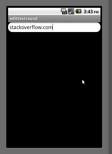
Edit
Based on Mark's comment, I want to add the way you can create different states for your EditText:
<?xml version="1.0" encoding="utf-8"?>
<!-- res/drawable/rounded_edittext_states.xml -->
<selector xmlns:android="http://schemas.android.com/apk/res/android">
    <item
        android:state_pressed="true"
        android:state_enabled="true"
        android:drawable="@drawable/rounded_focused" />
    <item
        android:state_focused="true"
        android:state_enabled="true"
        android:drawable="@drawable/rounded_focused" />
    <item
        android:state_enabled="true"
        android:drawable="@drawable/rounded_edittext" />
</selector>
These are the states:
<?xml version="1.0" encoding="utf-8"?>
<!-- res/drawable/rounded_edittext_focused.xml -->
<shape xmlns:android="http://schemas.android.com/apk/res/android"
    android:shape="rectangle" android:padding="10dp">

    <solid android:color="#FFFFFF"/>
    <stroke android:width="2dp" android:color="#FF0000" />
    <corners
        android:bottomRightRadius="15dp"
        android:bottomLeftRadius="15dp"
        android:topLeftRadius="15dp"
        android:topRightRadius="15dp" />
</shape>
And... now, the EditText should look like:
<?xml version="1.0" encoding="utf-8"?>
<LinearLayout xmlns:android="http://schemas.android.com/apk/res/android"
    android:orientation="vertical"
    android:layout_width="fill_parent"
    android:layout_height="fill_parent">

    <EditText
        android:layout_width="fill_parent"
        android:layout_height="wrap_content"
        android:text="@string/hello"
        android:background="@drawable/rounded_edittext_states"
        android:padding="5dip" />
</LinearLayout>
How to create edit text with rounded corners in android
Hey have a look about the problem in this discussion : How to create EditText with rounded corners? ..I am sure it will surely gonna help you.
Blur shadow around edittext with rounded corners
I think it's an elevation. What you need to do is you need to add background with rounded corners to EditText and set margin to the EditText because without margin your shadow will be cutted off.
edittext_background.xml
<?xml version="1.0" encoding="UTF-8"?>
<shape xmlns:android="http://schemas.android.com/apk/res/android">
    <solid android:color="@color/white"/>

    <corners android:bottomRightRadius="8dp" android:bottomLeftRadius="8dp"
        android:topLeftRadius="8dp" android:topRightRadius="8dp"/>
</shape>
EditText:
<EditText
                android:layout_width="match_parent"
                android:layout_height="40dp"
                android:elevation="8dp"
                android:background="@drawable/edittext_background"
                android:layout_margin="16dp" />
Designing EditText with rounded corners & inner shadow
Add a corners tag inside your shape tags:
  <corners
      android:radius="5dp" />
how to make full rounded edittext using shape material component?
If you want to use the TextInputLayout just use the app:shapeAppearanceOverlay attribute:
   <com.google.android.material.textfield.TextInputLayout
        app:shapeAppearanceOverlay="@style/ShapeAppearanceOverlay.MyApp.TextInputLayout.Rounded"
        ....

        app:hintEnabled="false"
        app:endIconDrawable="@drawable/..."
        app:endIconMode="custom"
        android:clipToPadding="true"
        style="@style/Widget.MaterialComponents.TextInputLayout.OutlinedBox"
        ...>
with:
<style name="ShapeAppearanceOverlay.MyApp.TextInputLayout.Rounded" parent="">
    <item name="cornerFamily">rounded</item>
    <item name="cornerSize">50%</item>
  </style>

If you want to use a simple ExitText you can use the MaterialShapeDrawable to draw custom shapes.
Check this answer.
Rounded Borders for EditText Android
You can try this
 <LinearLayout
    android:layout_width="match_parent"
    android:layout_height="wrap_content"
    android:background="@drawable/rounded_uname"
    android:orientation="vertical">

    <EditText
        android:id="@+id/editText"
        android:layout_width="match_parent"
        android:layout_height="wrap_content"
        android:background="@android:color/transparent" />

    <View
        android:id="@+id/v1"
        android:layout_width="match_parent"
        android:layout_height="1dp"
        android:background="#1caadf"></View>

    <EditText
        android:id="@+id/editText2"
        android:layout_width="match_parent"
        android:layout_height="wrap_content"
        android:background="@android:color/transparent"
        android:ems="10"
        android:inputType="textPassword" />
</LinearLayout>
How to create rounded edit text as is given in the pic
You will need two shape drawable files.
For the top EditText, call this, top_edittext_bg:
<?xml version="1.0" encoding="utf-8"?>
<shape xmlns:android="http://schemas.android.com/apk/res/android"
    android:shape="rectangle" >

    <solid
        android:color="#e2e2e2" >
    </solid>

    <corners
        android:radius="1dp"
        android:bottomLeftRadius="0.1dp"
        android:bottomRightRadius="0.1dp"
        android:topLeftRadius="5dp"
        android:topRightRadius="5dp" >
    </corners>

</shape>
And for the bottom EditText, call it for example, bottom_edittext_bg:
<?xml version="1.0" encoding="utf-8"?>
<shape xmlns:android="http://schemas.android.com/apk/res/android"
    android:shape="rectangle" >

    <solid
        android:color="#e2e2e2" >
    </solid>

    <corners
        android:radius="1dp"
        android:bottomLeftRadius="5dp"
        android:bottomRightRadius="5dp"
        android:topLeftRadius="0.1dp"
        android:topRightRadius="0.1dp" >
    </corners>

</shape>
And then set these in the android:background="@drawable/RESPECTIVE_XMLS" attribute to the relevant EditText's.
Related Topics
Arrayadapter in Android to Create Simple Listview
Export a Python Script to an Android Executable (.Apk) with Python-For-Android
Storing Dimensions in Xml File in Android
Tools: Replace Not Replacing in Android Manifest
Apply a Theme to an Activity in Android
Error: Fix the Version Conflict (Google-Services Plugin)
Get Current Location of User in Android Without Using Gps or Internet
Android: Using Findviewbyid() with a String/In a Loop
How to Get the List of Running Applications
How to Add a Badge to an Application Icon in Android
Difficulties with Calling an Android Ndk Function from Directly Delphi
What Does Porterduff.Mode Mean in Android Graphics.What Does It Do
Android: Creating Custom Preference
Transitive Dependencies for Local Aar Library
Blue Dot and Circle Is Not Shown on Mylocation Using Android Fused Location API