Android Custom Shape Button
Interesting question. I tried some solutions and this is what I found that has the same result of what you are trying to achieve. The solution below resolves 2 problems:
- Custom shape as you presented it
- The top right side of the button shouldn't be clickable
So this is the solution in 3 steps:
Step 1
Create two shapes.
First simple rectangle shape for the button: shape_button_beer.xml
<?xml version="1.0" encoding="utf-8"?>
<shape xmlns:android="http://schemas.android.com/apk/res/android" >

    <gradient
        android:angle="90"
        android:endColor="#C5D9F4"
        android:startColor="#DCE5FD" />

    <corners
        android:bottomLeftRadius="5dp"
        android:bottomRightRadius="5dp"
        android:topLeftRadius="5dp" >
    </corners>

</shape>
Second shape is used as mask for the top right side of the button: shape_button_beer_mask.xml. It is simple circle with black solid color.
<?xml version="1.0" encoding="utf-8"?>
<shape xmlns:android="http://schemas.android.com/apk/res/android"
    android:shape="oval" >

    <solid android:color="#000000" />

</shape>
Step 2
In your main layout add the button by next approach:
- RelativeLayout is the container of this custom button
- First LinearLayout is the blue button with beer icon and text inside
- Second ImageView is the mask above the blue button. And here comes dirty trick:
- Margins are negative to set the mask in the right place
- We define id to be able override on click (see step 3)
android:soundEffectsEnabled="false"- such that user will not feel that he pressed on something.
The XML:
    <!-- Custom Button -->
    <RelativeLayout
        android:layout_width="120dp"
        android:layout_height="80dp" >

        <LinearLayout
            android:id="@+id/custom_buttom"
            android:layout_width="100dp"
            android:layout_height="100dp"
            android:background="@drawable/shape_button_beer" >

            <!-- Beer icon and all other stuff -->

            <ImageView
                android:layout_width="40dp"
                android:layout_height="40dp"
                android:layout_marginLeft="5dp"
                android:layout_marginTop="15dp"
                android:src="@drawable/beer_icon" />
        </LinearLayout>

        <ImageView
            android:id="@+id/do_nothing"
            android:layout_width="120dp"
            android:layout_height="100dp"
            android:layout_alignParentRight="true"
            android:layout_alignParentTop="true"
            android:layout_marginRight="-50dp"
            android:layout_marginTop="-50dp"
            android:background="@drawable/shape_button_beer_mask"
            android:soundEffectsEnabled="false" >
        </ImageView>
    </RelativeLayout>
    <!-- End Custom Button -->
Step 3
In your main activity you define on click events for both: button and the mask as follow:
LinearLayout customButton = (LinearLayout) findViewById(R.id.custom_buttom);
customButton.setOnClickListener(new View.OnClickListener()
{
    @Override
    public void onClick(View arg0)
    {
        Toast.makeText(getApplicationContext(), "Clicked", Toast.LENGTH_SHORT).show();
    }
});

// Mask on click will do nothing
ImageView doNothing = (ImageView) findViewById(R.id.do_nothing);
doNothing.setOnClickListener(new View.OnClickListener()
{
    @Override
    public void onClick(View arg0)
    {
        // DO NOTHING
    }
});
That's it. I know that is not a perfect solution but in your described use case it could help.
I have tested it on my mobile and this is how it looks when you click on the blue area and nothing will happen on other areas:
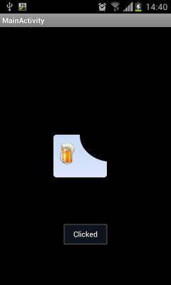
Hope it helped somehow :)
Defined custom shape for button in xml. Now I want to change the color dynamically. How?
I solved it by setting a ColorFilter:
Drawable mDrawable = context.getResources().getDrawable(R.drawable.balloons);
mDrawable.setColorFilter(new PorterDuffColorFilter(0xffff00,PorterDuff.Mode.MULTIPLY));
myButton.setResource(mDrawable);
android - Custom Button (using selector file) not working
As you can see in the video, your code works fine and does what you say to do. Change only while you press it. If you want to change it after click you should add in your drawable xml
drawable_button_selector.xml
 <?xml version="1.0" encoding="utf-8"?>
<selector xmlns:android="http://schemas.android.com/apk/res/android">
    <item android:drawable="@drawable/drawable_button_selected" android:state_selected="true" />
    <item android:drawable="@drawable/drawable_button_unselected" android:state_selected="false" />
    <item android:drawable="@drawable/drawable_button_unselected" />
</selector>
drawable_button_selected.xml
<?xml version="1.0" encoding="utf-8"?>
<shape xmlns:android="http://schemas.android.com/apk/res/android"
    android:shape="rectangle">

    <!-- color of the selected button -->
    <solid
        android:color="@color/purple_200"/>

</shape
drawable_button_unselected.xml
<?xml version="1.0" encoding="utf-8"?>
<shape xmlns:android="http://schemas.android.com/apk/res/android"
    android:shape="rectangle">

    <!-- unselected button background -->
    <solid
        android:color="@color/gray_dove_three" />

    <stroke
        android:color="@color/gray_martini"
        android:width="2dp"/>

</shape>
In your screen layout then you have
 <androidx.appcompat.widget.AppCompatButton
        android:id="@+id/button"
        android:layout_width="wrap_content"
        android:layout_height="wrap_content"
        android:text="Click Me"
        android:clickable="true"
        android:background="@drawable/drawable_button_selector"
        app:layout_constraintBottom_toBottomOf="parent"
        app:layout_constraintLeft_toLeftOf="parent"
        app:layout_constraintRight_toRightOf="parent"
        app:layout_constraintTop_toTopOf="parent" />
After that of course you have to change button state depending on your requirements. For example just switch button state on click
 private fun initLayout() {
        button.setOnClickListener {
            it.isSelected = !it.isSelected
            Log.d("Click Me", "Button isSelected" + it.isSelected)
            Toast.makeText(this, "Button Clicked and isSelected = " + it.isSelected, Toast.LENGTH_SHORT).show()

        }
How to apply shape and selector simultaneously for Button?
use this way:
<?xml version="1.0" encoding="utf-8"?>
<selector xmlns:android="http://schemas.android.com/apk/res/android">

   <item android:state_pressed="true" >
       <shape>.......</shape>
   </item>
   ..........
   ..........
</selector>
Android custom shape button or imageview hit area
In your onTouchListener you should check whether the event (MotionEvent) is in the transparent area of the background or not.
Either you can make a separate onTouchListener for each view/button and return false if the event is in the transparent area (of the View argument) or you can make a single listener for all of the buttons, ignore the View argument and check all of your three views to determine in which one the event is.
How to create custom button in Android using XML Styles
Have you ever tried to create the background shape for any buttons?
Check this out below:
Below is the separated image from your image of a button.

Now, put that in your ImageButton for android:src "source" like so:
android:src="@drawable/twitter"
Now, just create shape of the ImageButton to have a black shader background.
android:background="@drawable/button_shape"
and the button_shape is the xml file in drawable resource:
    <?xml version="1.0" encoding="UTF-8"?>
<shape
    xmlns:android="http://schemas.android.com/apk/res/android">
    <stroke
        android:width="1dp"
        android:color="#505050"/>
    <corners
        android:radius="7dp" />

    <padding
        android:left="1dp"
        android:right="1dp"
        android:top="1dp"
        android:bottom="1dp"/>

    <solid android:color="#505050"/>

</shape>
Just try to implement it with this. You might need to change the color value as per your requirement.
Let me know if it doesn't work.
Custom Background Shape of Button via Code
It's a lot more verbose to do it in Java, but here are the things you would need to do.
- Create a
new StateListDrawable() - For each state:
- Create a
new ShapeDrawable(new RoundRectShape(...)). I don't recall exactly how the constructor args work, but you can experiment. - Use
shapeDrawable.getPaint()to obtain its Paint object and make modifications. You'll probably usesetColor(),setStyle(), andsetStrokeWidth(). - Construct a state set. This is an array of integers composed of various android state attributes, like
android.R.attr.state_pressed, for the state you want. - Call
stateListDrawable.addState(stateSet, shapeDrawable). You can useStateSet.NOTHING(or an empty int[]) for the default state. Make sure you add them in the order they would appear in XML.
- Create a
Something like this:
StateListDrawable stateListDrawable = new StateListDrawable();
Shape roundRect = new RoundRectShape(...);
// Add states in order. I'll just demonstrate one.
ShapeDrawable pressed = new ShapeDrawable(roundRect);
Paint paint = pressed.getPaint();
paint.setColor(Color.BLUE);
paint.setStyle(Style.STROKE);
paint.setStrokeWidth(10f); // this is in pixels, you'll have to convert to dp yourself
int[] pressedState = { android.R.attr.state_pressed };
stateListDrawable.addState(pressedState, pressed);
how to make a capsule shape Button in android?
finally I found the way to do it with xml file. here is the code of the xml file that gave me the capsule shape button.
<?xml version="1.0" encoding="utf-8"?>
<shape xmlns:android="http://schemas.android.com/apk/res/android"
android:shape="rectangle" >

  <corners
    android:bottomLeftRadius="30dp"
    android:bottomRightRadius="30dp"
    android:radius="60dp"
    android:topLeftRadius="30dp"
    android:topRightRadius="30dp" />

  <solid android:color="#CFCFCF" />

  <padding
    android:bottom="0dp"
    android:left="0dp"
    android:right="0dp"
    android:top="0dp" />

  <size
    android:height="60dp"
    android:width="270dp" />

</shape>
Shape not getting applied to Button Selector in Android
You need to set android:radius="30dp" in your @drawable/instagram_gradient
Try this way
<?xml version="1.0" encoding="utf-8"?>
<androidx.constraintlayout.widget.ConstraintLayout xmlns:android="http://schemas.android.com/apk/res/android"
    xmlns:app="http://schemas.android.com/apk/res-auto"
    xmlns:tools="http://schemas.android.com/tools"
    android:layout_width="match_parent"
    android:layout_height="match_parent"
    tools:context=".MainActivity">

    <Button
        android:id="@+id/tvKioskMode"
        android:layout_width="300dp"
        android:layout_height="wrap_content"
        android:background="@drawable/instagram_button_style"
        android:padding="10dp"
        android:text="OPEN IN"
        android:textColor="@android:color/white"
        android:textStyle="bold"
        app:layout_constraintLeft_toLeftOf="parent"
        app:layout_constraintRight_toRightOf="parent"
        app:layout_constraintBottom_toBottomOf="parent"
        app:layout_constraintTop_toTopOf="parent" />

</androidx.constraintlayout.widget.ConstraintLayout>
drawable/instagram_button_style
<selector xmlns:android="http://schemas.android.com/apk/res/android">
    <item android:drawable="@drawable/instagram_button_shape" android:state_selected="true" android:textColor="@color/colorAccent" />
    <item android:drawable="@drawable/instagram_button_shape" android:state_pressed="true" android:textColor="@color/colorAccent" />
    <item android:drawable="@drawable/normal_button" />
</selector>
@drawable/instagram_button_shape
<?xml version="1.0" encoding="utf-8"?>
<layer-list xmlns:android="http://schemas.android.com/apk/res/android">
    <item>
        <shape xmlns:android="http://schemas.android.com/apk/res/android"
            android:shape="rectangle">
            <corners android:radius="30dp" />
            <solid android:color="@color/colorPrimary" />
        </shape>
    </item>

    <item android:drawable="@drawable/instagram_gradient" >
        <shape xmlns:android="http://schemas.android.com/apk/res/android"
            android:shape="rectangle">
            <corners android:radius="30dp" />

        </shape>
    </item>

</layer-list>
@drawable/normal_button
<shape xmlns:android="http://schemas.android.com/apk/res/android"
    android:shape="rectangle">
    <corners android:radius="30dp" />
    <solid android:color="@color/colorAccent" />
</shape>
@drawable/instagram_gradient
<?xml version="1.0" encoding="UTF-8"?>
<shape xmlns:android="http://schemas.android.com/apk/res/android" android:shape="rectangle" >

    <gradient
        android:angle="90"
        android:centerColor="#00E5FF"
        android:endColor="#FF1744"
        android:startColor="#3D5AFE"
        android:type="linear" />

    <corners
        android:radius="30dp"/>

</shape>
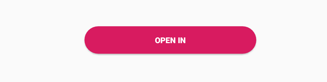
OUTPUT
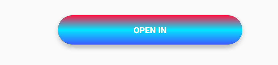
UPDATE
@drawable/instagram_button_style
<selector xmlns:android="http://schemas.android.com/apk/res/android">
    <item android:drawable="@drawable/instagram_button_shape" android:state_selected="true" android:textColor="@color/colorAccent" />
    <item android:drawable="@drawable/instagram_button_shape" android:state_pressed="true" android:textColor="@color/colorAccent" />
    <item android:drawable="@drawable/normal_button" />
</selector>
@drawable/instagram_button_shape
<?xml version="1.0" encoding="utf-8"?>
<layer-list xmlns:android="http://schemas.android.com/apk/res/android">

    <item>
        <shape xmlns:android="http://schemas.android.com/apk/res/android"
            android:shape="rectangle">
            <corners android:radius="30dp" />
            <solid android:color="@color/colorPrimary" />
        </shape>
    </item>

    <item android:drawable="@drawable/my_gradient"/>

</layer-list>
@drawable/my_gradient
<?xml version="1.0" encoding="utf-8"?>
<layer-list xmlns:android="http://schemas.android.com/apk/res/android">
    <item>
        <shape xmlns:android="http://schemas.android.com/apk/res/android"
            android:shape="rectangle">
            <corners android:radius="30dp" />

        </shape>
    </item>

    <!--add here your instagram image-->
    <item
        android:drawable="@drawable/insta_gradient_image"
        android:bottom="30dp"
        android:left="30dp"
        android:right="30dp"
        android:top="30dp"/>

</layer-list>
@drawable/normal_button
<shape xmlns:android="http://schemas.android.com/apk/res/android"
    android:shape="rectangle">
    <corners android:radius="30dp" />
    <solid android:color="@color/colorAccent" />
</shape>
Related Topics
Java.Lang.Noclassdeffounderror: Failed Resolution Of: Landroid/Support/V4/Os/Buildcompat
Failure [Install_Failed_Older_Sdk] Android-L
Android - Detecting Application Launch from Home or History
Picasso Loading of Image Spawned Inside Asynctask
Canonical Registration Id and Message Id Format
Recompile with -Xlint in Android Studio
Configure Eclipse to Use Signed Keystore
Android Google Maps V2: How to Add Marker with Multiline Snippet
Android Studio Where to Install Ndk File? (Downloaded It in Zip)
Set Language to French in Android Datepickerdialog
Android 2.1 View's Getdrawingcache() Method Always Returns Null
Getactionview() of My Menuitem Return Null