Expand/Collapse Lollipop toolbar animation (Telegram app)
Edit :
Since the release of the Android Design support library, there's an easier solution. Check joaquin's answer
--
Here's how I did it, there probably are many other solutions but this one worked for me.
First of all, you have to use a
Toolbarwith a transparent background. The expanding & collapsingToolbaris actually a fake one that's under the transparentToolbar. (you can see on the first screenshot below - the one with the margins - that this is also how they did it in Telegram).We only keep the actual
Toolbarfor theNavigationIconand the overflowMenuItem.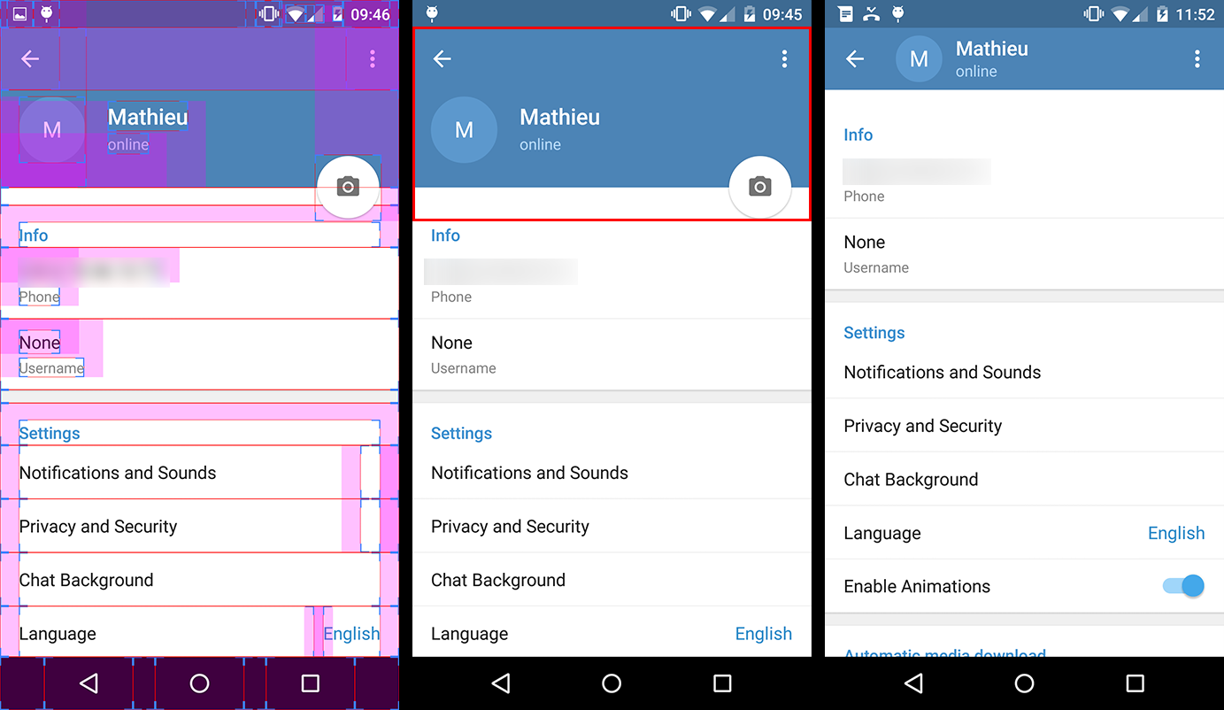
Everything that's in the red rectangle on the second screenshot (ie the fake
Toolbarand theFloatingActionButton) is actually a header that you add to the settingsListView(orScrollView).So you have to create a layout for this header in a separate file that could look like this :
 <!-- The headerView layout. Includes the fake Toolbar & the FloatingActionButton -->

 <FrameLayout xmlns:android="http://schemas.android.com/apk/res/android"
    android:layout_width="match_parent"
    android:layout_height="wrap_content">

    <RelativeLayout
        android:id="@+id/header_container"
        android:layout_width="match_parent"
        android:layout_height="@dimen/header_height"
        android:layout_marginBottom="3dp"
        android:background="@android:color/holo_blue_dark">

        <RelativeLayout
            android:id="@+id/header_infos_container"
            android:layout_width="match_parent"
            android:layout_height="wrap_content"
            android:layout_alignParentBottom="true"
            android:padding="16dp">

            <ImageView
                android:id="@+id/header_picture"
                android:layout_width="wrap_content"
                android:layout_height="wrap_content"
                android:layout_centerVertical="true"
                android:layout_marginRight="8dp"
                android:src="@android:drawable/ic_dialog_info" />

            <TextView
                android:id="@+id/header_title"
                style="@style/TextAppearance.AppCompat.Title"
                android:layout_width="wrap_content"
                android:layout_height="wrap_content"
                android:layout_toRightOf="@+id/header_picture"
                android:text="Toolbar Title"
                android:textColor="@android:color/white" />

            <TextView
                android:id="@+id/header_subtitle"
                style="@style/TextAppearance.AppCompat.Subhead"
                android:layout_width="wrap_content"
                android:layout_height="wrap_content"
                android:layout_below="@+id/header_title"
                android:layout_toRightOf="@+id/header_picture"
                android:text="Toolbar Subtitle"
                android:textColor="@android:color/white" />

        </RelativeLayout>
    </RelativeLayout>

    <FloatingActionButton
        android:id="@+id/header_fab"
        android:layout_width="wrap_content"
        android:layout_height="wrap_content"
        android:layout_gravity="bottom|right"
        android:layout_margin="10dp"
        android:src="@drawable/ic_open_in_browser"/>

</FrameLayout>
(Note that you can use negative margins/padding for the fab to be straddling on 2
Views)Now comes the interesting part. In order to animate the expansion of our fake
Toolbar, we implement theListViewonScrollListener.// The height of your fully expanded header view (same than in the xml layout)
int headerHeight = getResources().getDimensionPixelSize(R.dimen.header_height);
// The height of your fully collapsed header view. Actually the Toolbar height (56dp)
int minHeaderHeight = getResources().getDimensionPixelSize(R.dimen.action_bar_height);
// The left margin of the Toolbar title (according to specs, 72dp)
int toolbarTitleLeftMargin = getResources().getDimensionPixelSize(R.dimen.toolbar_left_margin);
// Added after edit
int minHeaderTranslation;
private ListView listView;
// Header views
private View headerView;
private RelativeLayout headerContainer;
private TextView headerTitle;
private TextView headerSubtitle;
private FloatingActionButton headerFab;
@Override
public View onCreateView(LayoutInflater inflater, ViewGroup container, Bundle savedInstanceState)
{
View rootView = inflater.inflate(R.layout.listview_fragment, container, false);
listView = rootView.findViewById(R.id.listview);
// Init the headerHeight and minHeaderTranslation values
headerHeight = getResources().getDimensionPixelSize(R.dimen.header_height);
minHeaderTranslation = -headerHeight +
getResources().getDimensionPixelOffset(R.dimen.action_bar_height);
// Inflate your header view
headerView = inflater.inflate(R.layout.header_view, listview, false);
// Retrieve the header views
headerContainer = (RelativeLayout) headerView.findViewById(R.id.header_container);
headerTitle = (TextView) headerView.findViewById(R.id.header_title);
headerSubtitle = (TextView) headerView.findViewById(R.id.header_subtitle);
headerFab = (TextView) headerView.findViewById(R.id.header_fab);;
// Add the headerView to your listView
listView.addHeaderView(headerView, null, false);
// Set the onScrollListener
listView.setOnScrollListener(this);
// ...
return rootView;
}
@Override
public void onScrollStateChanged(AbsListView view, int scrollState)
{
// Do nothing
}
@Override
public void onScroll(AbsListView view, int firstVisibleItem, int visibleItemCount, int totalItemCount)
{
Integer scrollY = getScrollY(view);
// This will collapse the header when scrolling, until its height reaches
// the toolbar height
headerView.setTranslationY(Math.max(0, scrollY + minHeaderTranslation));
// Scroll ratio (0 <= ratio <= 1).
// The ratio value is 0 when the header is completely expanded,
// 1 when it is completely collapsed
float offset = 1 - Math.max(
(float) (-minHeaderTranslation - scrollY) / -minHeaderTranslation, 0f);
// Now that we have this ratio, we only have to apply translations, scales,
// alpha, etc. to the header views
// For instance, this will move the toolbar title & subtitle on the X axis
// from its original position when the ListView will be completely scrolled
// down, to the Toolbar title position when it will be scrolled up.
headerTitle.setTranslationX(toolbarTitleLeftMargin * offset);
headerSubtitle.setTranslationX(toolbarTitleLeftMargin * offset);
// Or we can make the FAB disappear when the ListView is scrolled
headerFab.setAlpha(1 - offset);
}
// Method that allows us to get the scroll Y position of the ListView
public int getScrollY(AbsListView view)
{
View c = view.getChildAt(0);
if (c == null)
return 0;
int firstVisiblePosition = view.getFirstVisiblePosition();
int top = c.getTop();
int headerHeight = 0;
if (firstVisiblePosition >= 1)
headerHeight = this.headerHeight;
return -top + firstVisiblePosition * c.getHeight() + headerHeight;
}
Note that there are some parts of this code I didn't test, so feel free to highlight mistakes. But overall, I'm know that this solution works, even though I'm sure it can be improved.
EDIT 2:
There were some mistakes in the code above (that I didn't test until today...), so I changed a few lines to make it work :
- I introduced another variable, minHeaderTranslation, which replaced minHeaderHeight;
I changed the Y translation value applied to the header View from :
headerView.setTranslationY(Math.max(-scrollY, minHeaderTranslation));to :
headerView.setTranslationY(Math.max(0, scrollY + minHeaderTranslation));Previous expression wasn't working at all, I'm sorry about that...
The ratio calculation also changed, so that it now evolves from the bottom the toolbar (instead of the top of the screen) to the full expanded header.
How to make Toolbar animation like the Contacts app in Lollipop
The code below implements the action Expand / Collapse toolbar.
Basically we will have aCoordinatorLayout (FrameLayout)AppBarLayout (vertical LinearLayout Which implements many of the features of stuff designs),CollapsingToolbarLayout (is a wrapper for Toolbar)
ImageView and Toolbar
<android.support.design.widget.AppBarLayout
    android:id="@+id/appbar"
    android:layout_width="match_parent"
    android:layout_height="wrap_content"
    android:fitsSystemWindows="true"
    android:theme="@style/ThemeOverlay.AppCompat.Dark.ActionBar">
    <android.support.design.widget.CollapsingToolbarLayout
        android:id="@+id/collapsing_toolbar"
        android:layout_width="match_parent"
        android:layout_height="match_parent"
        android:fitsSystemWindows="true"
        app:contentScrim="?attr/colorPrimary"
        app:expandedTitleMarginEnd="64dp"
        app:expandedTitleMarginStart="48dp"
        app:layout_scrollFlags="scroll|exitUntilCollapsed">

        <ImageView
            android:id="@+id/header"
            android:layout_width="match_parent"
            android:layout_height="match_parent"
            android:background="@drawable/logo"
            android:minHeight="300dp"
            android:scaleType="centerCrop"
            app:layout_collapseMode="parallax" />

        <android.support.v7.widget.Toolbar xmlns:android="http://schemas.android.com/apk/res/android"
            android:id="@+id/toolbar"
            android:layout_width="match_parent"
            android:layout_height="?attr/actionBarSize"
            android:minHeight="?attr/actionBarSize"
            app:layout_collapseMode="pin" />

    </android.support.design.widget.CollapsingToolbarLayout>
</android.support.design.widget.AppBarLayout>

    <FrameLayout
        android:id="@+id/fr_container_home"
        android:layout_width="match_parent"
        android:layout_height="match_parent"
        app:layout_behavior="@string/appbar_scrolling_view_behavior"/>

</android.support.design.widget.CoordinatorLayout>

Observation
- FrameLayout is necessary app: layout_behavior = "@string/appbar_scrolling_view_behavior"
-TOOLBAR Not need backgroud, insert the color in the attribute app:contentScrim = "?Attr/ColorPrimary" from our CollapsingToolbarLayout
In your class
Toolbar toolbar = (Toolbar) findViewById(R.id.toolbar);
mCollapsingToolbarLayout = (CollapsingToolbarLayout)findViewById(R.id.collapsing_toolbar);
mCollapsingToolbarLayout.setTitle("YourTitle");
setSupportActionBar(toolbar);
Make collapsible toolbar automatically collapse/expand
You can use the snap flag like below:
<android.support.design.widget.CollapsingToolbarLayout
                android:id="@+id/collapsing_toolbar"
                android:layout_width="match_parent"
                android:layout_height="match_parent"
                android:fitsSystemWindows="true"
                app:contentScrim="?attr/colorPrimary"
                app:layout_scrollFlags="scroll|exitUntilCollapsed|snap">
Example Gif
Using this option will determine what to do when a view only has been partially reduced. If scrolling ends and the view size has been reduced to less than 50% of its original, then this view to return to its original size. If the size is greater than 50% of its sized, it will disappear completely.
You can read more about scrolling flags of CollapsingToolbarLayout here:
https://guides.codepath.com/android/Handling-Scrolls-with-CoordinatorLayout
Set initial size for collapsing toolbar, expand or collapse
After a lot of trying and searching for information about the collapsing toolbar I ended up using another library instead.
https://github.com/umano/AndroidSlidingUpPanel
With this I got the customisation I wanted by setting anchor points. Though I didn't get, or atleast I don't know how to get, the function of the toolbar expanding and changing from toolbar color to an image for example. But for my case, the customisation was the main function and thus more important.
How to make extended app bar with tabs collapse and expand while scrolling?
I finally got an answer to this, it was from Chris Banes' Cheesequare git highlighted by Paul:https://gist.github.com/iPaulPro/1468510f046cb10c51ea
And an edited version of mine:
<android.support.design.widget.CoordinatorLayout
xmlns:android="http://schemas.android.com/apk/res/android"
xmlns:app="http://schemas.android.com/apk/res-auto"
xmlns:tools="http://schemas.android.com/tools"
android:layout_width="match_parent"
android:layout_height="match_parent"
tools:context=".Home">

<android.support.design.widget.AppBarLayout
    android:id="@+id/appbar"
    android:layout_width="match_parent"
    android:layout_height="wrap_content"
    android:theme="@style/ThemeOverlay.AppCompat.Dark.ActionBar">
    <android.support.design.widget.CollapsingToolbarLayout
        android:id="@+id/collapsing_toolbar"
        android:layout_width="match_parent"
        android:layout_height="wrap_content"
        app:contentScrim="?attr/colorPrimary"
        app:layout_scrollFlags="scroll|exitUntilCollapsed">
        <ImageView
            android:id="@+id/background"
            android:layout_width="match_parent"
            android:layout_height="256dp"
            android:scaleType="centerCrop"
            android:fitsSystemWindows="true"
            app:layout_collapseMode="parallax"
            android:src="@drawable/hotdog"/>
        <android.support.v7.widget.Toolbar
            android:id="@+id/toolbar"
            android:layout_width="match_parent"
            android:layout_height="?attr/actionBarSize"
            app:popupTheme="@style/ThemeOverlay.AppCompat.Light"
            app:layout_collapseMode="pin"/>
    </android.support.design.widget.CollapsingToolbarLayout>

    <android.support.design.widget.TabLayout
        android:id="@+id/tabs"
        android:layout_width="match_parent"
        android:layout_height="?attr/actionBarSize"
        android:layout_gravity="bottom"
        android:background="?attr/colorPrimary"
        app:tabMode="scrollable"/>
</android.support.design.widget.AppBarLayout>

<android.support.v4.view.ViewPager
    android:id="@+id/viewpager"
    android:layout_width="match_parent"
    android:layout_height="match_parent"
    app:layout_behavior="@string/appbar_scrolling_view_behavior"/>

</android.support.design.widget.CoordinatorLayout>
Related Topics
How to Write Outputs to the Log in Android
How to Get the Current Orientation (Activityinfo.Screen_Orientation_*) of an Android Device
Cannot Resolve Method Setlatesteventinfo
Android Cannot Pass Intent Extras Though Alarmmanager
How to Determine If an Android Service Is Running in the Foreground
Android Cancel Toast When Exiting the App and When Toast Is Being Shown
How to Pass Bundle from Fragment to Fragment
Receive Push Notifications on One Android App from Two Firebase Projects
How to Get Release Build APK File Using Proguard
Vertical Line Using Xml Drawable
Android Install APK with Intent.View_Action Not Working with File Provider
Does Broadcastreceiver.Onreceive Always Run in the UI Thread
Android L's Ripple Effect - Touch Feedback for Buttons - Using Xml
Android Studio/Emulator on MACos with Arm CPU M1
How to Send Objects Through Bundle
How to Disable/Enable Dialog Negative Positive Buttons