Custom seekbar (thumb size, color and background)
First at all, use
android:splitTrack="false"for the transparency problem of your thumb.For the seekbar.png, you have to use a 9 patch. It would be good for the rounded border and the shadow of your image.
Custom SeekBar thumb showing unwanted background
adding android:splitTrack="false", will fix your problem. I would also use android:shape="oval", instead of rectangle with round corners, for your thumb.xml
Android - styling seek bar
I would extract drawables and xml from Android source code and change its color to red.
Here is example how I completed this for mdpi drawables:
Custom red_scrubber_control.xml (add to res/drawable):
<selector xmlns:android="http://schemas.android.com/apk/res/android">

    <item android:drawable="@drawable/red_scrubber_control_disabled_holo" android:state_enabled="false"/>
    <item android:drawable="@drawable/red_scrubber_control_pressed_holo" android:state_pressed="true"/>
    <item android:drawable="@drawable/red_scrubber_control_focused_holo" android:state_selected="true"/>
    <item android:drawable="@drawable/red_scrubber_control_normal_holo"/>
</selector>
Custom: red_scrubber_progress.xml
<layer-list xmlns:android="http://schemas.android.com/apk/res/android" >

    <item
        android:id="@android:id/background"
        android:drawable="@drawable/red_scrubber_track_holo_light"/>
    <item android:id="@android:id/secondaryProgress">
        <scale
            android:drawable="@drawable/red_scrubber_secondary_holo"
            android:scaleWidth="100%" />
    </item>
    <item android:id="@android:id/progress">
        <scale
            android:drawable="@drawable/red_scrubber_primary_holo"
            android:scaleWidth="100%" />
    </item>

</layer-list>
Then copy required drawables from Android source code, I took from this link
It is good to copy these drawables for each hdpi, mdpi, xhdpi. For example I use only mdpi:
Then using Photoshop change color from blue to red:
red_scrubber_control_disabled_holo.png:
red_scrubber_control_focused_holo.png:
red_scrubber_control_normal_holo.png:
red_scrubber_control_pressed_holo.png:
red_scrubber_primary_holo.9.png:
red_scrubber_secondary_holo.9.png:
red_scrubber_track_holo_light.9.png:
Add SeekBar to layout:
<SeekBar
    android:id="@+id/seekBar1"
    android:layout_width="match_parent"
    android:layout_height="wrap_content"
    android:progressDrawable="@drawable/red_scrubber_progress"
    android:thumb="@drawable/red_scrubber_control" />
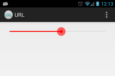
Result:
customise seekbar and show seekbar thumb based on focussed state
You can just hide the thumb in onStopTrackingTouch() and make it visible in onStartTrackingTouch().
final SeekBar seekbar = findViewById(R.id.seekbar);
//Hide the seekbar's thumb.
seekbar.getThumb().setAlpha(0);
final Handler seekBarHandler = new Handler(Looper.getMainLooper());

seekbar.setOnSeekBarChangeListener(new SeekBar.OnSeekBarChangeListener() {
    public void onProgressChanged(final SeekBar seekbar, final int progress, final boolean feomUser)
    {
         //Do something...
    }

    public void onStartTrackingTouch(final SeekBar seekbar)
    {
        seekBarHandler.removeCallbacksAndMessages(null);
        seekbar.getThumb().setAlpha(255);
    }

    public void onStopTrackingTouch(final SeekBar seekbar)
    {
        //Hide the thumb if not focus for a second.
        seekBarHandler.postDelayed(new Runnable() {
            public void run() {
                seekbar.getThumb().setAlpha(0);
            }
        }, 1000L); //Delay
    }
});
Drawing a custom Seek Bar
Code for your Thumb. Edit the height and top bottom spaces of this accordingly :
    <?xml version="1.0" encoding="utf-8"?>
<layer-list xmlns:android="http://schemas.android.com/apk/res/android">
    <!-- This is the main color -->

    <item>
        <shape android:shape="rectangle">
            <corners android:radius="1dp" />
            <solid android:color="#22B7FF" />
            <size
                android:width="10dp"
                android:height="20dp" />
        </shape>
    </item>

    <item
        android:bottom="7dp"
        android:left="4.5dp"
        android:right="4.5dp"
        android:top="7dp">
        <shape android:shape="rectangle">
            <solid android:color="@android:color/black" />

            <size
                android:width="1dp"
                android:height="4dp" />

        </shape>
    </item>

    <item
        android:bottom="7dp"
        android:left="2.5dp"
        android:right="6.5dp"
        android:top="7dp">
        <shape android:shape="rectangle">
            <solid android:color="@android:color/black" />

            <size
                android:width="1dp"
                android:height="4dp" />

        </shape>
    </item>

    <item
        android:bottom="7dp"
        android:left="6.5dp"
        android:right="2.5dp"
        android:top="7dp">
        <shape android:shape="rectangle">
            <solid android:color="@android:color/black" />

            <size
                android:width="1dp"
                android:height="4dp" />

        </shape>
    </item>

</layer-list>
Related Topics
Android 5.0 Material Design Style Navigation Drawer for Kitkat
Disable Logcat Output Completely in Release Android App
One Activity and All Other Fragments
How to Use Holo.Light Theme, and Fall Back to 'Light' on Pre-Honeycomb Devices
Jar Mismatch! Fix Your Dependencies
Sending Intent to Broadcastreceiver from Adb
Generate Signed APK Android Studio
How to Get Current Date in Android
Android Install APK with Intent.View_Action Not Working with File Provider
Upload a File Through an Http Form, via Multipartentitybuilder, with a Progress Bar
Android Studio: Drawable Folder: How to Put Images for Multiple Dpi
Webview Showing Err_Cleartext_Not_Permitted Although Site Is Https
What Are the Differences Between Activity and Fragment
Cannot Launch Avd in Emulator:Qt Library Not Found
How to Show Shadow Around the Linearlayout in Android
How to Enable Standard Copy Paste for a Textview in Android