android button selector
You just need to set selector of button in your layout file.
<Button
     android:id="@+id/button1"
     android:background="@drawable/selector_xml_name"
     android:layout_width="200dp"
     android:layout_height="126dp"
     android:text="Hello" />
and done.
Edit
Following is button_effect.xml file in drawable directory
<?xml version="1.0" encoding="utf-8"?>
<selector xmlns:android="http://schemas.android.com/apk/res/android">

    <item android:drawable="@drawable/numpad_button_bg_selected" android:state_selected="true"></item>
    <item android:drawable="@drawable/numpad_button_bg_pressed" android:state_pressed="true"></item>
    <item android:drawable="@drawable/numpad_button_bg_normal"></item>

</selector>
In this, you can see that there are 3 drawables, you just need to place this button_effect style to your button, as i wrote above. You just need to replace selector_xml_name with button_effect.
android - Custom Button (using selector file) not working
As you can see in the video, your code works fine and does what you say to do. Change only while you press it. If you want to change it after click you should add in your drawable xml
drawable_button_selector.xml
 <?xml version="1.0" encoding="utf-8"?>
<selector xmlns:android="http://schemas.android.com/apk/res/android">
    <item android:drawable="@drawable/drawable_button_selected" android:state_selected="true" />
    <item android:drawable="@drawable/drawable_button_unselected" android:state_selected="false" />
    <item android:drawable="@drawable/drawable_button_unselected" />
</selector>
drawable_button_selected.xml
<?xml version="1.0" encoding="utf-8"?>
<shape xmlns:android="http://schemas.android.com/apk/res/android"
    android:shape="rectangle">

    <!-- color of the selected button -->
    <solid
        android:color="@color/purple_200"/>

</shape
drawable_button_unselected.xml
<?xml version="1.0" encoding="utf-8"?>
<shape xmlns:android="http://schemas.android.com/apk/res/android"
    android:shape="rectangle">


    <!-- unselected button background -->
    <solid
        android:color="@color/gray_dove_three" />

    <stroke
        android:color="@color/gray_martini"
        android:width="2dp"/>


</shape>
In your screen layout then you have
 <androidx.appcompat.widget.AppCompatButton
        android:id="@+id/button"
        android:layout_width="wrap_content"
        android:layout_height="wrap_content"
        android:text="Click Me"
        android:clickable="true"
        android:background="@drawable/drawable_button_selector"
        app:layout_constraintBottom_toBottomOf="parent"
        app:layout_constraintLeft_toLeftOf="parent"
        app:layout_constraintRight_toRightOf="parent"
        app:layout_constraintTop_toTopOf="parent" />
After that of course you have to change button state depending on your requirements. For example just switch button state on click
 private fun initLayout() {
        button.setOnClickListener {
            it.isSelected = !it.isSelected
            Log.d("Click Me", "Button isSelected" + it.isSelected)
            Toast.makeText(this, "Button Clicked and isSelected = " + it.isSelected, Toast.LENGTH_SHORT).show()

        }
Android: Button with Ripple and State Selector in Background: Resource Not Found Exception
I found the issue.
The ripple needs a drawable resource.
The state selector which I had used did not provide a drawable for each state but rather it provided a color for each state. And thus it was crashing.
The following xml for the state selector would fix this issue. Everything else remains the same.
<selector xmlns:android="http://schemas.android.com/apk/res/android">

    <item android:drawable="@color/green" android:state_enabled="true"/>

    <item android:drawable="@color/grey" android:state_enabled="false"/>

</selector>
Shape not getting applied to Button Selector in Android
You need to set android:radius="30dp" in your @drawable/instagram_gradient
Try this way
<?xml version="1.0" encoding="utf-8"?>
<androidx.constraintlayout.widget.ConstraintLayout xmlns:android="http://schemas.android.com/apk/res/android"
xmlns:app="http://schemas.android.com/apk/res-auto"
xmlns:tools="http://schemas.android.com/tools"
android:layout_width="match_parent"
android:layout_height="match_parent"
tools:context=".MainActivity">
<Button
android:id="@+id/tvKioskMode"
android:layout_width="300dp"
android:layout_height="wrap_content"
android:background="@drawable/instagram_button_style"
android:padding="10dp"
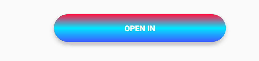
android:text="OPEN IN"
android:textColor="@android:color/white"
android:textStyle="bold"
app:layout_constraintLeft_toLeftOf="parent"
app:layout_constraintRight_toRightOf="parent"
app:layout_constraintBottom_toBottomOf="parent"
app:layout_constraintTop_toTopOf="parent" />
</androidx.constraintlayout.widget.ConstraintLayout>
drawable/instagram_button_style
<selector xmlns:android="http://schemas.android.com/apk/res/android">
    <item android:drawable="@drawable/instagram_button_shape" android:state_selected="true" android:textColor="@color/colorAccent" />
    <item android:drawable="@drawable/instagram_button_shape" android:state_pressed="true" android:textColor="@color/colorAccent" />
    <item android:drawable="@drawable/normal_button" />
</selector>
@drawable/instagram_button_shape
<?xml version="1.0" encoding="utf-8"?>
<layer-list xmlns:android="http://schemas.android.com/apk/res/android">
    <item>
        <shape xmlns:android="http://schemas.android.com/apk/res/android"
            android:shape="rectangle">
            <corners android:radius="30dp" />
            <solid android:color="@color/colorPrimary" />
        </shape>
    </item>

    <item android:drawable="@drawable/instagram_gradient" >
        <shape xmlns:android="http://schemas.android.com/apk/res/android"
            android:shape="rectangle">
            <corners android:radius="30dp" />

        </shape>
    </item>

</layer-list>
@drawable/normal_button
<shape xmlns:android="http://schemas.android.com/apk/res/android"
    android:shape="rectangle">
    <corners android:radius="30dp" />
    <solid android:color="@color/colorAccent" />
</shape>
@drawable/instagram_gradient
<?xml version="1.0" encoding="UTF-8"?>
<shape xmlns:android="http://schemas.android.com/apk/res/android" android:shape="rectangle" >

    <gradient
        android:angle="90"
        android:centerColor="#00E5FF"
        android:endColor="#FF1744"
        android:startColor="#3D5AFE"
        android:type="linear" />

    <corners
        android:radius="30dp"/>

</shape>
OUTPUT

UPDATE
@drawable/instagram_button_style
<selector xmlns:android="http://schemas.android.com/apk/res/android">
    <item android:drawable="@drawable/instagram_button_shape" android:state_selected="true" android:textColor="@color/colorAccent" />
    <item android:drawable="@drawable/instagram_button_shape" android:state_pressed="true" android:textColor="@color/colorAccent" />
    <item android:drawable="@drawable/normal_button" />
</selector>
@drawable/instagram_button_shape
<?xml version="1.0" encoding="utf-8"?>
<layer-list xmlns:android="http://schemas.android.com/apk/res/android">

    <item>
        <shape xmlns:android="http://schemas.android.com/apk/res/android"
            android:shape="rectangle">
            <corners android:radius="30dp" />
            <solid android:color="@color/colorPrimary" />
        </shape>
    </item>

    <item android:drawable="@drawable/my_gradient"/>

</layer-list>
@drawable/my_gradient
<?xml version="1.0" encoding="utf-8"?>
<layer-list xmlns:android="http://schemas.android.com/apk/res/android">
    <item>
        <shape xmlns:android="http://schemas.android.com/apk/res/android"
            android:shape="rectangle">
            <corners android:radius="30dp" />

        </shape>
    </item>


    <!--add here your instagram image-->
    <item
        android:drawable="@drawable/insta_gradient_image"
        android:bottom="30dp"
        android:left="30dp"
        android:right="30dp"
        android:top="30dp"/>

</layer-list>
@drawable/normal_button
<shape xmlns:android="http://schemas.android.com/apk/res/android"
    android:shape="rectangle">
    <corners android:radius="30dp" />
    <solid android:color="@color/colorAccent" />
</shape>
Strange button behavior XML selector enabled
I have found an answer to my question via this post :
Android custom view ignoring `android:enabled` in XML?
Since there is apparently no way to enable/disable view directly from XML, I had to set it programmatically.
Change drawableleft in button selector
I would suggest:
Your button xml:
<Button android:id="@+id/button1"
    android:background="@drawable/selector_aj_share_button_state"
    android:drawableLeft="@drawable/selector_aj_share_button_drawableleft"
/>
selector_aj_share_button_drawableleft.xml (in your drawable folder)
<?xml version="1.0" encoding="utf-8"?>
<selector xmlns:android="http://schemas.android.com/apk/res/android">
    <item android:state_focused="true"
        android:state_pressed="false"
        android:drawable="@drawable/aj_share_button_white_icon"/>
    <item android:state_focused="true"
        android:state_pressed="true"
        android:drawable="@drawable/aj_share_button_white_icon" />
    <item android:state_focused="false"
        android:state_pressed="true"
        android:drawable="@drawable/aj_share_button_white_icon" />
    <item android:drawable="@drawable/aj_share_button_blue_icon"/>
</selector>
It works with left drawable now. Try to do the same thing with selector_aj_share_button_state. Hope it helps!
How to toggle only the background of a button and save the state (pressed or not)
You can use:
        <com.google.android.material.button.MaterialButton
            android:checkable="true"
            app:backgroundTint="@drawable/btn_toggle_background"
            .../>
with:
<selector xmlns:android="http://schemas.android.com/apk/res/android">
    <item android:state_checked="false" android:color="#eeeeee" />
    <item android:state_checked="true" android:color="@color/...." android:alpha="xxx" />
</selector>
and the OnCheckedChangeListener:
    button.addOnCheckedChangeListener { button, isChecked ->
        if (isChecked){
            //
        }
    }
Use the method isChecked to know the status:
button.isChecked

Related Topics
How to Access My Localhost from My Android Device
Trying to Start a Service on Boot on Android
How to Copy Files from 'Assets' Folder to Sdcard
Sending and Receiving Sms and Mms in Android (Pre Kit Kat Android 4.4)
How to Start My App When the Phone Starts on Android
How to Obtain Crash-Data from My Android Application
What Is the List of Supported Languages/Locales on Android
Android Saving File to External Storage
Can the Android Drawable Directory Contain Subdirectories
How to Get the Device'S Imei/Esn Programmatically in Android
How to Get the External Sd Card Path For Android 4.0+
Open Facebook Page from Android App
Android Completely Transparent Status Bar
How to Prevent Android Taking a Screenshot When My App Goes to the Background
Android - How to Override the "Back" Button So It Doesn't Finish() My Activity
How to Change Current Theme At Runtime in Android