Add new item count to icon on button - Android
Make your badge a TextView, allowing you to set the numeric value to anything you like by calling setText(). Set the background of the TextView as an XML <shape> drawable, with which you can create a solid or gradient circle with a border. An XML drawable will scale to fit the view as it resizes with more or less text.
res/drawable/badge_circle.xml:
<shape xmlns:android="http://schemas.android.com/apk/res/android"
  android:shape="oval">
  <solid
    android:color="#F00" />
  <stroke
    android:width="2dip"
    android:color="#FFF" />
  <padding
    android:left="5dip"
    android:right="5dip"
    android:top="5dip"
    android:bottom="5dip" />
</shape>
You'll have to take a look at how the oval/circle scales with large 3-4 digit numbers, though. If this effect is undesirable, try a rounded rectangle approach like below. With small numbers, the rectangle will still look like a circle as the radii converge together.
res/drawable/badge_circle.xml:
<shape xmlns:android="http://schemas.android.com/apk/res/android"
  android:shape="rectangle">
  <corners
    android:radius="10dip"/>
  <solid
    android:color="#F00" />
  <stroke
    android:width="2dip"
    android:color="#FFF" />
  <padding
    android:left="5dip"
    android:right="5dip"
    android:top="5dip"
    android:bottom="5dip" />
</shape>
With the scalable background created, you simply add it to the background of a TextView, like so:
<TextView
  android:layout_width="wrap_content"
  android:layout_height="wrap_content"
  android:text="10"
  android:textColor="#FFF"
  android:textSize="16sp"
  android:textStyle="bold"
  android:background="@drawable/badge_circle"/>
Finally, these TextView badges can be placed in your layout on top of the appropriate buttons/tabs. I would probably do this by grouping each button with its badge in a RelativeLayout container, like so:
<RelativeLayout xmlns:android="http://schemas.android.com/apk/res/android"
  android:layout_width="wrap_content"
  android:layout_height="wrap_content">
  <Button
    android:id="@+id/myButton"
    android:layout_width="65dip"
    android:layout_height="65dip"/>
  <TextView
    android:id="@+id/textOne"
    android:layout_width="wrap_content"
    android:layout_height="wrap_content"
    android:layout_alignTop="@id/myButton"
    android:layout_alignRight="@id/myButton"
    android:text="10"
    android:textColor="#FFF"
    android:textSize="16sp"
    android:textStyle="bold"
    android:background="@drawable/badge_circle"/>
</RelativeLayout>
Hopefully that's enough information to at least get you pointed in the right direction!
How to display count of notifications in toolbar icon in android
In my solution, whenever a new notification arrives, the counter will increase (as observed in shopping apps)
Try this, it works on my MOTO e2.
Make sure your API Level > 14
Create a layout like:
</RelativeLayout>
    <ImageView
        android:id="@+id/counterBackground"
        android:layout_width="wrap_content"
        android:layout_height="wrap_content"
        android:background="@drawable/unread_background" />

    <TextView
        android:id="@+id/count"
        android:layout_width="wrap_content"
        android:layout_height="wrap_content"
        android:text="1"
        android:textSize="8sp"
        android:layout_centerInParent="true"
        android:textColor="#FFFFFF" />
</RelativeLayout>
In onCreateOptionMenu,
@Override
public boolean onCreateOptionsMenu(Menu menu) {
   getMenuInflater().inflate(R.menu.menu_main, menu);

   MenuItem menuItem = menu.findItem(R.id.testAction);
   menuItem.setIcon(buildCounterDrawable(count,  R.drawable.ic_menu_gallery));

   return true;
}
Now, build method for Icon :
private Drawable buildCounterDrawable(int count, int backgroundImageId) {
    LayoutInflater inflater = LayoutInflater.from(this);
    View view = inflater.inflate(R.layout.counter_menuitem_layout, null);
    view.setBackgroundResource(backgroundImageId);

    if (count == 0) {
        View counterTextPanel = view.findViewById(R.id.counterValuePanel);
        counterTextPanel.setVisibility(View.GONE);
    } else {
        TextView textView = (TextView) view.findViewById(R.id.count);
        textView.setText("" + count);
    }

    view.measure(View.MeasureSpec.makeMeasureSpec(0, View.MeasureSpec.UNSPECIFIED),
            View.MeasureSpec.makeMeasureSpec(0, View.MeasureSpec.UNSPECIFIED));
    view.layout(0, 0, view.getMeasuredWidth(), view.getMeasuredHeight());

    view.setDrawingCacheEnabled(true);
    view.setDrawingCacheQuality(View.DRAWING_CACHE_QUALITY_HIGH);
    Bitmap bitmap = Bitmap.createBitmap(view.getDrawingCache());
    view.setDrawingCacheEnabled(false);

    return new BitmapDrawable(getResources(), bitmap);
}
You can refer from here
How to make an icon in the action bar with the number of notification?
After a lot of trying of nearly all resources on SO I turned to blogs; successfully. I want to share what worked for me (Api >= 13).
Let's start with the way it's used in code:
 public boolean onCreateOptionsMenu(Menu menu) {
    //inflate menu
    getMenuInflater().inflate(R.menu.menu_my, menu);

    // Get the notifications MenuItem and LayerDrawable (layer-list)
    MenuItem item = menu.findItem(R.id.action_notifications);
    LayerDrawable icon = (LayerDrawable) item.getIcon();

    // Update LayerDrawable's BadgeDrawable
    Utils2.setBadgeCount(this, icon, 2);

    return true;
}
The menu_my.xml:
<menu xmlns:android="http://schemas.android.com/apk/res/android"
    xmlns:app="http://schemas.android.com/apk/res-auto"
    xmlns:tools="http://schemas.android.com/tools"
    tools:context=".MainActivity">
    <item
        android:id="@+id/action_notifications"
        android:icon="@drawable/ic_menu_notifications"
        android:title="Notifications"
        app:showAsAction="always" />
</menu>
This class that conveniently makes a BadgeDrawable:
public class BadgeDrawable extends Drawable {

    private float mTextSize;
    private Paint mBadgePaint;
    private Paint mTextPaint;
    private Rect mTxtRect = new Rect();

    private String mCount = "";
    private boolean mWillDraw = false;

    public BadgeDrawable(Context context) {
        //mTextSize = context.getResources().getDimension(R.dimen.badge_text_size);
        mTextSize = 12F;

        mBadgePaint = new Paint();
        mBadgePaint.setColor(Color.RED);
        mBadgePaint.setAntiAlias(true);
        mBadgePaint.setStyle(Paint.Style.FILL);

        mTextPaint = new Paint();
        mTextPaint.setColor(Color.WHITE);
        mTextPaint.setTypeface(Typeface.DEFAULT_BOLD);
        mTextPaint.setTextSize(mTextSize);
        mTextPaint.setAntiAlias(true);
        mTextPaint.setTextAlign(Paint.Align.CENTER);
    }

    @Override
    public void draw(Canvas canvas) {
        if (!mWillDraw) {
            return;
        }

        Rect bounds = getBounds();
        float width = bounds.right - bounds.left;
        float height = bounds.bottom - bounds.top;

        // Position the badge in the top-right quadrant of the icon.
        float radius = ((Math.min(width, height) / 2) - 1) / 2;
        float centerX = width - radius - 1;
        float centerY = radius + 1;

        // Draw badge circle.
        canvas.drawCircle(centerX, centerY, radius, mBadgePaint);

        // Draw badge count text inside the circle.
        mTextPaint.getTextBounds(mCount, 0, mCount.length(), mTxtRect);
        float textHeight = mTxtRect.bottom - mTxtRect.top;
        float textY = centerY + (textHeight / 2f);
        canvas.drawText(mCount, centerX, textY, mTextPaint);
    }

    /*
    Sets the count (i.e notifications) to display.
     */
    public void setCount(int count) {
        mCount = Integer.toString(count);

        // Only draw a badge if there are notifications.
        mWillDraw = count > 0;
        invalidateSelf();
    }

    @Override
    public void setAlpha(int alpha) {
        // do nothing
    }

    @Override
    public void setColorFilter(ColorFilter cf) {
        // do nothing
    }

    @Override
    public int getOpacity() {
        return PixelFormat.UNKNOWN;
    }
}
This class that helps to set the number.
public class Utils2 {
    public static void setBadgeCount(Context context, LayerDrawable icon, int count) {

        BadgeDrawable badge;

        // Reuse drawable if possible
        Drawable reuse = icon.findDrawableByLayerId(R.id.ic_badge);
        if (reuse != null && reuse instanceof BadgeDrawable) {
            badge = (BadgeDrawable) reuse;
        } else {
            badge = new BadgeDrawable(context);
        }

        badge.setCount(count);
        icon.mutate();
        icon.setDrawableByLayerId(R.id.ic_badge, badge);
    }

}
And mui importante a drawable (like a layout) in res/drawable:
<?xml version="1.0" encoding="utf-8"?>
<layer-list xmlns:android="http://schemas.android.com/apk/res/android">
    <item
        android:id="@+id/ic_notification"
        android:drawable="@drawable/ice_skate"
        android:gravity="center" />

    <!-- set a place holder Drawable so android:drawable isn't null -->
    <item
        android:id="@+id/ic_badge"
        android:drawable="@drawable/ice_skate" />
</layer-list>
Good luck!
Add badge counter to hamburger navigation menu icon in Android
Since version 24.2.0 of the support library, the v7 version of ActionBarDrawerToggle has offered the setDrawerArrowDrawable() method as a means to customize the toggle icon. DrawerArrowDrawable is the class that provides that default icon, and it can be subclassed to alter it as needed.
As an example, the BadgeDrawerArrowDrawable class overrides the draw() method to add a basic red and white badge after the superclass draws itself. This allows the hamburger-arrow animation to be preserved underneath.
import android.content.Context;
import android.graphics.Color;
import android.graphics.Canvas;
import android.graphics.Paint;
import android.graphics.Rect;
import android.graphics.Typeface;
import android.support.v7.graphics.drawable.DrawerArrowDrawable;
import java.util.Objects;

public class BadgeDrawerArrowDrawable extends DrawerArrowDrawable {

    // Fraction of the drawable's intrinsic size we want the badge to be.
    private static final float SIZE_FACTOR = .3f;
    private static final float HALF_SIZE_FACTOR = SIZE_FACTOR / 2;

    private Paint backgroundPaint;
    private Paint textPaint;
    private String text;
    private boolean enabled = true;

    public BadgeDrawerArrowDrawable(Context context) {
        super(context);

        backgroundPaint = new Paint();
        backgroundPaint.setColor(Color.RED);
        backgroundPaint.setAntiAlias(true);

        textPaint = new Paint();
        textPaint.setColor(Color.WHITE);
        textPaint.setAntiAlias(true);
        textPaint.setTypeface(Typeface.DEFAULT_BOLD);
        textPaint.setTextAlign(Paint.Align.CENTER);
        textPaint.setTextSize(SIZE_FACTOR * getIntrinsicHeight());
    }

    @Override
    public void draw(Canvas canvas) {
        super.draw(canvas);

        if (!enabled) {
            return;
        }

        final Rect bounds = getBounds();
        final float x = (1 - HALF_SIZE_FACTOR) * bounds.width();
        final float y = HALF_SIZE_FACTOR * bounds.height();
        canvas.drawCircle(x, y, SIZE_FACTOR * bounds.width(), backgroundPaint);

        if (text == null || text.length() == 0) {
            return;
        }

        final Rect textBounds = new Rect();
        textPaint.getTextBounds(text, 0, text.length(), textBounds);
        canvas.drawText(text, x, y + textBounds.height() / 2, textPaint);
    }

    public void setEnabled(boolean enabled) {
        if (this.enabled != enabled) {
            this.enabled = enabled;
            invalidateSelf();
        }
    }

    public boolean isEnabled() {
        return enabled;
    }

    public void setText(String text) {
        if (!Objects.equals(this.text, text)) {
            this.text = text;
            invalidateSelf();
        }
    }

    public String getText() {
        return text;
    }

    public void setBackgroundColor(int color) {
        if (backgroundPaint.getColor() != color) {
            backgroundPaint.setColor(color);
            invalidateSelf();
        }
    }

    public int getBackgroundColor() {
        return backgroundPaint.getColor();
    }

    public void setTextColor(int color) {
        if (textPaint.getColor() != color) {
            textPaint.setColor(color);
            invalidateSelf();
        }
    }

    public int getTextColor() {
        return textPaint.getColor();
    }
}
An instance of this can be set on the toggle any time after it's instantiated, and the badge's properties set directly on the drawable as needed.
As the OP noted below, the Context used for the custom DrawerArrowDrawable should be obtained with ActionBar#getThemedContext() or Toolbar#getContext() to ensure the correct style values are used. For example:
private ActionBarDrawerToggle toggle;
private BadgeDrawerArrowDrawable badgeDrawable;
...

toggle = new ActionBarDrawerToggle(this, ...);
badgeDrawable = new BadgeDrawerArrowDrawable(getSupportActionBar().getThemedContext());

toggle.setDrawerArrowDrawable(badgeDrawable);
badgeDrawable.setText("1");
...

To simplify things a bit, it might be preferable to subclass ActionBarDrawerToggle as well, and handle everything through the toggle instance.
import android.app.Activity;
import android.content.Context;
import android.support.v4.widget.DrawerLayout;
import android.support.v7.app.ActionBarDrawerToggle;
import android.support.v7.widget.Toolbar;
import java.lang.reflect.Field;
import java.lang.reflect.Method;

public class BadgeDrawerToggle extends ActionBarDrawerToggle {

    private BadgeDrawerArrowDrawable badgeDrawable;

    public BadgeDrawerToggle(Activity activity, DrawerLayout drawerLayout,
                             int openDrawerContentDescRes,
                             int closeDrawerContentDescRes) {
        super(activity, drawerLayout, openDrawerContentDescRes,
              closeDrawerContentDescRes);
        init(activity);
    }

    public BadgeDrawerToggle(Activity activity, DrawerLayout drawerLayout,
                             Toolbar toolbar, int openDrawerContentDescRes,
                             int closeDrawerContentDescRes) {
        super(activity, drawerLayout, toolbar, openDrawerContentDescRes,
              closeDrawerContentDescRes);
        init(activity);
    }

    private void init(Activity activity) {
        Context c = getThemedContext();
        if (c == null) {
            c = activity;
        }
        badgeDrawable = new BadgeDrawerArrowDrawable(c);
        setDrawerArrowDrawable(badgeDrawable);
    }

    public void setBadgeEnabled(boolean enabled) {
        badgeDrawable.setEnabled(enabled);
    }

    public boolean isBadgeEnabled() {
        return badgeDrawable.isEnabled();
    }

    public void setBadgeText(String text) {
        badgeDrawable.setText(text);
    }

    public String getBadgeText() {
        return badgeDrawable.getText();
    }

    public void setBadgeColor(int color) {
        badgeDrawable.setBackgroundColor(color);
    }

    public int getBadgeColor() {
        return badgeDrawable.getBackgroundColor();
    }

    public void setBadgeTextColor(int color) {
        badgeDrawable.setTextColor(color);
    }

    public int getBadgeTextColor() {
        return badgeDrawable.getTextColor();
    }

    private Context getThemedContext() {
        // Don't freak about the reflection. ActionBarDrawerToggle
        // itself is already using reflection internally.
        try {
            Field mActivityImplField = ActionBarDrawerToggle.class
                .getDeclaredField("mActivityImpl");
            mActivityImplField.setAccessible(true);
            Object mActivityImpl = mActivityImplField.get(this);
            Method getActionBarThemedContextMethod = mActivityImpl.getClass()
                .getDeclaredMethod("getActionBarThemedContext");
            return (Context) getActionBarThemedContextMethod.invoke(mActivityImpl);
        }
        catch (Exception e) {
            return null;
        }
    }
}
With this, the custom badge drawable will be set automatically, and everything toggle-related can be managed through a single object.
BadgeDrawerToggle is a drop-in replacement for ActionBarDrawerToggle, and its constructors are exactly the same.
private BadgeDrawerToggle badgeToggle;
...

badgeToggle = new BadgeDrawerToggle(this, ...);
badgeToggle.setBadgeText("1");
...
Small bubble over a button to count items added to cart?
In Working solution code if your arrange the button and the textview in Grid according to your need than it will solve your problem
Find more about Gridview Here
Notification Badge On Action Item Android
You can show custom MenuItem on ActionBar by creating a custom layout for MenuItem. To set a custom layout you have to use menu item attribute app:actionLayout.
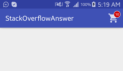
Follow below steps to create a Badge on Cart action item. See the attached image for result.
- Create a custom layout with
ImageView(for cart icon) andTextView(for count value)
layout/custom_action_item_layout.xml:
<?xml version="1.0" encoding="utf-8"?>
<FrameLayout
    style="?attr/actionButtonStyle"
    xmlns:android="http://schemas.android.com/apk/res/android"
    android:layout_width="wrap_content"
    android:layout_height="wrap_content"
    android:clipToPadding="false"
    android:focusable="true">

    <ImageView
        android:layout_width="wrap_content"
        android:layout_height="wrap_content"
        android:layout_gravity="center"
        android:src="@drawable/ic_action_cart"/>

    <TextView
        android:id="@+id/cart_badge"
        android:layout_width="20dp"
        android:layout_height="20dp"
        android:layout_gravity="right|end|top"
        android:layout_marginEnd="-5dp"
        android:layout_marginRight="-5dp"
        android:layout_marginTop="3dp"
        android:background="@drawable/badge_background"
        android:gravity="center"
        android:padding="3dp"
        android:textColor="@android:color/white"
        android:text="0"
        android:textSize="10sp"/>

</FrameLayout>
- Create drawable circular
badgebackground usingShape.
drawable/badge_background.xml:
<?xml version="1.0" encoding="utf-8"?>
<shape xmlns:android="http://schemas.android.com/apk/res/android" android:shape="oval">

    <solid android:color="@android:color/holo_red_dark"/>
    <stroke android:color="@android:color/white" android:width="1dp"/>

</shape>
- Add
custom layoutto menuitem.
menu/main_menu.xml
<menu
    xmlns:android="http://schemas.android.com/apk/res/android"
    xmlns:app="http://schemas.android.com/apk/res-auto" >

    <item
        android:id="@+id/action_cart"
        android:icon="@drawable/ic_action_cart"
        android:title="Cart"
        app:actionLayout="@layout/custom_action_item_layout"
        app:showAsAction="always"/>

</menu>
- In your MainActivity, add following codes:
MainActivity.java:
public class MainActivity extends AppCompatActivity {
    ................
    ......................
    TextView textCartItemCount;
    int mCartItemCount = 10;

    @Override
    protected void onCreate(Bundle savedInstanceState) {
        super.onCreate(savedInstanceState);
        setContentView(R.layout.activity_main);

        .....................
        ............................
    }

    @Override
    public boolean onCreateOptionsMenu(Menu menu) {
        getMenuInflater().inflate(R.menu.main_menu, menu);

        final MenuItem menuItem = menu.findItem(R.id.action_cart);

        View actionView = menuItem.getActionView();
        textCartItemCount = (TextView) actionView.findViewById(R.id.cart_badge);

        setupBadge();

        actionView.setOnClickListener(new View.OnClickListener() {
            @Override
            public void onClick(View v) {
                onOptionsItemSelected(menuItem);
            }
        });

        return true;
    }

    @Override
    public boolean onOptionsItemSelected(MenuItem item) {

        switch (item.getItemId()) {

            case R.id.action_cart: {
                // Do something
                return true;
            }
        }
        return super.onOptionsItemSelected(item);
    }

    private void setupBadge() {

        if (textCartItemCount != null) {
            if (mCartItemCount == 0) {
                if (textCartItemCount.getVisibility() != View.GONE) {
                    textCartItemCount.setVisibility(View.GONE);
                }
            } else {
                textCartItemCount.setText(String.valueOf(Math.min(mCartItemCount, 99)));
                if (textCartItemCount.getVisibility() != View.VISIBLE) {
                    textCartItemCount.setVisibility(View.VISIBLE);
                }
            }
        }
    }

    ..................
    ..............................

}
OUTPUT:
Related Topics
Android - Nullpointerexception on Searchview in Action Bar
Distance Calculation from My Location to Destination Location in Android
Navigation Drawer: How to Set the Selected Item at Startup
Textwatcher for More Than One Edittext
Have Both Gms and Hms in the Project
How to Get the List of Mounted External Storage of Android Device
How to Free a Component in Android/Ios
View Not Attached to Window Manager Crash
Keyboard Showed Messed Up Elements' Position
Calculating Distance Between Two Geographic Locations
Android Studio Error Installing Gradle
Java.Lang.Noclassdeffounderror: Javax.Activation.Datahandler in Android
Preferencefragmentcompat Requires Preferencetheme to Be Set
How to Create a Popup Window (Popupwindow) in Android
Google Play Game Services - Unable to Sign In