Making Button span across VStack
The best way to do this is via .frame(maxWidth: .infinity)
https://developer.apple.com/documentation/swiftui/view-layout
If you want the button not to be centered you need to specify alignment.
e.g.: .frame(maxWidth: .infinity, alignment: .leading)
Button(action: handleSignInAction) {
    Text("Sign In")
}
.frame(maxWidth: .infinity)
.background(Color.green)
Old answer from 2019:
You could use a HStack with a Text and Spacer to get a Button that fills the width of its parent:
Button(action: handleSignInAction) {
    HStack {
        Spacer()
        Text("Sign In")
        Spacer()
    }
}.background(Color.green)
SwiftUI: how to size to fit a Button to expand to fill a VStack or HStack parent View?
Setting .infinity as the maxWidth, the frame(minWidth: maxWidth: minHeight:) API can be used to make a subview expand to fill:
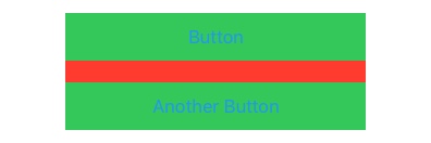
VStack(alignment: .center, spacing: 20) {

    NavigationLink(destination: CustomView()) {
        Text("Button")
    }.frame(minWidth: 100, maxWidth: .infinity, minHeight: 44)
        .background(Color.primary)

    Button(action: { self.isShowingAlert = true }) {
        Text("Another Button")
    }.frame(minWidth: 100, maxWidth: .infinity, minHeight: 44)
        .background(Color.primary)

}.frame(width: 340)
    .background(Color.secondary)
Make a SwiftUI button with style .bordered expand to full width
Use this way to make a full-width button.
Button(action: {
    saveUser()
}) {
    Text("Save").frame(minWidth: 0, maxWidth: .infinity)
}.buttonStyle(.borderedProminent)
Image and Button title in VStack button
Here is a solution. Tested with Xcode 11.4 / iOS 13.4.
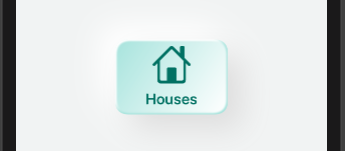
struct LightGreenButton: View {
    var body: some View {
        VStack {

            Image(systemName: "house")
              .resizable()
              .frame(width: 50, height: 50, alignment: .center)
              //.opacity(0.6)
              .clipped()
              .foregroundColor(Color(#colorLiteral(red: 0.005, green: 0.4422248602, blue: 0.3870742321, alpha: 1)))
              .offset(x: 0, y: 0)

            Text("Houses")
                .font(.system(size: 20, weight: .semibold, design: .rounded))
                .foregroundColor(Color(#colorLiteral(red: 0.005, green: 0.4422248602, blue: 0.3870742321, alpha: 1)))
        }
        .frame(width: 150, height: 100)
        .background(
            ZStack {
                Color(#colorLiteral(red: 0.6574724317, green: 0.8923466802, blue: 0.8671938181, alpha: 1))

                RoundedRectangle(cornerRadius: 16, style: .continuous)
                    .foregroundColor(.white)
                    .blur(radius: 4)
                    .offset(x: -8, y: -8)

                RoundedRectangle(cornerRadius: 16, style: .continuous)
                    .fill(
                        LinearGradient(gradient: Gradient(colors: [Color(#colorLiteral(red: 0.6574724317, green: 0.8923466802, blue: 0.8671938181, alpha: 1)), Color.white]), startPoint: .topLeading, endPoint: .bottomTrailing)
                )
                    .padding(2)
                    .blur(radius: 1)
            })

            .clipShape(RoundedRectangle(cornerRadius: 16, style: .continuous))
            .shadow(color: Color(#colorLiteral(red: 0.8696053624, green: 0.8697276711, blue: 0.8695667386, alpha: 1)), radius: 20, x: 20, y: 20)
            .shadow(color: Color(#colorLiteral(red: 1, green: 1, blue: 1, alpha: 1)), radius: 20, x: -20, y: -20)
        .frame(maxWidth: .infinity, maxHeight: .infinity)
        .background(Color(#colorLiteral(red: 0.9447055279, green: 0.954059048, blue: 0.954059048, alpha: 1)))
        .edgesIgnoringSafeArea(.all)
    }
}
Make a grid of buttons of same width and height in SwiftUI
How about using a GeometryReader(docs here)? They give the dimensions of their parent view to the children. Here's a partial implementation based on what you already have:
import SwiftUI

struct ContentView : View {
    var body: some View {
        VStack {
            Text("0")
            NumpadView()
        }
    }
}

struct NumpadView : View {

    let rows: Length = 5
    let columns: Length = 4
    let spacing: Length = 10

    var horizontalEdges: Length {
        return columns - 1
    }

    var verticalEdges: Length {
        return rows - 1
    }

    func getItemWidth(containerWidth: Length) -> Length {
        return (containerWidth - spacing * horizontalEdges) / columns
    }

    func getItemHeight(containerHeight: Length) -> Length {
        return (containerHeight - spacing * verticalEdges) / rows
    }

    var body: some View {
        GeometryReader { geometry in

        VStack(alignment: .center, spacing: self.spacing) {
            HStack(alignment: .center, spacing: self.spacing) {
                Button(action: {}) {
                    Text("7")
                        .frame(width: self.getItemWidth(containerWidth: geometry.size.width), height: self.getItemHeight(containerHeight: geometry.size.height))
                        .background(Color.green)
                    }

                Button(action: {}) {
                    Text("8")
                        .frame(width: self.getItemWidth(containerWidth: geometry.size.width), height: self.getItemHeight(containerHeight: geometry.size.height))
                        .background(Color.yellow)
                    }

                Button(action: {}) {
                    Text("9")
                        .frame(width: self.getItemWidth(containerWidth: geometry.size.width), height: self.getItemHeight(containerHeight: geometry.size.height))
                        .background(Color.green)
                    }
                }

            HStack(alignment: .center, spacing: self.spacing) {
                Button(action: {}) {
                    Text("4")
                        .frame(width: self.getItemWidth(containerWidth: geometry.size.width), height: self.getItemHeight(containerHeight: geometry.size.height))
                        .background(Color.yellow)
                }

                Button(action: {}) {
                    Text("5")
                        .frame(width: self.getItemWidth(containerWidth: geometry.size.width), height: self.getItemHeight(containerHeight: geometry.size.height))
                        .background(Color.green)
                }

                Button(action: {}) {
                    Text("6")
                        .frame(width: self.getItemWidth(containerWidth: geometry.size.width), height: self.getItemHeight(containerHeight: geometry.size.height))
                        .background(Color.yellow)
                }
            }

            HStack(alignment: .center, spacing: self.spacing) {
                Button(action: {}) {
                    Text("1")
                        .frame(width: self.getItemWidth(containerWidth: geometry.size.width), height: self.getItemHeight(containerHeight: geometry.size.height))
                        .background(Color.green)
                }

                Button(action: {}) {
                    Text("2")
                        .frame(width: self.getItemWidth(containerWidth: geometry.size.width), height: self.getItemHeight(containerHeight: geometry.size.height))
                        .background(Color.yellow)
                }

                Button(action: {}) {
                    Text("3")
                        .frame(width: self.getItemWidth(containerWidth: geometry.size.width), height: self.getItemHeight(containerHeight: geometry.size.height))
                        .background(Color.green)
                }
            }

            HStack(alignment: .center, spacing: self.spacing) {
                Button(action: {}) {
                    Text("0")
                        .frame(width: self.getItemWidth(containerWidth: geometry.size.width) * 2 + self.spacing, height: self.getItemHeight(containerHeight: geometry.size.height))
                        .background(Color.yellow)
                }

                Button(action: {}) {
                    Text(".")
                        .frame(width: self.getItemWidth(containerWidth: geometry.size.width), height: self.getItemHeight(containerHeight: geometry.size.height))
                        .background(Color.yellow)
                }
            }

            }.frame(maxWidth: .infinity, maxHeight: .infinity)
        }
    }
}

#if DEBUG
struct ContentView_Previews : PreviewProvider {
    static var previews: some View {
        ContentView()
    }
}
#endif
Looks like this: 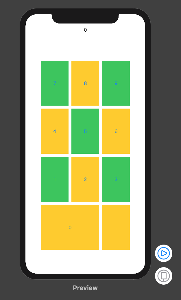
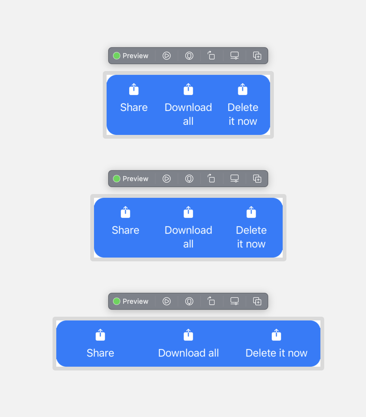
SwiftUI: buttons inside a HStack cause the overall HStack to exceed the bounds
Your fixedSize() was making it draw the HStack outside of it's bounds. You want the Texts to fill the available space, then SwiftUI will try to break on the words. If the container is too small it will break within the words so you need to be aware of this, 260 is about the smallest it can go with this font size.
Here's what I came up with, modified to be runnable with an SF symbol. You need some padding in between texts otherwise they will be right up against each other at some sizes of the container.
struct TransferDetailsButtonsView: View {
    enum ButtonType: Hashable {
        case share
        case download
        case delete

        fileprivate var imageName: String {
            switch self {
            case .share:
                return "square.and.arrow.up.fill"
            case .download:
                return "square.and.arrow.up.fill"
            case .delete:
                return "square.and.arrow.up.fill"
            }
        }

        fileprivate var title: String {
            switch self {
            case .share:
                return "Share"
            case .download:
                return "Download all"
            case .delete:
                return "Delete it now"
            }
        }
    }

    /// The button types you want to show
    var buttonTypes: [ButtonType] = [.share, .download, .delete]

    /// The action for the buttons
    var action: (ButtonType) -> Void = { _ in }

    var body: some View {
        HStack(alignment: .top, spacing: 0) {
            ForEach(buttonTypes, id: \.self) { button in
                Button {
                    action(button)
                } label: {
                    VStack(spacing: 8) {
                        Image(systemName: button.imageName)
                        Text(button.title)
                            .frame(maxWidth: .infinity)
                    }
                }
                .padding(.horizontal, 4)
            }
        }
        .padding(.vertical, 12)
        .foregroundColor(.white)
        .background(RoundedRectangle(cornerRadius: 16).fill(.blue))
    }
}
Related Topics
Convert String to Nsdate in Swift
How to Customize the Font and Appearance of a Uialertcontroller in the New Xcode W/ iOS8
Display Table View When Searchbar (From Searchcontroller) Begin Edited Swift
Using Codable to Encode/Decode from Strings to Ints with a Function in Between
Moving Skspritenode to Location of the Touch
Usage of Withmemoryrebound with Apples Swift 3 Beta 6
Name Convention for Unwrapped Value in Swift
Change Width of a Uibarbuttonitem in a Uinavigationbar in Swift
Swift Codable with Different Array Types
Swift Alamofire Add Custom Header to All Requests
How to Get Core Data Entity by It's Objectid
What's Wrong with My #If Target_Os_Simulator Code for Realm Path Definition
Swift - Kvo - Change.Newvalue and Change.Oldvalue Are Nil
Ios-Charts Set Maximum Visible X Axis Values
Swiftui Pick a Value from a List with Ontap Gesture
Unit Testing Wknavigationdelegate Functions