Arc progress bar
You can use an inline SVG with arc commands to make the arc shape. The animation can be handled with CSS by transitioning the stroke-dasharray property.
Here is an example, hover the arc to launch the loading animation :
svg {
  display: block;
  width: 40%;
  margin: 0 auto;
}
.loader {
  stroke-dasharray: .5 18 19;
  transition: stroke-dasharray 2s linear;
}
svg:hover .loader {
  stroke-dasharray: 19 0 19;
}
<svg viewbox="0 0.5 10 8">
<path d="M2 8 A 4 4 0 1 1 8 8" fill="none" stroke-width="0.78" stroke="#E8F6FD" />
<path class="loader" d="M2 8 A 4 4 0 1 1 8 8" fill="none" stroke-width="0.8" stroke="#00ACEE" />
</svg>Create and Filling arc progressively with css - circle progress bar
You can use an SVG with two arc on on top of the other and then use stroke-dash-array.
svg {  height: 90vh;  margin: auto;  display: block;}
path {  stroke-linecap: round;  stroke-width: 2;}
path.grey {  stroke: lightgrey;}
path.purple {  stroke: purple;  stroke-dasharray: calc(40 * 3.142 * 1.85);  stroke-dashoffset: 20;  /* adjust last number for variance */}
<svg xmlns="http://www.w3.org/2000/svg" xmlns:xlink="http://www.w3.org/1999/xlink" viewbox="0 0 100 100"> <path class="grey" d="M40,90 A40,40 0 1,1 60,90" style="fill:none;"/> <path class="purple" d="M40,90 A40,40 0 1,1 60,90" style="fill:none;"/></svg>How to make ArcProgress Bar in Flutter?
You can use the CircularPercentIndicator like this :
         @override
      Widget build(BuildContext context) {

        double yourPercentage = 0.5;

        return Scaffold(
          body: Center(
            child: CircularPercentIndicator(
              radius: 100.0,
              startAngle: 220,
              percent: 0.775 * yourPercentage,
              animation: true,
              backgroundColor: Colors.transparent,
              center: Text("50%"),
            ),
          ),
        );
      }
Just change the yourPercentage variable according to your needs.
UPDATE (16/05/2019)
I updated my code (not published yet on pub), but you can use like this way:
In pubspec.yaml
 percent_indicator:
    git:
      url: https://github.com/diegoveloper/flutter_percent_indicator.git
Code
    CircularPercentIndicator(
                  radius: 120.0,
                  animation: true,
                  animationDuration: 2000,
                  lineWidth: 10.0,
                  percent: 0.5,
                  reverse: true,
                  arcBackgroundColor: Colors.teal,
                  arcType: ArcType.FULL,
                  center: Text(
                    "20 hours",
                    style: TextStyle(fontWeight: FontWeight.bold, fontSize: 14.0),
                  ),
                  circularStrokeCap: CircularStrokeCap.butt,
                  backgroundColor: Colors.transparent,
                  progressColor: Colors.red,
                ),
How to create an arc shaped progress bar in Android?
In addition to the above answer, you can also use CircleProgress which seems to have something that looks exactly like your use case:
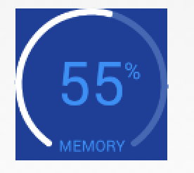
Usage:
<com.github.lzyzsd.circleprogress.ArcProgress
    android:id="@+id/arc_progress"
    android:background="#214193"
    android:layout_marginLeft="50dp"
    android:layout_width="100dp"
    android:layout_height="100dp"
    custom:arc_progress="55"
    custom:arc_bottom_text="MEMORY"/>
Also, if you check the license on this library (bottom of their README), it seems like it's very favorable to using it however you wish.
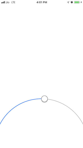
How to make Arc Progress Bar in Swift?
You can achieve this with the help of Autolayout and some radius modification with the below library.
Library : https://github.com/EranBoudjnah/MTCircularSlider
Autolayout setup for Circular Slider:
- Align Center X to Superview.
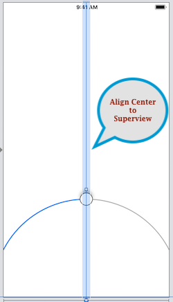
- Proportional Width to superview (Multiplier - 1.2).
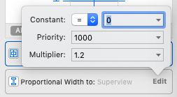
- Proportional Height to superview (Multiplier - 0.7).
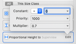
- Bottom 0 to superview.
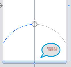
By this, you can achieve your layout.
Now 2nd step to limit your slider you need to set a radius of your slider as per your requirements of the design.
As per the above layout radius should be like below value.
Track Min Angle: 27

Track Max Angle: 153
By setting the above angle you will achieve your slider the same as ref image.
Ref Output :
Hope this will helps to achieve your goal.
Related Topics
Highlight an Individual Word Within a Text Block on Hover
How to Width-Wise Shrink-Wrap Content That Spans More Than One Line
How to Prevent CSS Interference in an Injected Piece of HTML
Document.Body.Scrollheight Yielding Two Different Results in Firefox/Chrome
Svg Resizes on Hover in Safari Only
Content Disappears Immediately After Form Submitted and Function Runs
Elements Positioned Relatively Don't Move When the Dom Is Updated (IE6 and IE7)
Retain Cursor Position in Contenteditable
Indicate That Processor-Heavy Js Function Is Running (Gif Spinners Don't Animate)
Find Next Cell Contained in Sibling Row with Queryselector
Onclick JavaScript Function Working Only on Second Click
Get Current CSS Property Value During a Transition in JavaScript
Does Animating the Value of a CSS3 Transform with JavaScript Rule Out Hardware Acceleration
Jquery/Js:Detect User's Scroll Attempt Without Any Window Overflow to Scroll To
Bootstrap Progress Bar Progression
How to Get Default Font Size in Pixels by Using JavaScript or Jquery