Applying more in depth selection to the :host CSS pseudo class
:host(.active)is for a Class selector notation:<my-element class="active" ></my-element>"
.
:host([active])is for an Attribute selector notation:<my-element active="..." ></my-element>"
.
I presume you mean to use the :active Pseudo-Class, like :hover
https://developer.mozilla.org/en-US/docs/Web/CSS/Pseudo-classes
Correct syntax:
:host(:active){
  color:yellow;
}
If you also have a :hover in your element:
:host(:hover){
  color:green;
}
you then need to force Specificity (https://css-tricks.com/specifics-on-css-specificity/) with:
:host(:active:active){
  color:yellow;
}
:not notation is then:
:host(:not(:active)){
  color:grey;
}
This of course has higher Specificity than :hover
So to make :hover work again, you need to increase Specificity:
:host(:hover:hover){
  color:green;
}
Applying selection style to slotted elements?
You can't, because slotted content is NOT moved to shadowDOM, it remains in ligthDOM.
You style slotted content in ligthDOM (in this case the main DOM)
For very detailed answer see: ::slotted CSS selector for nested children in shadowDOM slot
I added extra CSS to show:
Using variables (that penetrate shadowDOM) to declare a colors ones
Using a
#selectableDIV wrapper selects both custom elements
See for yourself what thex-widget ::selectionselector would do
Select all text:
<div id=selectable>
  <x-widget>CONTENT1</x-widget>
  <x-widget><div>CONTENT2</div></x-widget>
</div>
<style>
  body {
    --selectionBackground: green; --selectionColor: white;
    font-size: 2em;
  }
  #selectable ::selection {
    background: var(--selectionBackground); color: var(--selectionColor);
    font-weight: bold;
  }
</style>
<script>
  window.customElements.define('x-widget', class extends HTMLElement {
    constructor() {
      const template = document.createElement('template');
      template.innerHTML = `<div>TEMPLATE</div><div><slot></slot></div>`;
      const style = document.createElement('style');
      style.textContent = `
            ::selection { /* colors only template text, not slot content */
                background: var(--selectionBackground);
                color: var(--selectionColor);
            }
            ::slotted(*) {  /* selectors select HTMLElements! */
                color: red; /* CONTENT1 is TEXT, NOT an HTMLElement! */
            }`;
      super().attachShadow({mode: 'open'})
             .append(style, template.content.cloneNode(true));
    }});
</script>
Why is :read-only CSS pseudo-class being applied on this checkbox?
- Because
<input type="checkbox" />and<input type="radio" />(and most other elements) are inherently read-only. - Unlike an
<input type="text" />or<input type="date" />, when you interact with (i.e. toggle) a checkbox or radio button you are not changing itsvalue, you are changing itscheckedstate. - Yes, I agree it's counter-intuitive.
Consequently...
- You should not apply the
<input readonlyattribute to aradioorcheckboxfor any purpose.- Because it won't do anything useful.
- You should not define a CSS selector that uses the
:read-onlypseudo-class to select<input>elements that have an explicit HTML<input readonlyattribute set.- Instead use the has-attribute-selector:
input[readonly]. - It's probably a good idea just to avoid using the
:read-onlypseudo-class entirely because it also selects pretty-much every HTML element on the page too; a function with little practical utility, imo.
- Instead use the has-attribute-selector:
From the current WHATWG HTML specification (emphasis mine, especially the last point):
https://html.spec.whatwg.org/multipage/semantics-other.html#selector-read-only
The
:read-writepseudo-class must match any element falling into one of the following categories, which for the purposes of Selectors are thus considered user-alterable: [SELECTORS]
<input>elements to which the<input readonlyattribute applies, and that are mutable (i.e. that do not have the<input readonlyattribute specified and that are not<input disabled).<textarea>elements that do not have a<textarea readonlyattribute, and that are not<textarea disabled.- elements that are editing hosts or editable and are neither
<input>elements nor<textarea>elements.
- [i.e.
contenteditable]- The
:read-onlypseudo-class must match all other HTML elements.
Now, if you want a "read-only checkbox/radio" then you don't have too many good options, unfortunately; instead you have a mix of terrible options and barely-adequate ones...:
- There is this popular QA, however most of the highest-voted answers have suggestions that I think are bad ideas: such as depending upon a client-script to block user-interaction ...very imperfectly (from people who are ignorant of the fact a radio and checkbox can be manipulated in far, far more many ways than just
onclick), or using CSS'spointer-events: none;while completely disregarding the fact that computer keyboards both exist and are regularly used by human computer operators. - The least worst suggestion, I think, is using
<input type="checkbox/radio" disabled />, as demonstrated with this answer. (The<input type="hidden">is necessary because disabled (and unchecked) inputs are not submitted, which is another violation of the principle of least astonishment by the then-nascent browser vendors of the late-1990s.
If you want to use the :read-only pseudo-class on all input elements except radio and checkboxes then you need to think carefully (and test it too, using variations on document.querySeletorAll("input:read-only") in your browser's console!)
I recommend that you do not apply any styles using selectors for input elements without also explicitly specifying the [type=""] attribute selector - this is because styles with a selector like "input" (without any attribute-selectors) will be applied to future HTML input elements that we don't know about yet and could be introduced at any point in the near-future, and maybe next week Google Chrome adds a new <input type="human-dna-sample" /> or Microsoft adds <input type="clippy" /> to a particularly retro edition of their Edge browser - so you definitely don't want a :read-only style applied to those elements until you at least know how it will look and work - and so the browser will use its default/native styling which won't violate your users/visitor's expectations if they happen to come across it on your website at some point.
...so it means you need to write out rules for every known <input type="..."> as repetitive input[type=""] style rules, and now you might wonder if there were any pseudo-classes for input elements based on their default native appearance because a lot of them sure do look share similar, if not identical, native appearance and visual-semantics (and shadow DOM structure, if applicable) - for example in desktop Chrome the input types text, password, email, search, url, tel and more are all clearly built around the same native textbox widget, so there surely must be a pseudo-class for different input "kinds", right? Something like input:textbox-kind for text, password, etc and input:checkbox-kind for checkbox and radio - unfortunately such a thing doesn't exist and if introduced tomorrow the W3C's CSS committee probably wouldn't approve it for a few more years at least - so until then we need to explicitly enumerate every input[type=""] that we know about so that we can accurately anticipate how browsers will render them with our type=""-specific style rules instead of throwing everything as input {} and seeing what sticks.
...fortunately the list isn't too long, so I just wrote the rules out just now:
Feel free to copy + paste this; it's hardly even copyrightable. And I want to see how far this spreads across the Internet in my lifetime.
At the bottom is a CSS selector that will select only <input elements that are from the future by using an exhaustive set of :not([type="..."]) selectors, as well as not matching input elements with an empty type="" attribute or missing one entirely.
/* Textbox-kind: */
input[type="text"]:read-only,
input[type="password"]:read-only,
input[type="search"]:read-only,
input[type="tel"]:read-only,
input[type="url"]:read-only,
input[type="email"]:read-only,
input[type="number"]:read-only {
    background-color: #ccc;
    cursor: 'not-allowed';
}

/* Date/time pickers: */
input[type="date"]:read-only,
input[type="datetime-local"]:read-only,
input[type="time"]:read-only,
input[type="week"]:read-only,
input[type="month"]:read-only {
    background-color: #ccc;
    cursor: 'not-allowed';
}

/* Button-kind (these are all practically obsolete now btw, as the <button> element is far, far, far superior in every way) */
input[type="button"]:disabled,
input[type="reset"]:disabled,
input[type="submit"]:disabled,
input[type="image"]:disabled {
    background-color: #ccc;
    border: 1px outset #666;
    cursor: 'not-allowed';
    color: #666;
    text-shadow: 0 1px rgba(255,255,255,0.2);
}

/* Checkbox-kind (Don't use `:read-only` with these): */
input[type="checkbox"]:disabled,
input[type="radio"]:disabled {
    /* I'm not setting any properties here because it's impossible to effectively style these elements without resorting to image-replacements using the `:checked` state in selectors for their parent or adjacent `<label>` or ::before/::after` of other proximate elements. */
}

/* Weird-stuff-kind: */
input[type="color"]:read-only,
input[type="file"]:read-only,
input[type="hidden"]:read-only,
input[type="range"]:read-only {
    /* Again, due to differences in how different browsers and platforms display (and consequently style) these inputs I don't think it's worth doing anything. */
}

/* If you **really** want to select _future_ <input> elements in-advance... do this: */

input[type]:not([type="text"]):not([type="password"]):not([type="search"]):not([type="tel"]):not([type="url"]):not([type="email"]):not([type="number"]):not([type="date"]):not([type="datetime-local"]):not([type="time"]):not([type="week"]):not([type="month"]):not([type="button"]):not([type="reset"]):not([type="submit"]):not([type="image"]):not([type="checkbox"]):not([type="radio"]):not([type="color"]):not([type="file"]):not([type="hidden"]):not([type="range"]) {

}
CSS pseudo :dir(); :host-context() and directionality based styling
january 2020 answer:
As you said: the dir attribute on the body tag will (in most cases) be the only indication of a language change. Since CSS doesn't cascade (yet; as you said) the only option for now is for Elements to observe that attribute change. So I fear your only option is a MutationObserver (in the elements you own)
https://developer.mozilla.org/en-US/docs/Web/API/MutationObserver
// Options for the observer (which mutations to observe)
const config = { attributes: true, childList: false, subtree: false };
What is the different between :host ,:host() ,:host-context selectors
:host
Is syntax for styling the host component.
:host(.element)
Is an experimental CSS pseudo-class function that selects the shadow host of the shadow DOM containing the CSS it is used inside (Reference)
:host-context
Is syntax for styling a specific class anywhere outside the current element. The class must already be applied to an element outside the scope of the current element.
More in-depth info on the context of Angular applications can be found in this blog post.
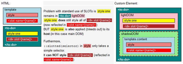
::slotted CSS selector for nested children in shadowDOM slot
styling ::slotted elements in shadowDOM
TL;DR
::slotted Specs: https://drafts.csswg.org/css-scoping/#slotted-pseudo
slotted content remains in light DOM, is reflected to a
<slot>in shadow DOM::slotted(x)targets the lightDOM outer-Element (aka 'skin'), NOT the SLOT in shadowDOM::slotted(x)takes basic selectorsInheritable styles trickle into shadowDOM
https://lamplightdev.com/blog/2019/03/26/why-is-my-web-component-inheriting-styles/For the latest WHATWG discussion on SLOT and related topics, see
- https://github.com/whatwg/html/issues/6051#issuecomment-816971072
Participants: rniwa (Apple) , annvk (Mozilla), dominic (Google) - https://github.com/WICG/webcomponents/issues/934#issuecomment-906063140
- https://github.com/whatwg/html/issues/6051#issuecomment-816971072
Interesting reads:
A history of the HTML <slot> element by Jan Miksovsky
Summary of positions on contentious bits of Shadow DOM — Web Components F2F on 2015-04-24
background
Yes, ::slotted() not styling nested elements is expected behavior.
The term slotted is counterintuitive,
it implies element lightDOM is moved to shadowDOM
slotted lightDOM is NOT moved, it remains.. hidden.. in lightDOM
the content (IF slotted) is reflected to a<slot></slot>
Or from Google Developer Documentation
, .
' ; .
I use the term reflected instead of render because render implies you can access it in shadowDOM.
You can not, because slotted content isn't in shadowDOM... only reflected from lightDOM.
Why :slotted has limited functionality
More advanced shadowDOM styling was tried.
WebComponents version 0 (v0) had <content> and ::content; but it was removed from the spec:
https://developer.mozilla.org/en-US/docs/Web/HTML/Element/content
The main takeway from the W3C standards discussions
(@hayatoito (Google team) here and here) is:
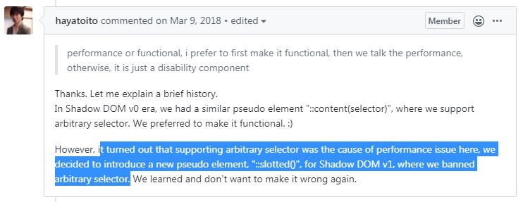
So in V1 we have :slotted: https://developer.mozilla.org/en-US/docs/Web/CSS/::slotted
Addition #1 : Performance if ::slotted allowed for complex selectors
From Mozilla developer Emilio:
source: https://github.com/w3c/webcomponents/issues/889
The performance issue is that it increments the amount of subtrees in
which every node needs to go look for rules that affect to them.Right now the logic goes like: if you're slotted, traverse your slots
and collect rules in their shadow trees as needed. This is the code
This is nice because the complexity of styling the element
depends directly on the complexity of the shadow trees that you're
building, and it only affects slotted nodes.If you want to allow combinators past slotted then every node would
need to look at its ancestor and prev-sibling chain and look at which
ones of them are slotted, then do that process for all their slots.
Then, on top, you also need to change the general selector-matching
code so that selectors that do not contain slotted selectors don't
match if you're not in the right shadow tree.That's a cost that you pay for all elements, regardless of whether you
use Shadow DOM or ::slotted, and is probably just not going to fly.
So due to performance issues
:slotted( S ) got limited CSS selector functionality:
► it only takes simple selectors for S. --> Basically anything with a space won't work
► it only targets lightDOM 'skin'. --> In other words, only the first level
<my-element>
  <h1>Hello World</h1>
  <p class=foo>
    <span>....</span>
  </p>
  <p class=bar>
    <span>....</span>
  </p>
</my-element>
::slotted(h1)and::slotted(p)works::slotted(.foo)works::slotted(span)(or anything deeper) will not work (not a 'skin' element)
Note: ::slotted([Simple Selector]) confirms to Specificity rules,
but (being simple) does not add weight to lightDOM skin selectors, so never gets higher Specificity.
You might need !important in some (rare) use cases.
 <style>
  ::slotted(H1) {
    color: blue !important;
  }
 <style>
Styling slotted content
Also see: Applying more in depth selection to the :host CSS pseudo class
#1 - style lightDOM
The <span> is hidden in lightDOM, any changes made there will continue to reflect to its slotted representation.
That means you can apply any styling you want with CSS in the main DOM
(or a parent shadowDOM container if you wrapped <my-element> in one)
 <style>
  my-element span {
    .. any CSS you want
  }
 <style>
#2 - (workaround) move lightDOM to shadowDOM
If you move lightDOM to shadowDOM with: this.shadowRoot.append(...this.childNodes)
you can do all styling you want in a shadowDOM <style> tag.
Note: You can not use <slot></slot> and :slotted() anymore now.<slot>s only works with content reflected from lightDOM.
For an example where an element wraps itself in an extra shadowDOM layer,
so no CSS bleeds out, and <slot>s can be used, see:
- https://jsfiddle.net/WebComponents/5w3o2q4t/?slotmeister
#3 - ::part (shadow Parts)
It is a different/powerful way of styling shadowDOM content:
Apple finally implemented shadowParts in Safari 13.1, March 2020
see:
https://meowni.ca/posts/part-theme-explainer/
https://css-tricks.com/styling-in-the-shadow-dom-with-css-shadow-parts/
https://dev.to/webpadawan/css-shadow-parts-are-coming-mi5
https://caniuse.com/mdn-html_global_attributes_exportparts
Note! ::part styles shadowDOM,<slot></slot> content remains in lightDOM!
references
be aware: might contain v0 documentation!
https://css-tricks.com/encapsulating-style-and-structure-with-shadow-dom/
https://developers.google.com/web/fundamentals/web-components/shadowdom?hl=en#composition_slot
https://polymer-library.polymer-project.org/2.0/docs/devguide/style-shadow-dom#style-your-elements
https://github.com/w3c/webcomponents/issues/331
https://github.com/w3c/webcomponents/issues/745
https://developer.mozilla.org/en-US/docs/Web/API/HTMLSlotElement/slotchange_event
::part() - https://developer.mozilla.org/en-US/docs/Web/CSS/::part
Example: Using slots as a router
Change the slot-name on buttonclick and reflect content from lightDOM:
<template id=MY-ELEMENT>
  <style>
    ::slotted([slot="Awesome"]){
      background:lightgreen
    }
  </style>
  <slot><!-- all unslotted content goes here --></slot>
  <slot id=answer name=unanswered></slot>
</template>
<style>/* style all IMGs in lightDOM */
  img { max-height: 165px;border:3px dashed green }
  img:hover{ border-color:red }
</style>
<my-element><!-- content below is: lightDOM! -->
  SLOTs are: <button>Cool</button> <button>Awesome</button> <button>Great</button>
  <span slot=unanswered>?</span>
  <div  slot=Cool>   <img src="https://i.imgur.com/VUOujQT.jpg"></div>
  <span slot=Awesome><b>SUPER!</b></span>
  <div  slot=Awesome><img src="https://i.imgur.com/y95Jq5x.jpg"></div>
  <div  slot=Great>  <img src="https://i.imgur.com/gUFZNQH.jpg"></div>
</my-element>
<script>
  customElements.define('my-element', class extends HTMLElement {
    connectedCallback() {
      this.attachShadow({mode:'open'})
          .append(document.getElementById(this.nodeName).content.cloneNode(true));
      this.onclick = (evt) => {
           const label = evt.composedPath()[0].innerText; // Cool,Awesome,Great
           this.shadowRoot.getElementById("answer").name = label;
      }
    }
  });
</script>
Why do I have to use ':host /deep/ .className' to select an element that is dynamically created by angular?
The default ViewEncapsulation for Angular components (ViewEncapsulation.Emulated) achieves style scoping by adding an attribute containing a surrogate id to the elements of the component template and pre-processing the style rules provided via styles or styleUrls, adding the new host element attribute to all selectors, so that the styling rules you define for a component only apply to that component and not the contents its child components. The advantage here is that your styling is less likely to have unpredicted effects on other components--in this case, mat-horizantal-stepper.
So, for example:
<div class="className">
...
</div>
would end up being rendered as something like
<div class="className" _ngcontent-0>
...
</div>
and your styling rules will compile to target that attribute specifically, like:
div.className[_ngcontent-0] {
  ...
}
The trick to understanding your example is that div.mat-horizontal-stepper-header-container and div.mat-horizontal-content-container are both inside of mat-horizantal-stepper, a child component of app-merchandise-dialog with its own encapsulation rules, and therefore will not be given those surrogate ID attributes. What that /deep/ selector does is tells the angular compiler to stop targeting that attribute.
So, while :host .className will compile to
host-element .className[_ngcontent-0] {
   ...
}
:host /deep/ .className will compile to
host-element .className {
   ...
}
By the way, you can turn off this view encapsulation feature like this:
@Component({
  ...
  encapsulation: ViewEncapsulation.None
})
which will allow your styling rules to apply globally instead; of course, then you need to be more careful about unintended application of your styling rules.
How to properly add css pseudo selectors to a Blazor project
Looks like it's the spaces. This works:
Test.razor
@page "/Test"
<h3>Test Page</h3>
<div class="m-5">
    <button class="login-button">Log In</button>
</div>
<style>
    .login-button:focus {
        outline: ridge !important;
    }
</style>
Test.razor.css
.login-button:hover {
    background-color: forestgreen;
}

/*.login-button:focus {
    outline: ridge !important;
}
*/
Take you choice:
- Inline will apply to all matches across the page.
- Isolation will only apply to the specific component.
Angular :host selector is not working
From the docs:
Use the :host pseudo-class selector to target styles in the element
that hosts the component (as opposed to targeting elements inside the
component's template).
So
:host {
  display: block;
  border: 1px solid white;
}
will set the style for the whole host, so your element will just inherit of that style.
Here you are setting a class style .active but :host is not taken in consideration.
:host .active {
  display: block;
  border: 1px solid white;
}
Do
:host(.active) {
  display: block;
  border: 1px solid white;
}
Related Topics
Adding Style Stored in a Variable Inside React Class
Android Webview, Loading JavaScript File in Assets Folder
Why Do Arabic Characters Behave as Separate Characters When Styling Single Arabic Character
How to Grab the CSS Truncated Text via Jquery
Detect Support for Background-Attachment: Fixed
Position Sticky: Scrollable, When Longer Than Viewport
Animation for Newly Rendered Elements, But Not on Page Load
JavaScript Invalidcharactererror When Modifying a CSS Name with a Space
Semantic-Ui Modal Size Keeps Extending to the Height of a Page
Angular: Why Doesn't CSS Justification Work with Ng-Repeat
Permanently Change CSS Property with JavaScript/D3Js/Jquery
Fixing Sub-Pixel Rounding Issue in a CSS Fluid Grid
How to Add an Icon to the Options in React-Select
Adding Custom CSS and Js to Shopify
Opening an External Website in a Modal Popup