Correct way to layout SwiftUI (similar to Autolayout)
As you've somewhat discovered, the first piece is that you need to decide what you want. In this case, you seem to want left-alignment (based on your padding solution). So that's good:
    HStack {
        Text("Latitude:")
        Text(verbatim: "\(randomNumber)")
        Spacer()
    }
That's going to make the HStack as wide as its containing view and push the text to the left.
But from you later comments, you seem to not want it to be on the far left. You have to decide exactly what you want in that case. Adding .padding will let you move it in from the left (perhaps by adding .leading only), but maybe you want to match it to the screen size.
Here's one way to do that. The important thing is to remember the basic algorithm for HStack, which is to give everyone their minimum, and then split up the remaining space among flexible views.
    HStack {
        HStack {
            Spacer()
            Text("Latitude:")
        }
        HStack {
            Text(verbatim: "\(randomNumber)")
            Spacer()
        }
    }
The outer HStack has 2 children, all of whom are flexible down to some minimum, so it offers each an equal amount of space (1/2 of the total width) if it can fit that.
(I originally did this with 2 extra Spacers, but I forgot the Spacers seem to have special handling to get their space last.)
The question is what happens if randomNumber is too long? As written, it'll wrap. Alternatively, you could add .fixedSize() which would stop it from wrapping (and push Latitude to the left to make it fit). Or you could add .lineLimit(1) to force it to truncate. It's up to you.
But the important thing is the addition of flexible HStacks. If every child is flexible, then they all get the same space.
If you want to force things into thirds or quarters, I find you need to add something other than a Spacer. For example, this will give Latitude and the number 1/4 of the available space rather than 1/2 (note the addition of Text("")):
    HStack {
        HStack {
            Text("")
            Spacer()
        }
        HStack {
            Spacer()
            Text("Latitude:")
        }
        HStack {
            Text(verbatim: "\(randomNumber)")//.lineLimit(1)
            Spacer()
        }
        HStack {
            Text("")
            Spacer()
        }
    }
In my own code, I do this kind of thing so much I have things like
struct RowView: View {
    // A centered column
    func Column<V: View>(@ViewBuilder content: () -> V) -> some View {
        HStack {
            Spacer()
            content()
            Spacer()
        }
    }

    var body: some View {
        HStack {
            Column { Text("Name") }
            Column { Text("Street") }
            Column { Text("City") }
        }
    }
}
Autolayout in SwiftUI
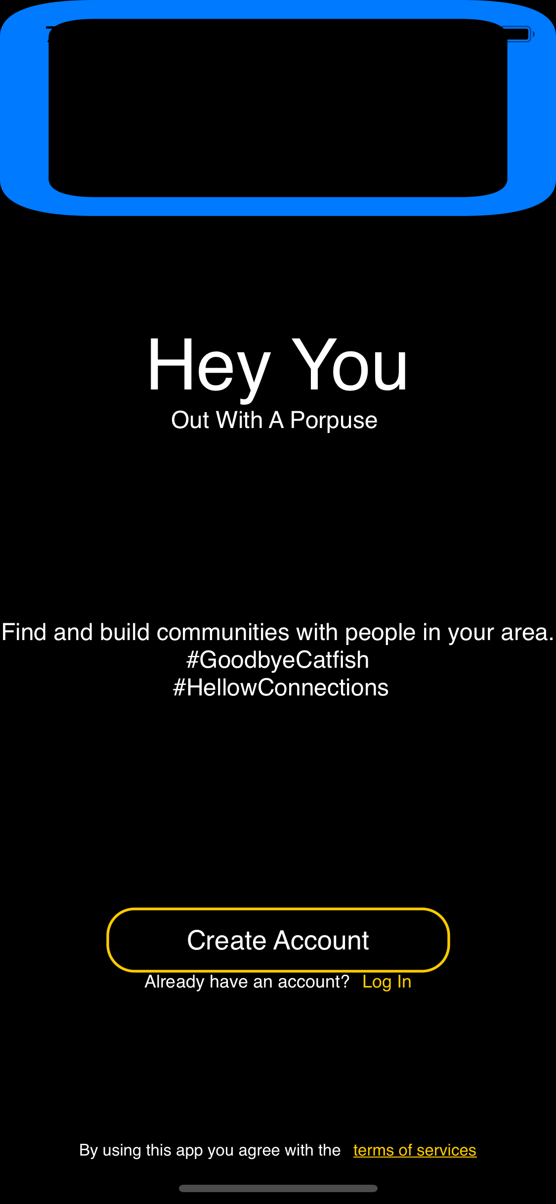
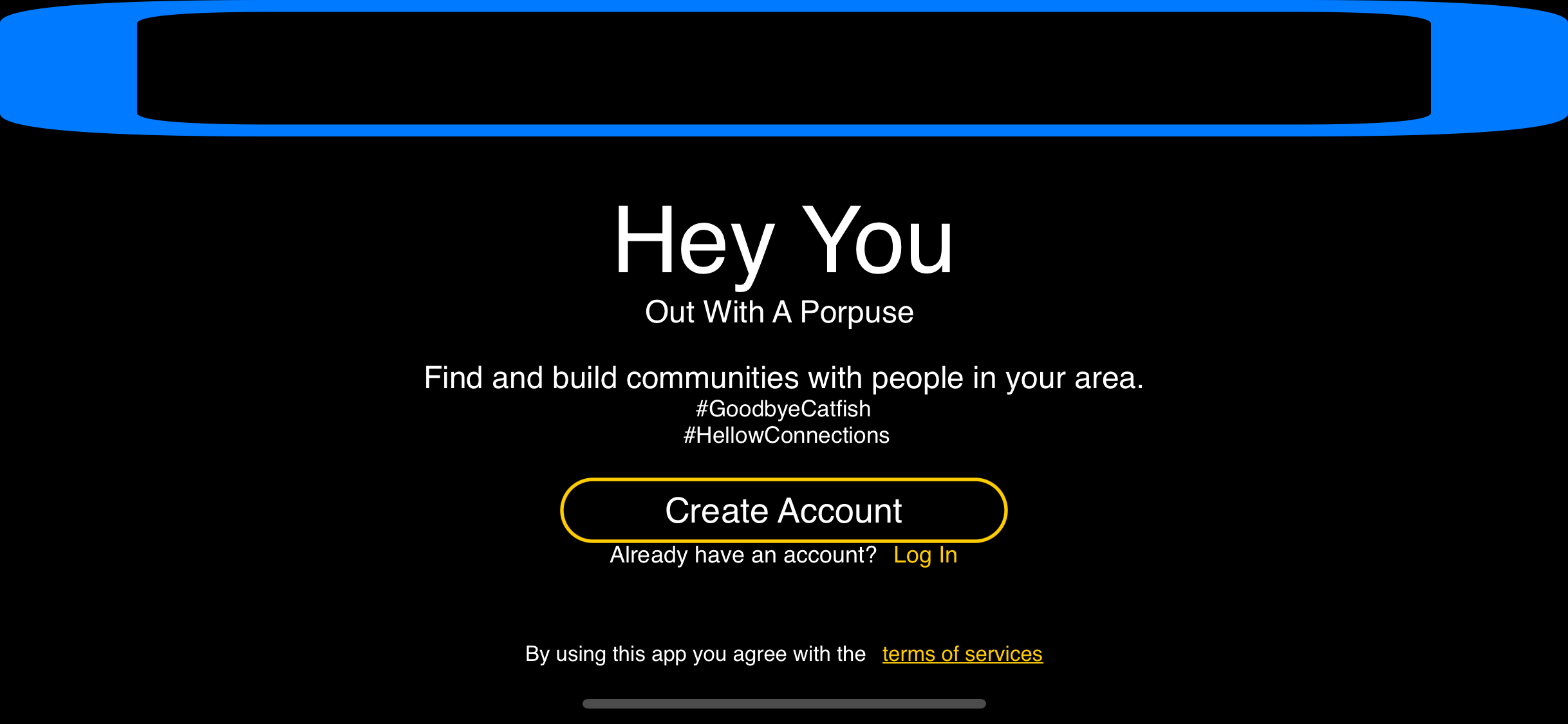
Here is a version of your code that works for all screen sizes and positions. Less is more in SwiftUI. The more the hardcoded values the harder it is for SwiftUI to do the adjusting.
struct OnBoardingView: View {
    var ImageOnTop:some View{
        //Just to simulate,I switched to a system image you will have to adjust for your own
        Image(systemName: "square")
            .resizable()
            .foregroundColor(.blue)
    }

    var Title:some View {
        Text("Hey You")
            .font(.custom("Montserrat-Medium", size: 48))
            .foregroundColor(.white)


    }
    var subTitle:some View{
        Text("Out With A Porpuse ")
            .font(.custom("Montserrat-SemiBold", size: 16))
            .foregroundColor(.white)
    }
    var secondSubtitle:some View{
        VStack{
            Text("Find and build communities with people in your area.")
                .lineLimit(1)
            Text("#GoodbyeCatfish \n #HellowConnections")
        }

        .font(.custom("Montserrat-Regular", size: 16))
        .foregroundColor(.white)
        .multilineTextAlignment(.center)
        .minimumScaleFactor(0.5)
    }

    var navigatinButton:some View{
        VStack(alignment:.center){
            NavigationLink(
                destination: Text("CreateAccountView()"),
                label: {
                    Text("Create Account")
                })
                .font(.custom("Montserrat-Medium", size: 18))
                .foregroundColor(.white)
                //Don't fix the size or thre won't be any differences between devices
                .frame(minWidth: 0, idealWidth: 230, maxWidth: 230, minHeight: 0, idealHeight: 42, maxHeight: 42, alignment: .center)
                .overlay(RoundedRectangle(cornerRadius: 18)
                .stroke(Color.yellow, lineWidth: 1.8))
            HStack{
                Text("Already have an account?")
                    .font(.custom("Montserrat-Regular", size: 12))
                    .foregroundColor(.white)
                    .multilineTextAlignment(.leading)
                NavigationLink(
                    destination: Text("LoginView(LoginViewM: LoginViewModel()"),
                    label: {
                        Text("Log In")
                    })
                    .font(.custom("Montserrat-Regular", size: 12))
                    .foregroundColor(.yellow)
            }
        }
    }

    var lastString: some View{
        HStack{
            Text("By using this app you agree with the")
                .foregroundColor(.white)
                .font(.custom("Montserrat-Medium", size: 11))
            Text("terms of services")
                .underline(true, color: .yellow)
                .foregroundColor(.yellow)
                .font(.custom("Montserrat-Medium", size: 11))

        }
        .padding(30)
    }
    var body: some View {
        GeometryReader{ geometry in
            NavigationView{
                VStack{
                    ImageOnTop
                        .frame(height: geometry.size.height * 0.2)
                    VStack{
                        Title
                        subTitle
                    }.frame(height: geometry.size.height * 0.25)

                    Spacer()
                    secondSubtitle
                    //You can give spaces more weight by addign spacers
                    //This makes the space above the button twice as wide as the bottom
                    Spacer()
                    Spacer()
                    navigatinButton
                    Spacer()
                    lastString
                }
                .background(Color.black)
                .edgesIgnoringSafeArea(.all)
                .navigationBarHidden(true)
            }
            .navigationBarBackButtonHidden(true)
        }

    }
}
SwiftUI: how to set a greater than or equal constraint like UIKit's AutoLayout?
Here is a possible solution:
struct ItemView: View {
    let text: String

    var body: some View {
        Text(text)
            .foregroundColor(.white)
            .lineLimit(nil)
            .padding(10)
            .background(Color.blue)
            .cornerRadius(17)
    }
}
struct ContentView: View {
    let texts = ["Short text", "Lorem ipsum dolor sit amet, consectetur adipiscing elit, sed do eiusmod tempor incididunt ut labore et dolore magna aliqua."]

    var body: some View {
        ZStack(alignment: .trailing) {
            Color.clear
            VStack {
                ForEach(texts, id: \.self) { text in
                    HStack {
                        Spacer()
                        ItemView(text: text)
                    }
                    .padding(.horizontal, 11)
                    .padding(.vertical, 8)
                }
            }
        }
    }
}
Note that instead of \.self in ForEach(texts, id: \.self) you may want to provide a way to identify texts (if they can be non-unique).
SwiftUI doesn't use auto layout, how to create a unique size interface for all devices?
SwiftUI does the autolayout for you, it is different than UIKit you are supposed to support all screens at once, that is why the spacing changes but your can set "rules"
//Prevents the repeating of code
struct ImageView: View {
    var deeplinkURLFirst: URL
    let mainColor: Color
    //Add another parameter for the image info I counldn't reprodice that
    var body: some View {
        Link(destination: deeplinkURLFirst) {
            ZStack {
                RoundedRectangle(cornerRadius: 10)
                    .foregroundColor(mainColor)
                    .overlay(
                    //Keep image within rectangle bounds
                    //The systemName stuff is just to replicate an actual image fill in with your image code
                    Image(systemName: "square")
                    .resizable())
            }
        }
        //Rule
        //Keep the images squares or you can set frame using your iconSize
        //for all but the size of an iPhone 7 or SE is not the same
        //as a ProMax it is best to set a ratio
        //If you fix the size padding will have to give way to adjust for larger/smaller screens.
        .aspectRatio(1, contentMode: .fit)

    }
}
struct WidgetTestEntryView : View {
    //var entry: Provider.Entry //I am just working with the View itself not a widget
    var deeplinkURLFirst: URL {
        URL(string: "\("WIDGET_DEEP_LINK")0")!
    }
    let iconSize: CGFloat = 75.0
    var widgetLabel = "Favourites"
    let mainColor = Color(red: 0.218, green: 0.215, blue: 0.25)
    let setSpacing: CGFloat = 4
    var body: some View {
        //Having multiple of GeometryReader just adds to the confusion look at the View as a whole vs pieces
        //Less is more with SwiftUI it is meant to support multiple screens
        //Set simple rules
        GeometryReader { geo in
        VStack(spacing: 0) {
                //Top portion
                HStack(spacing: geo.size.width * 0.4){
                    Text(widgetLabel).foregroundColor(.white).font(.system(size: geo.size.width * 0.045, weight: .semibold, design: .default))
                    //The systemName stuff is just to replicate an actual image fill in with your image code
                    Image(systemName: "square").resizable().foregroundColor(.white)
                        .frame(width: geo.size.width * 0.15, height: 15, alignment: .center)
                }
                //Using to many of these will end up causing conflicts
                //SwiftUI does a lot of the work for you
                .frame(maxWidth: .infinity, maxHeight: geo.size.height * (1/3))
                //Rule:
                //This will set the space between the boxes
                HStack(spacing: setSpacing)
                {
                    //Add another parameter for the image info I counldn't reproduce that without data
                    ImageView(deeplinkURLFirst: deeplinkURLFirst, mainColor: mainColor)
                    ImageView(deeplinkURLFirst: deeplinkURLFirst, mainColor: mainColor)
                    ImageView(deeplinkURLFirst: deeplinkURLFirst, mainColor: mainColor)
                    ImageView(deeplinkURLFirst: deeplinkURLFirst, mainColor: mainColor)
                }
                //Rule:
                //Keep the edge of the boxes from the edge of the screen/HStack
                //It is just a minimum so this will give if the space requries it to maintain ratio and spacing between boxes
                .padding(setSpacing)

                //This might need adjusting but the % of the top + the % of the bottom should == 1
                .frame(width: geo.size.width, height: geo.size.height * (2/3), alignment: .center)
                //This color needs to be adjusted to the right Color
                .background(Color(UIColor.darkGray))
            }
        }
        .background(Color(red: 0.118, green: 0.118, blue: 0.15))
        //Just to simualte widget size without crating a widget you shouldn't need it in your actual code
        .frame(maxWidth: 350, maxHeight: 150)
        .cornerRadius(20)
        .onAppear {
            print("all good")

        }
    }
}
How to alternate centerX auto layout constraint in SwiftUI
Here is possible solution (tested with Xcode 12.1 / iOS 14.1)
    HStack {
        Spacer()
        Text("1350 / 2917")
            .frame(alignment: .center)
            .foregroundColor(.white)
            .font(.title2)
        Spacer().overlay(
            Text("ml")
                .foregroundColor(.white)
                .font(.footnote)
                .padding(.leading, 2), alignment: .leading)
    }
How can I make a view align it's center to the top of another view in SwiftUI?
A possible approach is to use alignmentGuide modifier, which allows to fit specific internal alignment line to parent container. So by default containers have center alignment, so using top anchor instead for one of views result in align other's center to top.
Tested with Xcode 13.2 / iOS 15.2
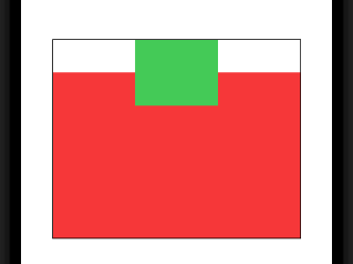
struct DemoView: View {
    var body: some View {
        ZStack {
            Rectangle().fill(.red)
                .frame(width: 300, height: 200)
                .alignmentGuide(VerticalAlignment.center) {   // << here !!
                    $0[VerticalAlignment.top]
                }
            Rectangle().fill(.green)
                .frame(width: 100, height: 80)
        }
        .border(Color.black)
    }
}
HTML-like table layout (i.e. auto-resizing table cells) in SwiftUI View?
GridItem(.flexible()) gives all cells a flexible, but SAME width. Seems like you are looking for flexible widths. The easiest way would be to skip LazyVGrid and just use HStack and VStack, they size themselves variable based on their content:
    var body: some View {

        HStack {
            ForEach(0..<5) { col in
                VStack(alignment: .leading) {
                    ForEach(0..<4) { row in
                        let index = row*5 + col
                        if index < words.count {
                            Text(words[index])
                        } else {
                            Text("")
                        }
                    }
                }
            }
        }
        .padding()
        .frame(width:600)
    }
Related Topics
Circle Image in Cell Imageview and How to Resize It
Xcode 6 & Swift: Black Bars Appear Above and Below the Viewcontroller on iOS 7 iPhone 5 Device
Sort Alphanumeric Array, Consecutive Numbers Should Reside at Last
Please Specify a Platform for This Target in Your Podfile
Code Coverage Result Is Not Accurate to Real Coverage in Xcode 7
In Collectionview How to Set Colors According to Selection
Setting a Stateobject Value from Child View Causes Navigationview to Pop All Views
Show Two Different Custom Cells in Same Uitableview - Swift Firebase
Avcapturestillimageoutput VS Avcapturephotooutput in Swift 3
Swift Universal Framework Depending on Pod
Does Not Have a Member 'Instantiatewithowner'
Get Index of Object from Array of Dictionary with Key Value
Peek/Pop Preview Ignores Cell Corner Radius in Collection View
Create Navbar Programmatically with Button and Title Swift