Rounded corners on rectangular image using CSS only
You do that by adding a parent div to your img and the code flows as follows
figure{
    width:150px;
    height:150px;
    border-radius:50%;
    overflow:hidden;
}
Updated Demo
How to get this rounded corner effect using only CSS?
Use border-radius on the parent + overflow: hidden.
Creating rounded corners using CSS
Since CSS3 was introduced, the best way to add rounded corners using CSS is by using the border-radius property. You can read the spec on the property, or get some useful implementation information on MDN:
If you are using a browser that doesn't implement border-radius (Chrome pre-v4, Firefox pre-v4, IE8, Opera pre-v10.5, Safari pre-v5), then the links below detail a whole bunch of different approaches. Find one that suits your site and coding style, and go with it.
- CSS Design: Creating Custom Corners
& Borders - CSS Rounded Corners 'Roundup'
- 25 Rounded Corners Techniques with CSS
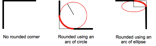
Avoid elliptical shape in CSS border-radius
(source: mozilla.org)
Formally, the syntax for the border-radius property accepts 2 values for each corner: a horizontal radius and a vertical radius (separated by a slash). The following line would create an elliptical border-radius similar to the third image above.
border-radius: 10px / 5px;
Usually, we only specify one value. In this case, that value gets used as both the vertical and horizontal radii. The following line would create a circular border-radius similar to the second image above.
border-radius: 10px;
Using Percentages
The Mozilla Developer's Network defines the possible value types for this property as follows:
<length>
Denotes the size of the circle radius or the semi-major and semi-minor axes of the ellipsis. It can be expressed in any unit allowed by the CSS data types. Negative values are invalid.<percentage>
Denotes the size of the circle radius, or the semi-major and semi-minor axes of the ellipsis, using percentage values. Percentages for the horizontal axis refer to the width of the box, percentages for the vertical axis refer to the height of the box. Negative values are invalid.
Using a single value to create a circular radius is fine when we're using absolute length units like pixels or ems, but gets more complicated when we're using percentages. Since the single-value usage of this property is synonymous with using the same value twice, the following two lines are equivalent; however, these would not necessarily create a circular border-radius.
border-radius: 50%;
border-radius: 50%/50%;
These lines say to "create an ellipse or circle whose vertical radius is equal to 50% of the element's height and whose horizontal radius is equal to 50% of the element's width, and use that as the border-radius.". If the element is 200 pixels wide and 100 pixels tall, this results in an ellipse rather than a circle.
Solution
If you want a circular border-radius, the easiest thing to do is to use absolute measurement units (like pixels or ems or anything besides percentage), but sometimes that doesn't fit your use case and you want to use percentages. If you know the aspect-ratio of the containing element, you still can! In the example below, since my element is twice as wide as it is tall, I've scaled the horizontal radius in half.
#rect {
  width: 200px;
  height: 100px;
  background: #000;
  border-radius: 25%/50%;
}
<div id="rect"></div>CSS Circular Cropping of Rectangle Image
The approach is wrong, you need to apply the border-radius to the container div instead of the actual image.
This would work:
.image-cropper {
  width: 100px;
  height: 100px;
  position: relative;
  overflow: hidden;
  border-radius: 50%;
}

img {
  display: inline;
  margin: 0 auto;
  height: 100%;
  width: auto;
}
<div class="image-cropper">
<img src="https://via.placeholder.com/150" class="rounded" />
</div>Rounded corners on background-image CSS
Looks like it's because the background image isn't expanding to the far corners of the element it's assigned to, so the border-radius isn't clipping the image. You likely just need to modify the background-size property, or potentially use a different image. I'm using background-size: cover here, which will cause the image to stretch to fill the element without distorting the aspect ratio.
h1 {

  font-family: Lobster;

  color: Orange;

  font-size: 64px;

  padding: 40px;

  text-align: center;

}

.header {

  background-image: url("https://futurism.com/wp-content/uploads/2015/11/neildegrassetyson.jpg");

  height: 400px;

  background-position: center center;

  background-size: cover;

  border-radius: 50px;

  background-repeat: no-repeat;

  margin: 20px;

}
<div class="header">
<h1> Joe's Pizza </h1>
</div>Related Topics
Why Isn't This Element Rotation Working
How to Save a File from a Website as PDF
Customise Ng Bootstrap Carousel in Angular
How to Tidy Up an HTML File's Indentation in Vi
Css: Why Background-Color Breaks/Removes the Box-Shadow
What Does the Clearfix Class Do in CSS
How to Use External Font in CSS
Remove ':Hover' CSS Behavior from Element
Changing Variable Dynamically (At Runtime) via Less and CSS
How to Set the Thumbnail Image on HTML5 Video
Overflow-Y Scroll Not Working in Ie 11
Vertically Centering a Div in Body
How to Open Submenu on Hover of Main Menu
Making a Custom Input Text Type
Best JSON-Ld Practices: Using Multiple <Script> Elements