HTML table with 100% width, with vertical scroll inside tbody
In order to make <tbody> element scrollable, we need to change the way it's displayed on the page i.e. using display: block; to display that as a block level element.
Since we change the display property of tbody, we should change that property for thead element as well to prevent from breaking the table layout.
So we have:
thead, tbody { display: block; }

tbody {
    height: 100px;       /* Just for the demo          */
    overflow-y: auto;    /* Trigger vertical scroll    */
    overflow-x: hidden;  /* Hide the horizontal scroll */
}
Web browsers display the thead and tbody elements as row-group (table-header-group and table-row-group) by default.
Once we change that, the inside tr elements doesn't fill the entire space of their container.
In order to fix that, we have to calculate the width of tbody columns and apply the corresponding value to the thead columns via JavaScript.
Auto Width Columns
Here is the jQuery version of above logic:
// Change the selector if needed
var $table = $('table'),
    $bodyCells = $table.find('tbody tr:first').children(),
    colWidth;

// Get the tbody columns width array
colWidth = $bodyCells.map(function() {
    return $(this).width();
}).get();

// Set the width of thead columns
$table.find('thead tr').children().each(function(i, v) {
    $(v).width(colWidth[i]);
});
And here is the output (on Windows 7 Chrome 32):

WORKING DEMO.
Full Width Table, Relative Width Columns
As the Original Poster needed, we could expand the table to 100% of width of its container, and then using a relative (Percentage) width for each columns of the table.
table {
    width: 100%; /* Optional */
}

tbody td, thead th {
    width: 20%;  /* Optional */
}
Since the table has a (sort of) fluid layout, we should adjust the width of thead columns when the container resizes.
Hence we should set the columns' widths once the window is resized:
// Adjust the width of thead cells when *window* resizes
$(window).resize(function() {
    /* Same as before */
}).resize(); // Trigger the resize handler once the script runs
The output would be:

WORKING DEMO.
Browser Support and Alternatives
I've tested the two above methods on Windows 7 via the new versions of major Web Browsers (including IE10+) and it worked.
However, it doesn't work properly on IE9 and below.
That's because in a table layout, all elements should follow the same structural properties.
By using display: block; for the <thead> and <tbody> elements, we've broken the table structure.
Redesign layout via JavaScript
One approach is to redesign the (entire) table layout. Using JavaScript to create a new layout on the fly and handle and/or adjust the widths/heights of the cells dynamically.
For instance, take a look at the following examples:
- jQuery .floatThead() plugin (a floating/locked/sticky table header plugin)
- jQuery Scrollable Table plugin. (source code on github)
- jQuery .FixedHeaderTable() plugin (source code on github)
- DataTables vertical scrolling example.
Nesting tables
This approach uses two nested tables with a containing div. The first table has only one cell which has a div, and the second table is placed inside that div element.
Check the Vertical scrolling tables at CSS Play.
This works on most of web browsers. We can also do the above logic dynamically via JavaScript.
Table with fixed header on scroll
Since the purpose of adding vertical scroll bar to the <tbody> is displaying the table header at the top of each row, we could position the thead element to stay fixed at the top of the screen instead.
Here is a Working Demo of this approach performed by Julien.
It has a promising web browser support.
And here a pure CSS implementation by Willem Van Bockstal.
The Pure CSS Solution
Here is the old answer. Of course I've added a new method and refined the CSS declarations.
Table with Fixed Width
In this case, the table should have a fixed width (including the sum of columns' widths and the width of vertical scroll-bar).
Each column should have a specific width and the last column of thead element needs a greater width which equals to the others' width + the width of vertical scroll-bar.
Therefore, the CSS would be:
table {
    width: 716px; /* 140px * 5 column + 16px scrollbar width */
    border-spacing: 0;
}

tbody, thead tr { display: block; }

tbody {
    height: 100px;
    overflow-y: auto;
    overflow-x: hidden;
}

tbody td, thead th {
    width: 140px;
}

thead th:last-child {
    width: 156px; /* 140px + 16px scrollbar width */
}
Here is the output:

WORKING DEMO.
Table with 100% Width
In this approach, the table has a width of 100% and for each th and td, the value of width property should be less than 100% / number of cols.
Also, we need to reduce the width of thead as value of the width of vertical scroll-bar.
In order to do that, we need to use CSS3 calc() function, as follows:
table {
    width: 100%;
    border-spacing: 0;
}

thead, tbody, tr, th, td { display: block; }

thead tr {
    /* fallback */
    width: 97%;
    /* minus scroll bar width */
    width: -webkit-calc(100% - 16px);
    width:    -moz-calc(100% - 16px);
    width:         calc(100% - 16px);
}

tr:after {  /* clearing float */
    content: ' ';
    display: block;
    visibility: hidden;
    clear: both;
}

tbody {
    height: 100px;
    overflow-y: auto;
    overflow-x: hidden;
}

tbody td, thead th {
    width: 19%;  /* 19% is less than (100% / 5 cols) = 20% */
    float: left;
}
Here is the Online Demo.
Note: This approach will fail if the content of each column breaks the line, i.e. the content of each cell should be short enough.
In the following, there are two simple example of pure CSS solution which I created at the time I answered this question.
Here is the jsFiddle Demo v2.
Old version: jsFiddle Demo v1
How to set tbody height with overflow scroll
If you want tbody to show a scrollbar, set its display: block;.
Set display: table; for the tr so that it keeps the behavior of a table.
To evenly spread the cells, use table-layout: fixed;.
DEMO 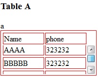
CSS:
table, tr td {
    border: 1px solid red
}
tbody {
    display: block;
    height: 50px;
    overflow: auto;
}
thead, tbody tr {
    display: table;
    width: 100%;
    table-layout: fixed;/* even columns width , fix width of table too*/
}
thead {
    width: calc( 100% - 1em )/* scrollbar is average 1em/16px width, remove it from thead width */
}
table {
    width: 400px;
}
If tbody doesn't show a scroll, because content is less than height or max-height, set the scroll any time with: overflow-y: scroll;. DEMO 2
<editS/updateS> 2019 - 04/2021
- Important note: this approach to making a table scrollable has drawbacks in some cases. (See comments below.) some of the duplicate answers in this thread deserves the same warning by the way
WARNING: this solution disconnects the thead and tbody cell grids; which means that in most practical cases, you will not have the cell alignment you expect from tables. Notice this solution uses a hack to keep them sort-of aligned: thead { width: calc( 100% - 1em ) }
Anyhow, to set a scrollbar, a display reset is needed to get rid of the table-layout (which will never show scrollbar).
Turning the
<table>into a grid viadisplay:grid/contentswill also leave a gap in between header and scrollable part, to mind about. (idem if built from divs)overflow:overlay;has not yet shown up in Firefox ( keep watching it)position:stickywill require a parent container which can be the scrolling one. make sure yourtheadcan be sticky if you have a few rows androwspan/colspanheaders in it (it does not with chrome).
So far, there is no perfect solution yet via CSS only. there is a few average ways to choose along so it fits your own table (table-layout:fixed; is .. fixing table and column's width, but javascript could probably be used to reset those values => exit pure CSS)
How to apply width 100% with scroll able table body
You'll need to clear a few styles that initially come with tables as well as set a width of 33% since you're using 3 column headers (100%/3)
See below:
table {    width: 100%;    border-collapse: collapse;    border-spacing: 0;    border: 2px solid black;}
thead, tbody, tr, td, th { display: block; }
tr:after {    content: ' ';    display: block;    visibility: hidden;    clear: both;}
thead th {     height: 30px;    line-height: 30px;    text-align: left;}
tbody {    height: 100px;    overflow-y: auto;}
thead {    /* fallback */    width: 97%;    /* minus scroll bar width */    width: calc(100% - 17px);}
tbody { border-top: 2px solid black; }
tbody td, thead th {    width: 33%;    float: left;}
tbody td:last-child, thead th:last-child {    border-right: none;}
<table><thead> <tr> <th>Company</th> <th>Contact</th> <th>Country</th> </tr> </thead> <tbody> <tr> <td>Alfreds Futterkiste</td> <td>Maria Anders</td> <td>Germany</td> </tr> <tr> <td>Centro comercial Moctezuma</td> <td>Francisco Chang</td> <td>Mexico</td> </tr> <tr> <td>Ernst Handel</td> <td>Roland Mendel</td> <td>Austria</td> </tr> <tr> <td>Island Trading</td> <td>Helen Bennett</td> <td>UK</td> </tr> <tr> <td>Laughing Bacchus Winecellars</td> <td>Yoshi Tannamuri</td> <td>Canada</td> </tr> <tr> <td>Magazzini Alimentari Riuniti</td> <td>Giovanni Rovelli</td> <td>Italy</td> </tr> </tbody></table>HTML Table, vertical scroll of a table body prevents horizontal scrolling of a wrapper div
Add the following css line to your div that needs horizontal scroll:
-webkit-overflow-scrolling: touch;
I tested on Android and it works. On iOS it's not working. The above setting should do the trick.
Having problem with setting scroll in tbody of an html table - the alignments get ruined
If your scroll bar is not restyled in any browser where it is possible, its width is average 1.1rem
You may then style thead minding this width, and set a padding or set thead as a block with a scrollbar wich is perfectly matching it own width via overflow-x:scroll.
option with overflow-x:scroll for thead
var mytable2 = "<tbody id='dynamic_table_2'><tr>";
for (var i = 1; i < 51; i++) {  if (i % 5 == 1 && i != 1) {    mytable2 += "</tr'><tr>";  }  mytable2 += "<td>" + i + "</td>";}mytable2 += "</tr></tbody></table>";$('#here2').append(mytable2);
.container th h1 { font-weight: bold; font-size: 1em; text-align: center; color: #185875;}
.container td { font-weight: normal; font-size: 1em; text-align: center; padding: 5px; -webkit-box-shadow: 0 2px 2px -2px #0E1119; -moz-box-shadow: 0 2px 2px -2px #0E1119; box-shadow: 0 2px 2px -2px #0E1119;}
.container { text-align: left; overflow: hidden; width: 100%; margin: 0 auto; display: table; padding: 0 0 8em 0;}
.container td,.container th { padding-bottom: 2%; padding-top: 2%; padding-left: 2%;}
/* Background-color of the odd rows */
.container tr:nth-child(odd) { background-color: #323C50;}
/* Background-color of the even rows */
.container tr:nth-child(even) { background-color: #2C3446;}
.container th { background-color: #1F2739;}
.container td:first-child { color: #FB667A;}
.container tr:hover { background-color: #464A52; -webkit-box-shadow: 0 6px 6px -6px #0E1119; -moz-box-shadow: 0 6px 6px -6px #0E1119; box-shadow: 0 6px 6px -6px #0E1119;}
.container td:hover { background-color: #FFF842; color: #403E10; font-weight: bold; box-shadow: #7F7C21 -1px 1px, #7F7C21 -2px 2px, #7F7C21 -3px 3px, #7F7C21 -4px 4px, #7F7C21 -5px 5px, #7F7C21 -6px 6px; transform: translate3d(6px, -6px, 0); transition-delay: 0s; transition-duration: 0.4s; transition-property: all; transition-timing-function: line;}
@media (max-width: 800px) { .container td:nth-child(4), .container th:nth-child(4) { display: none; }}
tbody { display:block;height:100px;overflow:auto;}tr{display:table;table-layout:fixed;width:100%;}<script src="https://cdnjs.cloudflare.com/ajax/libs/jquery/3.3.1/jquery.min.js"></script><table class="container" id="here2" style="font-family: Arial;"> <thead style=" overflow-y:scroll;display:block;"> <tr> <th> <h1>Column1</h1> </th> <th> <h1>Column2</h1> </th> <th> <h1>Column3</h1> </th> <th> <h1>Column4</h1> </th> <th> <h1>Column5</h1> </th> </tr> </thead></table>Related Topics
Make a Div Fill the Height of the Remaining Screen Space
Why Not Use Tables For Layout in Html
Align Left and Right in Mat-Card-Title
How to Lock Viewport to Portrait Orientation in Html5/Css3
Targeting Flex Items on the Last or Specific Row
Does Id Have to Be Unique in the Whole Page
Change Background Color of Iframe Issue
How to Append Querystrings to a Url on Submit of a Form
How to Use CSS to Show on Hover Tool-Tips Using the Same Text Which Is Shortend With Ellipses
Angular 2: Get Position of HTML Element
Flexbox: Center Horizontally and Vertically
What Are Valid Values For the Id Attribute in Html
How to Change Bootstrap 4 Drop-Down Colors
Why Is There a White Space Between Parent Div and Inner Div in React
Simple Way to Display Data in a .Txt File on a Webpage
Binding Select Element to Object in Angular
Why Position:Sticky Is Not Working When the Element Is Wrapped Inside Another One