How to make triangle shape in before a div in pure css?
Write like this:
.dashbord .active:after{
    content:'';
    position:absolute;
    right:-11px;
    top:3px;
    z-index:-1;
    width:22px;
    height:22px;
    background:green;
    -moz-transform:rotate(45deg);
    -webkit-transform:rotate(45deg);
    transform:rotate(45deg);
    box-shadow:-3px 0 0 0 rgba(153,40,19,1) inset;
    background: -moz-linear-gradient(left top, #e94541 0%,#b43720 100%);
    background: -webkit-linear-gradient(left top, #e94541 0%,#b43720 100%);
    background: linear-gradient(left top, #e94541 0%,#b43720 100%);
}
Check this http://jsfiddle.net/TBB9S/2/
Pure CSS tag div, with rounded triangle pointer
you can use clip-path for the shape, an SVG filter for the rounded corner (adjust the stdDeviation to control the radius) and a gradient coloration for the dot:
.box {
  display: inline-block;
  filter: url('#goo');
}

.box div {
  margin: 10px;
  padding: 20px 40px 20px 20px;
  font-size: 35px;
  font-weight: bold;
  font-family: sans-serif;
  color:#fff;
  transform-origin: right center;
  transform:rotate(-45deg);
  background:
    radial-gradient(8px at calc(100% - 20px) 50%,#fff 99%,transparent),/* the dot */
    linear-gradient(60deg,red,orange); /* gradient coloration */
  clip-path: polygon(0 0, calc(100% - 30px) 0, 100% 50%, calc(100% - 30px) 100%, 0 100%);
}
<div class="box">
<div>SALE</div>
</div>
<svg style="visibility: hidden; position: absolute;" width="0" height="0" xmlns="http://www.w3.org/2000/svg" version="1.1">
<defs>
<filter id="goo"><feGaussianBlur in="SourceGraphic" stdDeviation="5" result="blur" />
<feColorMatrix in="blur" mode="matrix" values="1 0 0 0 0 0 1 0 0 0 0 0 1 0 0 0 0 0 19 -9" result="goo" />
<feComposite in="SourceGraphic" in2="goo" operator="atop"/>
</filter>
</defs>
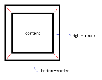
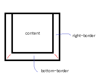
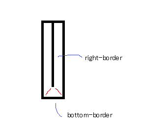
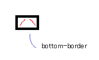
</svg>Inset triangle in a div using only css
It's not possible using box-shadow, however you could use a triangle on a :pseudo-element instead.
div {

  position: relative;

  width: 100px;

  height: 100px;

  background: black;

}

div:after {

  position: absolute;

  content: '';

  width: 0;

  height: 0;

  bottom: 0;

  border-left: 50px solid transparent;

  border-right: 50px solid transparent;

  border-bottom: 20px solid #3D6AB3;

  -moz-transform: scale(0.999);

  -webkit-backface-visibility: hidden;

}<div></div>How does one creates inner and outer triangles on a div with pure CSS?
You need 4 pseudo elements to create this properly, because triangles are created using borders, so they can't have a border and different background-color. We therefore need an inner and outer triangle for both sides. We can use both ::before and ::after, but since that only gives us two, we need at least two "real" elements.
Since this is a navigation panel, I used a series of lis and placed an a inside each one. This is a complicated setup though, so I'm going to break it down into several Fiddles showing the progression.
Edit: I've updated this so that the navigation elements are fluid, not fixed-width, per OP's comments.
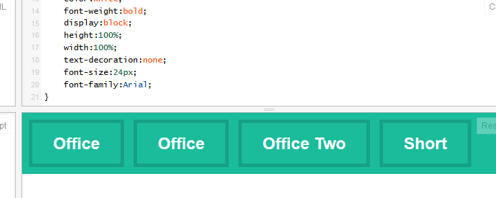
Step 1 - Navigation Setup:
First we set up the navigation boxes according to your mockup.
HTML:
<nav>
    <li><a href="">Office</a></li>
    <li><a href="">Office</a></li>
    <li><a href="">Office Two</a></li>
    <li><a href="">Short</a></li>
</nav>
CSS:
nav {
    background: #1abc9c;
}
nav li {
    display:inline-block;
    position:relative;
    margin:10px;
    margin-right:0;
    border: 5px solid #16a085;
    padding:15px 30px;
}
nav li a {
    color:white;
    font-weight:bold;
    display:block;
    height:100%;
    width:100%;
    text-decoration:none;
    font-size:24px;
    font-family:Arial;
}
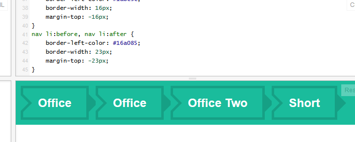
Step 2 - Set Up Pseudo-elements:
We are going to be using :before and :after, based on the code you provided in your question. Note, I've compressed this CSS based on rules that are shared across elements. Both inner triangles have the same color, both left arrows have the same position, etc.
CSS:
/* Arrows */
nav li:after, nav li a:after, nav li:before, nav li a:before {
    left: 100%;
    top: 50%;
    border: solid transparent;
    content: " ";
    height: 0;
    width: 0;
    position: absolute;
    pointer-events:none; /* So that the mouse will ignore this on top of the clickable area.*/
}
nav li:before, nav li a:before {
    left: -5px;
}
nav li a:before, nav li a:after {
    border-left-color: #1abc9c;
    border-width: 16px;
    margin-top: -16px;
}
nav li:before, nav li:after {
    border-left-color: #16a085;
    border-width: 23px;
    margin-top: -23px;
}
We've got an issue with the wrong triangles overriding others though. We can fix this with some judicial z-index;
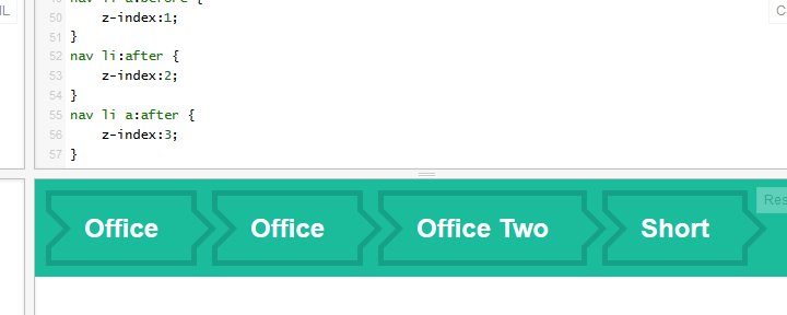
Step 3 - Fix Display Order:
nav li:before {
    z-index:0;
}
nav li a:before {
    z-index:1;
}
nav li:after {
    z-index:2;
}
nav li a:after {
    z-index:3;
}
Now we have working arrows that look right, on all elements. Success! ....almost. We have the arrows appearing on all elements, and we need to hide certain arrows for the beginning and end of the navigation panel.
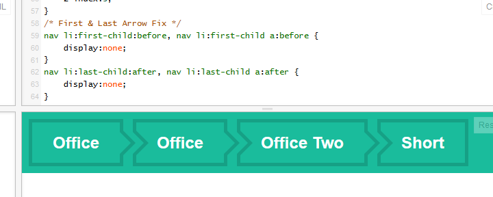
Step 4 - Fix First and Last Navigation Children:
In this final step we want to remove the two arrows before the first header element, and the two arrows after the last child. The code is surprisingly simple with the structure we've set up so far. We need two selectors, and a display:none;.
/* First & Last Arrow Fix */
nav li:first-child:before, nav li:first-child a:before {
    display:none;
}
nav li:last-child:after, nav li:last-child a:after {
    display:none;
}
And we're done!
Edit: Props to disinfo for idea of using nav instead of header.
Summary
As requested by OP in comments, final code is:
HTML:
<nav>
    <li><a href="">Office</a></li>
    <li><a href="">Office</a></li>
    <li><a href="">Office Two</a></li>
    <li><a href="">Short</a></li>
</nav>
CSS:
nav {
    background: #1abc9c;
}
nav li {
    display:inline-block;
    position:relative;
    margin:10px;
    margin-right:0;
    border: 5px solid #16a085;
    padding:15px 30px;
}
nav li a {
    color:white;
    font-weight:bold;
    display:block;
    height:100%;
    width:100%;
    text-decoration:none;
    font-size:24px;
    font-family:Arial;
}
/* Arrows */
nav li:after, nav li a:after, nav li:before, nav li a:before {
    left: 100%;
    top: 50%;
    border: solid transparent;
    content: " ";
    height: 0;
    width: 0;
    position: absolute;
    pointer-events:none; /* So that the mouse will ignore this on top of the clickable area.*/
}
nav li:before, nav li a:before {
    left: -5px;
}
nav li a:before, nav li a:after {
    border-left-color: #1abc9c;
    border-width: 16px;
    margin-top: -16px;
}
nav li:before, nav li:after {
    border-left-color: #16a085;
    border-width: 23px;
    margin-top: -23px;
}
/* Overlapping Fix */
nav li:before {
    z-index:0;
}
nav li a:before {
    z-index:1;
}
nav li:after {
    z-index:2;
}
nav li a:after {
    z-index:3;
}
/* First & Last Arrow Fix */
nav li:first-child:before, nav li:first-child a:before {
    display:none;
}
nav li:last-child:after, nav li:last-child a:after {
    display:none;
}
CSS - How to make rectangle with pointed sides?
The trick is to use the pseudo classes :before and :after. Try it like this:
.yourButton {
    position: relative;
    width:200px;
    height:40px;
    margin-left:40px;
    color:#FFFFFF;
    background-color:blue;
    text-align:center;
    line-height:40px;
}

.yourButton:before {
    content:"";
    position: absolute;
    right: 100%;
    top:0px;
    width:0px;
    height:0px;
    border-top:20px solid transparent;
    border-right:40px solid blue;
    border-bottom:20px solid transparent;
}

.yourButton:after {
    content:"";
    position: absolute;
    left: 100%;
    top:0px;
    width:0px;
    height:0px;
    border-top:20px solid transparent;
    border-left:40px solid blue;
    border-bottom:20px solid transparent;
}
JsFiddle: http://jsfiddle.net/VpW5x/
How to create a triangle with CSS that scales to parent div height?
I have found a solution (albeit not supported in IE) so it may not be the best way depending on circumstances.
The solution uses the background clip property:
https://jsfiddle.net/xq5wwf3h/32/
body * {
    box-sizing: border-box;
}

#triangle-container {
    position: relative;
    height: 100px;
    width: 100%;
    background: grey;
    margin-left:50px;
    color: #fff;
    padding: 15px;
}

#triangle-container:before {
    content: '';
    position: absolute;
    display: block;
    left: -25px;
    top: 0;
    bottom: 0;
    width: 25px;
    height: 100%;
    background: #007bff;
    -webkit-clip-path: polygon(100% 0, 100% 100%, 0 50%);
    clip-path: polygon(100% 0, 100% 100%, 0 50%);
}
How do CSS triangles work?
CSS Triangles: A Tragedy in Five Acts
As alex said, borders of equal width butt up against each other at 45 degree angles:
When you have no top border, it looks like this:
Then you give it a width of 0...
...and a height of 0...
...and finally, you make the two side borders transparent:
That results in a triangle.
how to change triangle to up arrow using pure css
I actually created this effect awhile back for a menu. You can find it here:
http://codepen.io/spikeyty/pen/IFBro
Basically, I took a transparent div, added bottom-left and bottom-right borders, and then rotated the div 45deg using transform. For extra sweetness the example has a neat hover effect. Enjoy!
How to make a right angled triangular cut on a div?
It's simple. Just use following css:
.shape {

    border-top: 100px solid blue;

    border-right: 50px solid transparent;

    height: 0;

    width: 100px;

}
<div class="shape"></div>Related Topics
Table Row Won't Contain Elements with Position:Absolute
How to Change an Image on Click Using CSS Alone
CSS Selector for Empty or Whitespace
How to Save a File from a Website as PDF
Responsive Image Align Center Bootstrap 3
How to Tidy Up an HTML File's Indentation in Vi
How to Set Placeholder Value Using CSS
"Height=100%" Is Not Working in HTML When Using <!Doctype>
Can Xhtml and HTML Class Attributes Value Start with a Number
How to Cut a Circular Part from an Image
Html5: Non-Replaced VS. Replaced Element
How to Create a Box-Shadow That Covers the Entire Page