Element will not stay centered, especially when re-sizing screen
You have your arrow centered with left:48%. This positions the arrow near the center of the container based on the arrow element's left edge.
In other words, assume you used left:50% (which is the correct way to go), this doesn't center the arrow element in the container. It actually centers the left edge of the element in the container.
In the image below a marker is centered on the page using text-align:center.
For comparison, see your arrow centered with left:50%.
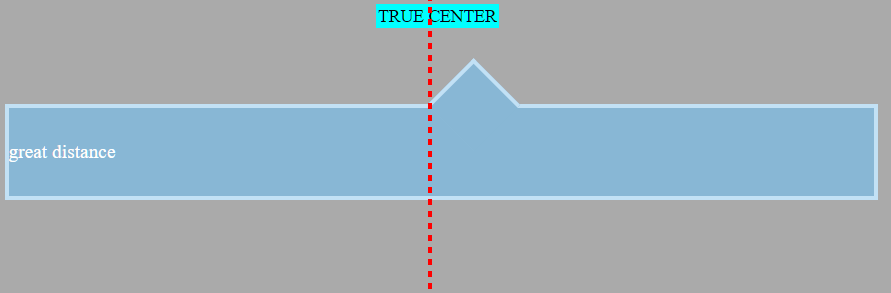
The element is positioned center-right. This misalignment becomes more noticeable as the window gets smaller.
As a result, it is common to see centered, absolutely positioned elements use the transform property:
.triangle {
   position: absolute;
   left: 50%;
   transform: translate(-50%,0);
}
The transform rule tells the triangle to shift itself back by 50% of its width. This makes it perfectly centered on the line. Now it emulates text-align:center.
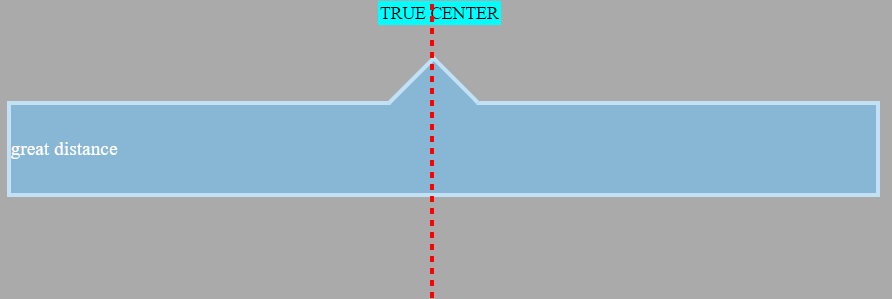
In translate(-50%,0), the first value targets the x-axis (horizontal), the other applies to the y-axis. An equivalent rule would be transform:translateX(-50%) (there's also transform:translateY()).
As an aside, here's how to center an element both horizontally and
vertically using this method:.triangle {
position: absolute;
left: 50%;
top: 50%;
transform: translate(-50%,-50%);
}
Note: If you were using
right: 50%orbottom: 50%, the respectivetranslatevalues would be50%(not negative).
In this particular question, however, an issue arises because transform:rotate(45deg) is also in the declaration block. Adding a second transform means the first one is ignored (per the cascade).
So, as a solution, try this:
.container::before {
    left: 50%;
    transform: translate(-50%,0) rotate(45deg);
}
By chaining functions together, multiple functions can be applied.
Just note that order matters. If translate and rotate were reversed, the triangle would first rotate 45 degrees and then shift -50% along the rotated axis, breaking the layout. So make sure that translate goes first. (Thanks @Oriol for pointing this out in the comments.)
Here's the full code:
body {    background: #333333;}
.container {    width: 98%;    height: 80px;    line-height: 80px;    position: relative;    top: 20px;    min-width: 250px;    margin-top: 50px;}
.container-decor {    border: 4px solid #C2E1F5;    color: #fff;    font-family: times;    font-size: 1.1em;    background: #88B7D5;    text-align: justify;}
.container::before {    top: -33px;    left: 50%;    transform: translate(-50%,0) rotate(45deg);    position: absolute;    border: solid #C2E1F5;    border-width: 4px 0 0 4px;    background: #88B7D5;    content: '';    width: 56px;    height: 56px;}
<div class="container container-decor">great distance</div>Position Element Using Center of Element?
You could do this using css transforms if that's fine
#whateverDiv{
    display: flex;
    left: 25%;
    transform: translateX(-50%)
}
Is it possible to anchor an element to a centered element?
.container {  position: relative;  width: 60%;  margin: 0 auto;  border: 2px solid blue;}
#cat {  width: 100%;  object-fit: cover;                 /* 1 */  vertical-align: bottom;            /* 2 */}
.box1 {  position: absolute;                /* 3 */  top: 50%;                          /* 3 */  left: 50%;                         /* 3 */  transform: translate(-50%, -50%);  /* 3 */  width: 100px;  height: 100px;}
<div class="container"> <img src="http://i.imgur.com/a2Wd9D2.jpg" height=300px id="cat" /> <textarea class="box1"> This is a text box </textarea></div>How to center the middle item in a flex row?
The primary way to achieve this layout – because it's clean and valid – is with flex: 1 on the items. That method is explained in the following post, but is also ruled out in this question.
- Keep the middle item centered when side items have different widths
An alternative method involves CSS absolute positioning:
.parentContainer {  display: flex;  justify-content: space-between;  position: relative;}
.middle {  position: absolute;  left: 50%;  transform: translateX(-50%);}
/* non-essential decorative styles */.parentContainer > * { background: orange; text-align: center; padding: 5px; }p { text-align: center;}p > span { background-color: aqua; padding: 5px; }P > span:first-child { font-size: 1.5em; }
<div class="parentContainer"> <div class="left">small</div> <div class="middle">medium element here</div> <div class="right">longer element is here too</div></div><p> <span>↑</span><br> <span>true center</span></p>centering a pseudo element
#a:after { content: "Text"; position: absolute; left: 50%; transform: translateX(-50%); color: red;}<div style="width:100%;text-align:center;"> <p id="a">Text</p></div>Image not centered with 50%
To make the image exactly placed on center, you need to put some margin-left with value is minus half of your image width.
Please try this example
#scroll-down {    position: fixed;    width: 100%;    height: 64px;}
#scroll-arrow {    position: absolute;    background: url("http://placehold.it/100x100") center no-repeat;    width: 64px;    height: 64px;    left: 50%;    margin-left: -32px; /* value -32px comes from (width / 2 * -1) */}
<div id="scroll-down"> <div id="scroll-arrow"></div></div>Flex item not centering in IE
The Problem
Absolutely-positioned children of a flex container are taken out of the normal flow of the document.
In fact, they are not even flex items, because they don't accept flex properties.
from the spec:
§ 4.1. Absolutely-positioned Flex Children
As it is out-of-flow, an absolutely-positioned child of a flex
container does not participate in flex layout.
Here is why your layout works anyway in Chrome, Firefox and Edge:
continuing with the spec:
The static position of an absolutely-positioned child of a flex container is determined such that the child is positioned as if it were the sole flex item in the flex container, assuming both the child and the flex container were fixed-size boxes of their used size. For this purpose,
automargins are treated as zero.read more >>
However, IE11 provides only partial support for the current flexbox specification, which may explain the rendering difference.
Solution
Since your content item isn't doing anything flex-related, just use a standard, non-flex method for horizontal and vertical centering.
body {  height: 100vh;  position: relative;}
.content {  position: absolute;  top: 50%;  left: 50%;  transform: translate(-50%, -50%);  width: 400px;  height: 200px;  background-color: #333333;}
<div class="content">Positioning a div relative to its vertical centre
In the snippet bellow I have two elements, both set to position:absolute with top: 25% and left: 50% .
.elementastransform: translate(-50%, -50%);that allows him to center vertically and horizontally "exactly" at 25% of the page dimensions (height, width). Because unliketopandleft, thetransformproperty is based on the size of the target element. So the percentage you set refers to the size of the bounding box of the target..otherin the other hand doesn't have atransformrule so it's not positioned like you wanted it to be, its top border sits at 25%
.element,.other {  position: absolute;  text-align: center;  top: 25%;  left: 50%;}
.element {  transform: translate(-50%, -50%);  color: green;}
.other {  color: red;}html,body{  height:100%;  margin:0;  padding:0;}
<div class="element">I'm at 25% middle</div><div class="other">I'm not at 25% middle</div>Related Topics
Html5 Number Input - Always Show 2 Decimal Places
How to Open a Link in New Tab Using Angular
Provide an Image for Whatsapp Link Sharing
How to Disable a Checkbox Based on Conditions in Angular 6
Select Option Padding Not Working in Chrome
How to Set Filename for Base64 Rendered Pdf Using Object Tag
How to Disable Auto-Play for Local Video in Iframe
Failed to Load Resource: the Server Responded With a Status of 404 (Not Found) CSS
Browsers Try to Download HTML File Instead of Opening
Limit Number of Digits After Decimals in Text Input
Htmlspecialchars() Expects Parameter 1 to Be String Array Given
Angular: Using the Ternary Operator in HTML Template
Navbar Menu Dropdown Not Working (Won't Drop Down When Clicked)
How to Switch Two Divs in HTML
Angular: *Ngif Tag on Input Element Causes It to Be Undefined. Cannot Read Value from Input Field