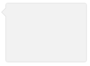
CSS Speech Bubble with Box Shadow
Instead of using a triangle hack, you can just rotate a div using transform and get a real box-shadow. Since you only want the shadow on one side of the div (the visible triangle side), you have to make the blur smaller and lower the opacity.
Demo: http://jsfiddle.net/ThinkingStiff/mek5Z/
HTML:
<div class="bubble"></div>
CSS:
.bubble{
    background-color: #F2F2F2;
    border-radius: 5px;
    box-shadow: 0px 0px 6px #B2B2B2;
    height: 200px;
    margin: 20px;
    width:  275px;
}

.bubble::after {
    background-color: #F2F2F2;
    box-shadow: -2px 2px 2px 0 rgba( 178, 178, 178, .4 );
    content: "\00a0";
    display: block;
    height: 20px;
    left: -10px;
    position: relative;
    top: 20px;
    transform:             rotate( 45deg );
        -moz-transform:    rotate( 45deg );
        -ms-transform:     rotate( 45deg );
        -o-transform:      rotate( 45deg );
        -webkit-transform: rotate( 45deg );
    width:  20px;
}
Output:
Speech bubble with arrow
In order to achieve this, you should consider altering your markup in order to make your html more efficient. This can be achieved using a pseudo element. I'll address each point individually, and put it all together at the end of my answer.
First of all,
Use pseudo elements to avoid extra elements
You could use a pseudo element to remove the extra .triangle div. This not only reduces your div numbers, but also helps with positioning as you can use the top: left: right: and bottom: css properties in order to position according to your main element. This can be seen below:
.oneAndOnlyDiv {
  height: 100px;
  width: 200px;
  border: 3px solid gray;
  background: lightgray;
  position: relative;
}
.oneAndOnlyDiv:before {
  content: "";
  position: absolute;
  top: 100%;
  left: 20px;
  width: 0;
  border-top: 20px solid black;
  border-left: 20px solid transparent;
  border-right: 20px solid transparent;
}
<div class="oneAndOnlyDiv">Main div</div>How to create a curved speech bubble?
I would consider radial-gradient to do this:
.userMsgBottom {
  position: relative;
  display: inline-block;
  color:#fff;
  max-width: 260px;
  background-color: #2e7384;
  margin: 30px;
  padding: 7px;
  border-radius: 6px;
}

.userMsgBottom:after {
  content: "";
  position: absolute;
  bottom: 0;
  right: -25px;
  width: 40px;
  height: 25px;
  background: radial-gradient(25px at top right, #0000 99%, #2e7384 102%);
}

.userMsgBottom.left:after {
  content: "";
  position: absolute;
  bottom: 0;
  left: -25px;
  width: 40px;
  height: 25px;
  background: radial-gradient(25px at top left, #0000 99%, #2e7384 102%);
}
<div class="userMsgBottom">
Some text here<br> Some text here<br> Some text here
</div>
<div class="userMsgBottom left">
Some text here<br> Some text here<br> Some text here
</div>CSS Speech Bubble with Box Shadow
Instead of using a triangle hack, you can just rotate a div using transform and get a real box-shadow. Since you only want the shadow on one side of the div (the visible triangle side), you have to make the blur smaller and lower the opacity.
Demo: http://jsfiddle.net/ThinkingStiff/mek5Z/
HTML:
<div class="bubble"></div>
CSS:
.bubble{
    background-color: #F2F2F2;
    border-radius: 5px;
    box-shadow: 0px 0px 6px #B2B2B2;
    height: 200px;
    margin: 20px;
    width:  275px;
}

.bubble::after {
    background-color: #F2F2F2;
    box-shadow: -2px 2px 2px 0 rgba( 178, 178, 178, .4 );
    content: "\00a0";
    display: block;
    height: 20px;
    left: -10px;
    position: relative;
    top: 20px;
    transform:             rotate( 45deg );
        -moz-transform:    rotate( 45deg );
        -ms-transform:     rotate( 45deg );
        -o-transform:      rotate( 45deg );
        -webkit-transform: rotate( 45deg );
    width:  20px;
}
Output:
How to create a curve tail for speech bubble with CSS?
As webtiki says, you can get this result adapting my previous answer (Even though may be it is a little bit difficult)
.container {  width:300px;  margin:5px;}.test {position: relative;width: 300px;height: 150px;padding: 0px;background: pink;border-radius: 6px;}
.test:after {    content: '';    top: 1px;    right: -29px;    position: absolute;    border: 0px solid;    display: block;    width: 38px;     height: 26px;    background-color: transparent;    border-bottom-left-radius: 50%;    border-bottom-right-radius: 50%;    box-shadow: -21px 9px 0px 8px pink;}
<div class="container"> <div class="test"></div></div><img src="http://i.stack.imgur.com/MYlKY.png" alt="Sample Image">About positioning the speech bubble created by css
You can use this code
<!doctype html><html lang="en">
<head>  <meta charset="utf-8">  <meta name="viewport" content="width=device-width, initial-scale=1, shrink-to-fit=no">  <link rel="stylesheet" href="https://stackpath.bootstrapcdn.com/bootstrap/4.3.1/css/bootstrap.min.css" integrity="sha384-ggOyR0iXCbMQv3Xipma34MD+dH/1fQ784/j6cY/iJTQUOhcWr7x9JvoRxT2MZw1T" crossorigin="anonymous">  <title>index</title>  <style type="text/css">    body {      margin: 0;    }        .speech {      background: #efefef;      -webkit-border-radius: 4px;      border-radius: 4px;      font-size: 1.2rem;      line-height: 1.3;      margin: 0px 30px 40px 190px;      max-width: 80%;      padding: 15px;      position: relative;      filter: drop-shadow(6px 4px 0px rgba(0, 0, 0, 0.2));      border: 1px solid black;    }        .onLeft::after {      border-left: 11px solid transparent;      border-right: 11px solid #efefef;      border-top: 11px solid #efefef;      border-bottom: 11px solid transparent;      content: "";      position: absolute;      left: -20px;      top: 8px;      filter: drop-shadow(-2px -1px 0px black);    }        .onRight:after {      content: "";      position: absolute;      border-left: 11px solid #efefef;      border-right: 11px solid transparent;      border-top: 11px solid #efefef;      border-bottom: 11px solid transparent;      right: -20px;      top: 8px;      filter: drop-shadow(2px -1px 0px black);    }        @media only screen and (max-width: 1366px) {      .speech {        margin: 0px 30px 40px 190px;        max-width: 72%;      }    }        @media only screen and (max-width: 1024px) {      .speech {        margin: 0px 30px 40px 190px;        max-width: 64%;      }    }        @media only screen and (max-width: 768px) {      .speech {        margin: 0px 30px 40px 190px;        max-width: 51%;      }    }        @media only screen and (max-width: 767px) {      .speech {        margin: 0px 30px 40px 190px;        max-width: 45%;      }    }        @media only screen and (max-width: 575px) {      .speech {        margin: 0px 30px 40px 190px;        max-width: 30%;      }    }  </style></head>
<body>  <div style="font-size: 12pt; margin-bottom: 20px; clear: both;">    <img style="float: left; margin: 15px;" src="https://www.w3schools.com/images/picture.jpg" width="120 " />    <div class="speech onLeft ">Here is my example of a speech bubble created in CSS and HTML.</div>  </div>  <div style="font-size: 12pt; margin-bottom: 20px; clear: both; ">    <img style="float: right; margin: 15px;" src="https://www.w3schools.com/images/picture.jpg" width="120" />    <div class="speech onRight">Here is my example of a speech bubble created in CSS and HTML. The arrow is on the right and the image is floating to the right.</div>  </div></body><script src="https://code.jquery.com/jquery-3.3.1.slim.min.js" integrity="sha384-q8i/X+965DzO0rT7abK41JStQIAqVgRVzpbzo5smXKp4YfRvH+8abtTE1Pi6jizo" crossorigin="anonymous"></script><script src="https://cdnjs.cloudflare.com/ajax/libs/popper.js/1.14.7/umd/popper.min.js" integrity="sha384-UO2eT0CpHqdSJQ6hJty5KVphtPhzWj9WO1clHTMGa3JDZwrnQq4sF86dIHNDz0W1" crossorigin="anonymous"></script><script src="https://stackpath.bootstrapcdn.com/bootstrap/4.3.1/js/bootstrap.min.js" integrity="sha384-JjSmVgyd0p3pXB1rRibZUAYoIIy6OrQ6VrjIEaFf/nJGzIxFDsf4x0xIM+B07jRM" crossorigin="anonymous"></script></body>
</html>
How to reduce bounding box of speech CSS generated bubble to visible part?
I used transform because I wanted it to be smoot when using animation. And that's how you can make triangle. It will also be responsive and will be positioned in the middle for each dimension. Triangle will now take up just as much space as its own and will not have a negative impact on the button.
  .bubble {    position: fixed;    top: 33.5vh;    left: 3vw;    max-width: 90vw;    width: 90vw;    z-index: 10000;      background-color: #00000088;    color: white;    font-size: 2.3vh;    padding: 2vh 2vw;    border-radius: 2vh;    box-shadow:   0 1vh 1vw rgba(0, 0, 0, .3), 0 0.1vh 0.2vw rgba(0, 0, 0, .2);      display: flex;    align-content: center;      animation-duration: 2s;    animation-iteration-count: infinite;    animation-name: bounce;    animation-timing-function: linear; /* changed  */   }
  @keyframes bounce { /* created  */
    0%   { transform: translateY(0) }    50%  { transform: translateY(-20px) }     100% { transform: translateY(0) }}

  .bubble.downwards::after { /* created */    content: '';    width: 0;    height: 0;    border-style: solid;    border-width: 30px 30px 0 30px; /* you can adjust it for any size you want*/    border-color: gray transparent transparent transparent;    position: absolute;    top: 100%;    left: 50%;    transform: translateX(-50%);  };
  .button {    border-radius: 0.5vh;    background-color: #aaa;    font-size: 2.3vh;    padding: 1vh;    text-align: center;  }
<div id="button" class="button">Button</div> <div id="hint" class="bubble downwards"> Hello! I'm a hint message... </div>Related Topics
Bootstrap 3: Push/Pull Columns Only on Smaller Screen Sizes
Html5 - Mp4 Video Does Not Play in IE9
Place Boxes Inside Ul in Center, But Align Them Left
Pick Images of Root Folder from Sub-Folder
Is It Considered Bad Practice to Use Absolute Positioning
Make Row Stretch Across All Columns in CSS Grid
CSS Image Resize Percentage of Itself
Image Scaling Causes Poor Quality in Firefox/Internet Explorer But Not Chrome
How to Get a Background Image to Print Using CSS
How to Create a Polygon Shape Div
How to Nest Button Inside Another Button
CSS Speech Bubble with Box Shadow
What Are the CSS Properties That Get Elements Out of the Normal Flow
HTML Auto Embedding Recent Uploaded Videos from a Youtube Channel