Simple svg css progress circle
You can leverage an SVG attribute to set the path length rather than having to calculate it.
pathLength sets the length to whatever you need...say 100 for a progress bar.
The pathLength attribute lets authors specify a total length for the path, in user units. This value is then used to calibrate the browser's distance calculations with those of the author, by scaling all distance computations using the ratio pathLength/(computed value of path length).
pathLength="100"
Then you can set the stroke-dasharray to 100 as well and then adjust the stroke-dashoffset as needed....
::root {
  --val: 0;
}

svg {
  transform: rotate(-90deg);
}

.percent {
  stroke-dasharray: 100;
  stroke-dashoffset: calc(100 - var(--val));
}

.fifty {
  --val: 50;
}

.sixty {
  --val: 60;
}

.ninety {
  --val: 90;
}
<svg width="120" height="120" viewBox="0 0 120 120">
<circle cx="60" cy="60" r="54" fill="none" stroke="#e6e6e6" stroke-width="12" />
<circle class="percent fifty" cx="60" cy="60" r="54" fill="none" stroke="#f77a52" stroke-width="12" pathLength="100" />
</svg>
<svg width="120" height="120" viewBox="0 0 120 120">
<circle cx="60" cy="60" r="54" fill="none" stroke="#e6e6e6" stroke-width="12" />
<circle class="percent sixty" cx="60" cy="60" r="54" fill="none" stroke="#f77a52" stroke-width="12" pathLength="100" />
</svg>
<svg width="120" height="120" viewBox="0 0 120 120">
<circle cx="60" cy="60" r="54" fill="none" stroke="#e6e6e6" stroke-width="12" />
<circle class="percent ninety" cx="60" cy="60" r="54" fill="none" stroke="#f77a52" stroke-width="12" pathLength="100" />
</svg>CSS Progress bar with a circle dot at the end
It would be useful if you could go through the code to understand what it is doing so far.
Notice that the way it is animating that bar is simply by animating one CSS variable - the percentage which goes from 0 to what is to be shown eventually.
In the code you already have this is used to draw a conic gradient with an angle which increases from 0 to that percentage of 360degrees.
We can use the same idea to move an element as if it were the hand of a clock, rotating it about the middle of its bottom in sync with the growing of the conic gradient.
First let's draw the 'hand' of the clock in the upright position. We can use a CSS pseudo after element to do this - as it's purely a visual embellishment we don't want to add actual content to the DOM. It's shown in pink here.
And to get the circle we give it a radial-gradient background image.
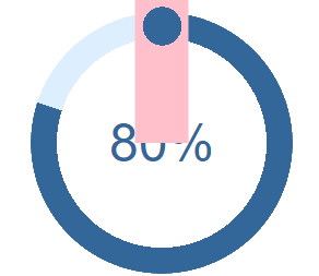
Now we want to rotate it about its bottom central point (the middle of the circle) so we change its transform origin and set it to have a rotation which depends on the CSS property (variable) which holds the percentage value we are already animating.
@keyframes growProgressBar {
  0%,
  33% {
    --pgPercentage: 0;
  }
  100% {
    --pgPercentage: var(--value);
  }
}

@property --pgPercentage {
  syntax: '<number>';
  inherits: false;
  initial-value: 0;
}

div[role="progressbar"] {
  --size: 12rem;
  --fg: #369;
  --bg: #def;
  --pgPercentage: var(--value);
  animation: growProgressBar 3s 1 forwards;
  width: var(--size);
  height: var(--size);
  border-radius: 50%;
  display: grid;
  place-items: center;
  background: radial-gradient(closest-side, white 80%, transparent 0 99.9%, white 0), conic-gradient(var(--fg) calc(var(--pgPercentage) * 1%), var(--bg) 0);
  font-family: Helvetica, Arial, sans-serif;
  font-size: calc(var(--size) / 5);
  color: var(--fg);
  position: relative;
}

div[role="progressbar"]::before {
  counter-reset: percentage var(--value);
  content: counter(percentage) '%';
}

div[role="progressbar"]::after {
  content: '';
  position: absolute;
  height: calc(var(--size) / 2 + 10px);
  width: calc(10 / 100 * var(--size) + 20px);
  top: -10px;
  left: 50%;
  transform: translateX(-50%) rotate(calc(var(--pgPercentage) / 100 * 360deg));
  transform-origin: 50% 100%;
  animation: growProgressBar 3s 1 forwards;
  z-index: 1;
  background-image: radial-gradient(var(--fg) 0 50%, transparent 50% 100%);
  background-repeat: no-repeat;
  background-position: 0px 0;
  background-size: 40px 40px;
}


/* demo */

body {
  margin: 0;
  display: flex;
  align-items: center;
  justify-content: center;
  height: 100vh;
}
<div role="progressbar" aria-valuenow="80" aria-valuemin="0" aria-valuemax="100" style="--value:80"></div>circular progress bar for 4 steps of form
Here is my solution which just used border and sudo elements before and after
Which is very simple.
NOTE: This can only used in case of 4 steps.
.count {
     position: relative;
     width: 40px;
     height: 40px;
     margin-right: 10px;
     display: inline-block;
     border: 1px solid #ffc107;
     border-radius: 50%;
     font-family: Arial;
     color: #888;
}
 .count span {
     position: absolute;
     left: 50%;
     top: 50%;
     transform: translate(-50%, -50%);
     z-index: 2;
}
 .count:after {
     position: absolute;
     content: "";
     background: #fff;
     width: 30px;
     height: 30px;
     border-radius: 50%;
     left: 5px;
     top: 5px;
}
 .count:before {
     position: absolute;
     content: "";
     border: 20px solid #ffc107;
     border-radius: 50%;
     height: 0;
     width: 0;
     transform: rotate(45deg);
}
 .count.step1:before {
     border-left-color: transparent;
     border-bottom-color: transparent;
     border-right-color: transparent;
}
 .count.step2:before {
     border-left-color: transparent;
     border-bottom-color: transparent;
}
 .count.step3:before {
     border-left-color: transparent;
}
<div class="count step1">
  <span>1</span>
</div>
<div class="count step2">
  <span>2</span>
</div>
<div class="count step3">
  <span>3</span>
</div>
<div class="count">
  <span>4</span>
</div>
how to properly create a simple circular progressbar via css
Live example:
body,
html {
  font-size: 10px;
}

.progress-circle {
  font-size: 20px;
  margin: 20px;
  position: relative;
  /* so that children can be absolutely positioned */
  padding: 0;
  width: 5em;
  height: 5em;
  background-color: #F2E9E1;
  border-radius: 50%;
  line-height: 5em;
}

.progress-circle:after {
  border: none;
  position: absolute;
  top: 0.35em;
  left: 0.35em;
  text-align: center;
  display: block;
  border-radius: 50%;
  width: 4.3em;
  height: 4.3em;
  background-color: white;
  content: " ";
}


/* Text inside the control */

.progress-circle span {
  position: absolute;
  line-height: 5em;
  width: 5em;
  text-align: center;
  display: block;
  color: #53777A;
  z-index: 2;
}

.left-half-clipper {
  /* a round circle */
  border-radius: 50%;
  width: 5em;
  height: 5em;
  position: absolute;
  /* needed for clipping */
  clip: rect(0, 5em, 5em, 2.5em);
  /* clips the whole left half*/
}


/* when p>50, don't clip left half*/

.progress-circle.over50 .left-half-clipper {
  clip: rect(auto, auto, auto, auto);
}

.value-bar {
  /*This is an overlayed square, that is made round with the border radius,
   then it is cut to display only the left half, then rotated clockwise
   to escape the outer clipping path.*/
  position: absolute;
  /*needed for clipping*/
  clip: rect(0, 2.5em, 5em, 0);
  width: 5em;
  height: 5em;
  border-radius: 50%;
  border: 0.45em solid #53777A;
  /*The border is 0.35 but making it larger removes visual artifacts */
  /*background-color: #4D642D;*/
  /* for debug */
  box-sizing: border-box;
}


/* Progress bar filling the whole right half for values above 50% */

.progress-circle.over50 .first50-bar {
  /*Progress bar for the first 50%, filling the whole right half*/
  position: absolute;
  /*needed for clipping*/
  clip: rect(0, 5em, 5em, 2.5em);
  background-color: #53777A;
  border-radius: 50%;
  width: 5em;
  height: 5em;
}

.progress-circle:not(.over50) .first50-bar {
  display: none;
}


/* Progress bar rotation position */

.progress-circle.p0 .value-bar {
  display: none;
}

.progress-circle.p1 .value-bar {
  transform: rotate(4deg);
}

.progress-circle.p2 .value-bar {
  transform: rotate(7deg);
}

.progress-circle.p3 .value-bar {
  transform: rotate(11deg);
}

.progress-circle.p4 .value-bar {
  transform: rotate(14deg);
}

.progress-circle.p5 .value-bar {
  transform: rotate(18deg);
}

.progress-circle.p6 .value-bar {
  transform: rotate(22deg);
}

.progress-circle.p7 .value-bar {
  transform: rotate(25deg);
}

.progress-circle.p8 .value-bar {
  transform: rotate(29deg);
}

.progress-circle.p9 .value-bar {
  transform: rotate(32deg);
}

.progress-circle.p10 .value-bar {
  transform: rotate(36deg);
}

.progress-circle.p11 .value-bar {
  transform: rotate(40deg);
}

.progress-circle.p12 .value-bar {
  transform: rotate(43deg);
}

.progress-circle.p13 .value-bar {
  transform: rotate(47deg);
}

.progress-circle.p14 .value-bar {
  transform: rotate(50deg);
}

.progress-circle.p15 .value-bar {
  transform: rotate(54deg);
}

.progress-circle.p16 .value-bar {
  transform: rotate(58deg);
}

.progress-circle.p17 .value-bar {
  transform: rotate(61deg);
}

.progress-circle.p18 .value-bar {
  transform: rotate(65deg);
}

.progress-circle.p19 .value-bar {
  transform: rotate(68deg);
}

.progress-circle.p20 .value-bar {
  transform: rotate(72deg);
}

.progress-circle.p21 .value-bar {
  transform: rotate(76deg);
}

.progress-circle.p22 .value-bar {
  transform: rotate(79deg);
}

.progress-circle.p23 .value-bar {
  transform: rotate(83deg);
}

.progress-circle.p24 .value-bar {
  transform: rotate(86deg);
}

.progress-circle.p25 .value-bar {
  transform: rotate(90deg);
}

.progress-circle.p26 .value-bar {
  transform: rotate(94deg);
}

.progress-circle.p27 .value-bar {
  transform: rotate(97deg);
}

.progress-circle.p28 .value-bar {
  transform: rotate(101deg);
}

.progress-circle.p29 .value-bar {
  transform: rotate(104deg);
}

.progress-circle.p30 .value-bar {
  transform: rotate(108deg);
}

.progress-circle.p31 .value-bar {
  transform: rotate(112deg);
}

.progress-circle.p32 .value-bar {
  transform: rotate(115deg);
}

.progress-circle.p33 .value-bar {
  transform: rotate(119deg);
}

.progress-circle.p34 .value-bar {
  transform: rotate(122deg);
}

.progress-circle.p35 .value-bar {
  transform: rotate(126deg);
}

.progress-circle.p36 .value-bar {
  transform: rotate(130deg);
}

.progress-circle.p37 .value-bar {
  transform: rotate(133deg);
}

.progress-circle.p38 .value-bar {
  transform: rotate(137deg);
}

.progress-circle.p39 .value-bar {
  transform: rotate(140deg);
}

.progress-circle.p40 .value-bar {
  transform: rotate(144deg);
}

.progress-circle.p41 .value-bar {
  transform: rotate(148deg);
}

.progress-circle.p42 .value-bar {
  transform: rotate(151deg);
}

.progress-circle.p43 .value-bar {
  transform: rotate(155deg);
}

.progress-circle.p44 .value-bar {
  transform: rotate(158deg);
}

.progress-circle.p45 .value-bar {
  transform: rotate(162deg);
}

.progress-circle.p46 .value-bar {
  transform: rotate(166deg);
}

.progress-circle.p47 .value-bar {
  transform: rotate(169deg);
}

.progress-circle.p48 .value-bar {
  transform: rotate(173deg);
}

.progress-circle.p49 .value-bar {
  transform: rotate(176deg);
}

.progress-circle.p50 .value-bar {
  transform: rotate(180deg);
}

.progress-circle.p51 .value-bar {
  transform: rotate(184deg);
}

.progress-circle.p52 .value-bar {
  transform: rotate(187deg);
}

.progress-circle.p53 .value-bar {
  transform: rotate(191deg);
}

.progress-circle.p54 .value-bar {
  transform: rotate(194deg);
}

.progress-circle.p55 .value-bar {
  transform: rotate(198deg);
}

.progress-circle.p56 .value-bar {
  transform: rotate(202deg);
}

.progress-circle.p57 .value-bar {
  transform: rotate(205deg);
}

.progress-circle.p58 .value-bar {
  transform: rotate(209deg);
}

.progress-circle.p59 .value-bar {
  transform: rotate(212deg);
}

.progress-circle.p60 .value-bar {
  transform: rotate(216deg);
}

.progress-circle.p61 .value-bar {
  transform: rotate(220deg);
}

.progress-circle.p62 .value-bar {
  transform: rotate(223deg);
}

.progress-circle.p63 .value-bar {
  transform: rotate(227deg);
}

.progress-circle.p64 .value-bar {
  transform: rotate(230deg);
}

.progress-circle.p65 .value-bar {
  transform: rotate(234deg);
}

.progress-circle.p66 .value-bar {
  transform: rotate(238deg);
}

.progress-circle.p67 .value-bar {
  transform: rotate(241deg);
}

.progress-circle.p68 .value-bar {
  transform: rotate(245deg);
}

.progress-circle.p69 .value-bar {
  transform: rotate(248deg);
}

.progress-circle.p70 .value-bar {
  transform: rotate(252deg);
}

.progress-circle.p71 .value-bar {
  transform: rotate(256deg);
}

.progress-circle.p72 .value-bar {
  transform: rotate(259deg);
}

.progress-circle.p73 .value-bar {
  transform: rotate(263deg);
}

.progress-circle.p74 .value-bar {
  transform: rotate(266deg);
}

.progress-circle.p75 .value-bar {
  transform: rotate(270deg);
}

.progress-circle.p76 .value-bar {
  transform: rotate(274deg);
}

.progress-circle.p77 .value-bar {
  transform: rotate(277deg);
}

.progress-circle.p78 .value-bar {
  transform: rotate(281deg);
}

.progress-circle.p79 .value-bar {
  transform: rotate(284deg);
}

.progress-circle.p80 .value-bar {
  transform: rotate(288deg);
}

.progress-circle.p81 .value-bar {
  transform: rotate(292deg);
}

.progress-circle.p82 .value-bar {
  transform: rotate(295deg);
}

.progress-circle.p83 .value-bar {
  transform: rotate(299deg);
}

.progress-circle.p84 .value-bar {
  transform: rotate(302deg);
}

.progress-circle.p85 .value-bar {
  transform: rotate(306deg);
}

.progress-circle.p86 .value-bar {
  transform: rotate(310deg);
}

.progress-circle.p87 .value-bar {
  transform: rotate(313deg);
}

.progress-circle.p88 .value-bar {
  transform: rotate(317deg);
}

.progress-circle.p89 .value-bar {
  transform: rotate(320deg);
}

.progress-circle.p90 .value-bar {
  transform: rotate(324deg);
}

.progress-circle.p91 .value-bar {
  transform: rotate(328deg);
}

.progress-circle.p92 .value-bar {
  transform: rotate(331deg);
}

.progress-circle.p93 .value-bar {
  transform: rotate(335deg);
}

.progress-circle.p94 .value-bar {
  transform: rotate(338deg);
}

.progress-circle.p95 .value-bar {
  transform: rotate(342deg);
}

.progress-circle.p96 .value-bar {
  transform: rotate(346deg);
}

.progress-circle.p97 .value-bar {
  transform: rotate(349deg);
}

.progress-circle.p98 .value-bar {
  transform: rotate(353deg);
}

.progress-circle.p99 .value-bar {
  transform: rotate(356deg);
}

.progress-circle.p100 .value-bar {
  transform: rotate(360deg);
}
<div class="progress-circle p2">
<span>2%</span>
<div class="left-half-clipper">
<div class="first50-bar"></div>
<div class="value-bar"></div>
</div>
</div>
<div class="progress-circle p8">
<span>8%</span>
<div class="left-half-clipper">
<div class="first50-bar"></div>
<div class="value-bar"></div>
</div>
</div>
<div class="progress-circle p13">
<span>13%</span>
<div class="left-half-clipper">
<div class="first50-bar"></div>
<div class="value-bar"></div>
</div>
</div>
<div class="progress-circle p26">
<span>26%</span>
<div class="left-half-clipper">
<div class="first50-bar"></div>
<div class="value-bar"></div>
</div>
</div>
<div class="progress-circle over50 p69">
<span>69%</span>
<div class="left-half-clipper">
<div class="first50-bar"></div>
<div class="value-bar"></div>
</div>
</div>
<div class="progress-circle over50 p100">
<span>100%</span>
<div class="left-half-clipper">
<div class="first50-bar"></div>
<div class="value-bar"></div>
</div>
</div>calculate percentage in progress circle
To have the progress circle redraw when the values are changed simply call the drawProgress() function within the input event handler.
Also note that there's a couple of other improvements you can make to the code:
- remove nested document.ready
- delegate is deprecated, use on instead
$('#percent').text()should be$('#percent').val(), and I would assume1000in the condition on that line should be100instead.
jQuery($ => {
  $('#submitClick').click(function() {
    var val = parseInt($('#percent').val());
    drawProgress(val / 100);
  }).trigger('click');

  $(".tags").on('input', function() {
    // needlessly using 2 loops here, amended
    //var calculated_total_sum = $(this).find(".ingredient:checked").map((i, el) => parseFloat($(el).closest("div").find(".txtCal").val())).get().reduce((a, b) => a + b) || 0;
    var calculated_total_sum = 0;
    $(this).find('div:has(.ingredient:checked) .txtCal').each((i, el) => calculated_total_sum += parseFloat(el.value));

    $("#percent")
      .val(calculated_total_sum)
      .css('color', parseFloat($("#percent").val()) > 1000 ? 'red' : 'green');

    drawProgress(calculated_total_sum / 100);
  });

  // ingrédients allergènes
  $('div.tags').on('change', 'input:checkbox', function() {
    $(this).parent().nextAll().slice(0, 2).hide().val('0');
    var list = $('.results > li').hide();

    $('input:checked').each(function() {
      list.filter('.' + $(this).attr('rel')).show();
      $(this).parent().nextAll().slice(0, 2).show();
    });
  }).find('input:checkbox').change();

  $(".tags").on('input', '.txtCal', function() {
    var calculated_total_sum = 0;
    $(".tags .txtCal").each(function() {
      var get_textbox_value = $(this).val();
      if ($.isNumeric(get_textbox_value)) {
        calculated_total_sum += parseFloat(get_textbox_value);
      }
    });
    $("#percent").val(calculated_total_sum);
  });

  var svg;

  function drawProgress(end) {
    d3.select("svg").remove()
    if (svg) {
      svg.selectAll("*").remove();
    }
    var wrapper = document.getElementById('radialprogress');
    var start = 0;

    var colours = {
      fill: '#FF0000',
      track: '#555555',
      text: '#00C0FF',
      stroke: '#FFFFFF',
    }

    var radius = 80;
    var border = 12;
    var strokeSpacing = 4;
    var endAngle = Math.PI * 2;
    var formatText = d3.format('.0%');
    var boxSize = radius * 2;
    var count = end;
    var progress = start;
    var step = end < start ? -0.01 : 0.01;

    //Define the circle
    var circle = d3.svg.arc()
      .startAngle(0)
      .innerRadius(radius)
      .outerRadius(radius - border);

    //setup SVG wrapper
    svg = d3.select(wrapper)
      .append('svg')
      .attr('width', boxSize)
      .attr('height', boxSize);


    // ADD Group container
    var g = svg.append('g')
      .attr('transform', 'translate(' + boxSize / 2 + ',' + boxSize / 2 + ')');

    //Setup track
    var track = g.append('g').attr('class', 'radial-progress');
    track.append('path')
      .attr('fill', colours.track)
      .attr('stroke', colours.stroke)
      .attr('stroke-width', strokeSpacing + 'px')
      .attr('d', circle.endAngle(endAngle));

    //Add colour fill
    var value = track.append('path')
      .attr('fill', colours.fill)
      .attr('stroke', colours.stroke)
      .attr('stroke-width', strokeSpacing + 'px');

    //Add text value
    var numberText = track.append('text')
      .attr('fill', colours.text)
      .attr('text-anchor', 'middle')
      .attr('dy', '.5rem');

    //update position of endAngle
    value.attr('d', circle.endAngle(endAngle * end));
    //update text value
    numberText.text(formatText(end));
  }
});
<div class="tags">
<div>
<label><input type="checkbox" checked rel="ingredient-1" class="ingredient"> ingredient 1 </label><br><input type="text" class='txtCal' /><br>
</div>
<div>
<label><input type="checkbox" checked rel="ingredient-2" class="ingredient"> ingredient 2 </label><br><input type="text" class='txtCal' /><br>
</div>
<div>
<label><input type="checkbox" checked rel="ingredient-3" class="ingredient"> ingredient 3 </label><br><input type="text" class='txtCal' /><br>
</div>
<span><b>TOTAL :</b></span><b><span id="total_sum_value"></span></b>
<label for="percent">Type a percent!</label>
<input id="percent" name="percent" value="0">
<button id='submitClick' name='submitButton'>Render</button>
<div id="radialprogress"></div>
</div>
<ul class="results">
<li class="ingredient-1 ingredient-3">Alpha isomethylionone</li>
<li class="ingredient-1">Amyl cinnamal (Jasmonal A)</li>
<li class="ingredient-1">Amylcinnamyl alcohol</li>
<li class="ingredient-1">Anisyl alcohol</li>
<li class="ingredient-1 ingredient-2">Benzyl alcohol</li>
<li class="ingredient-1 ingredient-2 ingredient-3">Benzyl benzoate</li>
<li class="ingredient-2">Benzyl cinnamate</li>
<li class="ingredient-2">Benzyl salicylate</li>
<li class="ingredient-2">Butylphenyl methylpropional (Lilial)</li>
<li class="ingredient-2 ingredient-3">Cinnamal</li>
<li class="ingredient-3">Cinnamyl alcohol</li>
<li class="ingredient-3">Citral</li>
<li class="ingredient-3">Citronellol</li>
<li class="ingredient-3">Coumarin</li>
</ul>
<script src="https://cdnjs.cloudflare.com/ajax/libs/d3/3.4.11/d3.min.js"></script>
<script src="https://ajax.googleapis.com/ajax/libs/jquery/2.1.1/jquery.min.js"></script>Mark Indicator of a threshold value in circular progress bar CSS
I will suggest something like this. I guess the meter/gauge itself is the easy part. Here I have a stroke-dasharay that can be set to a value between 0-100.
I added more threshold indicators so that you can see what they should look like, both on the left and right side of the circle. Basically it is just a line and a text that is rotated. When displaying the text in the left side it needs to be rotated 180 deg.
<svg width="400" viewBox="0 0 100 100" fill="none" stroke-width="5" stroke-linecap="round">
  <circle stroke="silver" cx="50" cy="50" r="40"/>
  <circle transform="rotate(-90 50 50)" stroke="green" cx="50" cy="50" r="40" pathLength="100" stroke-dasharray="65 100"/>
  <g transform="translate(50 50) rotate(-90) rotate(90)">
    <line x1="37.5" y1="0" x2="47.5" y2="0" stroke="black" stroke-width="1"/>
    <text transform="translate(43 -1)" font-size="4" fill="black">25</text>
  </g>
  <g transform="translate(50 50) rotate(-90) rotate(135)">
    <line x1="37.5" y1="0" x2="47.5" y2="0" stroke="black" stroke-width="1"/>
    <text transform="translate(43 -1)" font-size="4" fill="black">38</text>
  </g>
  <g transform="translate(50 50) rotate(-90) rotate(270)">
    <line x1="37.5" y1="0" x2="47.5" y2="0" stroke="black" stroke-width="1"/>
    <text transform="translate(43 -1) rotate(180) translate(-5 -2)" font-size="4" fill="black">75</text>
  </g>
  <g transform="translate(50 50) rotate(-90) rotate(315)">
    <line x1="37.5" y1="0" x2="47.5" y2="0" stroke="black" stroke-width="1"/>
    <text transform="translate(43 -1) rotate(180) translate(-5 -2)" font-size="4" fill="black">88</text>
  </g>
</svg>
Related Topics
Should I Put Input Elements Inside a Label Element
How to Add a Custom Attribute to an HTML Tag
What to Use in Place of ::Ng-Deep
Curve Bottom Side of the Div to the Inside With Css
What's the Difference Between ≪B≫ and ≪Strong≫, ≪I≫ and ≪Em≫
Is There a Float Input Type in Html5
Alternate Table Row Color Using Css
Css Grid Layout Not Working in Ie11 Even With Prefixes
Float:Left; VS Display:Inline; VS Display:Inline-Block; VS Display:Table-Cell;
Keep the Middle Item Centered When Side Items Have Different Widths
How to Style Even and Odd Elements
Put Icon Inside Input Element in a Form
Equal Height Rows in a Flex Container
Nesting Block Level Elements Inside the ≪P≫ Tag... Right or Wrong
Absolutely Positioned Flex Item Is Not Removed from the Normal Flow in Ie11