Borders disappear in Chrome when I zoom in
I'm pretty sure that Luís Pureza has solved his issue, but I found a really easy way to solve it changing only this:
If you have a table border like this one:
INPUT,TEXTAREA {
border-top: 1px solid #aaa
}
Change it to this one:
INPUT,TEXTAREA {
border-top: thin solid #aaa
}
I found this solution across this link: https://productforums.google.com/forum/#!topic/chrome/r1neUxqo5Gc
I hope it helps
CSS border disappears when child element has a background color AND browser is zoomed out less than 100%
It sounds like number rounding issues due to the browser's subpixel calculus to me, too. However, I do see the issue on Chrome/Mac if you adjust different zoom levels and viewport widths you can see the issue manifest in different ways:
Chrome/Mac
125% Zoom / 1196px viewport
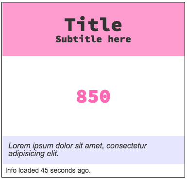
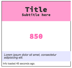
Gap between header and footer backgrounds and left border:
Chrome/Mac
90% Zoom / 1181px viewport
Header and footer backgrounds overlap right border:
A non-design impacting fix is to create the border using positioning in a pseudo-element:
.card__container {
    position: relative; // ADDED
    // border: 1px solid black; // REMOVED
    display: flex;
    flex-direction: column;
    width: 300px;
    margin: 10px auto;
    align-items: stretch;
    font-family: "source code pro";
    color: darken(#cccccc, 60%);

    // ADDED
    &::after {
         content: '';
         position: absolute;
         top: 0;
         right: 0;
         bottom: 0;
         left: 0;
         border: 1px solid #000;
    }
}
Codepen: https://codepen.io/danbrady/pen/QQYyzM (Tested in IE11, Chrome (Mac & Win7), Firefox, and Safari.
Although this is more code and, admittedly, a little quirky, it doesn't change the original design intent. Also, you might consider abstracting it into a mixin or separate utility class.
(P.S. Came here from your blog post. You've inspired me to not lurk (at least for today). :^)
How to make sure the 1px border always show up regardless how much the user zoom in chrome (or any browser)?
The only solution I found (see here) that doesn't change the HTML is to use 'thin' instead of '1px' in the CSS. It seems to reliably make a 1px border.
Also, I was not able to replicate the issue with the codepen you shared so in case a future developer sees this and wants to replicate the problem this site consistently produces the bug (for me) when zoomed out.
1px elements disappear unless zooming in or out based on (text) line count
You are forcing Chrome to do subpixel calculus, and this usually has strange behaviours.
If you change the height of the input to 30px, then a 90% zoom works ok (because this is 27px), but a zoom of 75% not (because this is 22.50 px).
You can also avoid this by giving the border a width of 3px. In this case, you will see that the borders width is different in different places .
Anyway, the very best solution is to give more space around the inputs so that the border can be drawn cleanly even if it is in a subpixel position.
Ref: Extracted from another question on stack.
Missing border after zooming page
First off Chrome 61, Firefox 52 ESR and IE 11 work with the following:
Math.round(window.devicePixelRatio * 100);
Secondly you're talking about a single pixel at a very aggressive level of zooming. In order to validate even having this concern to begin with you should collect the zoom statistics from your visitors first. There are so many more problems of incredibly larger magnitude to be concerned with that I highly recommend considering your priorities for your own sake.
Border Radius and Browser Zoom
The issue is that you are zoomed to 125% and Chrome is having issues with what's called "fractional pixels". This article covers the topic in-depth: https://www.simonbattersby.com/blog/browsers-and-fractional-pixels/ but a great callout is:
In this case Firefox and IE8 round the div width to the nearest whole
pixel, all the other tested browsers use the integer value only.
On a 1x monitor (where each pixel directly correlates to a single RGB lightsource) a browser can either display the pixel as a part of the blue circle "ON" or not a part of the blue circle "OFF". It looks like you're showing a 1x monitor demonstration in the video.
When a fractional pixel is < 0.5 it is "OFF" in a 1x scenario, and "ON" > 0.5. 2x Monitors can show greater density, and so this scenario is less common with them.
The issue will never go away, you will continue to see this behaviour when zoomed in or out in your browser. The rendering is atypical and skewed because you the user have chosen to view it that way, but for any other user using normal zoom - it will show as expected.
Consistent CSS border width with zoom
Most probably, this is a chrome-based browser bug, as the Firefox browser handles/renders it appropriately.
You could report the bug to the chrome team by using this bug report link
Consider making a media query for huge screens (e.g. more than 2k would have different border sizes).
@media screen and (min-width: 2560px) {
  table, table * {
    border: solid 1px black !important;
  }
  /* or */
  * {
    border: solid 1px black !important;
  }
}
You could change the min-width for your liking. Also, it is better to avoid using !important and specify one extra Specificity (class, tag name).
Related Topics
Easier Way to Create Circle Div Than Using an Image
How to Make an Entire HTML Form "Readonly"
Prevent Scroll-Bar from Adding-Up to the Width of Page on Chrome
Why Are Iframes Considered Dangerous and a Security Risk
Add a Horizontal Scrollbar to an HTML Table
Dynamically Adding and Removing Components in Angular
How to Render String with HTML Tags in Angular 4+
Absolute Positioning Inside Absolute Position
Use CSS to Remove the Space Between Images
How to Generate an HTML Report for Junit Results
Android: How to Use the HTML.Taghandler
How to Open Multiple Links Using a Single Anchor Tag
How to Change Color of Disabled HTML Controls in IE8 Using CSS
What Characters Are Allowed in the HTML Name Attribute Inside Input Tag