CSS Flexbox: difference between align-items and align-content
As described in 6. Flex Lines,
Flex items in a flex container are laid out and aligned
within flex lines, hypothetical containers used for grouping and
alignment by the layout algorithm. A flex container can be either
single-line or multi-line, depending on the flex-wrap
property
Then, you can set different alignments:
The
justify-contentproperty applies to all flex containers, and sets the alignment of the flex items along the main axis of each flex line.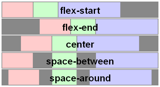
The
align-itemsproperty applies to all flex containers, and sets the default alignment of the flex items along the cross axis of each flex line. Thealign-selfapplies to all flex items, allows this default alignment to be overridden for individual flex items.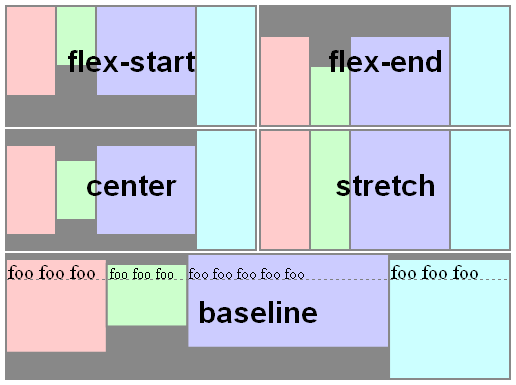
The
align-contentproperty only applies to multi-line flex containers, and aligns the flex lines within the flex container when there is extra space in the cross-axis.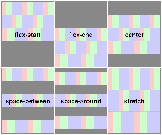
Here you have a snippet to play:
var form = document.forms[0], flex = document.getElementById('flex');form.addEventListener('change', function() { flex.style.flexDirection = form.elements.fd.value; flex.style.justifyContent = form.elements.jc.value; flex.style.alignItems = form.elements.ai.value; flex.style.alignContent = form.elements.ac.value;});ul { display: flex; flex-flow: row wrap; padding: 0; list-style: none;}li { padding: 0 15px;}label { display: block;}#flex { display: flex; flex-wrap: wrap; height: 240px; width: 240px; border: 1px solid #000; background: yellow;}#flex > div { min-width: 60px; min-height: 60px; border: 1px solid #000; background: blue; display: flex; justify-content: center; align-items: center; color: #fff;}#flex > .big { font-size: 1.5em; min-width: 70px; min-height: 70px;}<form> <ul> <li>flex-direction <label><input type="radio" name="fd" value="row" checked /> row</label> <label><input type="radio" name="fd" value="row-reverse" /> row-reverse</label> <label><input type="radio" name="fd" value="column" /> column</label> <label><input type="radio" name="fd" value="column-reverse" /> column-reverse</label> </li> <li>justify-content <label><input type="radio" name="jc" value="flex-start" checked /> flex-start</label> <label><input type="radio" name="jc" value="flex-end" /> flex-end</label> <label><input type="radio" name="jc" value="center" /> center</label> <label><input type="radio" name="jc" value="space-between" /> space-between</label> <label><input type="radio" name="jc" value="space-around" /> space-around</label> </li> <li>align-items <label><input type="radio" name="ai" value="flex-start" /> flex-start</label> <label><input type="radio" name="ai" value="flex-end" /> flex-end</label> <label><input type="radio" name="ai" value="center" /> center</label> <label><input type="radio" name="ai" value="baseline" /> baseline</label> <label><input type="radio" name="ai" value="stretch" checked /> stretch</label> </li> <li>align-content <label><input type="radio" name="ac" value="flex-start" /> flex-start</label> <label><input type="radio" name="ac" value="flex-end" /> flex-end</label> <label><input type="radio" name="ac" value="center" /> center</label> <label><input type="radio" name="ac" value="space-between" /> space-between</label> <label><input type="radio" name="ac" value="space-around" /> space-around</label> <label><input type="radio" name="ac" value="stretch" checked /> stretch</label> </li> </ul></form><div id="flex"> <div>1</div> <div class="big">2</div> <div>3</div> <div>4</div> <div class="big">5</div> <div>6</div></div>What is the difference between align-items vs. align-content in Grid Layout?
Let's start with clarifying the terminology:
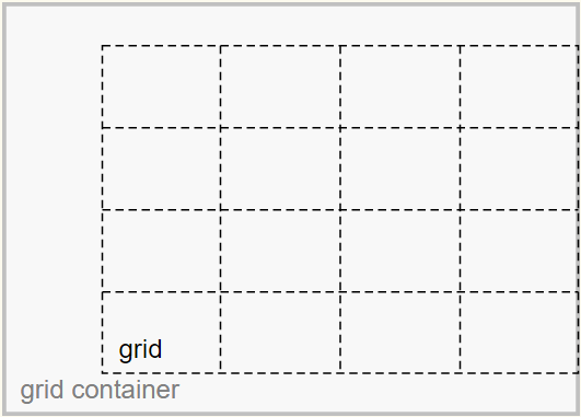
Grid Container
The grid container is the overall container for the grid and grid items. It establishes the grid formatting context (as opposed to another formatting context, such as flex or block).
Grid
The grid is a group of intersecting vertical and horizontal lines that divides the grid container’s space into grid areas, which are boxes that contain grid items.
Grid Items
Grid items are boxes in a grid container that represent in-flow content (i.e., content that is not absolutely positioned).
Here's an illustration from the W3C:
The justify-content and align-content properties align the grid.
The justify-self, justify-items, align-self and align-items properties align the grid items.
With regard to the problem described in your question:
My confusion revolves around the claim made by the author that the "
-content" set are there because: "Sometimes the total size of your grid might be less than the size of its grid container"
Well, you can see in the illustration that the grid is smaller than the grid container.
As a result, there is space remaining and the container is able to distribute this space to vertically center (align-content: center) and right-align (justify-content: end) the grid.
The extra space could also allow the grid to be spaced apart with values such as space-around, space-between and space-evenly.
However, if the grid size equaled the container size, then there would be no free space, and align-content / justify-content would have no effect.
Here's more from the spec:
10.3. Row-axis Alignment: the
justify-selfandjustify-items
propertiesGrid items can be aligned in the inline dimension by using the
justify-selfproperty on the grid item orjustify-itemsproperty
on the grid container.10.4. Column-axis Alignment: the
align-selfandalign-items
propertiesGrid items can also be aligned in the block dimension (perpendicular
to the inline dimension) by using thealign-selfproperty on the
grid item oralign-itemsproperty on the grid container.10.5. Aligning the Grid: the
justify-contentandalign-content
propertiesIf the grid’s outer edges do not correspond to the grid container’s
content edges (for example, if no columns are flex-sized), the grid
tracks are aligned within the content box according to the
justify-contentandalign-contentproperties on the grid
container.(emphasis added)
What's the difference between alignItems and alignSelf in React Native?
alignItems and alignSelf have the same functionality per se. The only difference being, alignItems applies the alignment on to it's children while alignSelf applies the alignment to itself. This is useful when you want to change the alignment of one child.
Here is an illustration from https://css-tricks.com/snippets/css/a-guide-to-flexbox/
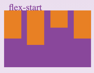
The above happens when the container has a style alignItems:'flex-start'
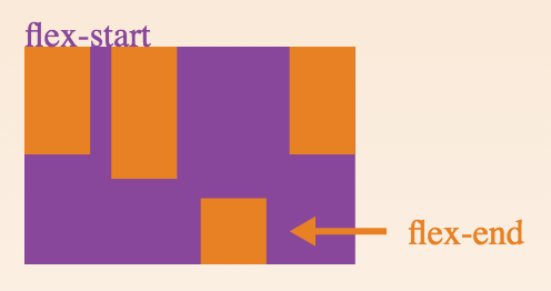
This happens when the container has the style alignItems:'flex-start' and the third child has the style alignSelf:'flex-end
What's the difference between margin:auto and justify-content / align-items center?
In your first example...
.outer {
  display: flex;
}
.inner {
  margin: auto;
}
... the auto margin applies only to the flex item and centers that one flex item within the container.
In your second example...
.outer {
  display: flex;
  justify-content: center;
  align-items: center;
}
You are centering items from the container level. This code will center all items.
Also, keep in mind, if you use both methods at the same time, margin: auto should prevail.
8.1. Aligning with auto
marginsPrior to alignment via
justify-contentandalign-self, any
positive free space is distributed to auto margins in that dimensionIf free space is distributed to auto margins, the alignment properties
will have no effect in that dimension because the margins will have
stolen all the free space left over after flexing.
But the most important difference, for practical purposes, may be the behavior when a flex item exceeds the size of the container. When this happens, you lose access to parts of the item when using the container-level code. The item disappears from the screen and is not accessible via scroll.
To overcome this problem, use margin: auto for centering to work properly.
Here's a more complete explanation:
- Can't scroll to top of flex item that is overflowing container
- Center a flex item vertically and horizontally (see Box #56)
IE Bugs:
- Flex auto margin not working in IE10/11
- Flexbox auto margins don't work with justify-content: center in IE
justify content won't align left
If both of your items inside the container are each 50% width, they won't move horizontally—they're spanning across the entire container; there's no free space (and justify-content works by distributing free space).
Remove the width: 50% rule and work on each item individually (using width, margin and/or flex properties).
Also, the justify-content property doesn't take left and right values. They're invalid. Here are the values that work.
Finally, when you're ready to pin both items to the left, consider flex auto margins.
Related Topics
Change Navbar Color in Twitter Bootstrap
How to Remove Focus Border (Outline) Around Text/Input Boxes - Chrome
Reset/Remove CSS Styles For Element Only
Css Display: Inline VS Inline-Block
Border Gradient With Border Radius
Stretch and Scale a CSS Image in the Background - With CSS Only
Remove White Space Below Image
Transparent Arrow/Triangle Indented Over an Image
Css - How to Overflow from Div to Full Width of Screen
How to Force Webkit to Redraw/Repaint to Propagate Style Changes
Select Every Nth Element in Css
Transparent Text Cut Out of Background
How to Prevent Less from Trying to Compile CSS Calc() Properties
How to Override Inline Styles With External Css
Is There a CSS Selector by Class Prefix