Vertical alignment based on x-height
The differece between text center position and the small letters center is equal to (ascender height - x-height - descender height)/2 (basically we need to increase somehow the descender height to make it equal to ascender height - x-height to move the geometric center of the line box to the position of the small letters center). From these 3 unknowns, only x-height is available for CSS (via ex unit). Other font metrics can't be read and remain kind of 'magical numbers', so it's possible only to choose the a specific value for each specific font. But with this 'font-specific magic number' you can center any number of lines - by giving the inner element display:inline-block and assigning the magic value to its padding-bottom.
It seems impossible to get the needed value from the font metrics in pure CSS. Such vertical-align values as text-top/text-bottom can give the position of ascender or descender, but only one of them, exotic values like sub seem to be completely arbitrary, and I found no possibility to 'measure' the difference between two font metrics for one element.
My most successful attempt was the way to move the line (or lines) by half of the needed difference, making 'hybrid' centering (neither caps nor lowercase letters are centerd precisely, but 'optically' the text may look even better centered). This can be done by another pseudo element added to the last line, that has the height of the line box, but its aligned with the center of small letters:
.blue:after {
  content: ':'; /* must contain text to get the auto height of the line box */
  display: inline-block;
  vertical-align: middle;
  width: 0; /* making pseudo elenent invisible */
  overflow: hidden;
}
Edited CodePen example with the result (I didn't hide pseudo elements there for visualization).
For centering the inline-block itself, any approach can be used, I choose the approach with second helper pseudo element that always has 100% height of the container, so no more magic numbers are needed.
Hope it helps:)
How to vertical-align to x-height?
The problem is, text sits on the text baseline while the image descends below that. And different browsers handle that differently.
My favorite solution is to display the image as a background-image, with its background-position set to left center ... you can season to taste.
Robust vertical alignment of both box and baseline using line-height?
Your box was too few high.
input, span {    display: inline-block;    box-sizing: border-box;    padding: 0;
    height: 24px; /* Note this correction */    line-height: 22px;    background-color: gray;       font-family: Arial, sans-serif;    font-weight: normal;    font-size: 14px;        width: 40px;    border: 1px solid black;    vertical-align: middle;}input {    background-color: #A6A6A6;}
<h4>One input, one span - the same ;-)</h4>vertical-align: middle messes up baseline alignment
<p> <input value="_asd_" type="text"> <span>_asd_</span></p>why the height of the out div is affected by vertical-align
As It is explained Here
Aligns the middle of the element with the baseline plus half the
x-height of the parent.
The line-height of your .wrap element is by default 1.5 that inherits from the body, the vertical align property will render depending on your line-height, so if the line height is bigger than your wrapper element, you will see the effect. to fix it just put line-height in your .wrap class, you can play with it to see how the line-height affects the vertical alignment.
body {  line-height: 1.5;}
.wrap {  line-height:1;  background:red;}
.btn {  font-size: 14px;  padding: 4px;  line-height: 1;  box-sizing: border-box;  border: 1px solid blue;  vertical-align: middle;}
<div class="wrap"> <button class="btn"> OK </button></div>inline-box with image vertical-align:middle with parent box
First the x-height of the element is not affected by the the image and is only defined by font-size and of course the font-family used. Then in order to get the value of the x-height you need to consider the ex unit.
Here is a better illustration taken for this answer
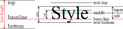
You may clearly see the difference between each value of vertical alignment and also notice the illustration of em and ex unit. Now in order to have the exact value of x-height, you simply need to use the ex unit.
Here is an example:
* { margin:0; padding:0;}body { font-family:Microsoft Yahei; font-size:16px; background-color:lightblue; line-height:2;}span { background-color:pink; border-right:1ex solid red; border-left:1em solid red; }img { width:50px; height:50px;}<span> words-g words-g words-g</span><br><span> words-g words-g words-g <img src="https://avatars3.githubusercontent.com/u/23273077" alt="Sample Image"></span>Vertical alignment on flex item with fixed height
Because now you need to center text inside li if you set height.
ul { display: flex; list-style: none; background: green; width: 400px; align-items: center;}ul li { flex: 50%;}ul.fail { background: red;}ul.fail li { height: 100px; display: flex; align-items: center;}<ul> <li>I am some text</li> <li>I am some more text I am some more text I am some more text</li></ul>
<ul class="fail"> <li>I am some text</li> <li>I am some more text I am some more text I am some more text</li></ul>How can I mix vertically-centered elements with different font sizes and retain consistent line height?
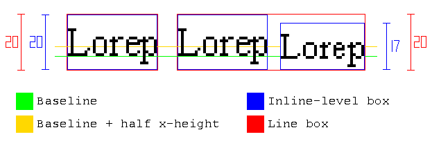
§10.8 explains how the height of the line boxes is calculated:
As described in the section on inline formatting contexts, user
agents flow inline-level boxes into a vertical stack of line
boxes. The height of a line box is determined as follows:
The height of each inline-level box in the line box is calculated.
[...] For inline boxes, this is their 'line-height'Since
.smallerinheritsline-height: 20pxand is an inline box (i.e. non-replaced withdisplay: inline), its height is20pxThe inline-level boxes are aligned vertically according to their
'vertical-align' property..smallerhasvertical-align: middle, which meansAlign the vertical midpoint of the box with the baseline of the parent
box plus half the x-height of the parent.The line box height is the distance between the uppermost box top and
the lowermost box bottom.
So both the text and .smaller have a height of 20px, but they have different alignment. Therefore, the line box grows:

Then, as other answers explain, a way to solve the problem is reducing .smaller's line-height:
However, there is an alternative solution, without modifying line-height: negative margins can be added to prevent .smaller from increasing the height of the line box.
As quoted above, the height of an inline box is its line-height, so to make the margins work, display: inline-block is also needed:
The height of each inline-level box in the line box is calculated. For
[...] inline-block elements [...] this is the height of their margin
box.
Note this solution won't break the alignment, because since .smaller has vartical-align: middle, if we use the same amount in margin-top and margin-bottom, it will remain centered.

To summarize, you can use this code:
.smaller {
    vertical-align: middle;
    display: inline-block;
    margin: -1em 0;
}
body { line-height: 20px; font-size: 14px;}.smaller { font-size: 0.9em; vertical-align: middle; display: inline-block; margin: -1em 0;}<div class="body"> <div class="why-not-twenty-px"> nor<span class="smaller">•</span>mal </div> <div class="why-not-sixty-px"> multiline multiline multiline multiline multiline multiline <span class="smaller">•</span> multiline multiline multiline multiline multiline multiline multiline multiline multiline multiline multiline multiline multiline multiline multiline multiline multiline multiline multiline multiline multiline multiline multiline multiline multiline multiline </div></div>How to understand the difference between vertical-align: -0.125em and vertical-align: middle?
vertical-align:middle means
Aligns the middle of the element with the baseline plus half the x-height of the parent
So you need to find the middle of your element, the baseline and half the x-height (defined by the ex unit).
Here is an example:
.box {  font-size:50px;  background:    linear-gradient(green,green) 0 46px/100% 2px no-repeat;}
.box > span {  display:inline-block;  width:30px;  height:30px;  background:    linear-gradient(black,black) center/100% 2px no-repeat,    linear-gradient(red,red) 0 calc(50% + 0.5ex)/100% 1px no-repeat,    yellow;  vertical-align:middle;}
<div class="box">Some text j <span></span></div>Related Topics
How to Increase Bootstrap 3 Navbar Height While Keeping Menu Height Small When Collapsed
Bootstrap Amazon Style Search Bar
Scss/Sass to CSS in Special Folder with PHPstorm 7 File Watcher
How to Make Leaflet Map Height Variable
How to Align Text to The Middle of an Element with CSS in Twitter Bootstrap
CSS Background-Position Animate Right to Left
CSS Transform on Svg Elements Ie9+
Sharepoint 2013 Deleting Contents of <Style> in Embed Code When Saving
Does Source-Maps in Style Tags Work
Using Container-Fluid Within Bootstrap Cause Horizontal Scrollbar
CSS Horizontal Navigation Spacing
How to Give Outer Glow to an Object in a Transparent Png Using CSS3
Remove All Borders on a Specific Datatable
Calculating Square-Roots with CSS
Layering Images in CSS - Possible to Put 2 Images in Same Element