Tailwindcss: fixed/sticky footer on the bottom
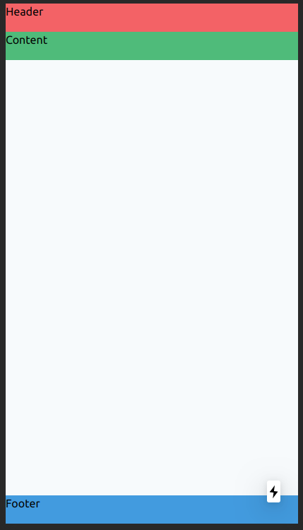
<div class="flex flex-col h-screen justify-between">
  <header class="h-10 bg-red-500">Header</header>
  <main class="mb-auto h-10 bg-green-500">Content</main>
  <footer class="h-10 bg-blue-500">Footer</footer>
</div>
Class justify-between is not required, but I would leave him (for other case).
So, play with h-screen and mb-auto classes.
And you get this UI:
How create a TRUE sticky header/ footer using Tailwindcss (sticks to bottom even if scroll)?
In the examples you're sharing they all expect the main content area to be where the scroll happens. To do this you just add overflow-hidden and h-screen to the outermost div or body tag and overflow-y-scroll to the main content area and that section will get it's own set of scrollbars but if done right the page itself will not have scrollbars. Here's an example of that on Tailwind play https://play.tailwindcss.com/A5Hs7ZtGad
In the end Tailwind is just CSS so if you can make something with CSS you can recreate it with Tailwind's utility classes. Another solution to this problem is if you just want a footer (or any div) to stay at the bottom above all other content and you want the regular scrollbars than you can give the element fixed bottom-0 left-0 w-full and it will have a similar result but will also have the ability to cover content if your inner elements don't have enough padding or margin. Here's an example of that https://play.tailwindcss.com/nna2QkrxlK
How to fix footer in the end of the page?
You had a master-footer-wrap and the footer itself set to position fixed. However, you need to set the position: relative for the body and to absolute for the footer. If you do this while either the footer or the master-footer-wrap is still set to position: fixed, it will remain fixed. Check the snippet below for a working example :)
/*BODY*/

html, body {

  position: relative;

  height: 150%;

  margin: 0px 0px 50px 0px;

  padding: 0;

}

/*FOOTER*/

#footer-logo {

  position: absolute;

  left: 20px;

  top: 12.5px;

  width: 61px;

  height: 25px;

}

.master-footer-list {

  list-style-type: none;

  overflow: hidden;

  padding: 0;

  margin: 0;

}

.master-footer-list li {

  display: inline-block;

  vertical-align: middle;

  padding-top: 17px;

  padding-left: 15px;

}

.master-footer-list a:hover {

  text-decoration: underline;

}

/* removed master footer wrap css */

footer {

  font-family: var(--work-sans);

  font-weight: 300;

  font-size: 14px;

  text-align: center;

  position: absolute; /* position absolute instead of fixed */

  bottom: -50px; /* move inside the body margin */

  left: 0;

  right: 0;

  margin-bottom: 0px;

  height: 50px;

  width: 100%;

  background-color: black;

}

/* Removed redundant div/wrapper */

footer a {

  color: #FF6869;

  text-decoration: none;

}

footer span {

  color: #C8C7CC;

}
<footer>
<a href="/"><img id="footer-logo" src="/assets/images/logo-white.png"><a/>
<ul class="master-footer-list">
<li><span>© 2019 – iStudi. Todos os direitos reservados.</span></li>
<li><a href="/termos-de-uso">Termos de Uso</a></li>
<li><a href="/politica-de-privacidade">Política de Privacidade</a></li>
</ul>
</footer>Tailwind CSS - Overflowing footer with fixed position
I have updated the HTML for your code and everything works fine. Here is the updated code : Sandbox link
Updates made was -
1. Removed class container mx-auto from body and added as a separate container div.
2. This new div will hold your nav and other contents, except footer.
What was happening earlier -
By default footer was aligning to the left from its parent which was body and as the body was aligning to the center it was displayed as if the footer is right aligned.
If you want to do it from your existing code, you can add one line in css -
footer { left: 0}
Tailwind css footer position not to the bottom
You can set a mt-auto to the footer. See Full Page:
<link href="https://unpkg.com/tailwindcss@^2/dist/tailwind.min.css" rel="stylesheet"/>
<div class="flex flex-col h-screen">
<!-- navbar -->
<div class="w-full text-gray-700 bg-white dark-mode:text-gray-200 dark-mode:bg-gray-800">
        <div x-data="{ open: false }" class="flex flex-col max-w-screen-xl px-4 mx-auto   md:items-center md:justify-between md:flex-row md:px-6 lg:px-8">
        <div class="p-4 flex flex-row items-center justify-between">
            <a href="#" class="text-lg font-semibold tracking-widest text-gray-900 uppercase rounded-lg dark-mode:text-white focus:outline-none focus:shadow-outline">Sachchidanand Prasad</a>
            <button class="md:hidden rounded-lg focus:outline-none focus:shadow-outline" @click="open = !open">
                <svg fill="currentColor" viewBox="0 0 20 20" class="w-6 h-6">
                <path x-show="!open" fill-rule="evenodd" d="M3 5a1 1 0 011-1h12a1 1 0 110 2H4a1 1 0 01-1-1zM3 10a1 1 0 011-1h12a1 1 0 110 2H4a1 1 0 01-1-1zM9 15a1 1 0 011-1h6a1 1 0 110 2h-6a1 1 0 01-1-1z" clip-rule="evenodd"></path>
                <path x-show="open" fill-rule="evenodd" d="M4.293 4.293a1 1 0 011.414 0L10 8.586l4.293-4.293a1 1 0 111.414 1.414L11.414 10l4.293 4.293a1 1 0 01-1.414 1.414L10 11.414l-4.293 4.293a1 1 0 01-1.414-1.414L8.586 10 4.293 5.707a1 1 0 010-1.414z" clip-rule="evenodd"></path>
                </svg>
            </button>
        </div>

        <nav :class="{'flex': open, 'hidden': !open}" class="flex-col flex-grow pb-4 md:pb-0 hidden md:flex md:justify-end md:flex-row">
            <a class="px-4 py-2 mt-2 text-sm font-semibold bg-transparent rounded-lg dark-mode:bg-gray-700 dark-mode:hover:bg-gray-600 dark-mode:focus:bg-gray-600 dark-mode:focus:text-white dark-mode:hover:text-white dark-mode:text-gray-200 md:mt-0 hover:text-gray-900 focus:text-gray-900 hover:bg-gray-200 focus:bg-gray-200 focus:outline-none focus:shadow-outline" href="index.html">Home</a>

            <a class="px-4 py-2 mt-2 text-sm font-semibold bg-transparent rounded-lg dark-mode:bg-transparent dark-mode:hover:bg-gray-600 dark-mode:focus:bg-gray-600 dark-mode:focus:text-white dark-mode:hover:text-white dark-mode:text-gray-200 md:mt-0 md:ml-4 hover:text-gray-900 focus:text-gray-900 hover:bg-gray-200 focus:bg-gray-200 focus:outline-none focus:shadow-outline" href="research.html">Research</a>

            <a class="px-4 py-2 mt-2 text-sm font-semibold bg-gray-200 text-gray-900 rounded-lg dark-mode:bg-transparent dark-mode:hover:bg-gray-600 dark-mode:focus:bg-gray-600 dark-mode:focus:text-white dark-mode:hover:text-white dark-mode:text-gray-200 md:mt-0 md:ml-4 hover:text-gray-900 focus:text-gray-900 hover:bg-gray-200 focus:bg-gray-200 focus:outline-none focus:shadow-outline" href="cv.html">CV</a>
        </nav>
    </div>
</div>

<!-- footer -->
<footer class="mt-auto border-t border-gray-200">
    <div class=" container flex flex-col flex-wrap px-4 py-16 mx-auto md:items-center lg:items-start md:flex-row md:flex-nowrap">

        <div class="justify-between w-full mt-4 text-center lg:flex">
            <div class="w-full px-4 lg:w-1/3 md:w-1/2">
                <h2 class="mb-2 font-bold tracking-widest text-gray-900">
                    Useful Links
                </h2>
                <ul class="mb-8 space-y-2 text-sm list-none">
                    <li>
                        <a class="text-gray-600 hover:text-gray-800" href="https://mathscinet.ams.org/mathscinet/" target="_blank">MathSciNet</a>
                    </li>
                    <li>
                        <a class="text-gray-600 hover:text-gray-800" href="https://www.ams.org/open-math-notes" target="_blank">AMS open Math Notes</a>
                    </li>
                    <li>
                        <a class="text-gray-600 hover:text-gray-800" href="https://mtts.org.in/" target="_blank">MTTS</a>
                    </li>
                    <li>
                        <a class="text-gray-600 hover:text-gray-800" href="https://www.atmschools.org/" target="_blank">ATM School</a>
                    </li>
                </ul>
            </div>
            <div class="w-full px-4 lg:w-1/3 md:w-1/2">
                <h2 class="mb-2 font-bold tracking-widest text-gray-900">
                    Useful Links
                </h2>
                <ul class="mb-8 space-y-2 text-sm list-none">
                    <li>
                        <a class="text-gray-600 hover:text-gray-800" href="http://www.nbhm.dae.gov.in/" target="_blank">NBHM</a>
                    </li>
                    <li>
                        <a class="text-gray-600 hover:text-gray-800">About Us</a>
                    </li>
                    <li>
                        <a class="text-gray-600 hover:text-gray-800">Blogs</a>
                    </li>
                    <li>
                        <a class="text-gray-600 hover:text-gray-800">Contact Us</a>
                    </li>
                </ul>
            </div>
            <div class="w-full px-4 lg:w-1/3 md:w-1/2">
                <h2 class="mb-2 font-bold tracking-widest text-gray-900">
                    Social Networks
                </h2>
                <ul class="mb-8 space-y-2 text-sm list-none">
                    <li>
                        <a class="text-gray-600 hover:text-gray-800" href="">Facebook</a>
                    </li>
                    <li>
                        <a class="text-gray-600 hover:text-gray-800" href="">Twitter</a>
                    </li>
                    <li>
                        <a class="text-gray-600 hover:text-gray-800" href="">Instagram</a>
                    </li>
                    <li>
                        <a class="text-gray-600 hover:text-gray-800" href="">Github</a>
                    </li>
                </ul>
            </div>
        </div>
    </div>
    <div class="flex justify-center">
        <p class="text-base text-gray-400">
            All rights reserved by @ <a class="text-gray-400 hover:text-gray-800" href="index.html">Sachchidanand</a> 2022
        </p>
    </div>
</footer>
</div>
TailwindCSS: How can I fix a header & footer to the screen while keeping scrollable content in between?
One way to keep flex on the parent container is to add sticky to the header and footer divs, with top-0 or bottom-0, like this:
Modified code from the tailwind play linked in your question.
<div class="flex flex-col h-screen">
  <header class="w-full text-center border-b border-grey p-4 sticky top-0">Some header</header>
  <main class="flex-1 overflow-y-scroll">
    <div class="min-h-screen bg-slate-100">
      <p>This is a very long section that consumes 100% viewport height!</p>
    </div>
    <div class="min-h-screen bg-slate-200">
      <p>This is second long section that consumes 100% viewport height!</p>
    </div>
    <div class="min-h-screen bg-slate-100">
      <p>This is third long section that consumes 100% viewport height!</p>
    </div>
    <div class="min-h-screen bg-slate-200">
      <p>This is fourth long section that consumes 100% viewport height!</p>
    </div>
    <div class="min-h-screen bg-slate-100">
      <p>This is fifth long section that consumes 100% viewport height!</p>
    </div>
  </main>
  <footer class="w-full text-center border-t border-grey p-4 sticky bottom-0">some footer</footer>
</div>
Why Footer is floating in tailwind css
You could set a minimum height based on 100vh minus the height of the footer to the main content container.
<main class="min-h-[calc(100vh-210px)]">Main Content</main>
<footer class="h-[210px] bg-gray-900">
    <!-- Your footer content -->
</footer>
Try it on TailwindCSS playground.
Related Topics
Why Is a Pseudo-Class So Called
Sass Store Selector in Variable
Twitter Bootstrap - Border Pushing Contents Down
How to Force Firefox to Render Textarea Padding the Same as in a Div
Difference Between Blank and Empty Pseudo-Classes
How to Override Device Pixel Ratio
What Does It Mean When a CSS Property Starts with a Dash
What Is Device Pixel Ratio For
How to Change Mui Input Underline Colour
Inherited Text-Decoration Style
How to Make Ie Support Min-Width/Max-Width CSS Properties
Css, Change Less Variable with @Media
Applying Webkit Transitions to Pseudo Elements
Webkit Linear Gradient Stops Render Incorrectly
Bootstrap: How to Collapse Navbar Earlier
Opera and Custom Cursor in CSS
(Css) Make a Background Image Scroll Slower Than Everything Else