JavaFX 8 - How to change the color of the prompt text of a NOT editable combobox via CSS?
When the ComboBox is not editable, there is no TextField, and the property -fx-prompt-text-fill is no longer valid, since the control displayed instead, a ListCell, doesn't extend TextInputControl.
In order to set the style of this cell, we can provide our custom styled ListCell:
@Override
public void start(Stage primaryStage) {
    ComboBox comboBox = new ComboBox();
    comboBox.getItems().addAll("Item 1", "Item 2", "Item 3");
    comboBox.setPromptText("Click to select");
    comboBox.setEditable(false);

    comboBox.setButtonCell(new ListCell(){

        @Override
        protected void updateItem(Object item, boolean empty) {
            super.updateItem(item, empty);
            if(empty || item==null){
                // styled like -fx-prompt-text-fill:
                setStyle("-fx-text-fill: derive(-fx-control-inner-background,-30%)");
            } else {
                setStyle("-fx-text-fill: -fx-text-inner-color");
                setText(item.toString());
            }
        }

    });

    Scene scene = new Scene(new StackPane(comboBox), 300, 250);
    primaryStage.setScene(scene);
    primaryStage.show();
}
Javafx Not Editable Combobox prompt text style with CSS
A Skin can be assigned from CSS. You could apply modifications to the Skinnable in the Skin's constructor, which is not what Skins should do.
Assigning a PseudoClass whenever no item is selected would be something that a Skin could do.
With such a pseudo-class the buttonCell can be styled from CSS.
package combobox.promptstyle;

import com.sun.javafx.scene.control.skin.ComboBoxListViewSkin;
import javafx.beans.value.ChangeListener;
import javafx.css.PseudoClass;
import javafx.scene.control.ComboBox;
import javafx.scene.control.SelectionModel;

// extend default ComboBox Skin
public class PromptSkin<T> extends ComboBoxListViewSkin<T> {

    private static final PseudoClass PROMPT = PseudoClass.getPseudoClass("prompt");

    public PromptSkin(final ComboBox<T> comboBox) {
        super(comboBox);

        ChangeListener<Number> selectionIndexChangeListener = (observable, oldIndex, newIndex) -> {
            getNode().pseudoClassStateChanged(PROMPT, newIndex.intValue() < 0);
        };

        ChangeListener<SelectionModel> modelChangeListener = (observable, oldSelectionModel, newSelectionModel) -> {
            if (oldSelectionModel != null) {
                oldSelectionModel.selectedIndexProperty().removeListener(selectionIndexChangeListener);
            }

            if (newSelectionModel != null) {
                newSelectionModel.selectedIndexProperty().addListener(selectionIndexChangeListener);
                selectionIndexChangeListener.changed(null, null, newSelectionModel.getSelectedIndex());
            } else {
                selectionIndexChangeListener.changed(null, null, -1);
            }
        };

        comboBox.selectionModelProperty().addListener(modelChangeListener);
        modelChangeListener.changed(null, null, comboBox.getSelectionModel());
    }

}
Example using the skin:
ComboBox comboBox = ...
comboBox.setId("combo");

// set stylesheet
CSS stylesheet
#combo {
    /* set skin to use */
    -fx-skin: 'combobox.promptstyle.PromptSkin';
}

#combo:prompt > .list-cell {
    -fx-text-fill: derive(-fx-control-inner-background,-30%);
}
Note that the Skin extends a class from the com.sun packages, which may be subject to change.
Javafx - combo-box text-field bg color
You can just add this css:
.combo-box > .list-cell{
    -fx-background-color: -fx-outer-border, white;
    -fx-background-insets: 1 -3 1 1, 1 -2 1 1 ;
}
But to get all the styles from edditable combobox you have to find .combo-box-base:editable from /jfxrt.jar!/com/sun/javafx/scene/control/skin/modena/modena.css and replace .text-field with .list-cell, because only editable combobox has .text-field
.combo-box > .arrow-button {
    -fx-background-color: -fx-shadow-highlight-color, -fx-outer-border, -fx-inner-border, -fx-body-color;
    -fx-background-insets: 0 0 -1 0, 0, 1, 2;
    -fx-background-radius: 3px, 3px, 2px, 1px;
    -fx-padding: 0.333333em 0.666667em 0.333333em 0.666667em; /* 4 8 4 8 */
    -fx-text-fill: -fx-text-base-color;
    -fx-alignment: CENTER;
    -fx-content-display: LEFT;
}

.combo-box  > .arrow-button{
    -fx-background-color: -fx-outer-border, -fx-inner-border, -fx-body-color;
    -fx-background-insets: 1 1 1 0, 1, 2;
    -fx-background-radius: 0 3 3 0, 0 2 2 0, 0 1 1 0;
}
.combo-box > .list-cell {
    -fx-background-color:
    linear-gradient(to bottom, derive(-fx-text-box-border, -10%), -fx-text-box-border),
    linear-gradient(from 0px 0px to 0px 5px, derive(-fx-control-inner-background, -9%), -fx-control-inner-background);
    -fx-background-insets: 1 0 1 1;
    -fx-background-radius: 2 0 0 2;
}
.combo-box:contains-focus {
    -fx-background-color: -fx-focus-color;
    -fx-background-insets: -0.2;
    -fx-background-radius: 3;
}
.combo-box:focused > .list-cell{
    -fx-background-color:
    -fx-control-inner-background,
    -fx-faint-focus-color,
    linear-gradient(from 0px 0px to 0px 5px, derive(-fx-control-inner-background, -9%), -fx-control-inner-background);
    -fx-background-insets: 1 0 1 1, 1 0 1 1, 3 2 3 3;
    -fx-background-radius: 2 0 0 2, 1 0 0 1, 0;
}

.combo-box :contains-focus > .arrow-button{
    -fx-background-color: -fx-inner-border, -fx-body-color, -fx-faint-focus-color, -fx-body-color;
    -fx-background-insets: 1, 2, 1, 2.6;
    -fx-background-radius: 0 2 2 0, 0 1 1 0, 0 1 1 0, 0 1 1 0;
}
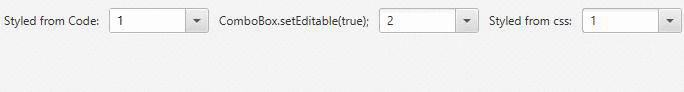
And here is the result:
1-st box styled with just 2 lines
2-nd has testComboBox2.setEditable(true);
3-d styled with big css from default styles.
JavaFX - TextField prompt text doesn't get deleted upon focus after changing color
The solution in this question and Slaws' answer helped me get to the solution of my problem.
CSS:
.root{
    username-prompt-text-fill: <color>;
}
#txtUsername{
    -fx-prompt-text-fill: username-prompt-text-fill;
}
#txtUsername:focused{
    -fx-prompt-text-fill: transparent;
}
JAVA:
txtUsername.setStyle("username-prompt-text-fill: " + returnColorValueInHex(colorPickerValue) + ";");
JavaFx comboBox JFoenix css
I am answering my own question for other people's reference. For some reason the font color of the Jfoenix combobox wasn't editable in css. So what I did instead is used the standard combobox provided and simply changed the css to make it look like the Jfoenix combobox.
This is the css style I used for combo-box:
.combo-box,
.choice-box {
    -fx-font-size: 12px;
    -fx-prompt-text-fill: black;
    -fx-text-fill: black;
    -fx-background-color: none;
    -fx-border-width: 0 0 1 0;
    -fx-border-color: #bdbdbd;
    -fx-padding: 0 0 3 -8;
}

.combo-box .list-cell:filled:selected .text,
.choice-box .list-cell:filled:selected .text {
    -fx-fill: black;
}

.combo-box .arrow,
.choice-box .arrow {
    -fx-background-color: #4d4d4d;
}
JavaFX ComboBox - How to get different Prompt Text and Selected Item Text?
Use a converter that uses the short version for the conversion and a custom cellFactory to create cells displaying the extended version:
static class Item {
    private final String full, part;

    public Item(String full, String part) {
        this.full = full;
        this.part = part;
    }

    public String getFull() {
        return full;
    }

    public String getPart() {
        return part;
    }

}

@Override
public void start(Stage primaryStage) {
    ComboBox<Item> comboBox = new ComboBox<>(FXCollections.observableArrayList(
            new Item("AB", "A"),
            new Item("CD", "C")
    ));

    comboBox.setEditable(true);

    // use short text in textfield
    comboBox.setConverter(new StringConverter<Item>(){

        @Override
        public String toString(Item object) {
            return object == null ? null : object.getPart();
        }

        @Override
        public Item fromString(String string) {
            return comboBox.getItems().stream().filter(i -> i.getPart().equals(string)).findAny().orElse(null);
        }

    });

    comboBox.setCellFactory(lv -> new ListCell<Item>() {

        @Override
        protected void updateItem(Item item, boolean empty) {
            super.updateItem(item, empty);

            // use full text in list cell (list popup)
            setText(item == null ? null : item.getFull());
        }

    });

    Scene scene = new Scene(comboBox);

    primaryStage.setScene(scene);
    primaryStage.show();
}
Related Topics
What Do Commas Mean in CSS Selectors
Nesting Element+Element Selector in SCSS
Anyone Know What The Purpose of Tagging a Class with *[Class]
Customizing Twitter Bootstrap Grid Does Not Work
Primefaces Elements Can't Load a Url of My CSS File
Image and Color Overlay on Hover
A Mnemonic for The Order of CSS Margin and Padding Shorthand Properties
Building a 4 Corners-Colors CSS3 Gradient
How to Do a 'Float: Left' with No Wrapping
CSS Not Loading in Firefox, Opera and Ie - Chrome and Safari Works Just Fine
How to Include a Custom CSS File in Typo3
Customizing Boostrap with Sass; Where Exactly Should I Import Bootstrap in My SCSS File
Styling a Hover Statement in Svg
Color Change of Navigation Buttons When Scrolling Up and When Scrolling Down
Why Jquery UI Button Looks Different in Firefox and Chrome
Auto Grid Columns, Without Wrapping to Next Row
Li:Before{ Content: "■"; } How to Encode This Special Character as a Bullit in an Email Stationery