How to prevent long words from breaking my div?
Soft hyphen
You can tell browsers where to split long words by inserting soft hyphen ():
averyverylongword
may be rendered as
averyverylongword
or
averyvery-
longword
A nice regular expression can ensure you won't be inserting them unless neccessary:
/([^\s-]{5})([^\s-]{5})/ → $1$2
Browsers and search engines are smart enough to ignore this character when searching text, and Chrome and Firefox (haven't tested others) ignore it when copying text to clipboard.
<wbr> element
Another option is to inject <wbr>, a former IE-ism, which is now in HTML5:
averyvery<wbr>longword
Breaks with no hyphen:
averyvery
longword
You can achieve the same with zero-width space character (or ).
FYI there's also CSS hyphens: auto supported by latest IE, Firefox and Safari (but currently not Chrome):
div.breaking {
  hyphens: auto;
}
However that hyphenation is based on a hyphenation dictionary and it's not guaranteed to break long words. It can make justified text prettier though.
Retro-whining solution
<table> for layout is bad, but display:table on other elements is fine. It will be as quirky (and stretchy) as old-school tables:
div.breaking {
   display: table-cell;
}
overflow and white-space: pre-wrap answers below are good too.
Preventing long words from flowing out of Div without using CSS break-word
it also breaks short words which are at the edge of the div
That's not true...word-wrap: break-word; shouldn't do that.
Perhaps you're confusing this with the word-break: break-all; property (which doesn't work in all browsers).
See this jsfiddle for a comparison:
http://jsfiddle.net/Snu8B/3/
For firefox you could try the hyphens property.
Automatically break up long words inside DIV container but prefer line breaking on spaces
You can set word-break property as break-word. I have updated your code and created a new fiddle. I think it will solve your problemCheck it out https://jsfiddle.net/yvLb6zer/
Stop word-wrap dividing words
use white-space: nowrap;. If you have set width on the element on which you are setting this it should work.
update -
rendered data in Firefox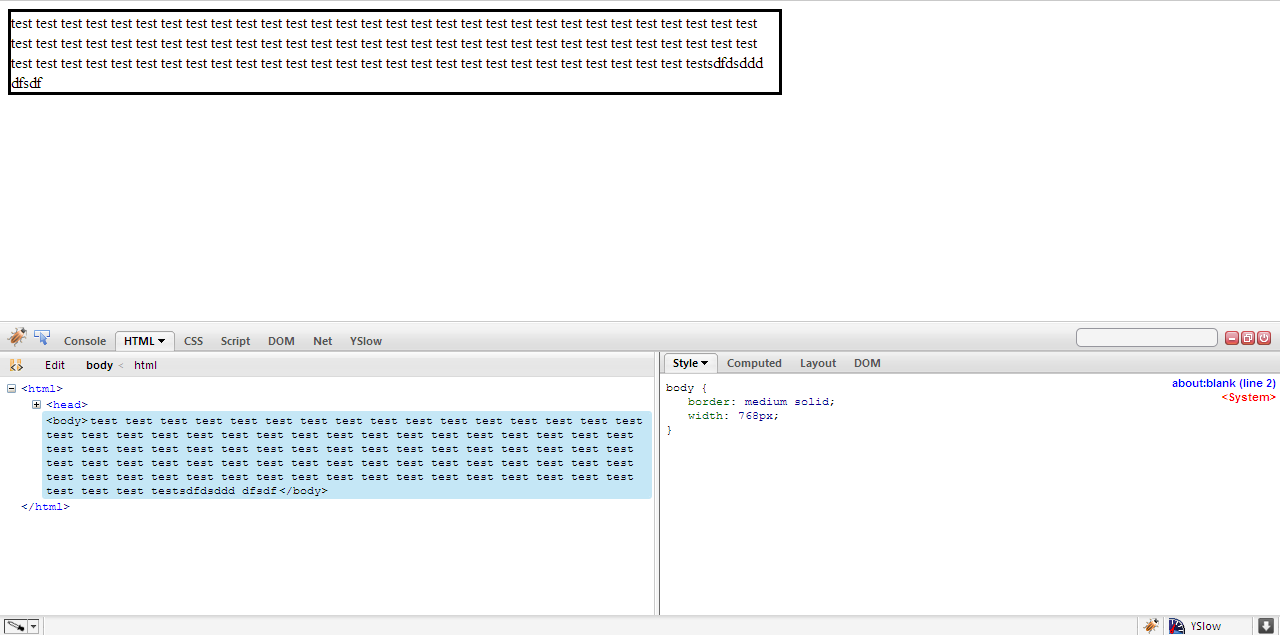
Why does `width: fit-content` prevent long unbroken words from wrapping?
width: fit-content forces the width of the container to, well, fit the content, up to the limit of max-content. Word breaks only occur if the content cannot fit within its container, but since the container is basically unbounded, the word doesn't wrap. You can see this if you set overflow: hidden on the outer container.
From Mozilla:
The max-content sizing keyword represents the intrinsic maximum width of the content. For text content this means that the content will not wrap at all even if it causes overflows.
* {
  box-sizing: border-box;
}

.outer {
  border: 4px solid red;
  width: 200px;
  overflow: hidden;
}

.inner {
  border: 4px solid blue;
  width: fit-content;
  width: -moz-fit-content;
  overflow-wrap: break-word;
  max-width: 300px;
}
Ex 1
<div class="outer">
<div class="inner">
kasdhakjsdhaksjdhjhgjhgjhgjhgjhgjhgjhghj
</div>
</div>
<br />
Ex 2
<div class="outer">
<div class="inner">
asd asd asd asd asd asd asd asd asd asd asd
</div>
</div>
<br />
Ex 3
<div class="outer">
<div class="inner">
asd asd asd
</div>
</div>How do I avoid 1 long word from messing up my comment section?
The problem with changing the default word wrapping behavior is that if the user is typing normally, their line may break in the middle of a word, which feels very unnatural.
I would consider instead putting a scrollbar on the div if the text gets too long. The way to do that is by giving it the overflow: auto CSS property.
Live Demo:
.content { background-color: white; margin: 0 auto; width: 500px; border: 1px solid purple; padding: 10px; overflow: auto;}<div class="content" style="color:#B404AE; font-weight:bold;">'.$name. '</div><div class="content">'VerylongwordVerylongwordVerylongwordVerylongwordVerylongwordVerylongwordVerylongwordVerylongwordVerylongwordVerylongwordVerylongwordVerylongwordVerylongwordVerylongwordVerylongwordVerylongwordVerylongwordVerylongwordVerylongwordVerylongwordVerylongwordVerylongwordVerylongwordVerylongwordVerylongwordVerylongwordVerylongwordVerylongwordVerylongwordVerylongwordVerylongwordVerylongwordVerylongwordVerylongwordVerylongwordVerylongword'</div><br/><div class="content" style="color:#B404AE; font-weight:bold;">'.$name. '</div><div class="content">'Shorter, normal words break and wrap normally when they reach the end of the div that they're in.'</div><br/>text flowing out of div
It's due to the fact that you have one long word without spaces. You can use the word-wrap property to cause the text to break:
#w74 { word-wrap: break-word; }
It has fairly good browser support, too. See documentation about it here.
Force long word to break inside div, but keep spaces between words
Until you specify how this does not solve your issue it will stay as my best answer: It sets all perameters you ask in your question http://jsfiddle.net/DIRTY_SMITH/xt9rj9d4/9/
div {
    word-wrap: break-word;
    border:1px solid black;
}
Related Topics
Overriding the Encapsulated CSS of External Component
Single Huge .Css File Vs. Multiple Smaller Specific .Css Files
How to Make Background-Size Work in Ie
Responsive CSS Background Images
Position Deeply Nested Elements in a Higher Level Grid Container
Remove Ie10'S "Clear Field" X Button on Certain Inputs
Column Order Manipulation Using Col-Lg-Push and Col-Lg-Pull in Twitter Bootstrap 3
Difference Between a Pseudo-Class and a Pseudo-Element in Css
Internet Explorer'S CSS Rules Limits
How to Add Fonts to Create-React-App Based Projects
Font Awesome Not Working, Icons Showing as Squares
Css Transform Doesn't Work on Inline Elements
Maintaining the Final State At End of a Css3 Animation
How Does the CSS Block Formatting Context Work
Overflow-X:Hidden Doesn't Prevent Content from Overflowing in Mobile Browsers