How to place a div below another div?
You have set #slider as absolute, which means that it "is positioned relative to the nearest positioned ancestor" (confusing, right?). Meanwhile, #content div is placed relative, which means "relative to its normal position". So the position of the 2 divs is not related.
You can read about CSS positioning here
If you set both to relative, the divs will be one after the other, as shown here:
#slider {
    position:relative;
    left:0;
    height:400px;

    border-style:solid;
    border-width:5px;
}
#slider img {
    width:100%;
}

#content {
    position:relative;
}

#content #text {
    position:relative;
    width:950px;
    height:215px;
    color:red;
}
http://jsfiddle.net/uorgj4e1/
Placing a div below another div
You're using absolute positioning with your #picture div, which means that it ignores the 'natural' order of positioning on the page. In order for your image to appear where you want it, adjust your CSS so that you aren't using absolute positioning. For example, you could put both image and #textual div within another div that you use for positioning the content inside.
Be sure to research the CSS Box Model to get a better understanding of how to optimally position elements with HTML and CSS.
Positioning a div under another div with absolute position
I believe this does what you're asking for:
<!DOCTYPE html>
<html>

<head>
  <title>Website Design</title>

  <style>
    .div1 {
      position: absolute;
      top: 0;
      bottom: 0;
      width: 25%;
    }

    .div2 {
      position: absolute;
      top: 0;
      left: 25%;
      bottom: 0;
      width: 75%;
      background-color: Coral;
    }

    .div3 {
      position: absolute;
      top: 100%;
      left: 0;
      bottom: 0;
      width: 100%;
      height: 100%;
      background-color: Aquamarine;
    }
  </style>
</head>

<body>

  <div class="div1"></div>

  <div class="div2"></div>

  <div class="div3"></div>

</body>

</html>
How to position div below another div
It looks as though this is actually a problem with the height of the divs.
Since the content is floating, it doesn't affect the height of the div. Thus, the content in the second div (NOT the div itself) wraps around the floated label from the first div.
clear: both is acceptable, but if (for instance), you wanted to use these divs as one column of a two-column layout, it would break the layout.
I would suggest div { overflow: hidden; } instead. This supplies a new box-context for the divs, which disallows overlapping borders, thus making the height of floated contents contribute to the height of the div.
Edit: Fixed fiddle
How to force div to appear below another div
You can try on menu2:
   float: right;
   clear: both;
here is a working fiddle
https://jsfiddle.net/qxLk4afk/2/
How can I position one element below another?
just give position : relative to second div and top:315px or what ever you want
.first{ width:70%; height:300px; position:absolute; border:1px solid red; }.second{ border:2px solid blue; width:40%; height:200px; position: relative; top: 315px;}<html><head>
</head><body><div class="first"></div><div class="second"></div></body></head>Place div below another div with property display:grid
Interesting problem, because the number of cards in the "wallet" can be 1, 2 or N and the fact that grid-auto-rows and/or grid-template-rows need to have tracking size explicit specified in the CSS.
Multiple solutions available (conserving the use of grid)
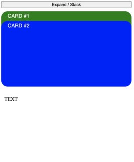
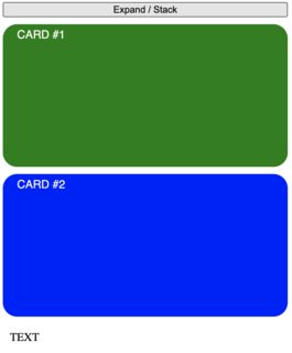
#1 The easy but ugly one
Simply set a margin-top: 200px; to the TEXT div. You apply this only when the cards are stacked.
I'm not a big fan of this solution since is more a "fix" than a proper design.
function expandStackCards() {
  var wrapper = document.getElementById("wrapper");
  if (wrapper.classList.contains("stacked")) {
    wrapper.classList.remove("stacked");
  } else {
    wrapper.classList.add("stacked");
  }
}
button {
width: 400px;
margin-bottom: 10px;
}
#wrapper {
display: grid;
grid-template-columns: 400px;
gap: 10px;
}
#wrapper.stacked {
grid-auto-rows: 30px;
gap: 0px;
}
.card {
width: 100%;
height: 200px;
background-color: grey;
border-radius: 20px;
padding: 6px 20px;
box-sizing: border-box;
}
.card span {
font-family: sans-serif;
text-transform: uppercase;
color: white;
}
.card.green {
background-color: green;
}
.card.blue {
background-color: blue;
}
.my-text {
margin: 10px;
}
.stacked .my-text {
margin-top: 200px;
}<button onclick="expandStackCards()">Expand / Stack</button>
<div id="wrapper" class="stacked">
<div class="card green"><span>Card #1</span></div>
<div class="card blue"><span>Card #2</span></div>
<div class="my-text">TEXT</div>
</div>Related Topics
How to Make Multiple Divs Display in One Line But Still Retain Width
How to Center Text in Select Box
How to Keep Two Divs on the Same Line
Formatting Numbers (Decimal Places, Thousands Separators, Localization, etc) With CSS
How to Change Whole Page Background-Color in Angular
How to Fade the Edge of a Div With Just CSS
Split Div into 2 Columns Using CSS
How Would You Make Two <Div>S Overlap
Download Attribute in <A> Tag Doesn't Work When File Url Called from Sub Domain
Css Change Button Style After Click
Css Files Are Not Loading in Laravel View
Img Src Svg Changing the Styles With CSS
What Is the Way to Add Horizontal Scroll on Material-Ui Table With Many Columns
Family Tree With Pure HTML and CSS (Or With Minimal Js)
How to Use HTML to Print Header and Footer on Every Printed Page of a Document
Stretch Child Div Height to Fill Parent That Has Dynamic Height