How to make 3-corner-rounded triangle in CSS
My best attempt: http://dabblet.com/gist/4592062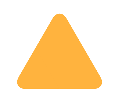
Pixel perfection at any size, uses simpler math than Ana's original solution, and is more intuitive in my opinion :)
.triangle { position: relative; background-color: orange; text-align: left;}.triangle:before,.triangle:after { content: ''; position: absolute; background-color: inherit;}.triangle,.triangle:before,.triangle:after { width:  10em; height: 10em; border-top-right-radius: 30%;}
.triangle { transform: rotate(-60deg) skewX(-30deg) scale(1,.866);}.triangle:before { transform: rotate(-135deg) skewX(-45deg) scale(1.414,.707) translate(0,-50%);}.triangle:after { transform: rotate(135deg) skewY(-45deg) scale(.707,1.414) translate(50%);}
<div class="triangle"></div>css rounded corner of right angled triangle
Here is an idea where you can rely on 2 pseudo element and some background coloration to approximate it. You simply need to find the correct value to have the perfect overlap between both pseudo elements.
h1 {  padding-left:1em;  position:relative;}
h1:before { content: ""; position:absolute; left: 0; top: calc(50% - 0.35em); width: 0.7em; height: 0.7em; background: linear-gradient(to bottom left, #34495e 50%, transparent 50%); border-radius: 0.1em;}h1:after { content: ""; position: absolute; left: 3.8px; top: -0.1px; width: 0.92em; height: 0.8em; margin-right: 10px; background: linear-gradient(to top,#34495e 3.5px,transparent 5px); border-radius: 0.1em; transform: rotate(45deg); z-index: -1;}<h1>Heading</h1>Is it possible to make a rounded triangle with just CSS?
To actually answer your question (and provide the first answer without border-radius): If you want a CSS only solution, you will have to use border-radius.
Nevertheless I would highly recommend to use SVG for creating shapes, as simple shapes like this are easy to create manually, it's responsive, it's widely supported now and (as @chharvey mentioned in the comments) semantically more appropriate.
<svg viewbox="0 0 50 50" height="56px"> <path d="M1 50 V10 Q1 1 10 1 H50z" fill="#ff4369" /></svg>Triangle with one rounded corner
I know this is a little hacky, but I don't think there is an easy way to do this with a single class.
All I've done is rotated a box 45 degrees with border-radius:10px and then contained it in another div with width set to the desired width of your arrow and overflow:hidden so that everything that spills over is invisible.
.arrow-left {  position: absolute;  width: 100px;  height: 100px;  left: 20px;  background: black;  -webkit-transform: rotate(45deg);  transform: rotate(45deg);  border-radius: 10px;}
.cover {  position: absolute;  height: 100px;  width: 40px;  overflow: hidden;}
<div class="cover"> <div class="arrow-left"></div></div>Rounded triangle right border css
You can add new div for arrow and apply the CSS for it..
See the Snippet below:
* {  box-sizing: border-box}.price{  width: 100px;  height: 50px;  background: #2d2d2d;  color:#fff;  align-items: center;  display: flex;  position:relative;  }    .icon{    font-size: 50px;  }    .items{    margin-left: 10px;    display: flex;    flex-direction: column;    height: 100%;    padding: 6px 0;    justify-content:space-between  }  .arrow {    position: absolute;    background-color: #2d2d2d;    text-align: left;    top: 4px;    right: -23px;    transform: rotate(-90deg) skewX(-30deg) scale(1,.866);}
.arrow:before,.arrow:after {    content: '';    position: absolute;    background-color: inherit;}
.arrow,.arrow:before,.arrow:after {    width: 28px;    height: 28px;    border-top-right-radius: 30%;}.arrow:before {    transform: rotate(-135deg) skewX(-45deg) scale(1.414,.707) translate(0,-50%);}
.arrow:after {  transform: rotate(135deg) skewY(-45deg) scale(.707,1.414) translate(50%);}
<div class="price"> <span class="icon">P</span> <div class="items"> <span class="title">Total</span> <span class="value">6 250</span> </div><div class="arrow"></div></div>Pure CSS tag div, with rounded triangle pointer
you can use clip-path for the shape, an SVG filter for the rounded corner (adjust the stdDeviation to control the radius) and a gradient coloration for the dot:
.box {
  display: inline-block;
  filter: url('#goo');
}

.box div {
  margin: 10px;
  padding: 20px 40px 20px 20px;
  font-size: 35px;
  font-weight: bold;
  font-family: sans-serif;
  color:#fff;
  transform-origin: right center;
  transform:rotate(-45deg);
  background:
    radial-gradient(8px at calc(100% - 20px) 50%,#fff 99%,transparent),/* the dot */
    linear-gradient(60deg,red,orange); /* gradient coloration */
  clip-path: polygon(0 0, calc(100% - 30px) 0, 100% 50%, calc(100% - 30px) 100%, 0 100%);
}
<div class="box">
<div>SALE</div>
</div>
<svg style="visibility: hidden; position: absolute;" width="0" height="0" xmlns="http://www.w3.org/2000/svg" version="1.1">
<defs>
<filter id="goo"><feGaussianBlur in="SourceGraphic" stdDeviation="5" result="blur" />
<feColorMatrix in="blur" mode="matrix" values="1 0 0 0 0 0 1 0 0 0 0 0 1 0 0 0 0 0 19 -9" result="goo" />
<feComposite in="SourceGraphic" in2="goo" operator="atop"/>
</filter>
</defs>
</svg>How to create a triangle in CSS3 using border-radius
Demo
#player {  margin: 32px;  position: relative;  width: 400px;  height: 250px;  background-color: #222;}
#inner {  transform: rotate(45deg);  background-color: silver;  width: 100px;  height: 100px;  top: 20px;  left: -50px;  position: relative;  border-radius: 20px;}
#outer {  position: absolute;  top: 50px;  left: 165px;  width: 70px;  height: 140px;  overflow: hidden;}
<div id="player"> <div id="outer"> <div id="inner"></div> </div></div>css3 triangle shape with one rounded corner
One solution that appears to work (tested in Chrome, Safari, Firefox) is removing the following lines from .triangle-topright
-webkit-border-top-right-radius: 6px 6px;
-moz-border-radius-topright: 6px / 6px;
-khtml-border-top-right-radius: 6px / 6px;
border-top-right-radius: 6px / 6px;
And instead simply adding overflow: hidden; to the .box css.
Demo: http://jsfiddle.net/BcrKH/
Related Topics
In Rc.1 Some Styles Can't Be Added Using Binding Syntax
What Do Commas and Spaces in Multiple Classes Mean in Css
Set Opacity of Background Image Without Affecting Child Elements
What Does !Important Mean in Css
How Does Flex-Wrap Work With Align-Self, Align-Items and Align-Content
Center a Column Using Twitter Bootstrap 3
Difference Between Visibility:Hidden and Display:None
Align Child Elements of Different Blocks
What Are the Differences Between Flex-Basis and Width
I Do Not Want to Inherit the Child Opacity from the Parent in Css
Bootstrap Align Navbar Items to the Right
What Does the CSS Rule "Clear: Both" Do
Css Customized Scroll Bar in Div
Css Floating Divs At Variable Heights
Creating Css3 Circles Connected by Lines