Is there any way to have slanted box-shadows using only CSS?
Pure CSS Slanted Shadow with Cut Corners
This took a little while to perfect, but it now has a slanted drop shadow under the banner which also has cut corners and multiple borders. All effects, including the background, logo, and shadow, are generated with pure CSS.
View on jsFiddle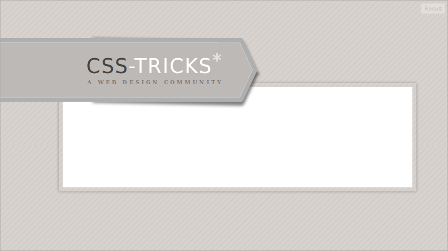
HTML
<div class="wrapper">
 <div>
  <h1><span>CSS</span>-Tricks</h1>
  <h2>A Web Design Community</h2>
 </div>
</div>
<div class="body">
 <div></div>
</div>
CSS
<style type="text/css">
body {
    min-width:600px;
    background-image:-webkit-repeating-linear-gradient(135deg, #d8d2ce, #d8d2ce 6px, #ccc6c3 7px, #d8d2ce 8px);
    background-image:repeating-linear-gradient(135deg, #d8d2ce, #d8d2ce 6px, #ccc6c3 7px, #d8d2ce 8px);
    background-color:#d8d2ce;
}
.wrapper {
    position:relative;
    margin:77px 46% 10% -10%;
}
.wrapper div:after,
.wrapper div:before {
    content:".";
    font-size:0;
    color:transparent;
    background-color:#bcb9b7;
    position:absolute;
    right:-12px;
    height:50%;
    width:40px;
    padding-top:2.5px;
    border-right:8px solid #afafaf;
}
.wrapper div:after {
    background-image:
        linear-gradient(90deg, transparent, transparent 38px, #c5c5c5 38px, #c5c5c5 40px),
        linear-gradient(180deg, #c5c5c5 0px, #c5c5c5 2px, transparent 2px);
    border-top:8px solid #afafaf;
    top:-10px;
    -webkit-transform-origin:100% 0;
    -webkit-transform: skewX(25deg);
    -ms-transform-origin:100% 0;
    -ms-transform: skewX(25deg);
    transform-origin:top right;
    transform: skewX(25deg);
}
.wrapper div:before {
    background-image:
        linear-gradient(90deg, transparent, transparent 38px, #c5c5c5 38px, #c5c5c5 40px),
        linear-gradient(0deg, #c5c5c5, #c5c5c5 2px, transparent 2px);
    border-bottom:8px solid #afafaf;

    bottom:-10px;
    right:-12px;

    -webkit-transform-origin:100% 100%;
    -webkit-transform: skewX(-25deg);
    -ms-transform-origin:100% 100%;
    -ms-transform: skewX(-25deg);
    transform-origin:bottom right;
    transform: skewX(-25deg);
}
.wrapper div {
    background:#bcb9b7;
    position:relative;
    z-index:2;
    top:-8px;
    left:-8px;
    border:2px solid #c5c5c5;
    box-shadow:0 0 0 8px #afafaf;
    text-align:right;
    text-transform:uppercase;
    font-family:sans-serif;
    color:#ffffff;
    font-size:40px;
    letter-spacing:.05em;
    padding:.55em .7em .55em;
}
.wrapper div h1:after {
    content:"*";
    color:#e5e1de;
    font-weight:bold;
    position:relative;
    top:-.4em;
    font-size:.9em;
}
.wrapper div span {
    color:#444444;
}
.wrapper div h1 {

}
.wrapper div h2 {
    font-size:.26em;
    letter-spacing:.4em;
    font-weight:bold;
    color:#807B77;
    font-family:serif;
    margin-top:.2em;
}
.wrapper:before {
    content:".";
    font-size:0;
    color:transparent;
    display:block;
    width:100%;
    height:90%;
    position:absolute;
    left:0;
    top:0;
    background:rgba(0,0,0,.5);
    box-shadow:0 0 12px 15px rgba(0,0,0,.5);
    -webkit-transform-origin:100% 100%;
    -webkit-transform: translate(-4px,10px) scale(.5, .5) matrix(1, .021, 0, 1, 10, 0) skewX(-25deg);
    -ms-transform-origin:100% 100%;
    -ms-transform: translate(-4px,10px) scale(.5, .5) matrix(1, .021, 0, 1, 10, 0) skewX(-25deg);
    transform-origin:100% 100%;
    transform: translate(-4px,10px) scale(.5, .5) matrix(1, .021, 0, 1, 10, 0) skewX(-25deg);
    z-index:1;
}
.wrapper:after {
    content:".";
    font-size:0;
    color:transparent;
    display:block;
    width:100%;
    height:90%;
    position:absolute;
    left:0;
    top:0;
    background:rgba(0,0,0,.5);
    box-shadow:0 0 12px 15px rgba(0,0,0,.5);
    -webkit-transform-origin:100% 0;
    -webkit-transform: translate(-4px,-4px) scale(.5, .5) matrix(1, .021, 0, 1, 10, 0) skewX(25deg);
    -ms-transform-origin:100% 0;
    -ms-transform: translate(-4px,-4px) scale(.5, .5) matrix(1, .021, 0, 1, 10, 0) skewX(25deg);
    transform-origin:100% 0;
    transform: translate(-4px,-4px) scale(.5, .5) matrix(1, .021, 0, 1, 10, 0) skewX(25deg);
    z-index:1;
}

.body {
    border:8px solid rgba(0,0,0,0);
    box-shadow:0 0 5px rgba(0,0,0,.3);
    position:absolute;
    top:165px;
    margin-left:13%;
    width:80%;
    -moz-box-sizing:border-box;
    -webkit-box-sizing:border-box;
    -o-box-sizing:border-box;
    -ms-box-sizing:border-box;
    box-sizing:border-box;
}
.body div {
    height:200px;
    background:white;
}
</style>
45 Degree Angle + Box Shadow - Using nothing but CSS
There is something called Sandpaper that can help you to transform your elements, even in IE!
.myDiv {
    -sand-transform: rotate(45deg);
}
You can just plug it into your site and you're set.
Also you can use CSS3 transforms, which you asked about in your question: "Using nothing but CSS."
To do this you'd use:
 .myDiv {
    -webkit-transform: rotate(45deg);
    -moz-transform: rotate(45deg);
    filter: progid:DXImageTransform.Microsoft.BasicImage(rotation=5); /*for IE*/
}
And thanks to Josh and Robert for the Opera equivalent:
-o-transform: rotate(45deg);
Internet Explorer will drop ClearType on any text that has a filter applied to it. But you can add empty extra element inside the main one and apply filter to this extra element. After this ClearType will be not ruined and the same result can be achieved.
How to get box-shadow on left & right sides only
NOTE: I suggest checking out @Hamish's answer below; it doesn't involve the imperfect "masking" in the solution described here.
You can get close with multiple box-shadows; one for each side
box-shadow: 12px 0 15px -4px rgba(31, 73, 125, 0.8), -12px 0 8px -4px rgba(31, 73, 125, 0.8);
http://jsfiddle.net/YJDdp/
Edit
Add 2 more box-shadows for the top and bottom up front to mask out the that bleeds through.
box-shadow: 0 9px 0px 0px white, 0 -9px 0px 0px white, 12px 0 15px -4px rgba(31, 73, 125, 0.8), -12px 0 15px -4px rgba(31, 73, 125, 0.8);
http://jsfiddle.net/LE6Lz/
How can I add a box-shadow on one side of an element?
Yes, you can use the shadow spread property of the box-shadow rule:
.myDiv{ border: 1px solid #333; width: 100px; height: 100px; box-shadow: 10px 0 5px -2px #888;}<div class="myDiv"></div>Only CSS rotate box-shadow without original element
Most flexible answer using only CSS is probably this:
.item {
    position: relative; /* or absolute */
}

.item:before {
    content: "";
    position: absolute;
    top: 0;
    left: 0;
    right: 0;
    bottom: 0;
    background: transparent;

    box-shadow: -50px 80px 4px 10px #555;
    -webkit-transform: rotate(10deg);
    -moz-transform: rotate(10deg);
    -o-transform: rotate(10deg);
    -ms-transform: rotate(10deg);
    transform: rotate(10deg);
}
How to make this button is CSS with Angled , Drop shadow, Inset shadow with flexibility in width
The final result is:
pure css blue button http://img832.imageshack.us/img832/8258/664d7b5656434db68cbee8b.png
Demonstration of flexibility:
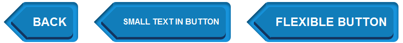
Although I tried to make a button like in the picture, but some parts may not be the same. Would consider it a proof of concept.
This button can be pure CSS only with a lot of extra markup with this markup:
<a class="btn">
    <span class="triangle"></span>
    <span class="btn_inner">
        <span class="triangle"></span>
        Back
    </span>
</a>
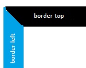
The main trick for creating triangles with box-shadow includes several steps:
Step 1. Create element '.triangle' - it will be a wrap for real triangle.
Step 2. Apply
position: absolute;, fix itswidthandheight:
red background-color is onle for demo
Step 3. Create big square element '.triangle::before' — it will be 'real' triangle after step 6
Step 4. Turn it 45 degrees (
transform: rotate(45deg)).Step 5. Add box-shadow.
The result after step 3 is:
Step 6. Add
overflow: hidden;Ta-dum!
On .tag_inner use the same trick, but box-shadow should be not inset but normal.
Notice, that if you will use this trick always check what vendor prefixes must be used and place property without prefix on the last place.
Update: Make markup more semantic — only one element for triangle trick.
box-shadow to the left side of a div only
Try changing your box-shadow property by adding a negative spread radius like this: http://jsfiddle.net/vW8VS/3/
div.side-bar {
    text-align: right;
    width: 11%;
    margin-left: 88%;
    border-left: 1px solid #000;
    position: fixed;
    height: 88%;
    -webkit-box-shadow: -5px 0px 5px -3px #616161;
    box-shadow: -5px 0px 5px -3px #616161;
}
That should let you push it off to just one side without worrying about the top and bottom.
Box-Shadow over angled corner
It is normally impossible, because the slanted corner is a part of border of element that is not visible.
In image if the blue area changes to white you have a slanted corner black area, that is a part of border and in css we can not any think to change this.(change as you want).
You can cover the shadows by adding two little divs to the product div:
<div class="product-info-wrapper">
    <div class="coverShadow c1"></div>
    <div class="coverShadow c2"></div>
    ....
And CSS:
.coverShadow {
   position: absolute;
   z-index: 999;
   background-color: white;
   box-shadow: 0 0 14px white;
 }

 .coverShadow.c1 {
    width: 10px;
    height: 35px;
    background-color: white;
    bottom: 8px;
    right: -10px;
 }

 .coverShadow.c2 {
    width: 35px;
    height: 10px;
    bottom: 0px;
    right: 0;
 }
By changing the box shadow and width/height and right/bottom of covering divs it could be more smooth.
And thanks for the good idea for creating slanted corners.
Box-Shadow on the left side of the element only
You probably need more blur and a little less spread.
box-shadow: -10px 0px 10px 1px #aaaaaa;
Try messing around with the box shadow generator here http://css3generator.com/ until you get your desired effect.
Related Topics
Set Width of Ng-Multiselect-Dropdown
Hide Content for Small and Extra Small Screen Size Devices
CSS Fixed Div Within Container
Not (Max-Width: 512Px) Not Working
Why Do Modern Browsers Still Put Spaces Between Inline Block If There Is Whitespace
Change Link Color Based on Href Attribute
Set Div Height Equal to Screen Size
Phonegap + Windows Phone 8: Viewport Meta & Scaling Issue
How to Center Form in Twitter Bootstrap
Typo3 Show Content from Subpages Inlcuding CSS Classes
Vertical-Align Not Working with Xhtml 1.0 Transitional Doctype
Ie8 Horizontal Scrollbar Problem
Resizing CSS Custom Mouse Cursor
CSS3 Image Frame-Border Z-Index
CSS: Using Hsl Variable in Hsla