How can I align one item right with flexbox?
To align one flex child to the right set it withmargin-left: auto;
From the flex spec:
One use of auto margins in the main axis is to separate flex items
into distinct "groups". The following example shows how to use this to
reproduce a common UI pattern - a single bar of actions with some
aligned on the left and others aligned on the right.
.wrap div:last-child {
  margin-left: auto;
}
Updated fiddle
.wrap { display: flex; background: #ccc; width: 100%; justify-content: space-between;}.wrap div:last-child { margin-left: auto;}.result { background: #ccc; margin-top: 20px;}.result:after { content: ''; display: table; clear: both;}.result div { float: left;}.result div:last-child { float: right;}<div class="wrap"> <div>One</div> <div>Two</div> <div>Three</div></div>
<!-- DESIRED RESULT --><div class="result"> <div>One</div> <div>Two</div> <div>Three</div></div>How to Right-align flex item?
A more flex approach would be to use an auto left margin (flex items treat auto margins a bit differently than when used in a block formatting context).
.c {
    margin-left: auto;
}
Updated fiddle:
.main { display: flex; }.a, .b, .c { background: #efefef; border: 1px solid #999; }.b { flex: 1; text-align: center; }.c {margin-left: auto;}<h2>With title</h2><div class="main"> <div class="a"><a href="#">Home</a></div> <div class="b"><a href="#">Some title centered</a></div> <div class="c"><a href="#">Contact</a></div></div><h2>Without title</h2><div class="main"> <div class="a"><a href="#">Home</a></div> <!--<div class="b"><a href="#">Some title centered</a></div>--> <div class="c"><a href="#">Contact</a></div></div><h1>Problem</h1><p>Is there a more flexbox-ish way to right align "Contact" than to use position absolute?</p>Center one and right/left align other flexbox element
Below are five options for achieving this layout:
- CSS Positioning
- Flexbox with Invisible DOM Element
- Flexbox with Invisible Pseudo-Element
- Flexbox with
flex: 1 - CSS Grid Layout
Method #1: CSS Positioning Properties
Apply position: relative to the flex container.
Apply position: absolute to item D.
Now this item is absolutely positioned within the flex container.
More specifically, item D is removed from the document flow but stays within the bounds of the nearest positioned ancestor.
Use the CSS offset properties top and right to move this element into position.
li:last-child { position: absolute; top: 0; right: 0; background: #ddd;}ul { position: relative; padding: 0; margin: 0; display: flex; flex-direction: row; justify-content: center; align-items: center;}li { display: flex; margin: 1px; padding: 5px; background: #aaa;}p { text-align: center; margin-top: 0;}span { background-color: aqua;}<ul> <li>A</li> <li>B</li> <li>C</li> <li>D</li></ul><p><span>true center</span></p>Using a flexbox, how can I align one element on the far left, one on the far right and another below the far right one?
Flexbox Solution
Here is a simple example. Both items on the first row take up 50% of space. The last item is pushed to the far right using margin-left: auto.
.container {  display: flex;  flex-wrap: wrap;}
.one, .two {  flex-basis: 50%;}
.two {  text-align: right;}
.three {  margin-left: auto;}
<div class="container"> <div class="one"> one </div> <div class="two"> two </div> <div class="three"> three </div> </div>How to align flexbox columns left and right?
You could add justify-content: space-between to the parent element. In doing so, the children flexbox items will be aligned to opposite sides with space between them.
Updated Example
#container {
    width: 500px;
    border: solid 1px #000;
    display: flex;
    justify-content: space-between;
}
#container {    width: 500px;    border: solid 1px #000;    display: flex;    justify-content: space-between;}
#a {    width: 20%;    border: solid 1px #000;}
#b {    width: 20%;    border: solid 1px #000;    height: 200px;}
<div id="container"> <div id="a"> a </div> <div id="b"> b </div></div>Css flex - one item on the right, the other centered on the left space
The solution to this problem is using nested flexboxes. Get rid of the display: block; on .item - you can't mix flex and block display rules like that.
What you want to do is set up series of containers:
- one top level flex container
- two equally sized flex containers inside of the the top level container
Markup will look like this:
<main class="container">
  <section class="left-container">
    <div class="item"></div>
  </section>
  <section class="right-container">
    <div class="item"></div>
  </section>
</main>
In the CSS layer, you give the top-level .container flex and then justify-content: space-between which pushes the containers to the sides.
.container {
  display: flex;
  justify-content: space-between;
}
In the two nested containers, you need to make them both display: flex; as well. Now you can control the positioning of your .item elements like you want. align-items: center controls the vertical axis so .left-container gets only that positioning while the right container gets justify-content: center; to control the vertical alignment.
.left-container {
  background-color: darkgray;
  display: flex;
  align-items: center;
  height: 200px;
  width: 50%;
}

.right-container {
  background-color: lightgray;
  display: flex;
  align-items: center;
  justify-content: center;
  height: 200px;
  width: 50%;
}
Styling on the item is pretty simple - I just gave height and width for demo purposes. They aren't necessary. If you want to do precise tweaks, use margin on .item to push slightly from these standards.
.item {
  background-color: red;
  height: 100px;
  width: 100px;
}
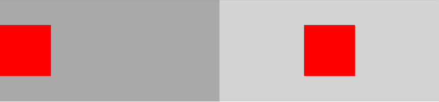
Codepen:
https://codepen.io/staypuftman/pen/PmLyNM
How can I align one flexbox item to the right and two stacked on the left?
One solution is to merge the first two li tags into one, wrapping each in a div.
<ul id="repairList">
  <li>
    <div class="repairTitle">
       <h4>Repair</h4>
    </div>
    <div class="repairBtn">
        <button>Repair Rates</button>
    </div>
  </li>
  <li>
    <img id="repairPic" src=""/>
  </li>
</ul>
Setting the h4 and button to display: block will also work if you'd prefer to avoid the extra divs.
These solutions avoid the common issues that arise from float positioning.
Align the content of the div to the right in a flex
Just use margin-left: auto on the element you want shoved to the side. Inside a flex container anything with an auto margin on any side will push it to the farthest opposite side.
.song {
  display: flex;
  flex-direction: row;
  align-items: center;
  border: 1px solid red;
  padding: 10px
}

.song-name {
  padding: 10px;
  display: flex;
  align-items: center;
}

.song-action {
  padding: 10px;
  margin-left: auto;
  color: red;
}
<div class="song">
<div class="album-cover">
<img src="https://gravatar.com/avatar/dba6bae8c566f9d4041fb9cd9ada7741?d=identicon&f=y" />
</div>
<div class="song-name">
Song name
</div>
<div class="song-action">
Add to library
</div>
</div>Related Topics
Creating Css3 Circles Connected by Lines
Vuejs Vue-Router Linking an External Website
Bootstrap Take Full Width for Select Drop Down
How to Make Ng-Select Remove-And-Read-Only
How to Scale an Image Proportionally Within a Table Cell of a Fixed Size
Bootstrap 4 - Change Position of Carousel Controls
Bootstrap 4 Table With One Column Larger Than Others
Is There a CSS Selector for Elements Containing Certain Text
How to Change Angular Material Table Row Height
How to Wrap or Truncate Long Strings in a Material-Ui Expansionpanelsummary
How to Style the ≪Option≫ With Only Css
Difference Between Margin and Padding
Order Columns Through Bootstrap4
Set Size on Background Image With Css
Difference Between "Screen" and "Only Screen" in Media Queries
How to Style Child Components from Parent Component'S CSS File