4 gradient borders in CSS
Using background image: (produces the exact output as your image)
You seem to be having gradients that are different on each sides and so it is difficult to achieve this with the border-image property. You could try and mimic the behavior using background-image like in the below snippet.
Basically what the below snippet does is that it creates the gradient for each of the 4 sides as gradient background image strips and then uses background-position to place them on the correct location.
The transparent border on parent is a placeholder where the mimiced border would end up appearing. The background-origin: border-box makes the background of the element start from border-box area itself (and not padding-box or content-box). These two are just extra steps to avoid the usage of unnecessary calc stuff in the background-position.
.test { height: 250px; border: 2px solid transparent; background-image: linear-gradient(to right, rgb(187, 210, 224), rgb(203, 231, 190)), linear-gradient(to bottom, rgb(114, 191, 87), rgb(116, 191, 86)), linear-gradient(to left, rgb(204, 233, 187), rgb(187, 210, 224)), linear-gradient(to top, rgb(84, 144, 184), rgb(80, 138, 176)); background-origin: border-box; background-size: 100% 2px, 2px 100%, 100% 2px, 2px 100%; background-position: top left, top right, bottom right, bottom left; background-repeat: no-repeat; padding-top: 50px;}<div class="test"> This is a box and i want border for all the side</div>Gradient borders
WebKit now (and Chrome 12 at least) supports gradients as border image:
-webkit-border-image: -webkit-gradient(linear, left top, left bottom, from(#00abeb), to(#fff), color-stop(0.5, #fff), color-stop(0.5, #66cc00)) 21 30 30 21 repeat repeat;
Prooflink -- http://www.webkit.org/blog/1424/css3-gradients/
Browser support: http://caniuse.com/#search=border-image
Adding a double border to a linear-gradient-filled-div colors the border too
You can manipulate box-shadow property... you can have more than one!
.colors { width: 100px; padding: 10px; height: 50px; background: linear-gradient(white, orange); box-shadow: inset 0 0 0 2px black, inset 0 0 0 8px white, inset 0 0 0 10px black;}<div class="colors"></div>Border Gradient with Border Radius
2021: I recommend using the CSS mask method since the support is pretty good now
You cannot use border-radius with gradient. Here is another idea where you can rely on multiple background and adjust the background-clip:
.white-grad {
  background:
    linear-gradient(#ccc 0 0) padding-box, /*this is your grey background*/
    linear-gradient(to right, #9c20aa, #fb3570) border-box;
  color: #313149;
  padding: 10px;
  border: 5px solid transparent;
  border-radius: 15px;
  display: inline-block;
  margin: 75px 0;
}
<div class="white-grad"> Some text here</div>
<div class="white-grad"> Some long long long text here</div>
<div class="white-grad"> Some long long <br>long text here</div>Android Gradient border?
I understand that you want what can be described as a corona around the disk with the disk a solid color and the corona starting with the color black at the disk's edge and transitioning to transparency radially.
I think you will need to implement a drawable for the corona with a RadialGradient using the constructors that allows the specification of colors and color stops from the center of the disk.
Mark Allison has a blog post entitled RadialGradient – Gradients that discusses the use of RadialGradients and their implementation.
You can look at a similar implementation that is transparent in the center and starts with black at the edge of the disk and transitions to a separate color. You would have to compute the starting position of the black as a fraction of the overall size of the image.
The following is a custom drawable that produces the desired effect:
class CoronaDrawable : Drawable() {
    private val mPaint = Paint()
    private var mRadius = 0f
    private val mColors =
        intArrayOf(Color.TRANSPARENT, Color.TRANSPARENT, Color.BLACK, Color.BLACK and 0xFFFFFF)
    private val mStops = floatArrayOf(0f, 0.85f, 0.85f, 1.0f)

    override fun onBoundsChange(bounds: Rect) {
        super.onBoundsChange(bounds)
        mRadius = min(bounds.width(), bounds.height()) / 2f
        mPaint.shader = shaderFactory(mRadius, mRadius, mColors, mStops)
    }

    override fun draw(c: Canvas) {
        c.drawCircle(mRadius, mRadius, mRadius, mPaint)
    }

    override fun setAlpha(alpha: Int) {
    }

    override fun setColorFilter(filter: ColorFilter?) {
    }

    override fun getOpacity(): Int {
        return PixelFormat.OPAQUE
    }

    private fun shaderFactory(centerX: Float, centerY: Float, colors: IntArray, stops: FloatArray) =
        RadialGradient(
            centerX, centerY, min(centerX, centerY), colors, stops, Shader.TileMode.CLAMP
        )
}
which looks like this in the Android Studio layout designer as the background to a simple View:
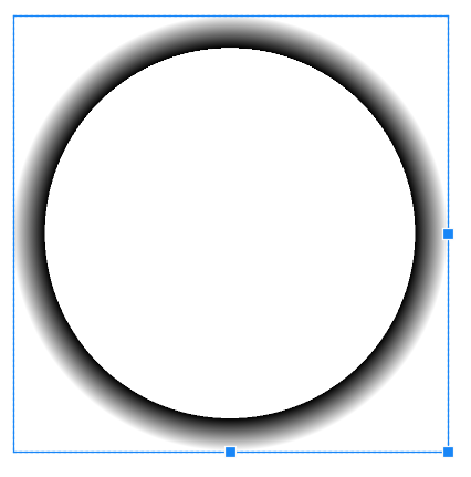
The key take-away here is that the blank area in the center is set to transition from transparent to transparent or, otherwise, no change. This gives the empty center. At 85% of the radius the color abruptly changes to black and transitions to a transparent black.
For API 24+, you can place this drawable into a drawable resource file as follows and use it like a regular drawable.
corona.xml
<drawable class="com.example.radialgradientwithstops.CoronaDrawable"/>
You will have to determine how best to incorporate this drawable into your layer list or other means of presentation in your app.
Border Linear Gradient
You can use the border-image css property:
border-width: 4px;
border-style: solid;
border-image: linear-gradient(to bottom, cyan, blue) 1;
Tutorial on how it works: https://codyhouse.co/nuggets/css-gradient-borders#:~:text=How%20to%20create%20gradient%20borders%20in%20CSS.%20To,linear-gradient%20%28to%20right%2C%20darkblue%2C%20darkorchid%29%201%20%3B%20%7D
Related Topics
How to Center an Absolutely Positioned Element in a Div
What Does !Important Mean in Css
Select Every Nth Element in Css
::Slotted CSS Selector For Nested Children in Shadowdom Slot
How to Style a Select Tag'S Option Element
Difference Between Style = "Position:Absolute" and Style = "Position:Relative"
Css Selector Based on Element Text
How to Vertically Center Content With Variable Height Within a Div
Difference Between @Import and Link in Css
Play Multiple CSS Animations At the Same Time
What Does the "≫" (Greater-Than Sign) CSS Selector Mean
Why Does Applying a Css-Filter on the Parent Break the Child Positioning
Css Text-Overflow in a Table Cell
Css to Select/Style First Word
How to Make Flexbox Items the Same Size