Get Angular Material theme color scheme/palette for other elements
I found an awesome workaround!!!!
I'm so excited to show this because its been bugging me how to implement this for ages.
So here goes;
First, change all of your css files to scss;
For existing projects
Run in console
ng set defaults.styleExt=scss
(ng set seems to have been depreciated, but you can check out this for a fix thanks to user @wlyles get/set have been deprecated in favor of the config command )
- Rename all existing
.cssfiles to.scss - Manually change the file extention of
stylesin.angular-cli.jsonfrom .css to.scss - If you didnt use a tool like WebStorm Refactor to rename then manually change all the
styleUrlsfrom.cssto.scss
For future projects
Just for your new project simply use
ng new your-project-name --style=scssFor all new projects to use scss use
ng set defaults.styleExt=scss --global
Now you will need to have a theme.scss file in your app root like so: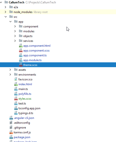
Now in your style.scss file you want to add the following (as you can see I referrence background-color but you can change this to any element to theme your site however you want):
EDIT: You dont NEED to put this custom @mixin element in your styles.scss you can put it in any one of your *name*.component.scss and then simply import and include it the same way you do with the example given!
@import '~@angular/material/theming';

// Define a custom mixin that takes in the current theme
@mixin theme-color-grabber($theme) {
  // Parse the theme and create variables for each color in the pallete
  $primary: map-get($theme, primary);
  $accent: map-get($theme, accent);
  $warn: map-get($theme, warn);
  // Create theme specfic styles
  .primaryColorBG {
    background-color: mat-color($primary);
  }
  .accentColorBG {
    background-color: mat-color($accent);
  }
  .warnColorBG {
    background-color: mat-color($warn);
  }
}
Now go to your theme.scss file that you use to theme your Material 2 items, if you need help theming check this out: Material 2 Github - Theming guide
Now open your theme.scss and import your style.scss, since my theme.scss is within the root of the /src/app/theme.scss folder I must first go out of it to reference my /src/styles.scss global styling file like so;
@import '../styles';
Then we must actually include our new custom @mixin we created in ALL our themes (if you have multiple like I do, so it changes color according to current selected theme).
Include it above the actual angular-material-theme include, like so:
@include theme-color-grabber($theme);
@include angular-material-theme($theme);
If you have any themes like me add it in the same position like so:
.light {
  $light-primary: mat-palette($mat-blue, 200,300, 900);
  $light-accent:  mat-palette($mat-light-blue, 600, 100, 800);
  $light-warn:    mat-palette($mat-red, 600);
  $light-theme: mat-dark-theme($light-primary, $light-accent, $light-warn);
  @include theme-color-grabber($light-theme);
  @include angular-material-theme($light-theme);

}
You can see I added my theme-color-grabber above the include, it doesnt really matter if its above or below the actual theme because its getting the themes colors which is the main point.
My whole themes.scss looks like this:
@import '~@angular/material/theming';
//We import our custom scss component here
@import '../styles';

@include mat-core();

$theme-primary: mat-palette($mat-red);
$theme-accent:  mat-palette($mat-deep-orange, A200, A100, A400);
$theme-warn:    mat-palette($mat-red);
$theme: mat-dark-theme($theme-primary, $theme-accent, $theme-warn);
//
@include theme-color-grabber($theme);
@include angular-material-theme($theme);
.light {
  $light-primary: mat-palette($mat-blue, 200,300, 900);
  $light-accent:  mat-palette($mat-light-blue, 600, 100, 800);
  $light-warn:    mat-palette($mat-red, 600);
  $light-theme: mat-dark-theme($light-primary, $light-accent, $light-warn);
  @include theme-color-grabber($light-theme);
  @include angular-material-theme($light-theme);

}
And finally we can now call on our themes color for a background ANYWHERE!, for instance I give a mat-grid-tile the 'primary' color (it doesn't take the color='' argument, like other elements such as mat-toolbar) by simply setting its class to the appropriate class name like so:
EDIT: In each of your components scss files, you will need to import '<path-to>/theme.scss' in order for your theme to apply to that component. Don't import theme.scss in styles.scss because that will create an import loop!
<mat-grid-list cols="4" rows="4" rowHeight="100px">
  <mat-grid-tile
    colspan="4"
    rowspan="5"
  class="primaryColorBG">
    <div fxLayout="column" fxLayoutAlign="center center">
      <h1 class="title-font">Callum</h1>
      <h1 class="title-font">Tech</h1>
    </div>
    <p>
      Ambitious and ready to take on the world of Information Technology,<br>
      my love for programming and all things I.T. has not wavered since I first got access<br>
      to my fathers computer at age 9.
    </p>
  </mat-grid-tile>

</mat-grid-list>
Finally our result will look like this!:
Red theme active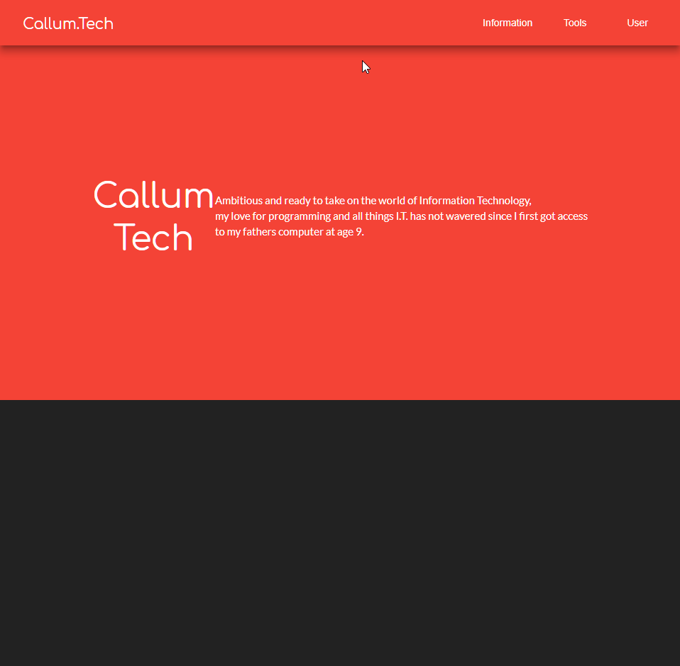
Blue theme active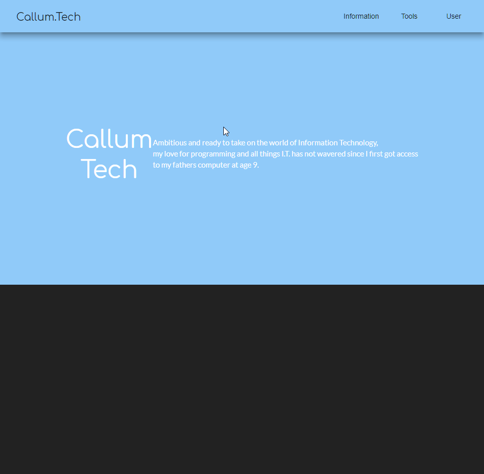
How can I use Material Theme colors for custom things?
The answer to THIS: question is actually what I was looking for:
It was much easier than I thought:
.mat-option {
  color : mat-color($foreground, text);
}
Angular Material - change color of clicked mat-list-option
How can I use custom theme palettes in Angular?
After some research I ended up with this conclusion which solved it for me, hope it will help you too.
Step1: Create your own palettes from branding colors.
Found this awesome website where you enter your brand color, and it creates a complete palette with the different shades of that brand color: http://mcg.mbitson.com
I used this tool for both my primary color (which is my brand color) and the accent color.
Step2: Create palettes in your custom theme file
here is a guide how to create such .scss file: https://github.com/angular/material2/blob/master/guides/theming.md
@import '~@angular/material/theming';

// Be sure that you only ever include 'mat-core' mixin once!
// it should not be included for each theme.
@include mat-core();

// define a real custom palette (using http://mcg.mbitson.com)
$bv-brand: (
    50: #ffffff,
    100: #dde6f3,
    200: #b4c9e4,
    300: #7fa3d1,
    400: #6992c9,
    500: #5282c1,
    600: #4072b4,
    700: #38649d,
    800: #305687,
    900: #284770,
    A100: #ffffff,
    A200: #dde6f3,
    A400: #6992c9,
    A700: #38649d,
    contrast: (
        50: $black-87-opacity,
        100: $black-87-opacity,
        200: $black-87-opacity,
        300: $black-87-opacity,
        400: $black-87-opacity,
        500: white,
        600: white,
        700: white,
        800: white,
        900: white,
        A100: $black-87-opacity,
        A200: $black-87-opacity,
        A400: $black-87-opacity,
        A700: white,
    )
);

$bv-orange: (
    50: #ffffff,
    100: #fff7f4,
    200: #fecdbd,
    300: #fc9977,
    400: #fc8259,
    500: #fb6c3b,
    600: #fa551d,
    700: #f44205,
    800: #d63a04,
    900: #b83204,
    A100: #ffffff,
    A200: #fff7f4,
    A400: #fc8259,
    A700: #f44205,
    contrast: (
        50: $black-87-opacity,
        100: $black-87-opacity,
        200: $black-87-opacity,
        300: $black-87-opacity,
        400: $black-87-opacity,
        500: white,
        600: white,
        700: white,
        800: white,
        900: white,
        A100: $black-87-opacity,
        A200: $black-87-opacity,
        A400: $black-87-opacity,
        A700: white,
    )
);

// mandatory stuff for theming
$bv-palette-primary: mat-palette($bv-brand);
$bv-palette-accent:  mat-palette($bv-orange);

// include the custom theme components into a theme object
$bv-theme: mat-light-theme($bv-palette-primary, $bv-palette-accent);

// include the custom theme object into the angular material theme
@include angular-material-theme($bv-theme);
Some explanation on the code above
The numbers on the left side set the "level" of brightness. The default is 500 (which is the true shade of my brand color/accent color). So in this example, my brand color is #5282c1. The rest are other shades of that color (where lower numbers mean brighter shades and higher numbers mean darker shades). The AXXX are different shades. Not sure (yet) where they are in use. Again, a lower number means brighter and higher numbers means darker.
The contrast sets the font color over those background colors. It's very hard (or even impossible) to calculate via CSS where the font should be bright (white) or dark (black with 0.87 opacity) so it is easily readable even to color blind people. So this is set manually and hard-coded into the palette definition. You get this also from the palette generator I linked above (although it's being outputted in the old Material1 format, and you'll have to manually convert this to Material2 format like I posted here).
Set the theme to use the brand color palette as the primary color, and whatever you have for accent as your accent color.
Step3: Use the theme throughout the app wherever you can
Some elements can take the theme colors, like <md-toolbar>, <md-input>, <md-button>, <md-select> and so on. They will use primary by default so make sure you set the brand color palette as primary. If you want to change the color, use the color directive (is it an Angular directive?).
For example:
<button mat-raised-button color="accent" type="submit">Login</button>
How to understand what colors are being used in angular material theme for the components?
At the end of this answer I show the source code to find exactly which hues are used from the palette, but you really don't need to worry about it.
You can choose which of the three themes to use with the color property of the component, and that's really the only decision you're supposed to make. The component designers will choose exactly which hue is appropriate for which piece of the component. The reason they want you to design an entire theme to override colours is so that all pieces of a component have the same relative hues, they don't want you overriding only one piece of a component.
The guide that you linked (https://material.angular.io/guide/theming) describes how to override the theme for an entire project or a single component, and within a specific scope:
You can use Angular Material's Sass mixins to customize component
styles within a specific scope in your application. The CSS rule
declaration in which you include a Sass mixin determines its scope.
The example below shows how to customize the color of all buttons
inside elements marked with the .my-special-section CSS class.@use '@angular/material' as mat;
.my-special-section { $special-primary:
mat.define-palette(mat.$orange-palette); $special-accent:
mat.define-palette(mat.$brown-palette); $special-theme:
mat.define-dark-theme(( color: (primary: $special-primary, accent:
$special-accent), ));
@include mat.button-color($special-theme); }
I did a bit of digging through the source code and found the function that defines palettes here: https://github.com/angular/components/blob/master/src/material/core/theming/_theming.scss
You can see the default value is 500, lighter is 100, and darker is 700
/// Creates a map of hues to colors for a theme. This is used to define a theme palette in terms
/// of the Material Design hues.
/// @param {Map} $base-palette Map of hue keys to color values for the basis for this palette.
/// @param {String | Number} $default Default hue for this palette.
/// @param {String | Number} $lighter "lighter" hue for this palette.
/// @param {String | Number} $darker "darker" hue for this palette.
/// @param {String | Number} $text "text" hue for this palette.
/// @returns {Map} A complete Angular Material theming palette.

@function define-palette($base-palette, $default: 500, $lighter: 100, $darker: 700,
  $text: $default) {
  $result: map.merge($base-palette, (
    default: _get-color-from-palette($base-palette, $default),
    lighter: _get-color-from-palette($base-palette, $lighter),
    darker: _get-color-from-palette($base-palette, $darker),
    text: _get-color-from-palette($base-palette, $text),

    default-contrast: get-contrast-color-from-palette($base-palette, $default),
    lighter-contrast: get-contrast-color-from-palette($base-palette, $lighter),
    darker-contrast: get-contrast-color-from-palette($base-palette, $darker)
  ));

  // For each hue in the palette, add a "-contrast" color to the map.
  @each $hue, $color in $base-palette {
    $result: map.merge($result, (
      '#{$hue}-contrast': get-contrast-color-from-palette($base-palette, $hue)
    ));
  }

  @return $result;
}
They will generally import a color into the component using this function:
/// Gets a color from a theme palette (the output of mat-palette).
/// The hue can be one of the standard values (500, A400, etc.), one of the three preconfigured
/// hues (default, lighter, darker), or any of the aforementioned prefixed with "-contrast".
///
/// @param {Map} $palette The palette from which to extract a color.
/// @param {String | Number} $hue The hue from the palette to use. If this is a value between 0
//     and 1, it will be treated as opacity.
/// @param {Number} $opacity The alpha channel value for the color.
/// @returns {Color} The color for the given palette, hue, and opacity.

@function get-color-from-palette($palette, $hue: default, $opacity: null) {
  // If hueKey is a number between zero and one, then it actually contains an
  // opacity value, so recall this function with the default hue and that given opacity.
  @if meta.type-of($hue) == number and $hue >= 0 and $hue <= 1 {
    @return get-color-from-palette($palette, default, $hue);
  }

  // We cast the $hue to a string, because some hues starting with a number, like `700-contrast`,
  // might be inferred as numbers by Sass. Casting them to string fixes the map lookup.
  $color: if(map.has-key($palette, $hue), map.get($palette, $hue), map.get($palette, $hue + ''));

  @if (meta.type-of($color) != color) {
    // If the $color resolved to something different from a color (e.g. a CSS variable),
    // we can't apply the opacity anyway so we return the value as is, otherwise Sass can
    // throw an error or output something invalid.
    @return $color;
  }

  @return rgba($color, if($opacity == null, opacity($color), $opacity));
}
For example the highlighted tab color is imported here: https://github.com/angular/components/blob/master/src/material/tabs/_tabs-theme.scss
.mat-tab-group, .mat-tab-nav-bar {
    $theme-colors: (
      primary: $primary,
      accent: $accent,
      warn: $warn
    );

    @each $name, $color in $theme-colors {
      // Set the foreground color of the tabs
      &.mat-#{$name} {
        @include _label-focus-color($color);
        @include _ink-bar-color($color);

        // Override ink bar when background color is the same
        &.mat-background-#{$name} {
          > .mat-tab-header, > .mat-tab-link-container {
            @include _ink-bar-color($color, default-contrast);
          }
        }
      }
    }

@mixin _ink-bar-color($color, $hue: default) {
  .mat-ink-bar {
    background-color: theming.get-color-from-palette($color, $hue);
  }
}
So the ink bar will be the default (500) color of the theme (primary, accent, or warn).
How to apply angular-material built in theme variables in component style?
Color variables are declared in scss files, while you are importing css. I.e. you cannot get sass variables via importing compiles css files.
If you want doing it properly you need to follow https://material.angular.io/guide/theming-your-components guidelines.
E.g. getting material colors:
@import '~@angular/material/theming';

$primary: mat-palette($mat-indigo);
$accent:  mat-palette($mat-pink, A200, A100, A400);
$theme: mat-light-theme((
  color: (
    primary: $primary,
    accent: $accent,
  )
));

$color: mat-get-color-config($theme);

$primary: map-get($color, primary);

.candy-carousel {
    // Use mat-color to extract individual colors from a palette.
    background-color: mat-color($config); // color will be there
    border-color: mat-color($config, A400); // a bit different hue
}
How to use custom material color palettes in Angular?
Angular Material themes are based on defining your primary, warn and accent colors.
The Documentation on Angular Material Theming are very helpful here
You can define these colors in your main scss file.
(below is copied straight from the docs)
@use '@angular/material' as mat;

@include mat.core();

$my-primary: mat.define-palette(mat.$indigo-palette, 500);
$my-accent: mat.define-palette(mat.$pink-palette, A200, A100, A400);

$my-theme: mat.define-light-theme((
 color: (
   primary: $my-primary,
   accent: $my-accent,
 )
));

@include mat.core-theme($my-theme);

@include mat.button-theme($my-theme);
Once you define your theme, you can then use the primary|accent|warn based on your theme.
If you don't want to do this, then you need to change the button's style directly, i.e. the background-color
Can you apply an Angular themes primary color to a div?
About the solution
With this solution you can:
- Switch the theme during runtime
- Get the current theme during runtime
- Theme directly in CSS without the usage of extra classes or anything
- Have an easy to use and easy to understand solution, that only requires a one time setup
Cons:
- Uses CSS variables. Some older browsers might not support them
- Relies on newer Angular versions. I don't know if this would work in older versions (Tested in Angular 6 & 7)
This is what I am using in my project right now:
Setup
First you need to define a theme.
Here is an example called dark-theme.scss located in src/themes:
@import '~@angular/material/theming';
@include mat-core();

// Set variables to whatever colors you want for your app
$dark-theme-primary: mat-palette($mat-pink);
$dark-theme-accent: mat-palette($mat-light-blue);
$dark-theme-warn: mat-palette($mat-red);

$dark-theme: mat-dark-theme(
    $dark-theme-primary,
    $dark-theme-accent,
    $dark-theme-warn
);

@include angular-material-theme($dark-theme);
Then you need a SCSS function that can create theme SCSS and CSS variables:
Here is mine called functions.scss in src/assets/scss:
@mixin generate-theme-vars($theme) {
  //default palette foreground/background:
  $foreground-palette: map-get($theme, foreground);
  $background-palette: map-get($theme, background);

  /////////////////////////////////////////////////
  // SCSS VARS
  /////////////////////////////////////////////////

  $primary: mat-color(map-get($theme, primary));
  $accent: mat-color(map-get($theme, accent));
  $warn: mat-color(map-get($theme, warn));

  $base: mat-color($foreground-palette, base);
  $divider: mat-color($foreground-palette, divider);
  $dividers: mat-color($foreground-palette, dividers);
  $disabled: mat-color($foreground-palette, disabled);
  $disabled-button: mat-color($foreground-palette, disabled-button);
  $disabled-text: mat-color($foreground-palette, disabled-text);
  $hint-text: mat-color($foreground-palette, hint-text);
  $secondary-text: mat-color($foreground-palette, secondary-text);
  $icon: mat-color($foreground-palette, icon);
  $icons: mat-color($foreground-palette, icons);
  $text: mat-color($foreground-palette, text);
  $slider-off: mat-color($foreground-palette, slider-off);
  $slider-off-active: mat-color($foreground-palette, slider-off-active);

  $status-bar: mat-color($background-palette, status-bar);
  $app-bar: mat-color($background-palette, app-bar);
  $background: mat-color($background-palette, background);
  $hover: mat-color($background-palette, hover);
  $card: mat-color($background-palette, card);
  $dialog: mat-color($background-palette, dialog);
  $disabled-button: mat-color($background-palette, disabled-button);
  $raised-button: mat-color($background-palette, raised-button);
  $focused-button: mat-color($background-palette, focused-button);
  $selected-button: mat-color($background-palette, selected-button);
  $selected-disabled-button: mat-color($background-palette, selected-disabled-button);
  $disabled-button-toggle: mat-color($background-palette, disabled-button-toggle);

  /////////////////////////////////////////////////
  // CSS VARS
  /////////////////////////////////////////////////

  --primary-color: #{$primary};
  --accent-color: #{$accent};
  --warn-color: #{$warn};

  --base-color: #{$base};
  --divider-color: #{$divider};
  --dividers-color: #{$dividers};
  --disabled-color: #{$disabled};
  --disabled-text-color: #{$disabled-text};
  --hint-text-color: #{$hint-text};
  --secondary-text-color: #{$secondary-text};
  --icon-color: #{$icon};
  --icons-color: #{$icons};
  --text-color: #{$text};
  --slider-off-color: #{$slider-off};
  --slider-off-active-color: #{$slider-off-active};

  --status-bar-color: #{$status-bar};
  --app-bar-color: #{$app-bar};
  --background-color: #{$background};
  --hover-color: #{$hover};
  --card-color: #{$card};
  --dialog-color: #{$dialog};
  --disabled-button-color: #{$disabled-button};
  --raised-button-color: #{$raised-button};
  --focused-button-color: #{$focused-button};
  --selected-button-color: #{$selected-button};
  --selected-disabled-button-color: #{$selected-disabled-button};
  --disabled-button-toggle-color: #{$disabled-button-toggle};
}
After that, you are all set and all you have to do is to create a class for every theme in your global styles.scss:
@import "functions";
@import "~@angular/material/theming";

// You have to define one of those for every theme you offer
.dark-theme {
    @import "themes/dark-theme";
    @include angular-material-theme($dark-theme);
    @include generate-theme-vars($dark-theme);
}

.light-theme {
    @import "themes/light-theme";
    @include angular-material-theme($light-theme);
    @include generate-theme-vars($light-theme);
}
Usage
To apply the theme you want to use, you need to put the CSS class dark-theme (or whatever you called it) to an element that contains all other elements.
I put it to the HTML tag:
<!doctype html>
<html lang="en" class="dark-theme">
    <!-- ... -->
</html>
Now you can switch the theme on runtime, by changing that class with JavaScript to light-theme for example.
In every CSS property that wants a color, you can use variables now:
div {
    width: 300px;
    height: 300px;

    background-color: var(--app-bar-color);

    .someText {
        color: var(--text-color);
    }
}
If you want to do something in your CSS if a special theme is applied and the change is not the color itself, then do it like this:
// Example: We want to remove some div only when the light-theme is used
div {
    width: 300px;
    height: 300px;

    background-color: var(--app-bar-color);


    :host-context(.light-theme) & {
        display: none;
    }
}
PS
For everyone who might wonder why I am using @import "functions";, even though they are in different folders:
Go into angular.json and add to the object projects > <YourProject> > architect > build > options the following:
"stylePreprocessorOptions": {
    "includePaths": [
    "src/assets/scss"
    ]
},
Now you can use @import "functions"; from every path.
In case you need to support IE (untested, might need work)
So if you can't use CSS variables on some clients, you can define a fallback for the specified colors like so:
div {
    background-color: red; // fallback to red if the variable doesnt exist -> Old browsers, or IE
    background-color: var(--app-bar-color);
}
With this knowledge, you could for example define a few SCSS variables in styles.scss:
@import "functions";
@import "~@angular/material/theming";

// Default theme
@import "themes/dark-theme";
@include angular-material-theme($dark-theme);

// Generate SCSS vars
$foreground-palette: map-get($theme, foreground);
$background-palette: map-get($theme, background);

/////////////////////////////////////////////////
// SCSS VARS
/////////////////////////////////////////////////

$primary: mat-color(map-get($theme, primary));
$accent: mat-color(map-get($theme, accent));
$warn: mat-color(map-get($theme, warn));

// ... and all the other vars from above if you would like

// You have to define one of those for every theme you offer
.dark-theme {
    // Only init the CSS vars here, because the rest is in default
    @include generate-theme-vars($dark-theme);
}

.light-theme {
    @import "themes/light-theme";
    @include angular-material-theme($light-theme);
    @include generate-theme-vars($light-theme);
}
Now you could use it like this:
div {
    background-color: $primary; // fallback
    background-color: var(--primary-color);
}
This cant be changed dynamically with JS during the runtime anymore
though!!
Related Topics
Media Queries for Tablet Min-Resolution and Max-Resolution
Nesting Selectors via Loops with SASS
Twitter Bootstrap - Border Pushing Contents Down
Forward Slash/In CSS Border Radius Syntax
Maintain Aspect Ratio of a Div According to Height
Remove 3D Press Effect Internet Explorer Button
Dynamic Variable Names in Less CSS
How to Change Mui Input Underline Colour
How to Create a Row of Elements of Equal Width Inside an Inline Container? Possibly Using Flexbox
How to Float Text Around Image in React Native
CSS Background-Image Path Issues
On Which Operating Systems or Browsers Are CSS Font-Family Names Case-Sensitive
How to Remove Left Property When Position: Absolute