Does bootstrap have builtin padding and margin classes?
There are built in classes, namely:
.padding-xs { padding: .25em; }
.padding-sm { padding: .5em; }
.padding-md { padding: 1em; }
.padding-lg { padding: 1.5em; }
.padding-xl { padding: 3em; }

.padding-x-xs { padding: .25em 0; }
.padding-x-sm { padding: .5em 0; }
.padding-x-md { padding: 1em 0; }
.padding-x-lg { padding: 1.5em 0; }
.padding-x-xl { padding: 3em 0; }

.padding-y-xs { padding: 0 .25em; }
.padding-y-sm { padding: 0 .5em; }
.padding-y-md { padding: 0 1em; }
.padding-y-lg { padding: 0 1.5em; }
.padding-y-xl { padding: 0 3em; }

.padding-top-xs { padding-top: .25em; }
.padding-top-sm { padding-top: .5em; }
.padding-top-md { padding-top: 1em; }
.padding-top-lg { padding-top: 1.5em; }
.padding-top-xl { padding-top: 3em; }

.padding-right-xs { padding-right: .25em; }
.padding-right-sm { padding-right: .5em; }
.padding-right-md { padding-right: 1em; }
.padding-right-lg { padding-right: 1.5em; }
.padding-right-xl { padding-right: 3em; }

.padding-bottom-xs { padding-bottom: .25em; }
.padding-bottom-sm { padding-bottom: .5em; }
.padding-bottom-md { padding-bottom: 1em; }
.padding-bottom-lg { padding-bottom: 1.5em; }
.padding-bottom-xl { padding-bottom: 3em; }

.padding-left-xs { padding-left: .25em; }
.padding-left-sm { padding-left: .5em; }
.padding-left-md { padding-left: 1em; }
.padding-left-lg { padding-left: 1.5em; }
.padding-left-xl { padding-left: 3em; }

.margin-xs { margin: .25em; }
.margin-sm { margin: .5em; }
.margin-md { margin: 1em; }
.margin-lg { margin: 1.5em; }
.margin-xl { margin: 3em; }

.margin-x-xs { margin: .25em 0; }
.margin-x-sm { margin: .5em 0; }
.margin-x-md { margin: 1em 0; }
.margin-x-lg { margin: 1.5em 0; }
.margin-x-xl { margin: 3em 0; }

.margin-y-xs { margin: 0 .25em; }
.margin-y-sm { margin: 0 .5em; }
.margin-y-md { margin: 0 1em; }
.margin-y-lg { margin: 0 1.5em; }
.margin-y-xl { margin: 0 3em; }

.margin-top-xs { margin-top: .25em; }
.margin-top-sm { margin-top: .5em; }
.margin-top-md { margin-top: 1em; }
.margin-top-lg { margin-top: 1.5em; }
.margin-top-xl { margin-top: 3em; }

.margin-right-xs { margin-right: .25em; }
.margin-right-sm { margin-right: .5em; }
.margin-right-md { margin-right: 1em; }
.margin-right-lg { margin-right: 1.5em; }
.margin-right-xl { margin-right: 3em; }

.margin-bottom-xs { margin-bottom: .25em; }
.margin-bottom-sm { margin-bottom: .5em; }
.margin-bottom-md { margin-bottom: 1em; }
.margin-bottom-lg { margin-bottom: 1.5em; }
.margin-bottom-xl { margin-bottom: 3em; }

.margin-left-xs { margin-left: .25em; }
.margin-left-sm { margin-left: .5em; }
.margin-left-md { margin-left: 1em; }
.margin-left-lg { margin-left: 1.5em; }
.margin-left-xl { margin-left: 3em; }
Twitter Bootstrap: margin-bottom built in css class
There is no bootstrap class for margins like you describe. The reasons would be the need for classes for margins 0 to 10s or 100s, as well as the need for multiple units, such as px, em, %, etc.
You can make your own classes fairly easy. Even easier with sublime text-editor and multi-select.
That being said, you don't want to abstract every style rule into the html. Original CSS is useful for something particular to your element, such as margins. Using bootstrap classes for every style would lead to difficult to read HTML.
This Question is tagged Bootstrap 3, but when you update to Bootstrap 4, there is a built in utility for this.
What is class= mb-0 in Bootstrap 4?
Bootstrap has a wide range of responsive margin and padding utility classes. They work for all breakpoints:
xs (<=576px), sm (>=576px), md (>=768px), lg (>=992px) or xl (>=1200px))
The classes are used in the format:
{property}{sides}-{size} for xs & {property}{sides}-{breakpoint}-{size} for sm, md, lg, and xl.
m - sets margin
p - sets padding
t - sets margin-top or padding-top
b - sets margin-bottom or padding-bottom
l - sets margin-left or padding-left
r - sets margin-right or padding-right
x - sets both padding-left and padding-right or margin-left and margin-right
y - sets both padding-top and padding-bottom or margin-top and margin-bottom
blank - sets a margin or padding on all 4 sides of the element
0 - sets margin or padding to 0
1 - sets margin or padding to .25rem (4px if font-size is 16px)
2 - sets margin or padding to .5rem (8px if font-size is 16px)
3 - sets margin or padding to 1rem (16px if font-size is 16px)
4 - sets margin or padding to 1.5rem (24px if font-size is 16px)
5 - sets margin or padding to 3rem (48px if font-size is 16px)
auto - sets margin to auto
See more at Bootstrap 4.5 - Spacing
Read more in w3schools
Bootstrap: add margin/padding space between columns
Bootstrap 5 (Update 2021)
Bootstrap 5 has still includes spacing utilities for padding. However, because of new RTL support "left" and "right" have been changed to "start" and "end". For example pl-2 is now ps-2.
pl-*=>ps-*(padding-left)pr-*=>pe-*(padding-right)ml-*=>ms-*(margin-left)mr-*=>me-*(margin-right)
Additionally, Bootstrap 5 introduces new grid gutter classes that can be used to adjust the spacing between columns. The guttter is set on the row instead of each col-* inside the row. For example, use g-0 for no spacing between columns.
Bootstrap 5 column spacing demo
Bootstrap 4 (Update 2018)
Bootstrap 4 has spacing utilities that make adding (or substracting) the space (gutter) between columns easier. Extra CSS isn't necessary.
<div class="row">
    <div class="text-center col-md-6">
        <div class="mr-2">Widget 1</div>
    </div>
    <div class="text-center col-md-6">
        <div class="ml-2">Widget 2</div>
    </div>
</div>
You can adjust margins on the column contents using the margin utils such as ml-0 (margin-left:0), mr-0 (margin-right:0), mx-1 (.25rem left & right margins), etc...
Or, you can adjust padding on the columns (col-*) using the padding utils such as pl-0 (padding-left:0), pr-0 (padding-right:0), px-2 (.50rem left & right padding), etc...
Bootstrap 4 Column Spacing Demo
Notes
- Changing the left/right margin(s) on
col-*will break the grid. - Change the left/right margin(s) on the content of
col-*works. - Change the left/right padding on the
col-*also works.
Bootstrap margin class for extra small screens
There's no xs in Bootstrap 4. So, what you are looking for is just my-3.
This is because Bootstrap 4 is "mobile first".
And the same thinking is applied to other classes like column classes as well.
So, instead of col-xs-*, in Bootstrap 4 there is just col-*.
"Mobile first" means the default value is defined for the smallest possible screen (mobile) and then values can be modified for screens that get progressively larger. This is also known as "progressive enhancement".
How to decorate the margins of a Bootstrap grid layout with row alignment
In your example you put .col-sm on the essential columns but didn't mention how much space you want the decorative columns to take up.
If I assume the decorative columns would take up the same amount of spaces the essential columns would do, then the following structure should give you what you want:
<div class="container">
    <div class="row">
        <div class="decorative col-sm d-sm-block d-none"></div>
        <div class="col-sm">
            column 1
        </div>
        <div class="col-sm">
            column 2
        </div>
        <div class="decorative col-sm d-sm-block d-none"></div>
    </div>
</div>
Those 2 decorative columns won't take up any space until small break point and up.
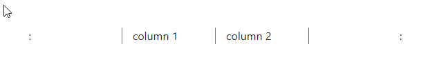
demo: https://jsfiddle.net/davidliang2008/4j1u7q0f/16/
Related Topics
A:Visited Links - Opacity Not Working
Css: Skew a Buttons Border, Not the Text
How to Maintain a Circlur Shape of Element with Dynamic Content
CSS Is Not Loaded at All in Internet Explorer (Sec7113)
Ie Z-Index Trouble on Element with Transparent Background
How to Dynamically Load a CSS File into a Flex Application
Enforce Print Page Breaks with CSS
Bootswatch Theme in Shiny Flexdashboard R
Chrome Ignoring Flex-Basis in Column Layout
Chrome and It's Handling of %S
Why Do You Put a Display:Block on an "A" Tag That Is Inside a List
Animated .Gif VS Spritesheet + Js/Css
Compass: Generate Sprites, Plus Width/Height on Each Images in the Sprite
How to Make a Sticky Footer in React
What's the Math Behind CSS's Background-Size:Cover