Cutting a triangle out of div, BUT have it horizontally centered
Now you've provided an image, I'll change my answer to what you actually want.
The trick I'd use is to create :before and :after elements that are absolutely positioned, one left and one right. Each one has borders to create the shapes. The key to this is the box-sizing trick which means that the borders are inside the width, rather than added onto, allowing us to define a 50% width for the :before and :after pseudo elements.
Note that the image I'm using as the background in this demo is rectangular, it doesn't have the triangle in the image!
HMTL
<div class="box">
  I'm a box.
</div>
CSS
/* apply a natural box layout model to all elements */
*, *:before, *:after {
  -moz-box-sizing: border-box; -webkit-box-sizing: border-box; box-sizing: border-box;
}

.box {
  background: transparent url('http://i.imgur.com/ipGvBz0.png') no-repeat;
  padding: 20px;
  min-height: 200px; /* Just to show the image */
  margin: 10px;
  position: relative;
}

.box:before,
.box:after {
  content: '';
  display: block;
  position: absolute;
  bottom: 0;
  width: 50%;
  border-bottom: 20px solid white;
}

.box:before {
  left: 0;
  border-right: 20px solid transparent;
}

.box:after {
  right: 0;
  border-left: 20px solid transparent;
}
DEMO
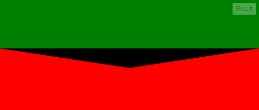
Center triangle at bottom of div full width responsively
See http://jsfiddle.net/L8372wcs/1/
CSS (Relevant changes)
.top {
    ...
    position: relative;
}

.triangle {

    border-top: 40px solid black;
    border-left: 50vw solid transparent;
    border-right: 50vw solid transparent;
    ...
    bottom: -40px;
}
The left and right borders are defined with viewport units (since your div is 100% wide). The triangle is responsive (try to resize the viewport)
The triangle position is defined with
bottom: -40px;(instead of top) and its parent hasposition: relative;This will ensure that the triangle will be positioned always just below the green element (until the top border of the triangle is40pxtall)
Result
Creating a background-image gradient triangle that is horizontally centered
You can do this with SVG
html,body {  margin: 0}
svg {  width: 100%;}
<svg viewBox="0 0 1920 400" height="400" preserveAspectRatio="xMidYMax slice"> <defs> <linearGradient id="Gradient1" x1="0" x2="0" y1="0" y2="1"> <stop offset="0%" stop-color="#65AAB0"></stop> <stop offset="100%" stop-color="#AEE2B6"></stop> </linearGradient> </defs> <polygon points="0,0 960,400 1920,0" fill="url(#Gradient1)"></polygon></svg>How to show complete right triangle? right edge cut off
Default padding on your input element was interfering with the cool CSS border trick. Add:
padding: 0;
I changed the element to a <button> and removed all the code not directly related to styling the purple triangle. I also reformatted the triangle border trick code to make it a little clearer. This is all for demo purposes. Just adding the padding line to your code will fix it.
.submit_btn {  /* this fixes the tip of the triangle */  padding: 0;
  width: 0;  height: 0;  border-top: 10px solid transparent;  border-bottom: 10px solid transparent;  border-left: 17.3px solid #bc2ac1;  border-right: none;
  cursor: pointer;}
<form class="form_name" action=""> <label class="name" for="name">What's your name?</label> <div class="input_wrapper"> <input class="name_field" type="text" name="name" placeholder="Your name"> <button class="submit_btn" type="submit" value=""></button> </div></form>Make a CSS generated triangle appearing at the bottom of the div half the size
If you change: padding-left:1.5%; within the triangle-down it should change the size to half of what you originally had.
padding-top: 1%;
Updated Fiddle to also change width: 1.5%;
I hope this is what you were looking for.
Related Topics
Why Is My CSS Media Query Being Ignored or Overridden
Phonegap + Windows Phone 8: Viewport Meta & Scaling Issue
Overflow: Hidden on Div and Body, Different Behavior
Background Image Not Displaying in Chrome Browser
How to Get Rid of The Gap at The Edge of The Page
How Come My Float Elements Aren't Within Their Parent
How to Remove The Arrows from Input[Type="Number"] in Opera
When 1 Px Border Is Added to Div, Div Size Increases, Don't Want to Do That
How to Stretch The Background Image to Fill a Div
Do We Need Type="Text/CSS" for <Link> in HTML5
Make Video Fit 100% with Any Screen Resolution
How to Place The Cursor (Auto Focus) in Text Box When a Page Gets Loaded Without JavaScript Support
Basic CSS - How to Overlay a Div with Semi-Transparent Div on Top
Setting Element Height in Responsive Layout
Make Div Fill Remainder of Page Vertically
Two Divs Side by Side, One 100% Width Others Width Depended on Content