CSS3 Radial Gradients with RGBA()
Edit Jan 2011:
Webkit nightly now supports elliptical gradients http://webkit.org/blog/1424/css3-gradients/, these will eventually find their way into Safari and Chrome. Faking elliptical radial gradients through css transforms will eventually be unnecesary.
Your problem has the most difficult constraints I've ever encountered, but it is an interesting challenge and it illustrates the limitations of each browsers approach for radial backgrounds, so that's why I decided on trying.
First, the rgba approach is stillborn because the opacity is going to hide some of the noise. It's better to apply semitransparent noise on top of the gradient, you can avoid the extra div by applying multiple background on the same image:
background: url(noise.png) repeat top left, -webkit-gradient(radial,50% 0,700,50% 0,100,from(#6f2813),to(#B9513D)) transparent;
You may notice the color property at the end of declaration, it looks weird but this how you declare colors when you apply multiple backgrounds.
Second, webkit doesn't support elliptical backgrounds, so the work around to this is squishing the gradient through -webkit-transform and positioning it a bit further up:
-webkit-transform: scale(1, 0.7) translate(0, -350px);
For sanity, the right thing to do would seem be applying circular backgrounds on both FF and webkit and then transform them. However, Firefox's transform doesn't support scaling gradients! So we apply an elliptical background:
background: url(noise.png) repeat top left, -moz-radial-gradient(50% 0 0deg,ellipse farthest-side,#B9513D,#6f2813) transparent;
But, since Webkit's container is squished, Firefox's gradient is larger! At this point we would think about applying different css rules for the height of the gradient, but since Firefox doesn't scale the gradient, we can apply the same transformation on the elliptical background the get the containers to be of the same height:
-moz-transform: scale(1, 0.7) translate(0, -250px);
And voila! we have an elliptical gradient with noise, that works on both Safari and Firefox!
http://duopixel.com/stackoverflow/gradient/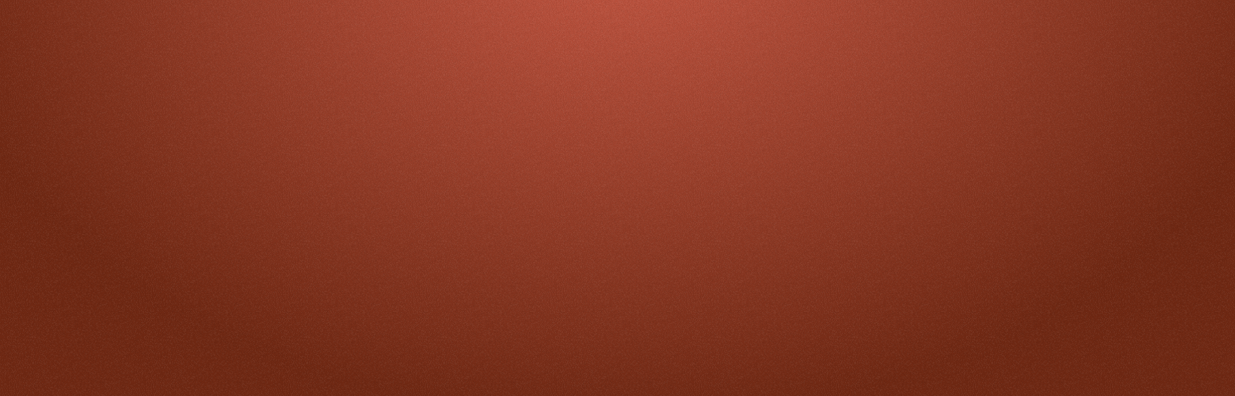
CSS3 Radial gradients syntax explanation
-webkit-radial-gradient(50% 50%,
                        200% 50%,
                        hsla(0, 0%, 90%, 1) 5%, hsla(0, 0%, 85%, 1) 30%, hsla(0, 0%, 60%, 1) 100%)
The radial-gradient provided above can be explained as follows:
- The gradient is a radial gradient which means the colors change in circular/elliptical path along a defined radius.
- The first parameter
50% 50%defines the position of the gradient image's center point. Here it is nothing but the center of the container element on which it is applied. - The second parameter
200% 50%defines the radius of the gradient in X-axis and Y-axis. Here the radius is 200% of the container's width in X-axis and 50% of the container's height in Y-axis. - The above setting along with the container's dimensions determine the shape of the gradient. If the container is 250px tall and 250px wide then the radius in X-axis would be 500px whereas the radius in Y-axis would be 125px and so the gradient would be elliptical. On the other hand if the container is 400px tall and 100px wide then the radius in X-axis would be 200px and the radius in Y-axis would also be 200px. So, the gradient's shape would be a circle.
- The next set of parameters define the colors and where they should end/stop. The gradient would have
hsla(0, 0%, 90%, 1)as color till 5%, from 5% to 30% the color would gradually move fromhsla(0, 0%, 90%, 1)tohsla(0, 0%, 85%, 1)and then from 30% to 100% it would move fromhsla(0, 0%, 85%, 1)tohsla(0, 0%, 60%, 1).
The equivalent standard syntax for this radial-gradient would be the following:
background: radial-gradient(ellipse 200% 50% at 50% 50%, hsla(0, 0%, 90%, 1) 5%, hsla(0, 0%, 85%, 1) 30%, hsla(0, 0%, 60%, 1) 100%);
The below snippet has the output of both of them for comparison.
div {

  float: left;

  height: 250px;

  width: 250px;

  border: 1px solid black;

  margin-right: 4px;

}

.radial-grad {

  background: -webkit-radial-gradient(50% 50%, 200% 50%, hsla(0, 0%, 90%, 1) 5%, hsla(0, 0%, 85%, 1) 30%, hsla(0, 0%, 60%, 1) 100%);

}

.radial-grad-standard {

  background: radial-gradient(ellipse 200% 50% at 50% 50%, hsla(0, 0%, 90%, 1) 5%, hsla(0, 0%, 85%, 1) 30%, hsla(0, 0%, 60%, 1) 100%);

}
<div class='radial-grad'></div>
<div class='radial-grad-standard'></div>Use CSS variables with rgba for gradient transparency
You can use variables, but you can't sample the individual red, green and blue components from a single hex value in CSS.
If you're simply looking to apply an alpha component to an existing RGB triplet, you can specify the entire triplet as a comma-separated list of decimal values instead of a hex value, and substitute it directly into the rgba() function as a single opaque token:
:root {
  --accent-color: 223, 208, 165;
}

h1 {
  background: linear-gradient(to right, rgba(255, 255, 255, 0), rgba(var(--accent-color), 1));
}
If you want to specify and control individual R, G and B values with rgba(), you will need to specify a variable for each color component as a decimal value, and reference each variable within the rgba() function like so:
:root {
  --accent-red: 223;
  --accent-green: 208;
  --accent-blue: 165;
}

h1 {
  background: linear-gradient(to right, rgba(255, 255, 255, 0), rgba(var(--accent-red), var(--accent-green), var(--accent-blue), 1));
}
How to apply multiple css radial gradients to a single element
Just sepereate each one with a comma.
Something like this :
background-image: url(),url(), url();
Ofcourse instead of url you can put gradient.
And all modern browsers support this feature ( meaning IE does not).
In order to make it available in IE, you can use pie.htc
Background image and radial gradient on responsive element?
With CSS background-image, you can specify multiple layers on a single element in descending z-index. Use a comma to separate layers, one for the gradient and one for the image:
.bg {
  background-image:
    radial-gradient(circle, rgba(0, 0, 0, 0) 25%, rgba(24, 24, 24, 1) 75%),
    url(https://i.stack.imgur.com/piK6l.jpg);
}
In your example, both the image and radial gradient are pushed to the right, which you can do with another comma-separated list for the background-position:
background-position: 200px, 200px;
That will leave a blank space that you want grey, so specify background-color for that space:
background-color: rgba(24, 24, 24, 1);
Here's a demo:
#app {
  width: 100%;
  height: 400px;
  color: white;
}
.bg {
  width: 100%;
  height: 100%;
  background-color: rgba(24, 24, 24, 1);
  background-image:
    radial-gradient(circle, rgba(0, 0, 0, 0) 25%, rgba(24, 24, 24, 1) 75%),
    url(https://i.stack.imgur.com/piK6l.jpg);
  background-position: 200px, 200px;
  background-repeat: no-repeat;
  background-size: cover;
}
<div id="app">
<div class="bg">My Content</div>
</div>CSS: Slice radial-gradient 50% on bottom for another similar radial-gradient?
Cover with a linear gradient
Paint a half transparent, half black linear gradient on top of it.
.bg {

  width: 100vh;

  height: 100vh;

  background: linear-gradient(to bottom, transparent 50%, black 50%),

              radial-gradient(circle closest-side, #00bffb, black);

}

body {

  margin: 0;

}
<div class="bg"></div>Related Topics
Add Bullet Styling to Dd Element
Join Two .Less Files into One CSS File
Why Is CSS Grid Row Height Different in Safari
How to Center a List with Bootstrap 4
How to Change Color of Bootstrap Progress Bar with Custom Color
Table Row Box-Shadow on Hover (Webkit)
Can the Default Named CSS Colors Be Overridden
CSS to Change the Cursor Style of the Resize Button on a Textarea
Css: Stretching Image to 100% Width
@Page :First { Margin: ... } in Chrome Bug
Chrome:Text Blurry When Skew Back:Skew(-10Deg) -> Skew(10Deg)
Firefox Unexpected Line Break Using Floats & Overflow Hidden
How to Modify the Strongloop's Loopback Explorer CSS
What's the :Any-Link Pseudo-Class For