CSS Transform square into thinner rhombus
-webkit-transform: rotate(45deg) skew(20deg, 20deg)
Change the skew values to affect how skinny your diamond gets. This will push out the other corners and you'll need to scale the whole object if maintaining the specific dimensions is a requirement.
Here's a jsfiddle with the transformation you described.
And some further reading on CSS transformations.
How to create quadrilateral (rhombus shape) with specific degree?
I would consider multiple background to achieve this where I simply need to find the width/height of the element. Based on your illustration we have this:
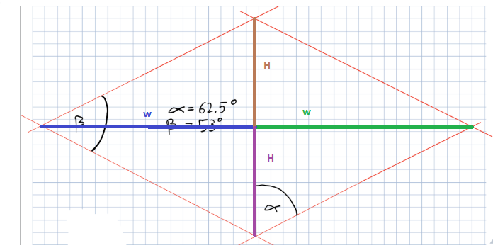
From this we can have the following formula:
tan(alpha) = W/H
and
tan(beta/2) = H/W
We only need to use one of them and you will notice that there isn't one solution which is logical as you simply need to keep a ratio between H and W and the width of our element will simply be 2*W and its height 2*H.
Since H/W is also the same as 2*H/2*W we can simply consider that width = tan(alpha)*height
.box { height:var(--h); width:calc(1.92098213 * var(--h)); /* tan(62.5)xH */ background: linear-gradient(to bottom right,transparent 49%,red 50%) top left, linear-gradient(to top right,transparent 49%,red 50%) bottom left, linear-gradient(to bottom left ,transparent 49%,red 50%) top right, linear-gradient(to top left ,transparent 49%,red 50%) bottom right; background-size:50% 50%; background-repeat:no-repeat;}<div class="box" style="--h:50px;"></div>
<div class="box" style="--h:100px;"></div>
<div class="box" style="--h:200px;"></div>CSS3 Transform Skew One Side
Try this:
To unskew the image use a nested div for the image and give it the opposite skew value. So if you had 20deg on the parent then you can give the nested (image) div a skew value of -20deg.
.container {  overflow: hidden;}
#parallelogram {  width: 150px;  height: 100px;  margin: 0 0 0 -20px;  -webkit-transform: skew(20deg);  -moz-transform: skew(20deg);  -o-transform: skew(20deg);  background: red;  overflow: hidden;  position: relative;}
.image {  background: url(http://placekitten.com/301/301);  position: absolute;  top: -30px;  left: -30px;  right: -30px;  bottom: -30px;  -webkit-transform: skew(-20deg);  -moz-transform: skew(-20deg);  -o-transform: skew(-20deg);}
<div class="container"> <div id="parallelogram"> <div class="image"></div> </div></div>CSS: creating background with shapes?
Well, adding to all the answers with JS and Canvas, I want to add that you might are able to do this in CSS. With a huge amount of effort of course.
Using Background-gradients, you could create as many overlaying pictures as you want.
See this example:
http://lea.verou.me/css3patterns/#japanese-cube
Possible to use border-radius together with a border-image which has a gradient?
Probably not possible, as per the W3C spec:
A box's backgrounds, but not its
border-image, are clipped to the
appropriate curve (as determined by
‘background-clip’). Other effects that
clip to the border or padding edge
(such as ‘overflow’ other than
‘visible’) also must clip to the
curve. The content of replaced
elements is always trimmed to the
content edge curve. Also, the area
outside the curve of the border edge
does not accept mouse events on behalf
of the element.
This is likely because border-image can take some potentially complicated patterns. If you want a rounded, image border, you'll need to create one yourself.
How to create a radial menu in CSS?
Almost 3 years later, I finally made the time to revisit this and post an improved version. You can still view the original answer at the end for reference.
While SVG may be the better choice, especially today, my goal with this was to keep it just HTML and CSS, no JS, no SVG, no images (other than the background on the root element).
2015 demo
Screenshots
Chrome 43:
Firefox 38:
IE 11:
Code
The HTML is pretty simple. I'm using the checkbox hack to reveal/ hide the menu.
<input type='checkbox' id='t'/>
<label for='t'>✰</label>
<ul>
    <li><a href='#'>☀</a></li>
    <li><a href='#'>☃</a></li>
    <li><a href='#'>☁</a></li>
</ul>
I'm using Sass to keep this logical and make it easier to change things if needed. Heavily commented.
$d: 2em; // diameter of central round button
$r: 16em; // radius of menu
$n: 3; // must match number of list items in DOM
$exp: 3em; // menu item height
$tip: .75em; // dimension of tip on middle menu item
$w: .5em; // width of ends
$cover-dim: 2*($r - $exp); // dimension of the link cover
$angle: 15deg; // angle for a menu item
$skew-angle: 90deg - $angle; // how much to skew a menu item to $angle
$scale-factor: cos($skew-angle); // correction factor - see vimeo.com/98137613 from min 15
$off-angle: .125deg; // offset angle so we have a little space between menu items

// don't show the actual checkbox
input {
  transform: translate(-100vw); // move offscreen
  visibility: hidden; // avoid paint
}

// change state of menu to revealed on checking the checkbox
input:checked ~ ul {
    transform: scale(1);
    opacity: .999;
    // ease out back from easings.net/#easeOutBack
    transition: .5s cubic-bezier(0.175, 0.885, 0.32, 1.275);
}

// position everything absolutely such that their left bottom corner
// is in the middle of the screen
label, ul, li {
    position: absolute;
    left: 50%; bottom: 50%;
}

// visual candy styles
label, a {
    color: #858596;
    font: 700 1em/ #{$d} sans-serif;
    text-align: center;
    text-shadow: 0 1px 1px #6c6f7e;
    cursor: pointer;
}

label {
    z-index: 2; // place it above the menu which has z-index: 1
    margin: -$d/2; // position correction such that it's right in the middle
    width: $d; height: $d;
    border-radius: 50%;
    box-shadow: 0 0 1px 1px white,
                0 .125em .25em #876366,
                0 .125em .5em #876366;
    background: radial-gradient(#d4c7c5, #e5e1dd);
}

ul {
    z-index: 1;
    margin: -$r + $exp + 1.5*$d 0; // position correction
    padding: 0;
    list-style: none;
    transform-origin: 50% (-$r + $exp);
    transform: scale(.001); // initial state: scaled down to invisible
    will-change: transform; // better perf on transitioning transform
    opacity: .001; // initial state: transparent
    filter: drop-shadow(0 .125em .25em #847c77)
            drop-shadow(0 .125em .5em #847c77);
    // ease in back, also from easings.net
    transition: .5s cubic-bezier(0.6, -0.28, 0.735, 0.045);

    // menu ends
    &:before, &:after {
        position: absolute;
        margin: -$exp (-$w/2);
        width: $w; height: $exp;
        transform-origin: 50% 100%;
        background: linear-gradient(#ddd, #c9c4bf);
        content: '';
    }

    &:before {
        border-radius: $w 0 0 $w;
        transform: rotate(-.5*$n*$angle)
                   translate(-$w/2, -$r + $exp);
        box-shadow: inset 1px 0 1px #eee;
    }
    &:after {
        border-radius: 0 $w $w 0;
        transform: rotate(.5*$n*$angle)
            translate($w/2, -$r + $exp);
        box-shadow: inset -1px 0 1px #eee;
    }
}

li {
    overflow: hidden;
    width: $r; height: $r;
    transform-origin: 0 100%;

    @for $i from 0 to $n {
        &:nth-child(#{$i + 1}) {
            $curr-angle: $i*$angle +
                ($i + .5)*$off-angle -
                .5*$n*($angle + $off-angle);

            // make each list item a rhombus rotated around its bottom left corner
            // see explanation from minute 33:10 youtube.com/watch?v=ehjoh_MmE9A
            transform: rotate($curr-angle)
                       skewY(-$skew-angle)
                       scaleX($scale-factor);

            // add tip for the item n the middle, just a rotated square
            @if $i == ($n - 1)/2 {
                a:after {
                    position: absolute;
                    top: $exp; left: 50%;
                    margin: -$tip/2;
                    width: $tip; height: $tip;
                    transform: rotate(45deg);
                    box-shadow:
                        inset -1px -1px 1px #eee;
                    background: linear-gradient(-45deg,
                        #bbb, #c9c4bf 50%);
                    content: '';
                }
            }
        }
    }

    a, &:before {
        margin: 0 (-$r);
        width: 2*$r; height: 2*$r;
        border-radius: 50%;
    }

    &:before, &:after {
        position: absolute;
        border-radius: 50%;
        // undo distorting transforms from menu item (parent li)
        transform: scaleX(1/$scale-factor)
                   skewY($skew-angle);
        content: '';
    }

    // actual background of the arched menu items
    &:before {
        box-shadow:
            inset 0 0 1px 1px #fff,
            inset 0 0 $exp #ebe7e2,
            inset 0 0 1px ($exp - .0625em) #c9c4bf,
            inset 0 0 0 $exp #dcdcdc;
    }

    // cover to prevent click action in between the star and menu items
    &:after {
        top: 100%; left: 0;
        margin: -$cover-dim/2;
        width: $cover-dim; height: $cover-dim;
        border-radius: 50%;
    }
}

a {
    display: block;
    // undo distorting transforms from menu item and rotate into right position
    transform: scaleX(1/$scale-factor)
               skewY($skew-angle)
               rotate($angle/2);
    line-height: $exp;
    text-align: center;
    text-decoration: none;
}
html {  overflow: hidden;  background: url(http://i.imgur.com/AeFfmwL.jpg);}
input {  /* move offscreen */  -webkit-transform: translate(-100vw);      -ms-transform: translate(-100vw);          transform: translate(-100vw);  /* avoid paint */  visibility: hidden;}
input:checked ~ ul {  -webkit-transform: scale(1);      -ms-transform: scale(1);          transform: scale(1);  opacity: .999;  /* ease out back from easings.net */  -webkit-transition: 0.5s cubic-bezier(0.175, 0.885, 0.32, 1.275);          transition: 0.5s cubic-bezier(0.175, 0.885, 0.32, 1.275);}
label, ul, li {  position: absolute;  left: 50%;  bottom: 50%;}
label, a {  color: #858596;  font: 700 1em/ 2em sans-serif;  text-align: center;  text-shadow: 0 1px 1px #6c6f7e;  cursor: pointer;}
label {  z-index: 2;  margin: -1em;  width: 2em;  height: 2em;  border-radius: 50%;  box-shadow: 0 0 1px 1px white,  0 .125em .25em #876366,  0 .125em .5em #876366;  background: #d3d3d3;  background: -webkit-radial-gradient(#d4c7c5, #e5e1dd);  background: radial-gradient(#d4c7c5, #e5e1dd);}
ul {  z-index: 1;  margin: -10em 0;  padding: 0;  list-style: none;  -webkit-transform-origin: 50% -13em;      -ms-transform-origin: 50% -13em;          transform-origin: 50% -13em;  -webkit-transform: scale(0.001);      -ms-transform: scale(0.001);          transform: scale(0.001);  /* for improved perf on transitioning transform   * https://twitter.com/paul_irish/status/608492121734193152   */  will-change: transform;  opacity: .001;  -webkit-filter: drop-shadow(0 0.125em 0.25em #847c77);          filter: drop-shadow(0 0.125em 0.25em #847c77);  -webkit-transition: 0.5s cubic-bezier(0.6, -0.28, 0.735, 0.045);          transition: 0.5s cubic-bezier(0.6, -0.28, 0.735, 0.045);}ul:before, ul:after {  position: absolute;  margin: -3em -0.25em;  width: 0.5em;  height: 3em;  -webkit-transform-origin: 50% 100%;      -ms-transform-origin: 50% 100%;          transform-origin: 50% 100%;  background: #d3d3d3;  background: -webkit-linear-gradient(#ddd, #c9c4bf);  background: linear-gradient(#ddd, #c9c4bf);  content: '';}ul:before {  border-radius: 0.5em 0 0 0.5em;  -webkit-transform: rotate(-22.5deg) translate(-0.25em, -13em);      -ms-transform: rotate(-22.5deg) translate(-0.25em, -13em);          transform: rotate(-22.5deg) translate(-0.25em, -13em);  box-shadow: inset 1px 0 1px #eee;}ul:after {  border-radius: 0 0.5em 0.5em 0;  -webkit-transform: rotate(22.5deg) translate(0.25em, -13em);      -ms-transform: rotate(22.5deg) translate(0.25em, -13em);          transform: rotate(22.5deg) translate(0.25em, -13em);  box-shadow: inset -1px 0 1px #eee;}
li {  overflow: hidden;  width: 16em;  height: 16em;  -webkit-transform-origin: 0 100%;      -ms-transform-origin: 0 100%;          transform-origin: 0 100%;}li:nth-child(1) {  -webkit-transform: rotate(-22.625deg) skewY(-75deg) scaleX(0.25882);      -ms-transform: rotate(-22.625deg) skewY(-75deg) scaleX(0.25882);          transform: rotate(-22.625deg) skewY(-75deg) scaleX(0.25882);}li:nth-child(2) {  -webkit-transform: rotate(-7.5deg) skewY(-75deg) scaleX(0.25882);      -ms-transform: rotate(-7.5deg) skewY(-75deg) scaleX(0.25882);          transform: rotate(-7.5deg) skewY(-75deg) scaleX(0.25882);}li:nth-child(2) a:after {  position: absolute;  top: 3em;  left: 50%;  margin: -0.375em;  width: 0.75em;  height: 0.75em;  -webkit-transform: rotate(45deg);      -ms-transform: rotate(45deg);          transform: rotate(45deg);  box-shadow: inset -1px -1px 1px #eee;  background: -webkit-linear-gradient(135deg, #bbb, #c9c4bf 50%);  background: linear-gradient(-45deg, #bbb, #c9c4bf 50%);  content: '';}li:nth-child(3) {  -webkit-transform: rotate(7.625deg) skewY(-75deg) scaleX(0.25882);      -ms-transform: rotate(7.625deg) skewY(-75deg) scaleX(0.25882);          transform: rotate(7.625deg) skewY(-75deg) scaleX(0.25882);}li a, li:before {  margin: 0 -16em;  width: 32em;  height: 32em;  border-radius: 50%;}li:before, li:after {  position: absolute;  border-radius: 50%;  -webkit-transform: scaleX(3.8637) skewY(75deg);      -ms-transform: scaleX(3.8637) skewY(75deg);          transform: scaleX(3.8637) skewY(75deg);  content: '';}li:before {  box-shadow: inset 0 0 1px 1px #fff, inset 0 0 3em #ebe7e2, inset 0 0 1px 2.9375em #c9c4bf, inset 0 0 0 3em #dcdcdc;}li:after {  top: 100%;  left: 0;  margin: -13em;  width: 26em;  height: 26em;  border-radius: 50%;}
a {  display: block;  -webkit-transform: scaleX(3.8637) skewY(75deg) rotate(7.5deg);      -ms-transform: scaleX(3.8637) skewY(75deg) rotate(7.5deg);          transform: scaleX(3.8637) skewY(75deg) rotate(7.5deg);  line-height: 3em;  text-align: center;  text-decoration: none;}
<input type='checkbox' id='t'/><label for='t'>✰</label><ul> <li><a href='#'>☀</a></li> <li><a href='#'>☃</a></li> <li><a href='#'>☁</a></li></ul>Stretch an image to fit in any quadrangle
The normal method is to start with the destination, pick an appropriate grid size and then for each point in the new shape calculate the corresponding point in the source image (possibly with interpolation depending on the quality you need)
Cut Corners using CSS
If the parent element has a solid color background, you can use pseudo-elements to create the effect:
div {    height: 300px;    background: red;    position: relative;}
div:before { content: ''; position: absolute; top: 0; right: 0; border-top: 80px solid white; border-left: 80px solid red; width: 0;}<div></div>Related Topics
How to Align Input and Label from Collection_Check_Boxes
Is There an Inverse to The CSS "Clip" Property; Hide The Clipped Area
How to Capitalize First Letter Only Using CSS in Each Case
Balanced Alternating Column Layout in CSS3
Custom Font Sometimes Renders in Italics in Ie8/Ie7
Flexbox Align Items Horizontally
Most Sophisticated CSS Rendering Bug of All Time (Ie9)
Nuxt & Vuetify: How to Control The Order in Which CSS Files Are Loaded
Where to Put CSS3 Media Queries
How to Use CSS3: :Selection Without Changing The Default Color and Background Color
Should I Locally Store CSS Generated by The Google Web Fonts API
Text Wrapping Incorrectly for Radio Button
Floated Divs Obeying/Not Obeying Vertical-Align
Apply CSS Properties When Transition Ends
CSS: Nth-Of-Type() and: Not() Selector