CSS transform doesn't work on inline elements
Answered here in the official W3 specifications under transformable element:
an element whose layout is governed by the CSS box model which is
either a block-level or atomic inline-level element, or whose
‘display’ property computes to ‘table-row’, ‘table-row-group’,
‘table-header-group’, ‘table-footer-group’, ‘table-cell’, or
‘table-caption’ [CSS21]
Why can't inline elements be transformed?
As @Shikkediel mentioned, inline elements do not have strong boundary like block elements do. They don't influence the flow of the document in the same way, if at all, and are tightly bound to their neighboring text or elements. CSS transforms operate on the bounding box (which inline elements do technically have) in a way that wouldn't really make sense for inline elements.
Consider a <strong> within a <span> (or div). The bold text is defined only by the change in style, but can flow across multiple lines and does not have a predictable rectangular bounding area. If you were to apply a CSS rotation, where would it rotate from? How would it reflow, if at all, while rotating?
On the other hand, the containing <span> does have rectangular bounds, so finding the center and corners, rotating and scaling, are all predictable and well-defined.
As an example, take this fiddle. The background of the inline element is:
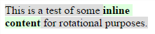
but the bounds shown by the editor are:
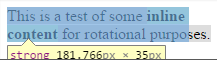
You can clearly see that the background and the element's bounds do not match at all. Without clear bounds, transforms because difficult and not very useful.
Why are inline transform styles not being applied
When you attempt to translate the span elements vertically, you don't see a change because of how inline elements work in HTML.
If you want to apply a translation to the spans, you need to first change their display style to inline-block, which will let you apply a transformation to them while keeping them in the same line.
#output span { display: inline-block; }
From the w3 css wiki:
transformable element
A transformable element is an element in one of
these categories:
all elements whose layout is governed by the CSS box model except for
non-replaced inline boxes, table-column boxes, and table-column-group
boxes [CSS2]all SVG paint server elements, the clipPath element and SVG renderable
elements with the exception of any descendant element of text content
elements [SVG2]
letters won't transform without `inline-block` property
It's because the default display of a span is inline, so it's not considered as a block.
Also, you can not use the transform property on an inline element, it should be used on a block or inline-block.
Why can't I translate element using transform: translateY()?
Transform doesn't work on inline elements.
.first {
  display:inline-block;
  transform: translateY(40px);
}
https://developer.mozilla.org/en-US/docs/Web/CSS/transform
CSS transform does not get applied on elements selected by :nth-child()
<span> by default has display: inline and you need display:block or display:inline-block for transform to take effect.
p span:nth-of-type(2) { display: inline-block; transform: rotateX( 180deg); color: blue}<p> <span> A </span> <span> A </span> <span> A </span></p>Does anybody know why my transform scale css isnt working?
You need to add a display property to your button:
.btn-s,
.btn-e { display: inline-block; }
http://jsfiddle.net/5dhjLm80/
var btnE = document.querySelector(".btn-e");btnE.addEventListener('mouseover', function() { btnE.classList.add("btn-eScript")})btnE.addEventListener("transitionend", function() { btnE.classList.remove("btn-eScript")}).btn-e { margin-left: 155px; background-color: rgba(83,155,232,0.9); }
.btn-s { margin-left: 120px; background-color: rgb(236, 130, 139);
}
.btn-s,.btn-e { text-decoration: none; color: white; font-size: 90%; font-weight: 100; text-align: center; padding: 10px 20px; border-radius: 25px; transition: 0.15s; display: inline-block;}
.btn-eScript { color: blue; transform: scale(1.5);}<div class="btns"> <a class="btn-s" href="#">Más demos</a> <a class="btn-e" href="#">Más demos</a> </div>CSS3 transform not working
This is merely an educated guess without seeing the rest of your HTML/CSS:
Have you applied display: block or display: inline-block to li a? If not, try it.
Otherwise, try applying the CSS3 transform rules to li instead.
Transform CSS property doesn't work with a element
transform is not applicable to inline elements such as <a>. You could display the link as inline-block or block to get transform to work:
transformable element
A transformable element is an element in one of these categories:
- an element whose layout is governed by the CSS box model which is either a block-level or atomic inline-level element, or whose display
property computes to table-row, table-row-group, table-header-group,
table-footer-group, table-cell, or table-caption [...]
Where atomic inline-level elements include:
replaced inline-level elements, inline-block elements, and
inline-table elements
a { display: inline-block; }
a:hover { transform: scale(2,2); }
Besides, there's no on-click state available in CSS. Possible options are :active or :hover, or using checkbox hack.
a { background-color: green; color: white; padding: 10px 20px; text-decoration: none; border: 2px solid #85ADFF; border-radius: 30px 10px; transition: all 2s; display: inline-block; /* <-- added declaration */}a:hover{ transform: scale(2,2); }/* just for demo */body { padding: 2em; text-align: center; }<a href="xyz.html">click here</a>Rotate inline elements with CSS
Start by simplifying your HTML markup:
<h1 class="deallogo">Deal<span>OR</span>No deal</h1>
Much more semantic, it is all one heading and there is no more <center> which is deprecated :)
Now apply the needed CSS properties for h1:
.deallogo {
    background: linear-gradient(#685300, #E6B800);
    border: black solid 1px;
    display: block;
    /* the default */
    margin: 0 auto;
    /* margin auto centers block elements that have a fixed width! */
    width: 204px;
    padding: 0 9px 0 10px;
    /*Slight changes with width and padding values*/
}
and the span:
.deallogo span {
    color: white;
    background: black;
    border: black solid 1px;
    width: 35px;
    font-size: 0.7em;
    /* Smaller font size to fit the height */
    transform: rotate(270deg);
    display: inline-block;
    /* inline-block allows the element to have a height and width (and rotate) */
    vertical-align: top;
    /* a top margin is being used, so let's get it up there with vertical-align */
    margin: 4px 0 0;
}
et voilà!

Have an example! (fixed link)
Some light reading:
- The display property
inline-block - The element generates a block element box that will be flowed with surrounding content as if it were a single inline box (behaving much like a replaced element would)
Related Topics
Swap Div Position With CSS Only
Angular Material Mat-Drawer in Full Height Flex, Content Overflow Auto
Align ≪Div≫ Elements Side by Side
How to Make Bootstrap Columns All the Same Height
Set Opacity of Background Image Without Affecting Child Elements
Css Text-Overflow in a Table Cell
Difference Between "Word-Break: Break-All" Versus "Word-Wrap: Break-Word" in Css
How to Write a ':Hover' Condition For 'A:Before' and 'A:After'
How to Change the Cursor into a Hand When a User Hovers Over a List Item
Should I Avoid Using !Important in Css
How to Disable the Border on Bootstrap 4 Cards
Child Inside Parent With Min-Height: 100% Not Inheriting Height
How to Disable Text Selection Highlighting