Font scaling based on width of container
If the container is not the body, CSS Tricks covers all of your options in Fitting Text to a Container.
If the container is the body, what you are looking for is Viewport-percentage lengths:
The viewport-percentage lengths are relative to the size of the initial containing block. When the height or width of the initial containing block is changed, they are scaled accordingly. However, when the value of overflow on the root element is auto, any scroll bars are assumed not to exist.
The values are:
vw(% of the viewport width)vh(% of the viewport height)vi(1% of the viewport size in the direction of the root element's inline axis)vb(1% of the viewport size in the direction of the root element's block axis)vmin(the smaller ofvworvh)vmax(the larger orvworvh)
1 v* is equal to 1% of the initial containing block.
Using it looks like this:
p {
    font-size: 4vw;
}
As you can see, when the viewport width increases, so do the font-size, without needing to use media queries.
These values are a sizing unit, just like px or em, so they can be used to size other elements as well, such as width, margin, or padding.
Browser support is pretty good, but you'll likely need a fallback, such as:
p {
    font-size: 16px;
    font-size: 4vw;
}
Check out the support statistics: http://caniuse.com/#feat=viewport-units.
Also, check out CSS-Tricks for a broader look: Viewport Sized Typography
Here's a nice article about setting minimum/maximum sizes and exercising a bit more control over the sizes: Precise control over responsive typography
And here's an article about setting your size using calc() so that the text fills the viewport: http://codepen.io/CrocoDillon/pen/fBJxu
Also, please view this article, which uses a technique dubbed 'molten leading' to adjust the line-height as well. Molten Leading in CSS
Responsive font size in CSS
The font-size won't respond like this when resizing the browser window. Instead they respond to the browser zoom/type size settings, such as if you press Ctrl and + together on the keyboard while in the browser.
Media Queries
You would have to look at using media queries to reduce the font-size at certain intervals where it starts breaking your design and creating scrollbars.
For example, try adding this inside your CSS at the bottom, changing the 320 pixels width for wherever your design starts breaking:
@media only screen and (max-width: 320px) {

   body {
      font-size: 2em;
   }

}
Viewport percentage lengths
You can also use viewport percentage lengths such as vw, vh, vmin and vmax. The official W3C document for this states:
The viewport-percentage lengths are relative to the size of the initial containing block. When the height or width of the initial containing block is changed, they are scaled accordingly.
Again, from the same W3C document each individual unit can be defined as below:
vw unit - Equal to 1% of the width of the initial containing block.
vh unit - Equal to 1% of the height of the initial containing block.
vmin unit - Equal to the smaller of vw or vh.
vmax unit - Equal to the larger of vw or vh.
And they are used in exactly the same way as any other CSS value:
.text {
  font-size: 3vw;
}

.other-text {
  font-size: 5vh;
}
Compatibility is relatively good as can be seen here. However, some versions of Internet Explorer and Edge don’t support vmax. Also, iOS 6 and 7 have an issue with the vh unit, which was fixed in iOS 8.
Is there really any point to using relative font sizing in CSS?
According to YUI Font CSS,
Always use percentages as the units
because they render more consistently
than ems, and because they allow
user-initiated resizing (unlike
pixels).
Relative font sizes work pretty well when they are part of a framework like YUI. Especially because they normalize how fonts work across browsers.
Personally, I do throw in absolute px every once in a while, but typically only for text that must somehow match up size-wise with some other design elements (like a menu).
The % stuff does break down when you assign % to a certain element and then a different % to a contained element. But that's the only real gotcha I've found.
Font size relative to the user's screen resolution?
@media screen and (max-width : 320px)
{
  body or yourdiv element
  {
    font:<size>px/em/rm;
  }
}
@media screen and (max-width : 1204px)
{
  body or yourdiv element
  {
    font:<size>px/em/rm;
  }
}
You can give it manually according to screen size of screen.Just have a look of different screen size and add manually the font size.
Font-size not getting bigger in CSS
How to approach issues of type "My styles are not applied"
First, you should use the dev tools in your browser to investigate the element in your DOM.
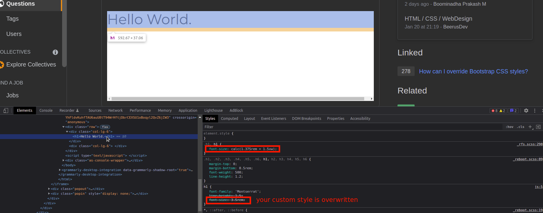
As you can see, your font-size value is overwritten by Bootstrap's styles (coming from that _rfs.scss file mentioned at the right).
Option A: Display Headings (Bootstrap, only in your case)
Use Bootstrap's Display Headings. This lets you define different font sizes on your headings.
In your case, you could try this one:
<h1 class="display-1">Hello World.</h1>
Option B: Class Specificity
Add a class by yourself and refer to this class in your CSS.
h1.my-heading {
  font-family: 'Montserrat';
  font-size: 15rem;
}
<head>
<!-- Google Fonts -->
<link rel="preconnect" href="https://fonts.googleapis.com">
<link rel="preconnect" href="https://fonts.gstatic.com" crossorigin>
<link href="https://fonts.googleapis.com/css2?family=Montserrat" rel="stylesheet">
<!-- Bootstrap -->
<link href="https://cdn.jsdelivr.net/npm/bootstrap@5.1.3/dist/css/bootstrap.min.css" rel="stylesheet" integrity="sha384-1BmE4kWBq78iYhFldvKuhfTAU6auU8tT94WrHftjDbrCEXSU1oBoqyl2QvZ6jIW3" crossorigin="anonymous">
</head>
<div class="row">
<div class="col-lg-6">
<h1 class="my-heading">Hello World.</h1>
</div>
<div class="col-lg-6">
</div>
</div>Most Standard way to Set Font Sizes in HTML/CSS
They're all standard. Use what works for you.
Auto scale font size in CSS
Per your comment you are open to use Javascript, hence proposing a Javascript solution (actually using jQuery). Hope you understand that this is not possible with only CSS.
All you need is to define your threshold for height. For example, if you decide that you need to accommodate your text in a p with a maximum height of 100px, then you loop and keep reducing the font-size until the threshold height is reached.
Something like this:
var threshold = 100, /* define height to restrict */
    p = $('#p'), /* your element depending on whatever selector */
    fs = parseInt(p.css('font-size')); /* get the current font size */

while (p.height() > threshold) { /* while height is more than threshold */
    p.css({'font-size': fs-- }); /* reduce the font-size */
}
p.height(threshold); /* adjust the final height to clean up */
You might need to adjust the final height a little bit after the loop.
Demo fiddle: http://jsfiddle.net/abhitalks/ab6m7yh1/2/
Demo Snippet:
var threshold = 100;
$('p').each(function() {    var $self = $(this),   fs = parseInt($self.css('font-size'));        while($self.height() > threshold) {        $self.css({'font-size': fs-- });    }    $self.height(threshold);});
p { font-size: 2em; width: 320px; height: auto; border: 1px solid #ccc; }<script src="https://ajax.googleapis.com/ajax/libs/jquery/2.1.1/jquery.min.js"></script><p>Lorem ipsum dolor sit amet, consectetur adipiscing elit, sed do eiusmod tempor incididunt ut labore et dolore magna aliqua. </p><p>Lorem ipsum dolor sit amet, consectetur adipiscing elit, sed do eiusmod tempor incididunt ut labore et dolore magna aliqua. Ut enim ad minim veniam, quis nostrud exercitation ullamco laboris nisi ut aliquip ex ea commodo consequat. </p><p>Lorem ipsum dolor sit amet, consectetur adipiscing elit, sed do eiusmod tempor incididunt ut labore et dolore magna aliqua. Ut enim ad minim veniam, quis nostrud exercitation ullamco laboris nisi ut aliquip ex ea commodo consequat. Duis aute irure dolor in reprehenderit in voluptate velit esse cillum dolore eu fugiat nulla pariatur. Excepteur sint occaecat cupidatat non proident, sunt in culpa qui officia deserunt mollit anim id est laborum. </p>Change font height and width
CSS transform has the scale function for this:
p {
  display: inline-block;
  font-size: 32px;
  transform: scale(.5, 1);
}
<p>This is text.</p>Related Topics
Background-Size Transition on Hover Causes Chrome to "Shake" Background Image
How to Disable Inline CSS in Gatsby
How to Make a Div Disappear on Hover Without It Flickering When The Mouse Moves
Select All Block Level Elements with CSS
Why Isn't -Moz-Animation Working
Horizontal Sharp Background Gradient with Specific Length of First Color
How to Combine Compass with Bless
How to Break Lines in Urls in Stylesheet
Overflow with Absolute/Relative Positioning Layout
Ionic 4 How to Change: Shadow Dom in CSS
Chrome Dev Tools Showing a CSS Rule on a Grey Background. Why