Creating CSS3 Circles connected by lines
You can achieve this effect with no additional markup using pseudo-elements and the adjacent sibling selector (~):
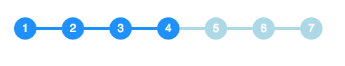
li {  width: 2em;  height: 2em;  text-align: center;  line-height: 2em;  border-radius: 1em;  background: dodgerblue;  margin: 0 1em;  display: inline-block;  color: white;  position: relative;}
li::before{  content: '';  position: absolute;  top: .9em;  left: -4em;  width: 4em;  height: .2em;  background: dodgerblue;  z-index: -1;}

li:first-child::before {  display: none;}
.active {  background: dodgerblue;}
.active ~ li {  background: lightblue;}
.active ~ li::before {  background: lightblue;}
<ul> <li>1</li> <li>2</li> <li>3</li> <li class="active">4</li> <li>5</li> <li>6</li> <li>7</li></ul> Create css circles connected by line
Sidenote: This is why I would never use tailwindcss or the likes. You don't need it, and it totally ruins the HTML.
Now compare the markup you have with the markup below - which is a) much, much more concise, b) using only a single CSS class and c) using the proper semantic elements for the job.
It also works for 2 or 4 or 7 items. Sure it needs some refinement regarding size and color of the active circle, but that should be an easy adjustment for you.
The only restriction of this solution is that your page background-color needs to be solid and be matched by the background-color of the ::after elements.
document.querySelectorAll('.steplist').forEach(steplist => {
  steplist.addEventListener('click', function(event) {
    if (event.target.nodeName !== 'LI') return;
    const items = event.target.closest('.steplist').querySelectorAll('li');
    for (const item of items) {
      item.classList.toggle('active', item === event.target);
    }
  });
});
*, ::after, ::before { box-sizing: border-box; }
.steplist {
border-top: 2px solid #ccc;
display: inline-flex;
font-family: 'Gill Sans', 'Gill Sans MT', Calibri, 'Trebuchet MS', sans-serif;
list-style-type: none;
gap: 7em;
margin: 0;
padding: 0;
--circle-radius: 8px;
}
.steplist li {
color: #999;
cursor: pointer;
padding: calc(5px + var(--circle-radius)) 0 0;
margin: 0;
position: relative;
text-align: center;
}
.steplist li::before {
background-color: #ccc;
border-radius: 50%;
content: '';
position: absolute;
height: calc(2 * var(--circle-radius));
width: calc(2 * var(--circle-radius));
top: 0;
left: 50%;
transform: translate(-50%, -50%);
transition: all 0.3s ease;
}
.steplist .active {
color: black;
}
.steplist .active::before {
background-color: green;
box-shadow: 0 0 0 3px rgba(0,255,0,.25);
}
.steplist li:first-child::after {
background-color: white;
content: '';
position: absolute;
height: 2px;
width: 100%;
top: -2px;
left: calc(-50% - var(--circle-radius));
}
.steplist li:last-child::after {
background-color: white;
content: '';
position: absolute;
height: 2px;
width: 100%;
top: -2px;
left: calc(50% + var(--circle-radius));
}
.circle-big {
--circle-radius: 12px;
}<ol class="steplist">
<li>Point 1<br>whatever</li>
<li>Point 2<br>whatever</li>
<li>Point 3<br>whatever</li>
</ol>
<br><br><br>
<ol class="steplist circle-big">
<li>Point 1<br>whatever</li>
<li>Point 2<br>whatever</li>
<li>Point 3<br>whatever</li>
<li>Point 4<br>whatever</li>
</ol>Creating CSS circles connected with lines vertical and horizontal
Check out updated pen :
http://codepen.io/Debabrata89/pen/QNZrxE
Below are the relevant code:
HTML:
<div></div><span id="step1">step1</span>
<div id="second"></div>
<div></div><span id="step2">step2</span>
<div id="last"></div>
CSS:
@import "compass/css3";

div {
  width: 2em;
  height: 2em;
  text-align: center;
  line-height: 2em;
  border-radius: 1em;
  background: dodgerblue;
  margin: 0 1em;
  color: white;
  position: relative;
 -ms-transform: rotate(-180deg);
 -webkit-transform: rotate(-180deg);
 transform: rotate(-180deg);
}

div::before{
  content: '';
  position: absolute;
  top: .9em;
  left: -4em;
  width: 4em;
  height: .2em;
  background: dodgerblue;
  z-index: -1;

}


div:first-child::after {
  display: none;
}


body {
  font-family: sans-serif;
  padding: 2em;
}
#last{
  transform: rotate(-90deg);
  width:0;
  height:0;
}
 #second{
   transform: rotate(-90deg);
   width:0;
   height:10;
   left:16px;
   top:-16px;

}
#step1{
  position:absolute;
  top:40px;
  left:150px
}
#step2{
  position:absolute;
  top:104px;
  left:150px
 }
Css3 responsive circles connected by a line?
You could use the solution of Justify the last line of a div? in order to make it full width.
And fake the line with absolute positioned pseudo-elements.
Demo
ul {
  text-align: justify;
  position: relative;
  overflow: hidden;
}
ul:before, .active:after {
  content: '';
  width: 100%;
  border: 2px solid dodgerblue;
  position: absolute;
  top: 1em;
  margin-top: -2px;
  z-index: -1;
}
.active:after {
  border-color: lightblue;
}
ul:after {
  content: "";
  display: inline-block;
  width: 100%;
}
li {
  width: 2em;
  height: 2em;
  text-align: center;
  line-height: 2em;
  border-radius: 50%;
  background: dodgerblue;
  margin: 0 1em;
  display: inline-block;
  color: white;
}
.active ~ li {
  background: lightblue;
}
body {
  font-family: sans-serif;
  padding: 2em;
}
Creating CSS circles connected by lines to one main circle
.left-box,.right-box {  vertical-align: middle;  display: inline-block;}
.left-box {  margin-right: 50px;}
.right-box .circle + .circle {  margin-top: 20px;}
.circle {  border-radius: 100%;  background: #ed1c24;  text-align: center;  position: relative;  display: table;  height: 70px;  z-index: 10;  color: #fff;  width: 70px;}
.big-circle {  background: #52883b;  height: 100px;  width: 100px;}
.purple {  background: #ec008c;}
.circle .circle-content {  vertical-align: middle;  display: table-cell;}
.circle.one:before,.circle.two:before {  transform: rotate(-20deg);  position: absolute;  margin: 0 -5px 0 0;  background: #000;  width: 74px;  content: '';  height: 1px;  right: 100%;  z-index: -1;  top: 50%;}
.circle.two:before {  transform: rotate(20deg);}
<div class="left-box"> <div class="big-circle circle"> <div class="circle-content">1</div> </div></div><div class="right-box"> <div class="circle one"> <div class="circle-content">1.1</div> </div> <div class="circle purple two"> <div class="circle-content">1.2</div> </div></div>Creating CSS circles connected by lines to middle main circle
What you will need is a position: relative; container with child elements positioned absolute
Demo
Demo 2 (Using transform)
Explanation: What am doing here is using position: relative; on the parent element which is .ball_wrap, than am using position: absolute; for the child elements AS WELL AS the :after pseudo elements to connect the child elements with the parent. If you are not aware of the pseudo elements than take them as a virtual element, these elements do not exist literally in the DOM but they do render graphically. So am using display: block; as they are inline by default..along with content: "";... Rest, set them accordingly using top, right, bottom and left properties.
.ball_wrap {
    position: relative;
    margin: 150px;
    width: 90px;
}

.green_ball {
    background: #00C762;
    height: 50px;
    width: 50px;
    border-radius: 50%;
    border: 3px solid #ccc;
    position: absolute;
}

.blue_ball {
    background: #2F9BC1;
    height: 80px;
    width: 80px;
    border-radius: 50%;
    border: 3px solid #ccc;
}

.ball_wrap div:nth-of-type(2) {
    top: 20px;
    left: -100px;
}

.ball_wrap div:nth-of-type(2):after {
    content: "";
    display: block;
    border-bottom: 1px solid #000;
    position: absolute;
    width: 50px;
    right: -50px;
    top: 50%;
}

.ball_wrap div:nth-of-type(3) {
    top: 20px;
    right: -100px;
}

.ball_wrap div:nth-of-type(3):after {
    content: "";
    display: block;
    border-bottom: 1px solid #000;
    position: absolute;
    width: 50px;
    left: -52px;
    top: 50%;
}

.ball_wrap div:nth-of-type(4) {
    right: 20px;
    bottom: -100px;
}

.ball_wrap div:nth-of-type(4):after {
    content: "";
    display: block;
    border-left: 1px solid #000;
    position: absolute;
    height: 50px;
    left: 50%;
    top: -52px;
}
Also you might take a look at these types of charts using jQuery
css: how to make circles connected by lines responsive with bootstrap?
The simplest solution contains two divs and two pseudo elements. position: absolute keeps the circles over the parents border and position: relative keeps the circles positioned relative to the parent.
Have an example!
HTML
<div class="parent"><div class="child"></div></div>
CSS
* {
  margin:0;
  padding:0;
}

.parent {
  margin:100px 0 0;
  width:100%;
  border-bottom:2px solid #CCC;
  position:relative;
  z-index:-1;
}

.parent:before,.parent:after,.child {
  background:#CCC;
  width:15px;
  height:15px;
  border-radius:50%;
  border:1px solid #CCC;
  position:absolute;
  content:'';
  top:-8px;
}

.parent:before {
  left:0;
}

.parent:after {
  right:0;
}

.child {
  left:50%;
  margin-left:-8px;
}
CSS3 circles connected by smaller dots in between
You could use Flexbox and make space between circles responsive. You can also use nth-child selector to select every 5th circle. Demo
.parent { display: flex; align-items: center; justify-content: space-between;}.circle { border: 1px solid black; background: black; border-radius: 50%; width: 10px; height: 10px;}.big { width: 30px; height: 30px; background: none;}<div class="parent"> <div class="circle big"></div> <div class="circle"></div> <div class="circle"></div> <div class="circle"></div> <div class="circle"></div> <div class="circle big"></div> <div class="circle"></div> <div class="circle"></div> <div class="circle"></div> <div class="circle"></div> <div class="circle big"></div></div>Creating a circle connected with vertical line and display text on right side of each circle
You can use display: inline-block instead, you also need to remove the margin for it to connect:
.info-timeline ul {  list-style: none;  margin: 0;  padding: 0;}
.info-timeline ul li span.timeline-circle {  position: relative;  border: 2px solid #999;  border-radius: 100%;  width: 50px;  line-height: 50px;  text-align: center;  margin-top: 50px;  background-color: #fff;  z-index: 2;  display: inline-block;}
.info-timeline ul li:not(:first-of-type) span.timeline-circle::before {  position: absolute;  border: 1px solid #999;  width: 0;  height: 50px;  display: block;  content: '';  left: 50%;  z-index: 1;  top: -54px;  margin-left: -1px;}
.info-timeline ul li a {  color: #000;}
<div class="info-timeline"> <ul> <li><span class="timeline-circle">1</span><a href="#">example 1</a></li> <li><span class="timeline-circle">2</span><a href="#">example 2</a></li> <li><span class="timeline-circle">3</span><a href="#">example 3</a></li> <li><span class="timeline-circle">4</span><a href="#">example 4</a></li> </ul></div>Related Topics
Stretch Child Div Height to Fill Parent That Has Dynamic Height
How to Change Angular Material Table Row Height
How to Make a Floated Div 100% Height of Its Parent
Media Queries: How to Target Desktop, Tablet, and Mobile
Custom CSS Scrollbar For Firefox
Text in a Flex Container Doesn't Wrap in Ie11
Remove Blue Underline from Link
Font Awesome 5 Choosing the Correct Font-Family in Pseudo-Elements
Possible to Use Border-Radius Together With a Border-Image Which Has a Gradient
How to Suppress Spacing Between Paragraphs of the Same CSS Class
How to Make an Element Fill the Remaining Viewport Height
How to Make an Svg Scale With Its Parent Container
How to Apply a CSS Filter to a Background Image
What's So Bad About In-Line Css
How to Show Only Corner Borders