Change navbar color in Twitter Bootstrap
tl;dr - TWBSColor - Generate your own Bootstrap navbar
Version notes:
- Online tool: Bootstrap 3.3.2+ / 4.0.0+
- This answer: Bootstrap 3.0.x
- For Bootstrap 5.x, please check documentation
Available navbars
You've got two basic navbars:
<!-- A light one -->
<nav class="navbar navbar-default" role="navigation"></nav>
<!-- A dark one -->
<nav class="navbar navbar-inverse" role="navigation"></nav>
Default color usage
Here are the main colors and their usage:
#F8F8F8: navbar background#E7E7E7: navbar border#777: default color#333: hover color (#5E5E5Efor.nav-brand)#555: active color#D5D5D5: active background
Default style
If you want to put some custom style, here's the CSS you need to change:
/* navbar */
.navbar-default {
    background-color: #F8F8F8;
    border-color: #E7E7E7;
}
/* Title */
.navbar-default .navbar-brand {
    color: #777;
}
.navbar-default .navbar-brand:hover,
.navbar-default .navbar-brand:focus {
    color: #5E5E5E;
}
/* Link */
.navbar-default .navbar-nav > li > a {
    color: #777;
}
.navbar-default .navbar-nav > li > a:hover,
.navbar-default .navbar-nav > li > a:focus {
    color: #333;
}
.navbar-default .navbar-nav > .active > a,
.navbar-default .navbar-nav > .active > a:hover,
.navbar-default .navbar-nav > .active > a:focus {
    color: #555;
    background-color: #E7E7E7;
}
.navbar-default .navbar-nav > .open > a,
.navbar-default .navbar-nav > .open > a:hover,
.navbar-default .navbar-nav > .open > a:focus {
    color: #555;
    background-color: #D5D5D5;
}
/* Caret */
.navbar-default .navbar-nav > .dropdown > a .caret {
    border-top-color: #777;
    border-bottom-color: #777;
}
.navbar-default .navbar-nav > .dropdown > a:hover .caret,
.navbar-default .navbar-nav > .dropdown > a:focus .caret {
    border-top-color: #333;
    border-bottom-color: #333;
}
.navbar-default .navbar-nav > .open > a .caret,
.navbar-default .navbar-nav > .open > a:hover .caret,
.navbar-default .navbar-nav > .open > a:focus .caret {
    border-top-color: #555;
    border-bottom-color: #555;
}
/* Mobile version */
.navbar-default .navbar-toggle {
    border-color: #DDD;
}
.navbar-default .navbar-toggle:hover,
.navbar-default .navbar-toggle:focus {
    background-color: #DDD;
}
.navbar-default .navbar-toggle .icon-bar {
    background-color: #CCC;
}
@media (max-width: 767px) {
    .navbar-default .navbar-nav .open .dropdown-menu > li > a {
        color: #777;
    }
    .navbar-default .navbar-nav .open .dropdown-menu > li > a:hover,
    .navbar-default .navbar-nav .open .dropdown-menu > li > a:focus {
          color: #333;
    }
}
Custom colored navbar examples
Here are four examples of a custom colored navbar:

And the SCSS code:
$bgDefault   : #e74c3c;
$bgHighlight : #c0392b;
$colDefault  : #ecf0f1;
$colHighlight: #ffbbbc;
.navbar-default {
  background-color: $bgDefault;
  border-color: $bgHighlight;
  .navbar-brand {
    color: $colDefault;
    &:hover, &:focus {
      color: $colHighlight; }}
  .navbar-text {
    color: $colDefault; }
  .navbar-nav {
    > li {
      > a {
        color: $colDefault;
        &:hover,  &:focus {
          color: $colHighlight; }}}
    > .active {
      > a, > a:hover, > a:focus {
        color: $colHighlight;
        background-color: $bgHighlight; }}
    > .open {
      > a, > a:hover, > a:focus {
        color: $colHighlight;
        background-color: $bgHighlight; }}}
  .navbar-toggle {
    border-color: $bgHighlight;
    &:hover, &:focus {
      background-color: $bgHighlight; }
    .icon-bar {
      background-color: $colDefault; }}
  .navbar-collapse,
  .navbar-form {
    border-color: $colDefault; }
  .navbar-link {
    color: $colDefault;
    &:hover {
      color: $colHighlight; }}}
@media (max-width: 767px) {
  .navbar-default .navbar-nav .open .dropdown-menu {
    > li > a {
      color: $colDefault;
      &:hover, &:focus {
        color: $colHighlight; }}
    > .active {
      > a, > a:hover, > a:focus, {
        color: $colHighlight;
        background-color: $bgHighlight; }}}
}
And finally, a little gift
I've just made a script which will allow you to generate your theme:
TWBSColor - Generate your own Bootstrap navbar
[Update]: TWBSColor now generates SCSS/SASS/Less/CSS code.
[Update]: From now, you can use Less as the default language provided by TWBSColor
[Update]: TWBSColor now supports drop down menus colorization
[Update]: TWBSColor now allows to choose your version (Bootstrap 4 support added)
Changing color of twitter bootstrap nav bar item
Bootstrap comes with some predefined styles, so in order to override them, an easy way is to use the keyword !important in your css. If you omit this keyword it is unlikely that you will see a color change in your case due to Bootstrap's default styling, therefore I recommend you add it.
CSS
.nav-link, .navbar-brand{
    color: red!important;
}

#active{
    color: blue!important;
}
See codeply: https://www.codeply.com/p/pLDEIidtkA
navbar color in Twitter Bootstrap
You can overwrite the bootstrap colors, including the .navbar-inner class, by targetting it in your own stylesheet as opposed to modifying the bootstrap.css stylesheet, like so:
.navbar-inner {
  background-color: #2c2c2c; /* fallback color, place your own */

  /* Gradients for modern browsers, replace as you see fit */
  background-image: -moz-linear-gradient(top, #333333, #222222);
  background-image: -ms-linear-gradient(top, #333333, #222222);
  background-image: -webkit-gradient(linear, 0 0, 0 100%, from(#333333), to(#222222));
  background-image: -webkit-linear-gradient(top, #333333, #222222);
  background-image: -o-linear-gradient(top, #333333, #222222);
  background-image: linear-gradient(top, #333333, #222222);
  background-repeat: repeat-x;

  /* IE8-9 gradient filter */
  filter: progid:DXImageTransform.Microsoft.gradient(startColorstr='#333333', endColorstr='#222222', GradientType=0);
}
You just have to modify all of those styles with your own and they will get picked up, like something like this for example, where i eliminate all gradient effects and just set a solid black background-color:
.navbar-inner {
  background-color: #000; /* background color will be black for all browsers */
  background-image: none;
  background-repeat: no-repeat;
  filter: none;
}
You can take advantage of such tools as the Colorzilla Gradient Editor and create your own gradient colors for all browsers and replace the original colors with your own.
And as i mentioned on the comments, i would not recommend you modifying the bootstrap.css stylesheet directly as all of your changes will be lost once the stylesheet gets updated (current version is v2.0.2) so it is preferred that you include all of your changes inside your own stylesheet, in tandem with the bootstrap.css stylesheet. But remember to overwrite all of the appropriate properties to have consistency across browsers.
Change navbar color in twitter bootstrap 2.0.4
The color of the navbar come from the .navbar-inner lines 3582 to 3589 in bootstrap.css (for the version 2.0.4)
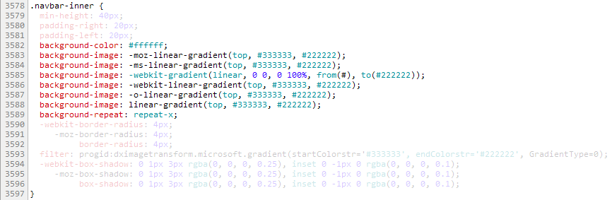
The css properties are applied in a specific order
- background-color (recognised by all web browser)
- vendor prefixes -moz, -ms, -webkit, -o (to serve specific web browser)
- the standard (but not implemented yet)
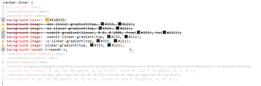
Example of background-color override in boostrap.css with Chrome:
background-color:#ffffff; has been replaced with background-color:#eab92d directly into boostrap.css (it's not recommended but it's just to illustrate the point).
background-color: #EAB92D is applied first
-moz-linear-gradient and -ms-linear-gradient are ignored
-webkit-gradient cover background: #EAB92D(back to the default gradient)
-webkit-linear-gradient overrides -webkit-gradient
-o-linear-gradient and linear-gradient are ignored

Change the color of .navbar-inner from colorzilla
You can easily create a cross browser gradient with colorzilla
Create a <style> tag in <head> after bootstrap.css is called.
Then copy the css generated by colorzilla in .navbar-inner {} inside the <style> tag.
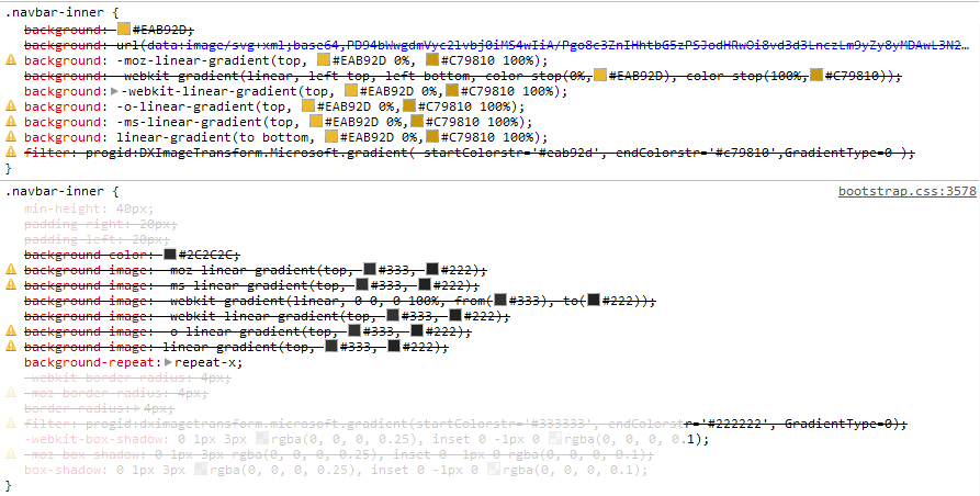
.navbar-inner {
  background: #eab92d; /* Old browsers */
  /* IE9 SVG, needs conditional override of 'filter' to 'none' */
  background: url(data:image/svg+xml;base64,PD94bWwgdmVyc2lvbj0iMS4wIiA/Pgo8c3ZnIHhtbG5zPSJodHRwOi8vd3d3LnczLm9yZy8yMDAwL3N2ZyIgd2lkdGg9IjEwMCUiIGhlaWdodD0iMTAwJSIgdmlld0JveD0iMCAwIDEgMSIgcHJlc2VydmVBc3BlY3RSYXRpbz0ibm9uZSI+CiAgPGxpbmVhckdyYWRpZW50IGlkPSJncmFkLXVjZ2ctZ2VuZXJhdGVkIiBncmFkaWVudFVuaXRzPSJ1c2VyU3BhY2VPblVzZSIgeDE9IjAlIiB5MT0iMCUiIHgyPSIwJSIgeTI9IjEwMCUiPgogICAgPHN0b3Agb2Zmc2V0PSIwJSIgc3RvcC1jb2xvcj0iI2VhYjkyZCIgc3RvcC1vcGFjaXR5PSIxIi8+CiAgICA8c3RvcCBvZmZzZXQ9IjEwMCUiIHN0b3AtY29sb3I9IiNjNzk4MTAiIHN0b3Atb3BhY2l0eT0iMSIvPgogIDwvbGluZWFyR3JhZGllbnQ+CiAgPHJlY3QgeD0iMCIgeT0iMCIgd2lkdGg9IjEiIGhlaWdodD0iMSIgZmlsbD0idXJsKCNncmFkLXVjZ2ctZ2VuZXJhdGVkKSIgLz4KPC9zdmc+);
  background: -moz-linear-gradient(top,  #eab92d 0%, #c79810 100%); /* FF3.6+ */
  background: -webkit-gradient(linear, left top, left bottom, color-stop(0%,#eab92d), color-stop(100%,#c79810)); /* Chrome,Safari4+ */
  background: -webkit-linear-gradient(top,  #eab92d 0%,#c79810 100%); /* Chrome10+,Safari5.1+ */
  background: -o-linear-gradient(top,  #eab92d 0%,#c79810 100%); /* Opera 11.10+ */
  background: -ms-linear-gradient(top,  #eab92d 0%,#c79810 100%); /* IE10+ */
  background: linear-gradient(to bottom,  #eab92d 0%,#c79810 100%); /* W3C */
  filter: progid:DXImageTransform.Microsoft.gradient( startColorstr='#eab92d', endColorstr='#c79810',GradientType=0 ); /* IE6-8 */
}
The css generated by colorzilla overrides all the css properties from boostrap.css as you can see below


Changing '.navbar-inner' is not enough few other bits needs to be changed.
.navbar .btn-navbar (the button to open the menu when width<768px) share the same properties as .navbar-inner
.navbar-inner, .navbar .btn-navbar {
    background: #eab92d; /* Old browsers */
    /* IE9 SVG, needs conditional override of 'filter' to 'none' */
    background: url(data:image/svg+xml;base64,PD94bWwgdmVyc2lvbj0iMS4wIiA/Pgo8c3ZnIHhtbG5zPSJodHRwOi8vd3d3LnczLm9yZy8yMDAwL3N2ZyIgd2lkdGg9IjEwMCUiIGhlaWdodD0iMTAwJSIgdmlld0JveD0iMCAwIDEgMSIgcHJlc2VydmVBc3BlY3RSYXRpbz0ibm9uZSI+CiAgPGxpbmVhckdyYWRpZW50IGlkPSJncmFkLXVjZ2ctZ2VuZXJhdGVkIiBncmFkaWVudFVuaXRzPSJ1c2VyU3BhY2VPblVzZSIgeDE9IjAlIiB5MT0iMCUiIHgyPSIwJSIgeTI9IjEwMCUiPgogICAgPHN0b3Agb2Zmc2V0PSIwJSIgc3RvcC1jb2xvcj0iI2VhYjkyZCIgc3RvcC1vcGFjaXR5PSIxIi8+CiAgICA8c3RvcCBvZmZzZXQ9IjEwMCUiIHN0b3AtY29sb3I9IiNjNzk4MTAiIHN0b3Atb3BhY2l0eT0iMSIvPgogIDwvbGluZWFyR3JhZGllbnQ+CiAgPHJlY3QgeD0iMCIgeT0iMCIgd2lkdGg9IjEiIGhlaWdodD0iMSIgZmlsbD0idXJsKCNncmFkLXVjZ2ctZ2VuZXJhdGVkKSIgLz4KPC9zdmc+);
    background: -moz-linear-gradient(top,  #eab92d 0%, #c79810 100%); /* FF3.6+ */
    background: -webkit-gradient(linear, left top, left bottom, color-stop(0%,#eab92d), color-stop(100%,#c79810)); /* Chrome,Safari4+ */
    background: -webkit-linear-gradient(top,  #eab92d 0%,#c79810 100%); /* Chrome10+,Safari5.1+ */
    background: -o-linear-gradient(top,  #eab92d 0%,#c79810 100%); /* Opera 11.10+ */
    background: -ms-linear-gradient(top,  #eab92d 0%,#c79810 100%); /* IE10+ */
    background: linear-gradient(to bottom,  #eab92d 0%,#c79810 100%); /* W3C */
    filter: progid:DXImageTransform.Microsoft.gradient( startColorstr='#eab92d', endColorstr='#c79810',GradientType=0 ); /* IE6-8 */
    }
.divider-vertical (the vertical separator) uses the same colors used in the gradient
.navbar .divider-vertical {
    background-color: #c79810;
    border-right: 1px solid #eab92d;
    }
.active (the highlight on the active page) is corresponding to the dark color of the gradient
.navbar .nav .active > a, .navbar .nav .active > a:hover {
    background-color: #c79810;
    }
the color of the link on the menu needs to be changed as well, in this case 75% from the fair color of the gradient to white.
.navbar .nav > li > a {
    color: #f9ed9d;
    }
And finally the color of the .brand , in this case 50% from the fair color of the gradient to white.
.navbar-fixed-top .brand {
    color: #634c08;color: #f4dc87;
    }
The :hover color of links has not been changed bu can be with:
.navbar .nav > li > a:hover {color:white;}
Same for the color of the active link
.navbar .nav .active > a, .navbar .nav .active > a:hover {color:white;}


How can I change the Bootstrap 4 navbar button icon color?
The navbar-toggler-icon (hamburger) in Bootstrap 4 uses an SVG background-image. There are 2 "versions" of the toggler icon image. One for a light navbar, and one for a dark navbar...
- Use
navbar-darkfor a light/white toggler on darker backgrounds - Use
navbar-lightfor a dark/gray toggler on lighter backgrounds
// this is a black icon with 50% opacity
.navbar-light .navbar-toggler-icon {
  background-image: url("data:image/svg+xml;..");
}
// this is a white icon with 50% opacity
.navbar-dark .navbar-toggler-icon {
  background-image: url("data:image/svg+xml;..");
}
Therefore, if you want to change the color of the toggler image to something else, you can customize the icon. For example, here I set the RGB value to pink (255,102,203). Notice the stroke='rgba(255,102,203, 0.5)' value in the SVG data:
.custom-toggler .navbar-toggler-icon {
  background-image: url("data:image/svg+xml;charset=utf8,%3Csvg viewBox='0 0 32 32' xmlns='http://www.w3.org/2000/svg'%3E%3Cpath stroke='rgba(255,102,203, 0.5)' stroke-width='2' stroke-linecap='round' stroke-miterlimit='10' d='M4 8h24M4 16h24M4 24h24'/%3E%3C/svg%3E");
}

.custom-toggler.navbar-toggler {
  border-color: rgb(255,102,203);
}
Demo http://www.codeply.com/go/4FdZGlPMNV
OFC, another option to just use an icon from another library ie: Font Awesome, etc..
Update Bootstrap 4.0.0:
As of Bootstrap 4 Beta, navbar-inverse is now navbar-dark to use on navbars with darker background colors to produce lighter link and toggler colors.
How to change Bootstrap 4 Navbar colors
Related Topics
Should I Avoid Using !Important in Css
Is Embedding Background Image Data into CSS as Base64 Good or Bad Practice
Align an Image and Some Text on the Same Line Without Using Div Width
Change Button Border Color When the Button Is Being Clicked and After
Simulate Display: Inline in React Native
How to Override Default Primefaces CSS With Custom Styles
Fill Remaining Vertical Space With CSS Using Display:Flex
Align Child Elements of Different Blocks
Prevent Content from Expanding Grid Items
How Are the Points in CSS Specificity Calculated
Why Do Browsers Create Vendor Prefixes For CSS Properties